In the wake of another major core ranking update focused on quality on May 17, I saw many examples of quality problems across sites that were impacted. That included some very familiar characteristics including poor user experience (UX), low-quality content, and aggressive advertising. If you are not familiar with Google’s quality updates, then I recommend reading my two-part series on Search Engine Land. You will get a solid understanding of what quality updates are, how Google is rolling them out, and what is being targeted.
From an aggressive advertising standpoint, I have seen disruptive, annoying, and deceptive ads hundreds of times while analyzing sites that were negatively impacted by quality updates. I have seen it so much that I have written about it numerous times in my posts about major core ranking updates focused on quality.
By the way, in some cases the ads were so heavy that they crashed my display driver… twice. And if they are doing that to my systems, imagine what they are doing to the average user.
A Battery of Smoking Guns
In my opinion, there is a serious connection between aggressive ads, poor user experience, and how Google is evaluating quality for a given site. That said, it is important to understand that there isn’t typically one smoking gun causing a site to be negatively impacted by Google’s quality updates. Instead, there is usually a battery of smoking guns. So, it is important to take a hard look at the various factors that can cause serious damage. And in my opinion, aggressive advertising that negatively impacts the user experience seems to be one of them.
The impact of disruptive and aggressive advertising is an important topic that site owners need to thoroughly understand. Because if they don’t, it is easy to wake up one day and see this:

By the way, it makes complete sense that Google would be doing this. Aggressive, disruptive, and deceptive ads lead to unhappy users. Google is keenly aware of user happiness since it is what keeps people coming back to Google. And, if user happiness tails off by even a small percentage, then that can be a direct hit to Google’s revenue (both short and long-term). That is the last thing Google wants as Facebook, Apple, Amazon, and others are eager to steal customers and advertising share from them.
So I Asked Google’s John Mueller About This… And It is Complicated
Based on the connection I’ve seen between aggressive ads and poor UX, I decided to ask John Mueller a question during yesterday’s webmaster hangout video. John’s answer was very interesting (and nuanced).
I asked if machine learning is being used by Google's quality algorithms to determine what is disruptive, annoying, or aggressive from a usability standpoint. For example, identifying clunky user interfaces, aggressive advertising, deceptive ads, autoplay video/audio, or anything else that negatively impacts the user experience.
John first said he didn’t know, but then went on to explain that Google’s quality algorithms could be looking at this as a “bigger picture view” to determine what is a sign of a good site versus bad site. He explained that some high-quality sites use annoying monetization methods, so it is hard to map the monetization method to the quality of content on any given site. Also, he said some of this could be flowing into Google’s algorithms in general, but not in a very targeted way.
So yes, no, maybe, and possibly. :)
John’s nuanced answer makes sense, since it is clear that this topic is not binary (pass or fail). Some sites run aggressive ads, but never fall out of the gray area (they remain untouched). But others do get hit hard. Like I said earlier, there is typically not one smoking gun. There usually a number of problems that can be picked up by Google’s quality algorithms.
Here’s the video (watch at 1:31):

Confusion About Aggressive Advertising and A Focus On Ad Types (Not Sites)
After writing posts about many significant Google updates over the past several years, I find site owners are still confused about what constitutes aggressive advertising, which tactics and ads are in the gray area, and what is ok usability-wise. Therefore, I have decided to provide seven examples of aggressive advertising below that I have seen on sites that were smoked by quality updates.
Now, I am NOT going to call out specific sites. That is definitely not my style, but I will explain the types of aggressive ads I am seeing while explaining why I feel they are so aggressive (and could be causing problems from an algorithmic standpoint).
But first, a message from Google. Literally. :)
Google’s Quality Rater Guidelines (QRG) And The Connection To Aggressive, Disruptive, And Deceptive Ads
If you have read any of my posts about Google’s core ranking updates focused on quality, then you should have noticed several mentions of Google’s Quality Rater Guidelines (QRG). I still find there are many people that haven’t read the guidelines. That is crazy since the QRG is packed with amazing information about what Google deems high versus low quality.
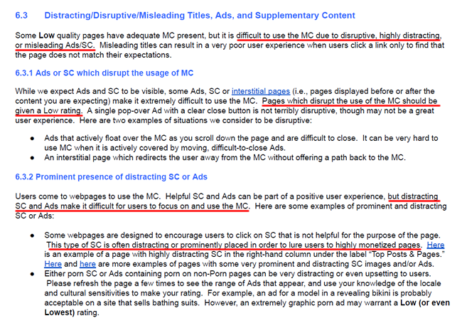
In addition, I have seen a serious connection between what is contained in the QRG and what I see in the field while analyzing sites impacted by Google’s quality updates. For example, Google specifically calls out aggressive, distractive, misleading, and deceptive ads. Yes, they clearly explain this in the QRG. I think it’s amazing they did this since I have been saying for a long time that deceptive, distracting, and aggressive ads could cause problems from an algorithmic standpoint.
Here is a screenshot directly from the Quality Rater Guidelines about these problems:
But don’t stop there, download the QRG today and read the entire document. And then read it again. It’s eye-opening.
And now, ANOTHER message from Google…
Just recently, Google announced that Chrome will begin blocking annoying and aggressive ads in early 2018. That includes ad types marked as annoying based on the Coalition for Better Ads. For example, autoplay video with sound, popups, large sticky banners, and more. Remember, this is Chrome we’re speaking about (with over a billion users across desktop and mobile).
Here are the annoying ad types from Coalition for Better Ads website:
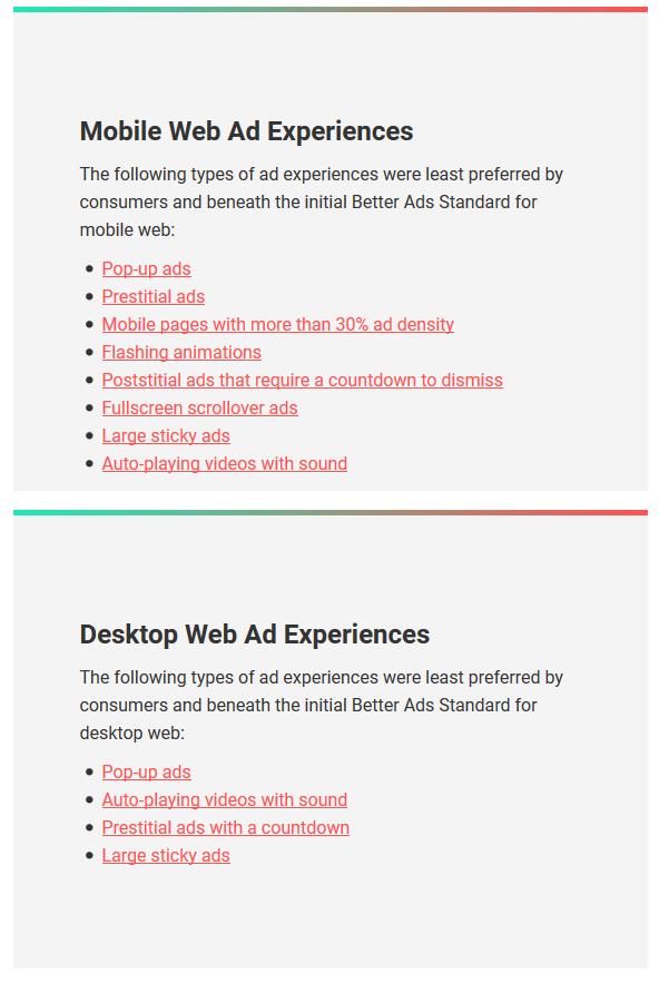
So once again, Google is basically telling you that people hate aggressive and annoying ads and that they are targeting those ads to be filtered. Therefore, combine what I have seen with Google’s quality updates with what the Quality Rater Guidelines explain about disruptive ads, with what real people are explaining via surveys, and now what Chrome is about to filter, and we have overwhelming evidence that aggressive and disruptive ads are not a good thing.
Examples of Aggressive Advertising From Sites Hammered By Google Quality Updates
Now that we have covered an introduction to the topic, I am going to cover seven examples of aggressive advertising based on sites that were smoked during quality updates. My hope is you can review the ad types and then take a hard look at your site to determine if you are crossing the line. And if you are, hopefully, you can quickly rectify the situation.
So put on your battle gear, we are heading to Aggressive Ad Land.
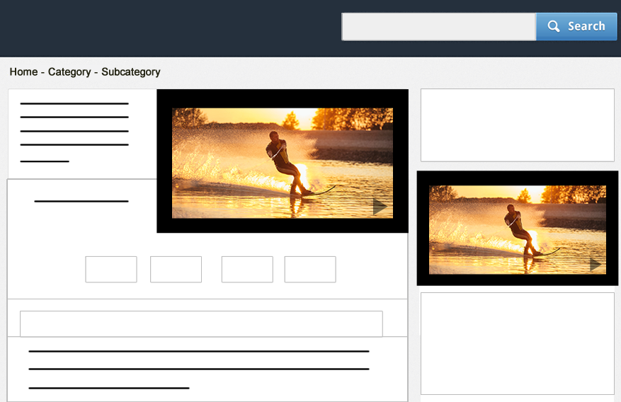
1. Multiple Video Ads + Autoplay = Insanity
Autoplay video is annoying to begin with, but having multiple video ads autoplaying is even worse. I have seen this a number of times while analyzing sites that were negatively impacted by quality updates. And to make matters even worse, there are times those videos play with audio on by default. It is enough to give you a heart attack and a seizure at the same time. Site owners, please don’t do this. There is not a person in the world that would enjoy that user experience.
But again, I am not saying having autoplay video alone with cause a massive algorithm hit. I am just saying I have seen this implemented many times across sites that were negatively hit. Beware.
2. Deceptive Ads Weaved Into The Content
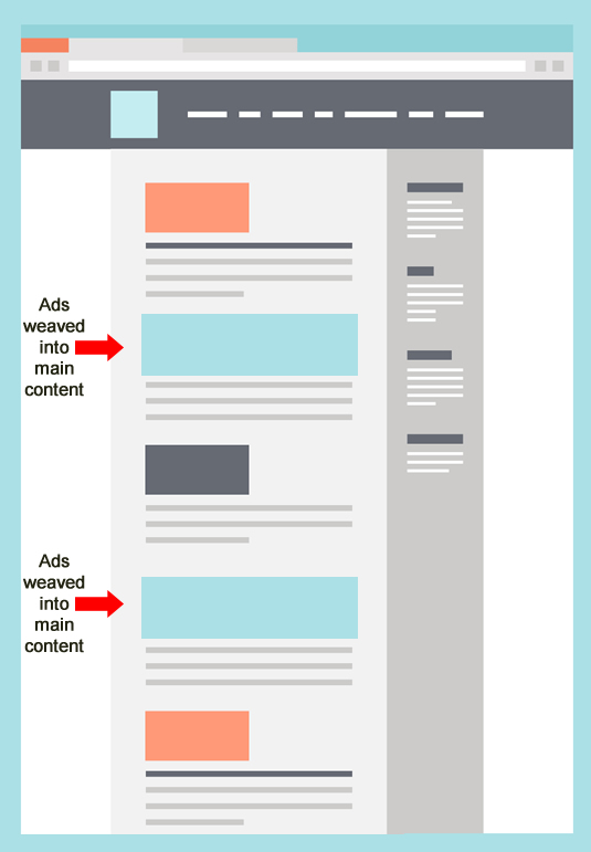
This is probably the most prominent example of aggressive ads I have seen across sites negatively impacted by major core ranking updates focused on quality. It is when ads are weaved into the content, and they often match the color scheme and style of the site. There are times it is nearly impossible to see the difference between the ads and the content.
Why is this dangerous? Users can mistakenly click on those ads thinking they are visiting more content from the same site, but instead, they are whisked off the site to a third-party advertiser. I have had this happen to me many times while analyzing sites that were impacted. And if it happened to me knowing the sites had quality problems, imagine what is happening to the average user.
Don’t do this. Clearly label your ad modules, make sure users know they are ads, and don’t try to deceive users by having the ads match your content.
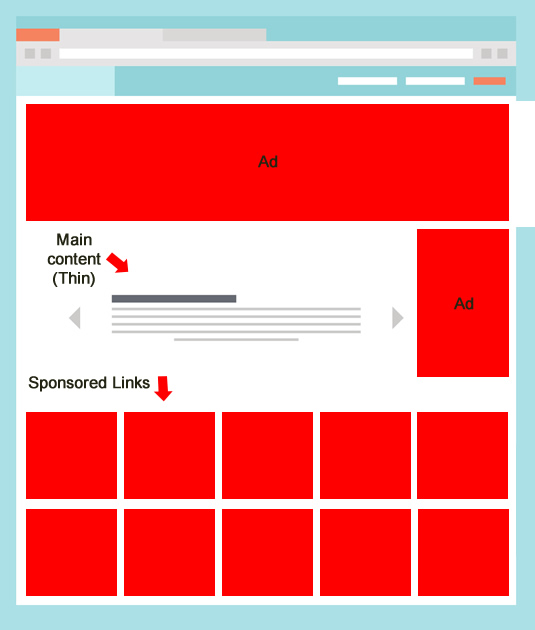
3. Surrounding Thin Content With Ads
We know that Google looks at a number of factors when evaluating quality for a given website. One of those factors is content quality. There are times I have come across thin content that is completely surrounded by ads. It is a quality double whammy. Users don’t get what they need content-wise, and they are getting hammered ad-wise. It is not a good combination, to say the least.
4. Excessive Pagination For Monetization Purposes
I have mentioned this situation many times before (even during old-School Panda days). This is when a site is clearly looking to gain as many ad impressions as possible and decides to break up an article into many different component pages. For example, taking a typical article and breaking it up across 38 different pages (all with multiple ads running per page). As the user is forced to click to each page, they see more ads. I have seen some examples where a standard article was broken up into 50+ component pages.
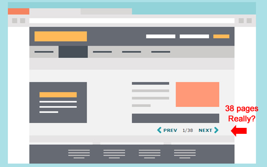
THAT’S INSANE.
Think about your users… Would they ever want to click through that many pages to read an article? Many won’t even get past the first few pages, let alone 30, 40, or 50+. In addition, there are times site owners only provide a paragraph or two per page, surrounded by ads. Avoid this at all costs.
5. Sponsored Links Masked As Supplementary Content
This category falls under both deceptive and aggressive. And that is not exactly the dynamic duo of ad problems. I have seen sponsored links that are styled exactly like the site content, and that can lead to users mistakenly clicking through those sponsored ads believing they are going to visit more content from the same site.
Actually, there have been many times that I have done this while analyzing sites impacted! The unit even tricked me, and I was on the lookout for this type of stuff.
In addition, the placement of the sponsored links matter. For example, I have even seen them at the top of the content! Yes, the first thing you see before hitting the main content are what look to be relevant links to additional content on the site. But in reality, they whisk you off the site to advertisers.
Needless to say, this can be shocking for users (in a bad way). I have also seen downstream advertiser websites with malware or malicious downloads. So not only are you driving users off the site when they didn’t expect it, but you are potentially causing them problems security-wise.
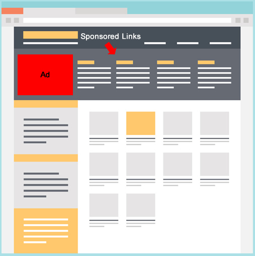
Avoid this like the plague. Don’t deceive users with pseudo-supplementary content. If you are providing sponsored links, then make sure people understand it’s advertising. Don’t have it match your content style-wise, make sure you clearly label the ad unit, and don’t place it at the top of your main content!
6. Clickable Site Skins (Madness)
There are certain verticals that use this type of advertising more than others. It is maddening to me, especially since I am continually analyzing sites impacted by quality updates and know the pitfalls of poor user experience and deceptive ads.
A “skin” or “takeover skin” is essentially the background design for a site. It can include the background and side rails. Well, there are some skins that act as giant, overwhelming ads. When that happens, users cannot click anywhere outside the main content area of the page. If they do, they are whisked off the site to the advertiser website. It’s freaking horrible from a user experience standpoint.
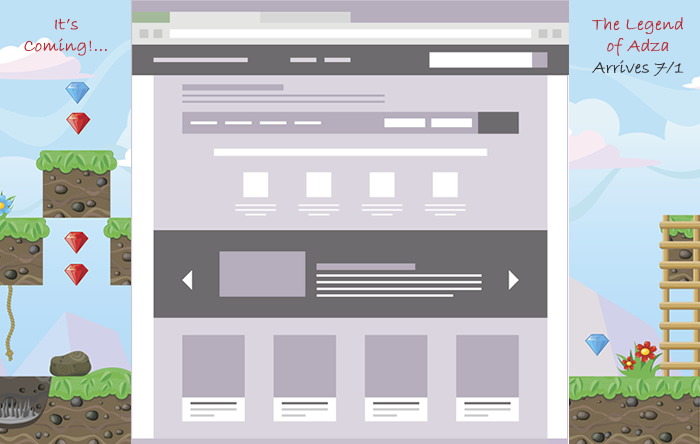
Avoid using “ad takeover skins” at all costs. They might be driving clicks in the short-term, but it’s probably yielding the wrong clicks. Beware.
7. Full -Screen Overlay Ads (And desperately searching for the X Button)
Full-screen overlay ads can yield a horrible user experience. This is when you are reading an article, post, or any main content, and boom, a giant ad opens and takes over the entire browser window. There is nowhere to go.
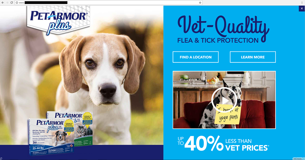
When this happens, you frantically search for a close button, but those darn ad designers are good, really good. And what is that? You hear music playing; yes, they added autoplay video in the giant overlay ad. Your blood pressure rises and you look for the close button even more aggressively. Then you mistakenly click the ad and you are taken downstream to the advertiser site. And once you are there, let’s hope it’s not filled with malware or malicious downloads.
Does that sound like a great user experience??
Avoid full-screen overlays. Don’t force someone looking for your content to experience a giant overlay ad that’s hard to close and sometimes contains media (like autoplay video or audio). You are sure to anger them. And like I’ve said a thousand times before, “Hell hath no fury like a user scorned”. Beware.
The Trap - When Over-Monetization Leads To Rankings Deceleration
I can keep going here, but I hope you get the picture. Some of you may be wondering how site owners don’t understand the problems associated with these ad types. Well, it is easy to be too close to a situation to see the problems. In addition, when you have a lot of Google traffic, it is easy to want to monetize it more…and more… and then even more.
When you tip the scale in the wrong direction, you can get smoked by the next quality update. I have seen this many times while helping companies deal with algorithm updates. Avoid this situation at all costs.
How To Know If You Have Aggressive Ads and What To Do About It:
OK, I am sure you are wondering if you have aggressive and disruptive advertising on your site. I will cover some final points below that can help you identify and then fix the problem.
Have real users go through your site and objectively provide feedback. I have explained this a number of times while writing about quality updates, and it is so important. Give users an objective, have them go through your site, and then ask for feedback. If there is aggressive advertising, you will probably hear about it…several times. Review your site on both desktop and mobile. Remember, you may have many users visiting your site on mobile devices. Check how your site works on mobile, how your ads look on phones, check the user experience, etc. You might be surprised with what you find. Go through your site with other people in the room. Did anything on the site embarrass you? Did video start playing immediately with no way to turn it off? Was there audio too? Did you get angry while visiting the site? If you answered yes to any of these questions, it might be time to rethink your ad strategy. When users traverse your site, do they end up downstream on some advertiser site without knowing they were heading there? Deception is specifically called out in Google’s Quality Rater Guidelines. Remember, “hell hath no fury like a user scorned”. If you have been hit by a quality update and you think aggressive ads could be the problem, then YOU should be aggressive with the remediation plan. Don’t pull back slightly and stay in the gray area. Instead, pull back and improve the user experience significantly. That is hard to do when you are already receiving less traffic, but it is the right move. If you recover, then think about other ways to introduce ads that aren’t ultra-aggressive. But don’t sit with 60% less traffic and leave those aggressive ads in place. You probably won’t recover.Summary – Happy Users Win, Aggressive Ads Lose
Don’t force users to bang their heads against their monitors due to aggressive and disruptive advertising. When you employ aggressive monetization tactics, you risk angering users, deceiving them, and putting them at risk security-wise. And if that happens, you could be negatively impacted during major core ranking updates focused on quality.
I recommend objectively reviewing your site as soon as possible and then taking action. That may include being aggressive in your own way by cutting back on disruptive ad types and promoting a better user experience.
Good luck.
GG
Innovative SEO services
SEO is a patience game; no secret there. We`ll work with you to develop a Search strategy focused on producing increased traffic rankings in as early as 3-months.
A proven Allinclusive. SEO services for measuring, executing, and optimizing for Search Engine success. We say what we do and do what we say.
Our company as Semrush Agency Partner has designed a search engine optimization service that is both ethical and result-driven. We use the latest tools, strategies, and trends to help you move up in the search engines for the right keywords to get noticed by the right audience.
Today, you can schedule a Discovery call with us about your company needs.
Source:


