

Search Engine Optimization (SEO) has proven to be one of the fundamental building blocks of the digital marketing niche. Almost every online business implements SEO strategies to boost their online visibility and improve search engine rankings.
Take into account that approximately half of the web traffic worldwide comes via mobile searches, and your heed automatically shifts towards the all-important domain of mobile optimization.
Google has been pressing the point of mobile-first indexing for the past few years. It rolled out the mobile-first index in 2018, but more recently, it has announced mobile-first indexing for the whole web.
Google says, “From our analysis, most sites shown in search results are good to go for mobile-first indexing, and 70% of those shown in our search results have already shifted over. To simplify, we'll be switching to mobile-first indexing for all websites starting September 2020.”
So what does this mean to website owners and SEOs worldwide?
Websites that are fully optimized for mobile searches are being preferred, and if you haven’t acted upon that yet, it is high time you do so.
As you already know what SEO is, in this article we will check the SEO basics and importance of mobile SEO, mobile best practices, preparing your site for Google’s mobile-first index, and much more.
What is Mobile SEO? Mobile Search in The Eyes of Google Why is Mobile SEO Critical? Checking if Your Website is Mobile-Friendly How to Implement a Mobile-Friendly Website How to Optimize Your Website for Mobile Keyword Research for Mobile With SEMrush Mobile SEO Best Practices Should You Invest in Mobile SEO?1. What is Mobile SEO?
Mobile Search Engine Optimization (SEO) is the process of improving the experience of visitors who access your website from mobile devices, such as smartphones and tablets. Mobile SEO includes optimizing your website and making it mobile-friendly to ensure better visibility and performance in search engine result pages (SERPs).
I am sure you must have heard of Walmart.ca’s mobile eCommerce site optimization, which boosted their mobile sales by 98%.
The key to their stellar performance? Mobile optimization.
Note: Google has several user agents or crawlers, which automatically scan and discover new content and websites. The main crawler is Googlebot, with different versions for desktop and smartphones.
You can check the whole list of Google’s user agents here.
2. Mobile Search in The Eyes of Google
Before diving into mobile SEO basics, we need to understand how Google perceives searches made on mobile and desktops.
Earlier, a mix of the desktop version and the mobile version of any web page’s content was used by Google’s index to show results for a searcher’s query, with the desktop version being the primary source.
Searching from a mobile device ⟹ Mobile results displayedSearching from a desktop or laptop ⟹ Desktop results displayed
Now, the scene has changed. Only the mobile version of your web page’s content is used, meaning:
Searching from a mobile device ⟹ Mobile results displayedSearching from a desktop or laptop ⟹ Mobile results displayed
This is Google’s Mobile-First Index, which clearly lays emphasis on the mobile version of your website content.
Here is what Google has to say on some important aspects of mobile searches and mobile-first indexing:
On Ranking
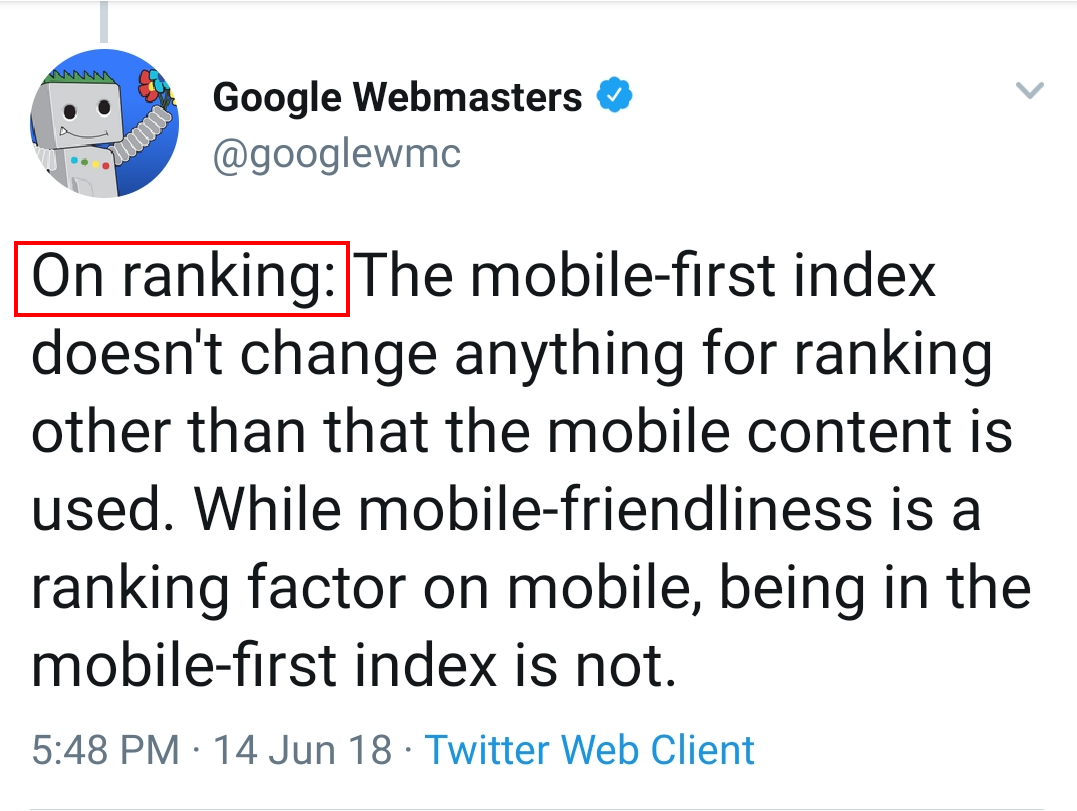
On Preferred URLs
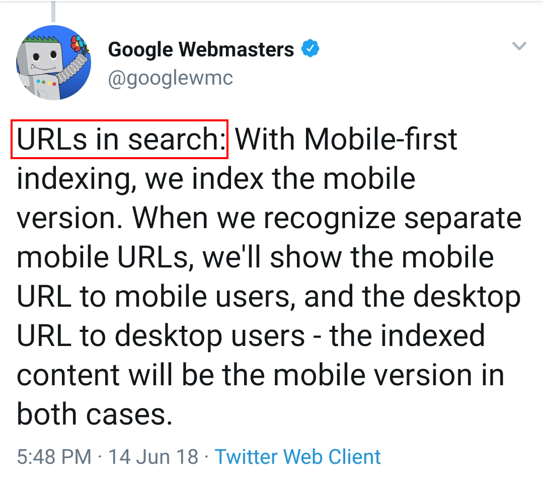
On Requirements
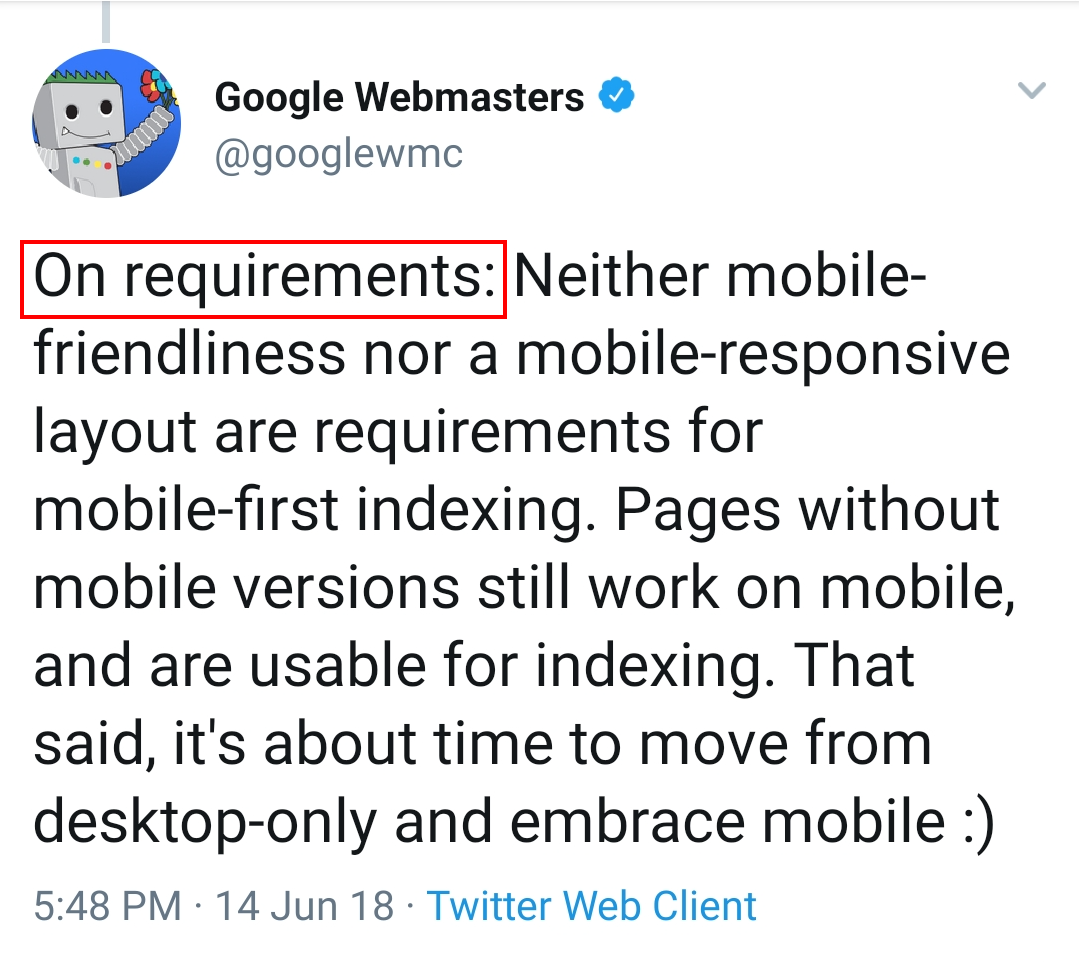
This is the importance of mobile search in Google's eyes as of 2018, and it has been growing ever since. So, without any further ado, let’s check the basics of mobile SEO.
3. Why is Mobile SEO Critical?
While you must have had an idea of how important mobile is to searching on the web, I will sum it up in one sentence.
Reaching your customers at the right time in the right place with the right experience is what mobile allows you to do.
I have summed up the vitality of mobile optimization, as follows:
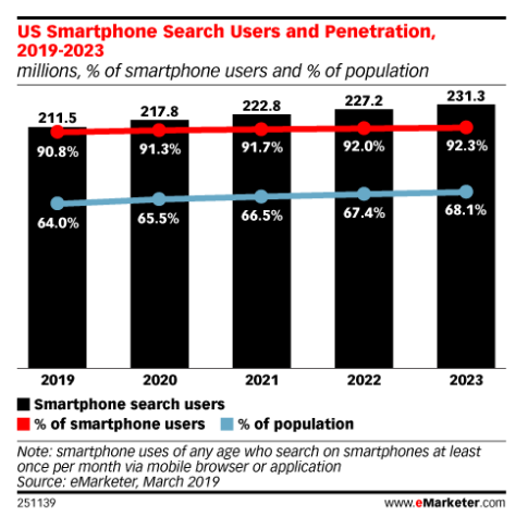
Mobile Searches Have Exceeded Desktop Searches
With great ease of use and portability of mobiles and smartphones, this was definitely on the cards. People have started using their mobiles to search more and more, and this is a clear indication that your content should be optimized for mobile.
As per the latest 2020 statistics depicted below, 50.34% of all searchers worldwide use their mobiles, while 46.67% searchers use desktops. The remaining 2.99% of people use tablets.
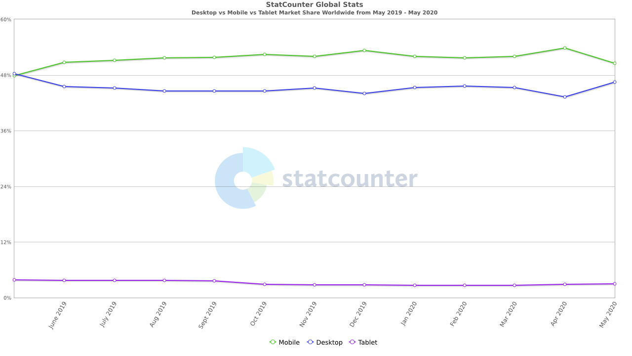
Source
We all understand that this number is only going to increase from here onwards. Thus, to allow your audience to find your content better, you should perform mobile SEO.
Mobile User Experience Matters for Your Brand
The experience you offer your visitors on mobile can be the biggest determining factor for your brand image and future relationships.

Source
It is hard to ignore the importance of positive user experience on mobile, which allows users to trust your brand more, and mobile SEO helps you achieve that.
Mobile Sales Are on the Rise
With mobile searches rising exponentially and people feeling comfortable purchasing products through mobiles, eCommerce sales on mobile grew massively.

Source
Apart from purchases, people are also using mobile for presale queries. If you have your content, products, and overall store optimized for mobile, users will find it easier to reach out to you and eventually become your customers.
Mobile SEO Impacts Local Search and Voice Search
Users worldwide perform many “nearby” searches on their mobile devices, for which Google returns a lot of localized results as compared to desktops. Mobile SEO helps in getting found locally and improves traffic to your website.
Voice search is the “now” and “future” of search. Similar to mobile search, voice search is on the rise too, and businesses who optimize for voice search have a clear edge over those who don’t.
The best part is that a lot of businesses are unaware of this and haven’t even started or planned for voice search optimization.
Given the fierce competition in the industry, it would be really wise to gain a competitive advantage over others, whenever you have the chance to.
4. Checking if Your Website is Mobile-Friendly
Before we immerse ourselves in the depths of mobile SEO and its best practices, we must check our current standings on mobile optimization and then act accordingly.
To check the mobile-friendliness of your website, you can use a variety of tools to gain useful insights. Let’s check the most important and recommended ones:
Google’s Mobile-Friendly Test
This is a very handy tool that serves as a great starting point for your mobile SEO journey. You can either paste in your website’s URL or a specific code snippet, and Google will let you know whether the fed input is mobile-friendly or not.
Here’s the test result for my website:
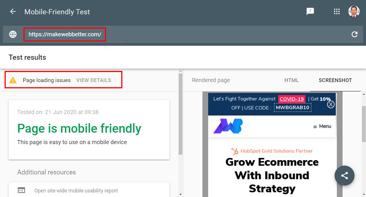
The results say that the page is mobile-friendly, but it also shows some page loading issues. You can view the details of these issues to understand things better.
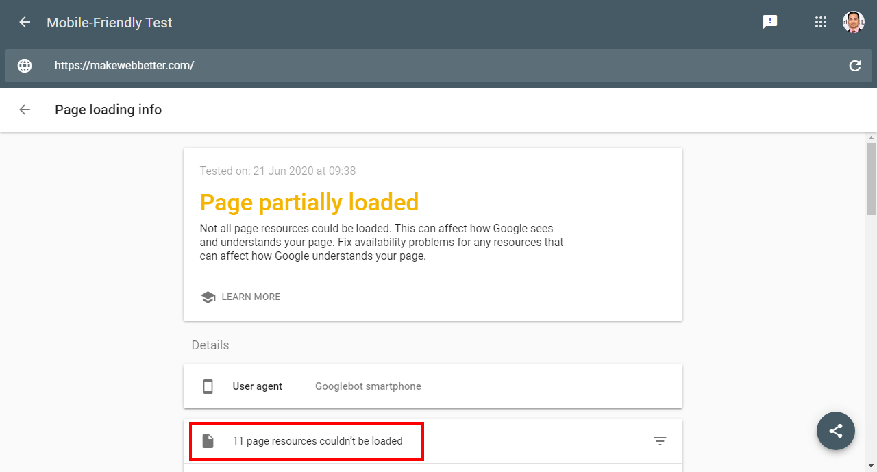
It shows that 11 resources on my page couldn’t be loaded, and if we click on it, it will show us all those 11 resources one by one so that we can fix them.
Without this tool, we would be deprived of some useful information. All thanks to Google!
Google’s Mobile Usability Tool
This is another free tool by Google, which can be found in your Google Search Console account.
Just log in to your GSC account and select “Mobile Usability” in the panel on the left-hand side.
Here is an example result of this tool’s test:
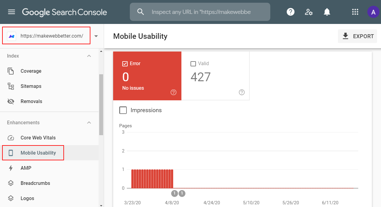
My website’s result shows that there are no issues with the number of valid web pages (427).
If your website has any errors, it will be shown under “Details”. The type of errors and the number of pages affected will also be shown.
This usability test is highly recommended to check if your website is mobile-friendly or not.
SEMrush
Another effective way of checking the mobile-friendliness of your website is via SEMrush. It is a complete tool that offers a variety of efficient digital marketing solutions, and one of them is the popular Site Audit tool.
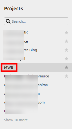
You just need to add your website as a “Project” in SEMrush and then select that specific project.
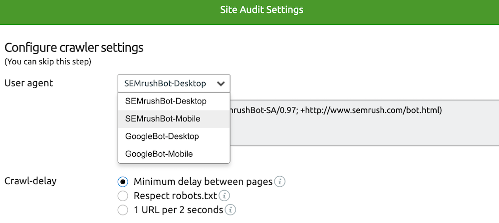
Now, check for the “Settings” icon on your project and select “User Agent”. By default, this user agent or bot would be set to desktop, as shown below.
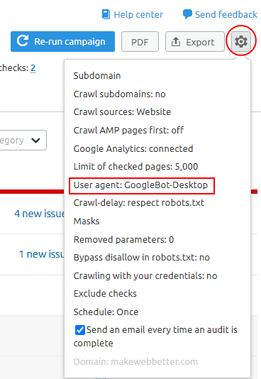
We need to switch it to mobile. Here is how it looks in the tool.
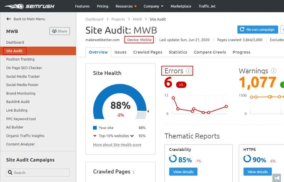
Now, navigate to the “Site Audit” section and run a report. (You will notice that the device is now showing as mobile.)
Click on the “Issues” section of your generated report and SEMrush will tell you the exact errors and also how to fix them.
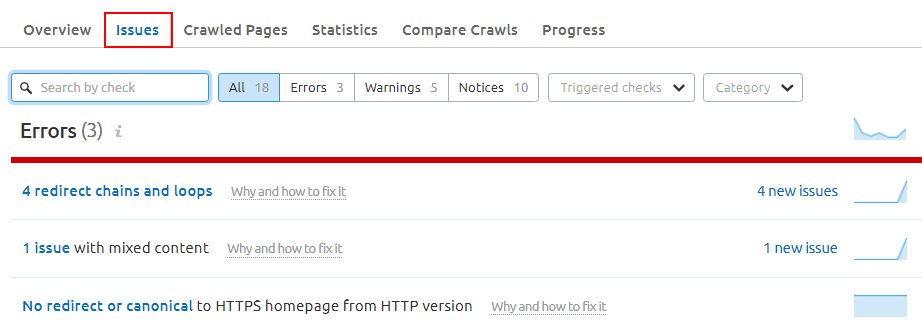
This information is quite helpful and plentiful for you to start with, and to make you understand the amount of work that needs to be done to fix all errors.
All of these are my favorite tools when it comes to mobile optimization, and I hope you will find them useful too.
5. How to Implement a Mobile-Friendly Website
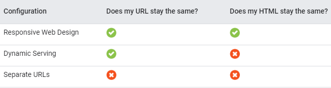
To manage screen views of multiple sizes and types, Google allows us to implement a mobile-friendly website in 3 ways:
Separate URLs Dynamic Serving Responsive DesignWe will check each one of these ways in-depth but just to let you have an idea of the basic differentiation; here is a comparison:
Source
Let’s explore each of these ways.
Separate URLs
This configuration works on the principle of first detecting the user’s device and then serving the optimized URL for that device.
In simpler words, there is also a mobile version of your website along with the desktop version, known as the mobile or “m” configuration. A different code on different URLs is served to mobile and desktop, hence the name "separate URLs."

If you are wondering that managing these URLs for both mobile and desktop could get hectic, you are right on point. You will have to use the following annotations to manage separate URLs:
Add a rel="alternate" tag on your desktop page to point to the corresponding mobile URL. Add a rel="canonical" tag on your mobile page to point to the corresponding desktop URL.Owing to this rigorous and difficult task of implementing separate URLs for each page, Google itself doesn’t recommend this website configuration.
Dynamic Serving
In the dynamic serving configuration, the URL doesn’t change for different devices, but different versions of HTML/CSS are served for mobile and desktop.

The server detects the user’s device and requests the corresponding user agent to crawl the page and present it. There are some issues attached to this. Let’s understand this better.
For instance, Google’s user agent for desktop won’t be able to crawl mobile content. Thus, when someone is visiting your website via mobile, the server should request Google’s user agent for mobile to crawl the page and show the content. This detection is often flawed and can lead to errors. Consequently, it can lead the wrong versions of the web page to be displayed and ruin the user experience.
On a personal note, I don’t recommend serving content dynamically either.
Responsive Design
At last, we have this highly recommended way of implementing a mobile-friendly website. In the responsive web design setup, the same HTML code is served on the same URL, irrespective of the user’s device.

As the name suggests, the code and content responds to each individual user and adjusts to different screen sizes.
Here are the main reasons as to why Google recommends the responsive web design setup:
The crawling of your website becomes highly efficient, which, in turn, improves the overall SEO of the site.
No redirection for users on different devices means your website’s load time is improved.
Fewer chances of errors and mistakes in terms of device detection, URL redirection, and displaying content means the user experience on your websites is enhanced.
Keeping the above points in mind, the majority of websites nowadays are configured using the responsive design setup. So if you are still in the minority, you know what to do next.
6. How to Optimize Your Website for Mobile
Make Sure Google Can Access and Crawl Everything Avoid Using Interstitial Popups Present Same Content on Desktop and Mobile Improve Mobile Site Speed Offer Seamless Mobile User Experience Perform Technical SEO for Mobile Consider Accelerated Mobile Pages (AMP) and Progressive Web Apps (PWAs) Optimize for Local Searches Here are different ways you can improve local SEO for mobile: Prepare for Voice Search OptimizationChoosing the responsive web design setup for configuring your website doesn’t automatically make it mobile-friendly. There are still a lot of tweaks to be done to obtain the best results.
Having said that, if you are using any of the three ways for implementing your mobile website, here is how to mobile-optimize your website:
Make Sure Google Can Access and Crawl Everything
The first step towards mobile optimization is to let Googlebot access and crawl JavaScript, CSS, and images.
For starters, you can check the “URL Inspection” tool in Google Search Console. This is the replacement tool for “Fetch as Google,” which appeared in the old Search Console. Enter any of your website URLs there, and the tool will tell you how Googlebot renders your content.
Here is an example test from my website:
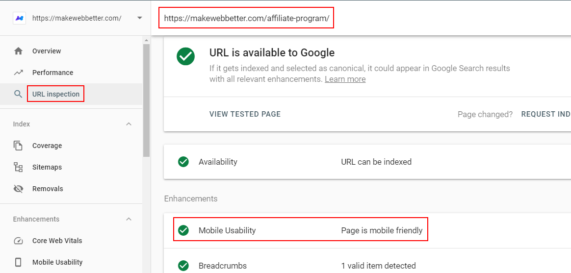
I would advise you to run a live test for your web page, which gives more information on crawling issues.
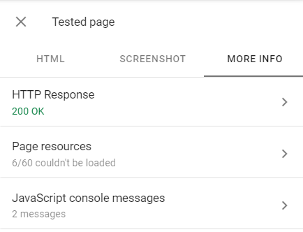
If the tool returns any issues with your page, you have your work cut out. Expand each menu to check the issues and fix them.
Next up is checking if you are blocking the Googlebot from indexing certain website URLs. The robots.txt file contains all information on resources that have been excluded from being accessed by Google.
You can see your robots.txt file at yourwebsite.com/robots.txt and check the “disallow” directive to confirm no important URLs have been blocked.
If you are using separate URLs configuration, please ensure to use the same meta robots tags on both the mobile and desktop sites.
Avoid Using Interstitial Popups
Taking into consideration the fact that user experience always trumps other factors in determining a web page’s ranking and performance, content accessibility on mobiles is prioritized and rightly so.
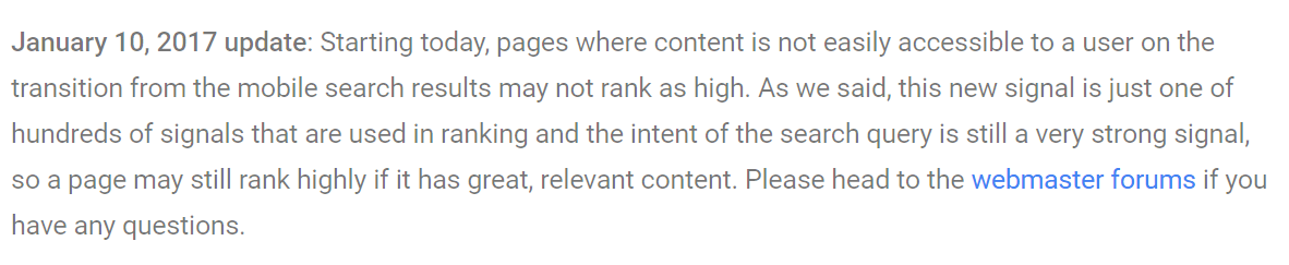
In 2016, Google expressed its concern over the use of hindering popups on websites that spoiled the page experience up to a considerable extent. There has been an update to that which says,
There is a clear hint of a Google mobile popup penalty, which usually is a drop in search rankings.
So does that mean we should abandon popups altogether? No.
Google presented examples of popups which can cause issues in accessibility.

And then there are popups that are still acceptable and cause no hindrance.
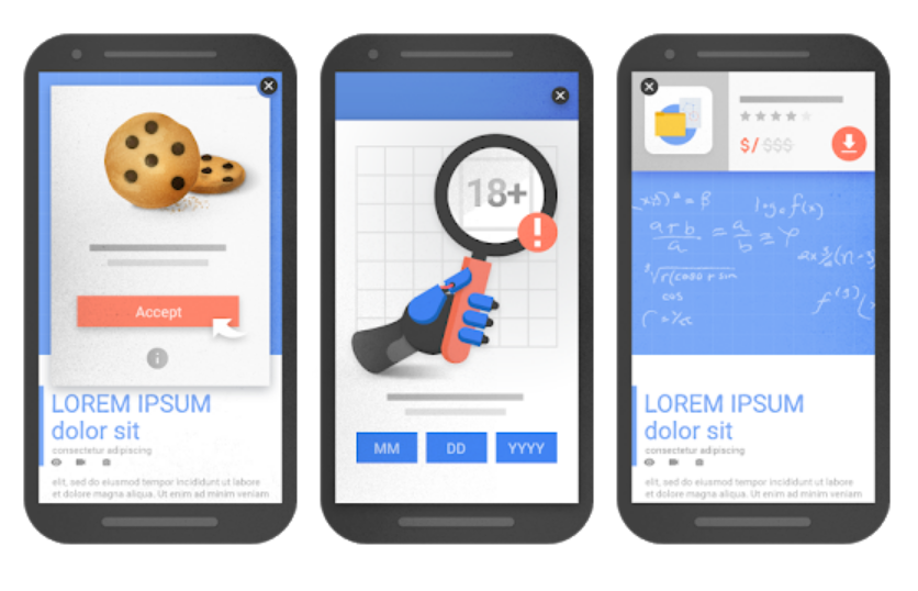
I would recommend using a minimal number of popups on mobiles that don’t compel users to click on them or hide the background text completely.
All in all, your popups should also be mobile-friendly.
Present Same Content on Desktop and Mobile
This really comes unsaid, but if there is a difference between your content appearing on a desktop and content appearing on a mobile, you have a problem.
The whole idea of the mobile-first index and mobile optimization is based on enabling website visitors to perform almost every possible action in the same manner regardless of the devices they are using. This also makes it very important for website owners to show the exact same content on different devices.

The text along with headings and images should be corresponding to each other on both desktop and mobile. If separate URLs are being used, the page titles and meta descriptions should also be the same.
Improve Mobile Site Speed
According to Google’s analysis of 11 million mobile web pages, the average mobile web page takes 15.3 seconds to load.
And then there is this:
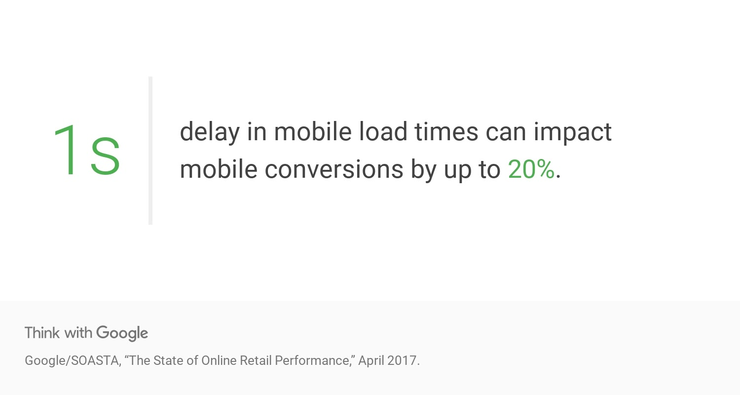
As clear as daylight, there is a lot of work to be done on mobile site speeds, and the intriguing part is that page load speed is also a ranking factor for Google.
There are a variety of tools to test your website speed, but Google’s PageSpeed Insights tool should be your first choice.
Here is the tool’s result for my website homepage on mobile devices:
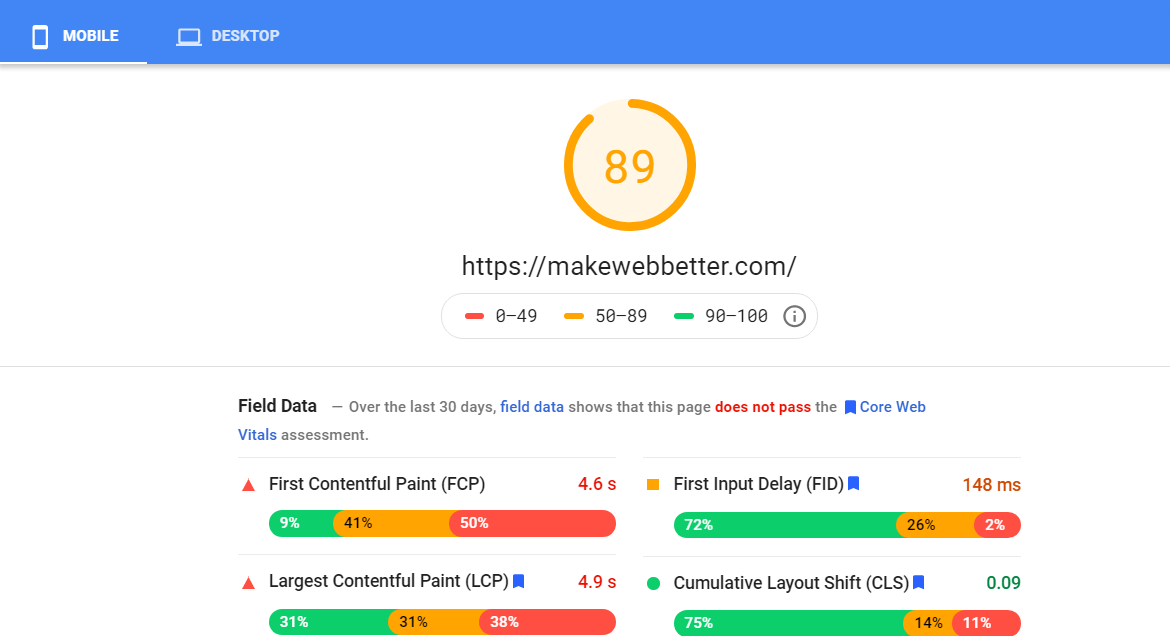
The speed of the webpage is good, but there is more to it that the tool offers. It also points out the issues and opportunities to improve speed.
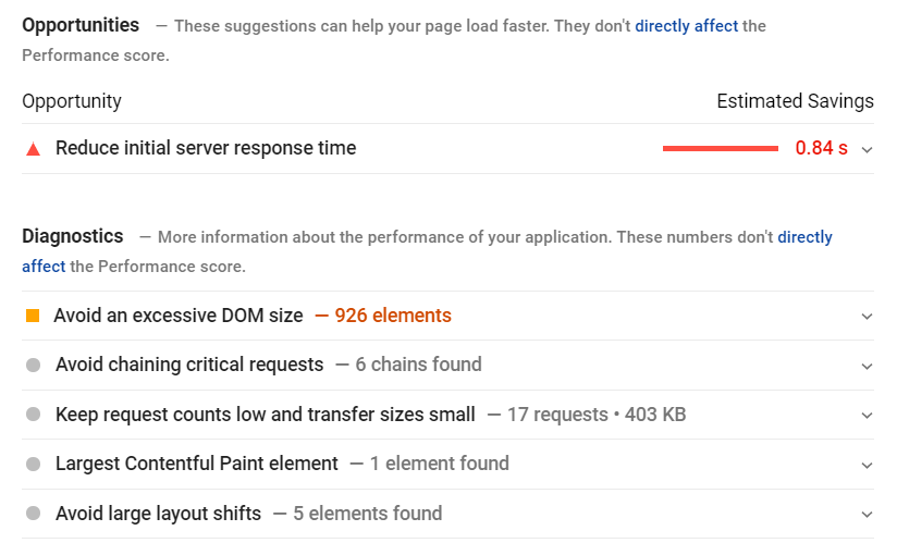
You get a complete diagnosis of your website speed.
Some of you may be tempted to use other tools to test website speed, and you surely can, but prioritize this nifty tool by Google.
Here are some best practices to follow to improve your website speed:
Your server response time must be minimal, and it principally depends on your web host. Find a good website hosting provider to avoid slow server response times and sluggish performances. All website extensions you use must be tested and shouldn’t slow down your website at all. You can test and compare your website speeds with and without the plugins to better understand and correct the faults. Image optimization is key for a fast loading website. Compressing images to optimal sizes, lazy-loading images, using Google’s WebP image format, and serving responsive images with correct dimensions are all best practices for optimizing images. Do not use Flash to load video content. You can use HTML5 for embedding video and animated content. Try avoiding animated GIFs and replace them with videos. Albeit website redirects seem inevitable, make sure to use them wisely. Having a lot of redirected URLs on your website can make it slow. Implement HTTP caching and allow browsers to save all page resources such as text, images, CSS, scripts, etc. for first-time visitors on a webpage. The next time the webpage is loaded, the browser can fetch all details from the saved cache without having to load them again. This accelerates website loading for return visitors and improves the overall website speed. I cannot stress this enough, but your website code should be flawless. Ensure to compress and optimize all HTML, CSS, and JavaScript for the fast performance of your website.Offer Seamless Mobile User Experience
All business today is more about the experience and less about products. People often remember great experiences with a company, website, or service. In the same light, Google announced its latest ranking algorithm.
And guess what? What does the algorithm revolve around? That is correct. Page experience.
And mobile is no different. A lot of users may be visiting your site on mobile, and it is critical to understand their needs and serve them the best possible user experience.
This also allows me to push my point on responsive design and mobile-friendliness of your website. Don’t be mistaken to think that your site with responsive design is automatically mobile-friendly.
It is not.
Here is how you can optimize your website for user experience on mobile:
Readability
The first thing that comes to mind while improving the mobile user experience is our content's readability on the device. If some visitor has a hard time reading or understanding your content, they will bounce off your site without thinking twice.
Use a good font size (15px or 16px) with short paragraphs of 2-3 lines.
Fit in a lot of negative space between text and other page elements for better visibility.
Prioritize high contrast text as it is easier to read and digest, even with a change in light and surroundings.
An example of a good readable webpage on mobile:

Navigation
People should feel no difference when they are accessing your site on desktop, mobile, or tablet. It should be fairly easy for them to explore different website sections, even if they are surfing on a mobile device.
There should be adequate screen tapping space with fingers, and the clickable area must not be compact. Also, two clickable elements must be separated by enough space to avoid any confusion.
All buttons on your site menus must be neatly arranged, corresponding to the device screen size.
Nowness does this nicely.

Forms
Next up in bettering the mobile user experience is the display of website forms and all the fields involved.
Generally, try to minimize the number of form fields so that they don't find it tedious when people fill them on any device. Moreover, people should find it a breeze to fill in your forms and shouldn’t face any of this.
Distinguish all optional fields, avoid dropdown menus, enable placeholder text, and offer matching keyboards for the concerned field to provide the best experience.
Here are these suggestions in action:

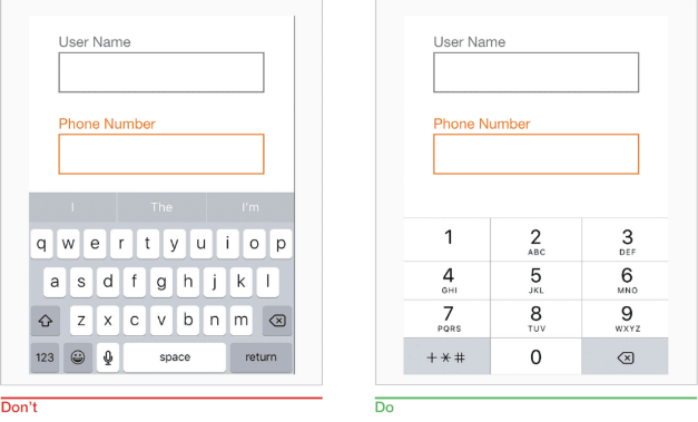
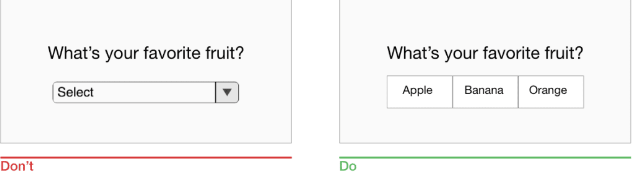
You can check out this great resource on mobile forms best practices for extra help.
Perform Technical SEO for Mobile
The basics for technical SEO for a website are almost identical for both mobile and desktop, but you still have to pay attention.
Listed below are some steps you should take to perfect the technical aspects of mobile SEO for your website:
Optimize your meta titles and meta description tags for mobile searches. Mobile searches show less information as compared to desktop searches. Keeping this in mind, create tags and descriptions which include all important keywords and information upfront on both mobile and desktop. Implement the “ViewPort Content” tag if you are using responsive design. The sample code is recommended by Google and looks like this. <!DOCTYPE html> <html lang="en"> <head> … <meta name="viewport" content="width=device-width, initial-scale=1"> … </head> … This tag alters the page size automatically as per the user’s device. Use structured data or schema markup to make Google understand the type of content you have on your site and obtain rich results. If you have an online store or a large website, use breadcrumbs as secondary navigation along with your primary navigation. Leverage internal linking between your website pages and articles to improve their visibility and keyword rankings. Implement AMP (Accelerated Mobile Pages) for your website. Finally, don’t forget to check in on basic technical SEO practices, which include implementing a sitemap, securing your website with HTTPS, and using canonical URLs for the separate URL configuration.Consider Accelerated Mobile Pages (AMP) and Progressive Web Apps (PWAs)
Accelerated Mobile Pages ( AMP) is an HTML framework project initiated by Google, which allows web pages to load instantly on mobiles. AMP reduces the load on-page elements by stripping them and presenting a fast loading page.
AMP pages are signified by a “lightning” icon as displayed in the screenshot below.

As Google leads the AMP project, a lot of website owners and SEOs applied the framework without further ado.
But is it always beneficial to implement AMP? I don’t think so.
Some limitations of AMP to be taken into account are:
CSS and other design elements become limited while using AMP. This means a generic form of your webpage will be displayed instead of the full design.
You are not in full control of the ads or popups on your page.
It is Google, which stores AMP pages. The link of an example AMP page is https://www.google.com/amp/s/www.theweek.co.uk/94404/dan-brown-s-books-ranked-best-to-worst%3famp This means all backlinks to your content, and related link juice is transferred to Google’s domain and not yours.
As per Google, analytics for AMP currently has more limited capabilities than standard analytics.
Thus, you should decide on AMP implementation depending on the nature of your business and the number of mobile visits you get.
PWAs
The lines between a website and an application are disappearing, and progressive web apps (PWAs) serve as a borderline technology. For those of you who aren’t aware, a progressive web app is a cross between a website and an application. It acts both like a website and an app. PWAs work on all browsers and on all devices.
Some merits of PWAs are:
A PWA doesn’t need any approval from any App Store for publication. It can be downloaded directly from the browser.
Functionalities like working offline without any network and push notifications make them nifty and popular.
A hybrid of PWAs and AMP, known as PWAMP, is also gaining momentum and can easily become the ultimate solution for resolving slow website speed and improved user experience on mobile.
One demerit of PWAs is their cost-effectiveness. Here again, you will have to dig up your business analytics and resources to make sure whether a progressive web app is the best choice for you or not.
Optimize for Local Searches
There has been substantial growth in “near me” searches in recent years, and Google shows localized results for such searches. We all understand that people use smartphones outside their living places, and a lot of this usage results in local queries for the search engine.
This calls for local SEO implementation, so whenever someone searches locally, your website or content shows up in the results.

Source
Here are different ways you can improve local SEO for mobile:
Write content oriented for local searches while referencing your local business and area. Prepare a content strategy specifically for local SEO efforts. Claim your GMB Google My Business profile and fill in all the required details, including your NAP (Name, Address, and Phone Number). Use your GMB profile to add photos of your business or workplace. Ensure listing of your business in local directories and try to build maximum local links. Ask your happy customers to leave reviews for you as it can build rapport and image for your brand. Use structured data or Schema for your products, reviews, and NAP details, and you stand a chance to appear in rich results. Wherever your business is listed, make sure all the details, including NAP, are up to date and the same throughout.Prepare for Voice Search Optimization
Optimizing for local searches and mobile queries can itself mean that you are prepared for voice searches. Many voice searches are done using mobiles, and a lot of these voice searches include local queries.
For best voice SEO results, try to include more conversational and question keywords. The majority of voice searches are longer in query length and in the form of questions.
Also, try to aim for rich results, which will automatically increase your chances to appear as a top voice search result. Include direct answers to questions, use whole questions as subheadings, and include answers as numbered lists.
You can check this guide on voice search SEO strategies to understand the basics of voice search and optimize accordingly.
If your voice optimization technique is on point, you can benefit a lot. On the one hand, you will satisfy the mobile searcher’s curiosity, and on the other hand, the same answer may appear as a rich result for desktop users.
Voice search is starting to gain traction, and it will only move in one direction now — forward and upwards. Thus, it is imperative to prepare for such trends and reap its fruit in the future.
7. Keyword Research for Mobile With SEMrush
Keyword research is the backbone of any SEO strategy, and when it comes to mobile SEO, the scene is no different.
The reasons that I have included this separate section in the article are:
You can learn the keyword research process for both mobile optimization and voice search optimization in one place.
SEMrush is a great intelligence tool that you should master.
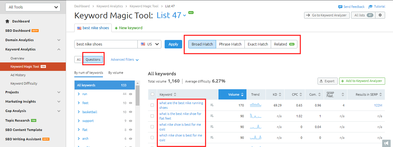
First up is the keyword research for mobile.
SEMrush allows you to toggle between the devices for which you are optimizing content. You can switch to mobile and collect select keywords, which can help you attract searchers on mobile.
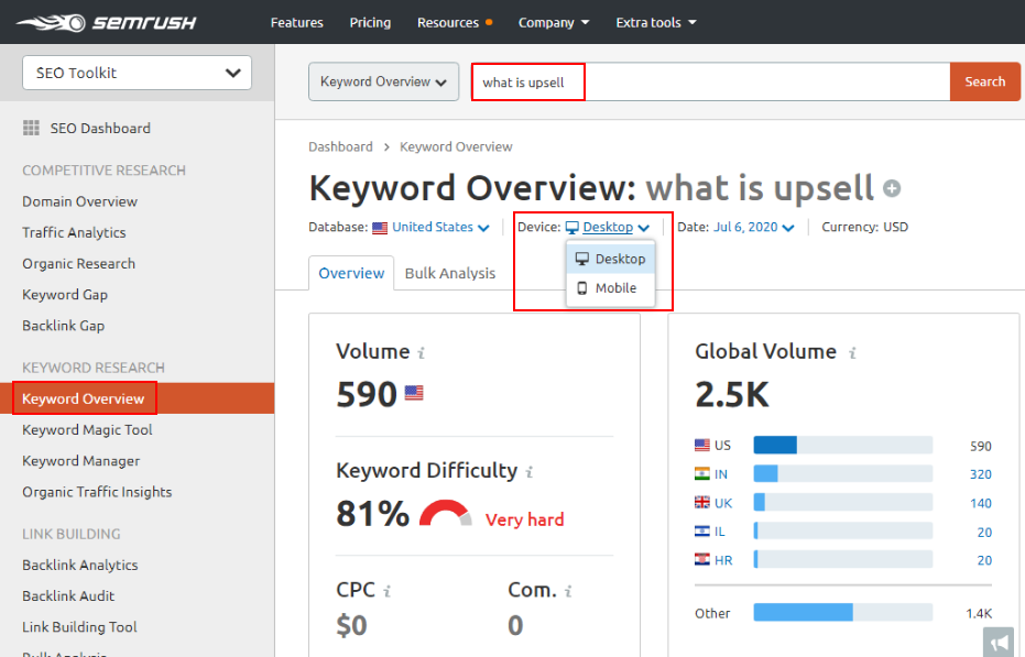
There are different search patterns for users on mobile and desktop, and you may find that difference in the displayed keywords as well. On the other hand, there will also be keywords for which the results would be identical for both the type of devices.
For voice search, we understand that the queries are conversational and longer in length. So it is highly recommended to include question keywords.
Thus, by using SEMrush for the optimization of two indispensable parts of online search, you are set to remain one step ahead of your competitors and lead the pack.
8. Mobile SEO Best Practices
I hope I have been able to keep your interest up with my copy so far, and adding to that; I would like to shed more light on mobile SEO best practices.
Here is a mobile SEO checklist that I would like you to go through:
Take assistance from Google Analytics, and check what percentage of your website traffic is via mobiles. Analyze your mobile traffic through Google Search Console to check the clicks, impressions, and click-through rate(CTR). Leverage different tools to check if your current website is mobile-friendly or not. Use the new URL Inspection tool in Google Search Console to validate how your website looks on mobile. Confirm crawling errors on your site and rectify as many errors as possible. Make sure to let Google crawl everything on your website. Check your website's speed on mobile using the Page Speed Insights tool and work on opportunities to load your site faster. Configure your website via the responsive site setup, if possible. If you use dynamic serving or separate URLs, perform corresponding mobile SEO best practices. Implement mobile-friendly popups. Pay attention to your mobile UX and optimize all of your content for mobile. Put in dedicated efforts for mobile keyword research and perform technical SEO for mobile. Don’t forget to improve your local SEO for mobile.9. Should You Invest in Mobile SEO?
Well, that depends.
It totally depends on your business and the percentage of mobile traffic you attract.
If you are an eCommerce store owner, it is absolutely vital for you to optimize your website for mobile. This is due to the high number of online shoppers who purchase goods on mobile.
On the other hand, if you don’t receive a lot of mobile traffic, you may be tempted to ignore the concept altogether. But do keep in mind that mobile search traffic will catch up to you, sooner or later.
Source
A lot of people may not be purchasing via their mobile devices, but remember that mobile searches play a very big role in determining the purchase decision of the same buyer later in their buyer’s journey.
They might check your website, products, or services on their phones one day and may convert from a desktop the other day.
Consequently, my take is that you should definitely consider investing in mobile optimization. It may not be huge initially but always take a start to build upon the foundation later.
Conclusion
I would really like to appreciate your curiosity and learning if you are still reading this with me.
The mobile search revolution has been dominating the search world for some time now, and it is bound to reach a peak in the coming years. For many of you, the mobile optimization concept may not be new because you have already acted on it, and that’s great.
For people who are starting their online journey, this mobile optimization guide is sure to help you a lot and teach you how to do SEO for mobile websites.
Make sure to follow the steps and mobile SEO best practices mentioned and do share your results. Also, keep a check on mobile SEO trends for 2020 and keep exploring new updates.
Which of the above-mentioned mobile SEO tips works best for you? Have you considered mobile optimization for your website? Why not? Is there anything I could have done to make this guide better?
Innovative SEO services
SEO is a patience game; no secret there. We`ll work with you to develop a Search strategy focused on producing increased traffic rankings in as early as 3-months.
A proven Allinclusive. SEO services for measuring, executing, and optimizing for Search Engine success. We say what we do and do what we say.
Our company as Semrush Agency Partner has designed a search engine optimization service that is both ethical and result-driven. We use the latest tools, strategies, and trends to help you move up in the search engines for the right keywords to get noticed by the right audience.
Today, you can schedule a Discovery call with us about your company needs.
Source:


