As the digital world gets more complex and crowded, conversions seem more elusive. People are plagued by options. Your competition isn’t only businesses like yours anymore. You are also competing with anybody who is creating content in the same space as you.
The great news is that conversions aren’t really elusive. If you understand how media has evolved, people’s preferences and how you can meet them, you can dramatically increase your conversion rate and grow your business.
Here are five solid ways to boost your conversion rate in 2017.
1. Use Testimonials as Social Proof
The market has undergone a massive inverse shift. According to Nielsen Trust Barometer 2017, trust in friends, family and ‘people like me’ has risen, while trust in brands and organizations has decreased further.
That is why your customer testimonials are gold, and the more narrative and personal they are, the more likely they are to land as you want them to.
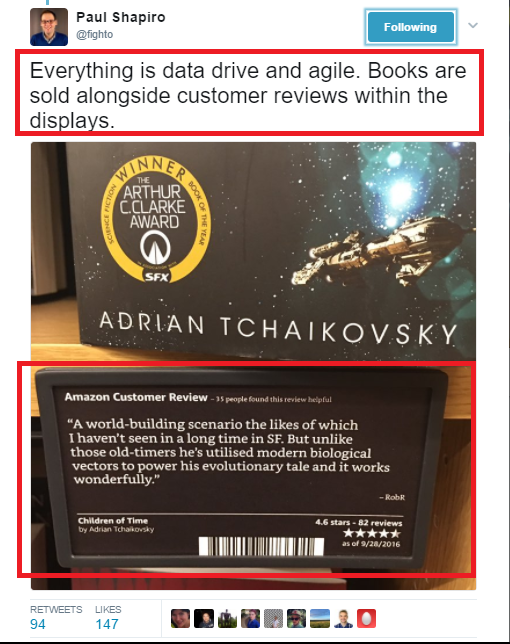
Testimonials aren’t only for your website (where you should display them prominently). They can also be used strategically on any conversion-intended communication, like sales, event registration, and customer retention emails. Here’s a great example of one now.
Amazon uses customer reviews to sell books in their book and mortar stores.
Tips to Collect and Make Use of Testimonials That Convert
Even if your customers are happy, only a few of them are likely to take the trouble to give your recommendations/testimonials. However, they do tend to spontaneously share happy experiences on social media. Use keyword alert tools to keep an eye out for what people are saying about your brand, so you can collect positive mentions and turn them into powerful testimonials for your brand. Use visuals. Photographs of happy customers are good, and videos or live streams are great. Visual testimonials are not only more credible, but more compelling. Try and find/use testimonials where customers directly discuss the benefits of overcoming concerns that you know your customers have.2. Leverage Personality, Visuals, and Video to Create the Human Connection
The biggest absence in digital is the human presence. This is why people are more isolated today and suffer from loneliness, even though we are of the most “connected” age in the history of mankind. The typical commercial experience that many brands provide lacks connection and the human element. Some brands manage to pull it off, very well, and people love them for it.
Taco Bell, for instance, has a very sassy, fun personality on Twitter. Their tweets are pure personality, and they don’t even need fancy graphics or complicated concepts to make an impact.

Entrepreneurship coach and a host of MarieTV, Marie Forleo, answers questions that her audience asks on video. This is a great way to nurture the human connection.
Tips to Humanize Your Brand and Connect with Your Audience
Create a brand personality and commit to it. Use humor, wit, and inspiration. You could use video to simulate face-to-face interactions with the support of products like Tagove, that lets you offer live video assistance to customers, or Periscope that lets you easily post a live video on Twitter. Get real on video to connect with your audience. There are many different things you could do on video - interviews with experts/celebrities, entertainment bits, news bits, product support, etc.3. Make Purchase/Registration Uber-Simple
The eight-second attention span is now a popular concept. In 2015, a Canadian media house conducted a survey that revealed that people now have shorter attention spans than goldfish!
How many times do you check your smartphone each hour? Even when you are on your smartphone, how many times are you disrupted by notifications?
We are in a world where millions of information threads are constantly seeking our attention. In such a world, it is criminal to expect your audience to give you more than 8 seconds of attention.
Create registration forms that are short, less wordy and not demanding in the least. The fewer fields and hurdles your audience faces, the more likely they are to complete a purchase.
Remember, more fields = more effort = more dropoffs and abandoned carts.
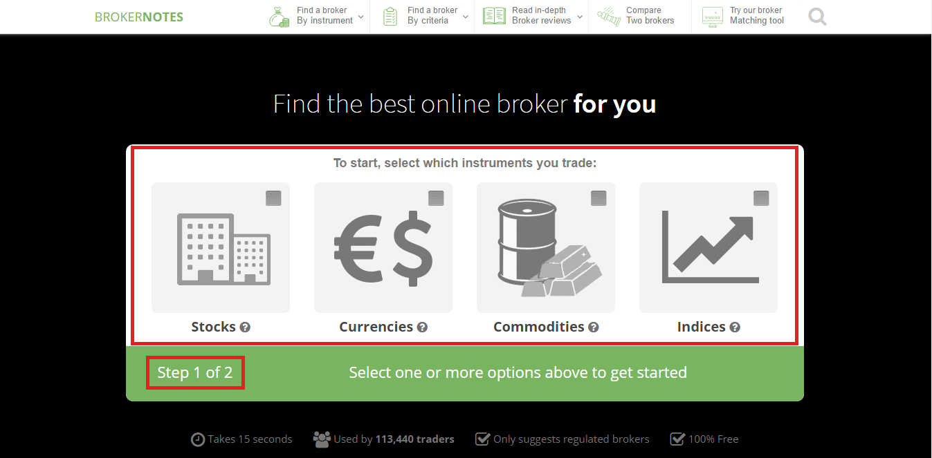
Here is a great example of an optimized registration form that converts at 46%. The website prompts visitors to choose from one of four well-defined areas and indicates that this simple step is the first of two.
The blacked out background concentrates visitors’ focus on the form and prevents distractions.
Tips to Simplify the Onboarding/Purchase Process
Ask for only an email address and 2-3 more fields that are absolutely necessary. You can add more fields post-purchase or registration/make them optional. Auto-generate user names, passwords, payment details and whatever else you can manage securely. Ensure that you are technically supported, so your loading/response times don’t test your prospects’ patience.4. Go Minimalistic with Content/Webpage Designs
One experiment, conducted by MECLabs, shows a 681% increase in conversions when switching to a single column layout from a double column layout. All futuristic designs imagined to date have been minimalistic, and that is where we are heading.
"Obvious always wins." – Luke Wroblewski
In general, your rule for content on webpages and otherwise should be minimalism. Say only what you need to and don’t focus on too many elements in any one place.
Many SaaS tools spend weeks testing their homepages, fidgeting with every button and menu, deciding on the simplest version to work with as possible.
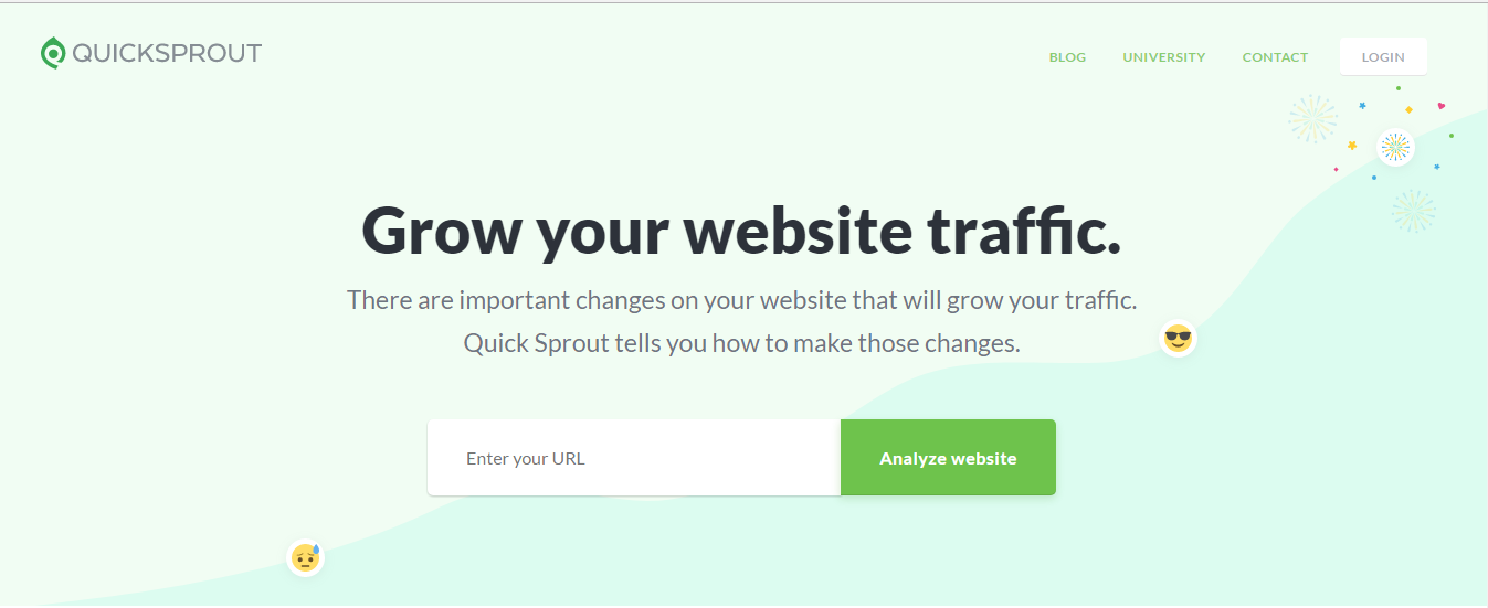
For instance, traffic analysis tool QuickSprout’s homepage asks you for only one piece of information (your website URL) in exchange for a valuable, unique offering (an analysis report).
Tips to Boost Conversion Rates of Content/Webpages with Minimalism
Apply KISS (Keep It Simple Silly). Anything that isn’t directly part of the conversion funnel and complicates the process is dispensable. When writing content, stick to the core message and ensure that your final draft is visually appealing and readable. Use images where possible. A/B tests everything, colours, fonts, and content included.5. Set Up an A/B Tested Lead Capture Form
To salvage visitors who are leaving your website, you can create a system to manage to capture at least their email address before they disappear forever.
Lead capture forms are tricky though, as they can be perceived as annoying if not implemented correctly.
Successful lead capture forms have a strong lead in, the perfect small-commitment offering, and possibly, an effective redirection leading to your main product.
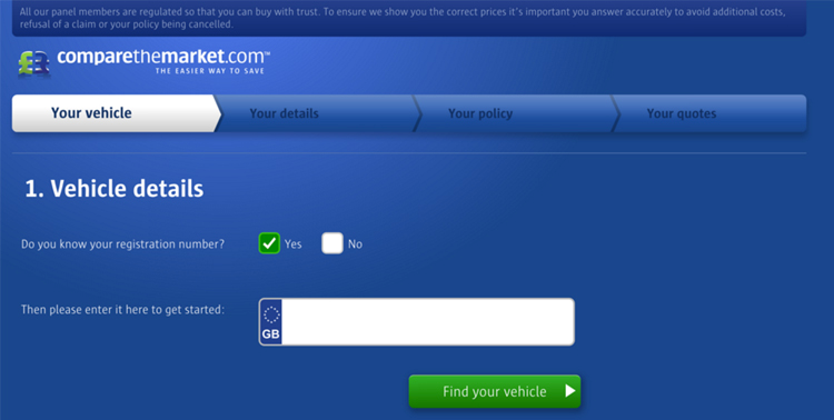
For instance, here is a great example of a lead magnet. It has one required field, only what is most necessary.
Tips to Create a Lead Capture Form
Craft a lead in message that’s short, non-sales-y and compelling. Consider your audience’s dislike for unsolicited interruptions when creating this message.
Decide on the most valuable low commitment offering that your audience will be happy to acquire. For instance, if you are a digital marketing agency, you can offer a complete brand audit at low cost, or a free eBook in exchange for your visitor’s email address.
You can even direct visitors from one lead gen form to another one, provided you optimize the path leading between them.
In Summary
In a world where noise is commonplace, and people struggle with the prospect of dealing with too many options, you need minimalistic but powerful content and designs to increase conversion rates. This post has five of the simplest, most basic ways you could begin. So what are you waiting for?
Innovative SEO services
SEO is a patience game; no secret there. We`ll work with you to develop a Search strategy focused on producing increased traffic rankings in as early as 3-months.
A proven Allinclusive. SEO services for measuring, executing, and optimizing for Search Engine success. We say what we do and do what we say.
Our company as Semrush Agency Partner has designed a search engine optimization service that is both ethical and result-driven. We use the latest tools, strategies, and trends to help you move up in the search engines for the right keywords to get noticed by the right audience.
Today, you can schedule a Discovery call with us about your company needs.
Source:


![How To Create a Strategic Dashboard in Excel Using Semrush Data [Excel Template Included]](https://allinclusive.agency/uploads/images/how-to-create-a-strategic-dashboard-in-excel-using-semrush-data-excel-template-included.svg)
