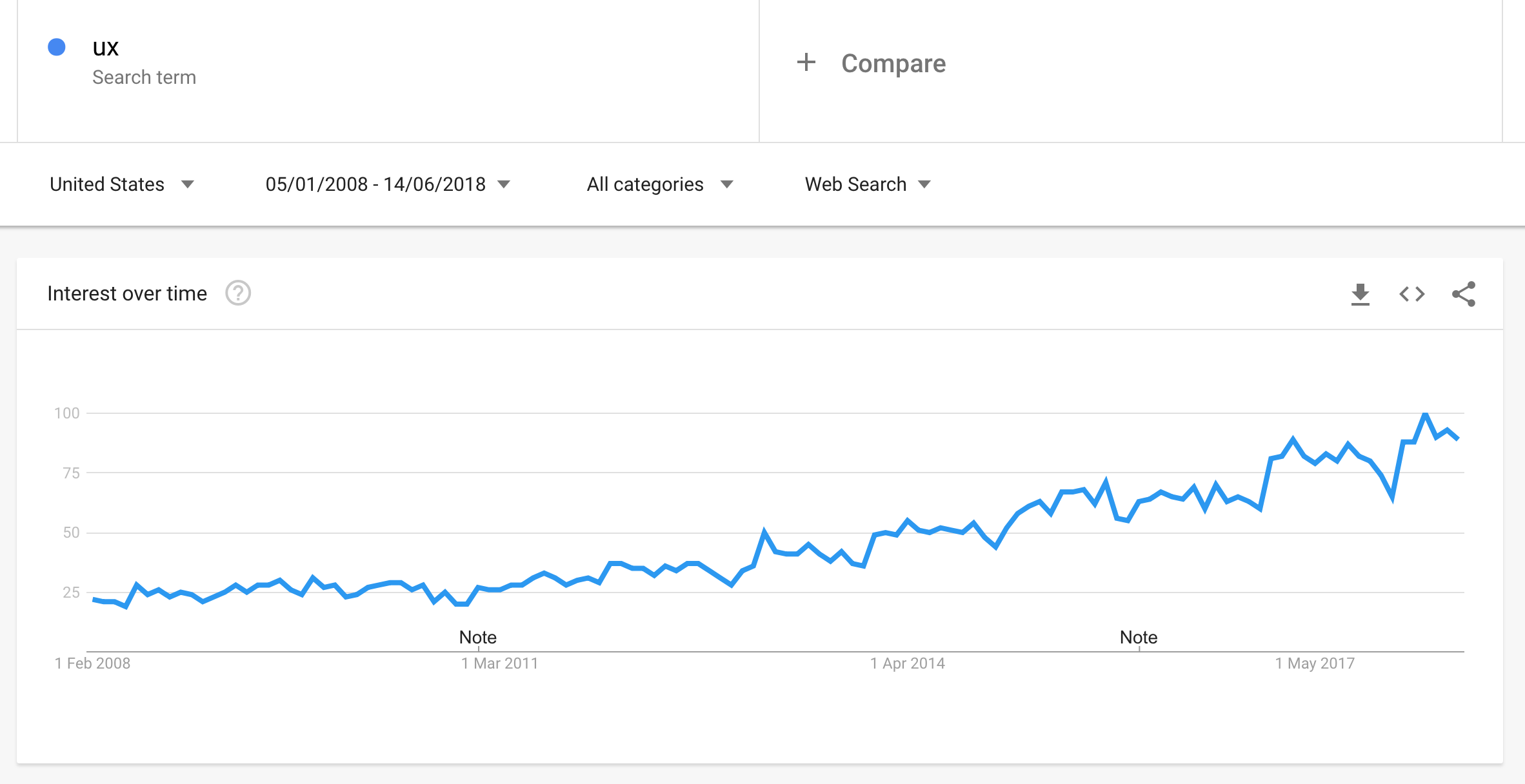
If you look at Google Trends, the term "UX" is officially at the breakout point, which means searches for this term have grown over 5,000% in the last few years.

The SEO industry is now full of articles on UX and SEO which is certainly a good thing. However, there is a problem. Most websites don't have a clear process when it comes to UX, and for them the biggest barriers are:
To figure out what exactly UX is. To make a website more user-friendly.Websites that do a better job at meeting users' expectations have better chances of increasing search results, as I have described in my previous case study on SEMrush.
What do you need to do if you don't have enough knowledge about UX? What if you don't have the skillset?
The problem is that normally UX analysis is not part of the SEO skillset. But UX is not more than just focusing on the visitor. If you want to get your hands dirty with UX and analytics, the 4 principles explained below will be a good starting point for you.
Before I list them, I need to say that my suggestions will not necessarily work for every website all the time. You need to test different solutions until you get great results on your own so I would recommend a test and learn approach.
UX Analysis Principle 1: Healthy Analytics Data and Account
First of all, you need reliable and actionable data.
I have seen analytics left behind when it comes to SEO, and I am always surprised by it. Analytics data should not be considered a mere "let's check how my website is doing" kind of task. It is a vital element of user experience, and the data should be of the highest quality to get the information you need.
Also, you need the right tool for the job that meets all analytics needs. If you don't have integrated analytics systems, your data will come from a multitude of sources, which only adds more confusion and complications.
It is important to make sure your data is centralized and perfectly integrated into one system. Google Analytics is the place to start because it is free and it integrates well with other channels for your campaigns, like the Google Campaign Builder.
Finally, I would recommend an analytical audit of your website to make sure the data you see is the actionable data you need. An audit will also identify plenty of other issues to fix, like 404 errors, self-referrals, cross-domain, and events tracking, goals settings, property settings, and lack of integration with Search Console. More on analytics audits.
UX Analysis Principle 2: Useful Analytics Metrics, Engagement
We can track engagement metrics with Google Analytics.
To get as close as possible to calculate engagement, we need to look at three key metrics: Exit Rate, Bounce Rate, and Time on Page. Here are the definitions for each of these from Google:
Exit Rate: For all pageviews to the page, Exit Rate is the percentage that were the last in the session. Bounce Rate: Single-page sessions divided by all sessions or the percentage of all sessions on your site in which users viewed only a single page. Time on Page: The average amount of time all visitors spend on a particular pageOur UX job is to improve those metrics as much as possible to make sure engagement is at its best. Google doesn't tell us to focus on engagement metrics, but we should still do it. Google doesn't know why there is a high bounce rate. There might be one or ten reasons why visitors have a single hit on your website and then leave. All that Google knows is that visitors went back to search results to look for alternatives, and it treats this behavior as something negative; it means something is wrong with your page. Google factors this into how well you should rank.
Your job as an SEO is to understand why there is a high bounce rate and figure out a way to improve it.
How to Find the Right Metrics
Here are some things that work for my websites.
Look at acquisition metrics by channel, device, and country, and compare periods of time to find trends. Always compare data; don't follow data on its own, because it doesn't have any insight. Look particularly close to data from Google Search Console, isolate your high traffic and low CTR landing pages and go back to Google Analytics to find out users' behaviors on those pages (bounce rates, exit rates, avg. time on page, pages per session). You might have sudden insights.UX Analysis Principle 3: Qualitative Data
Feedback, a.k.a. qualitative data aims to reduce website errors, users pain points and increase engagement, all elements that are vital to good SEO.
As I said before, improving engagement can only be a good thing for your website. Besides, you never know which errors you might find that are preventing crawlers to correctly index your pages.
With Google Analytics you collect quantitative data, things like bounce rates, traffic sources, performance and events data. You will learn the "what" about your users. But you also need to know the "why". That is when qualitative data comes to help. If you are not the user, how can you possibly know how they feel and what they think about your website?
Ask them.
I personally like Hotjar.com (note: I am not affiliated with them) for collecting feedback through polls and surveys. I have been using it for a year now and the amount of feedback I received allowed me to enter the mind of my users; I have had so many of those "aha" moments with sudden insights.
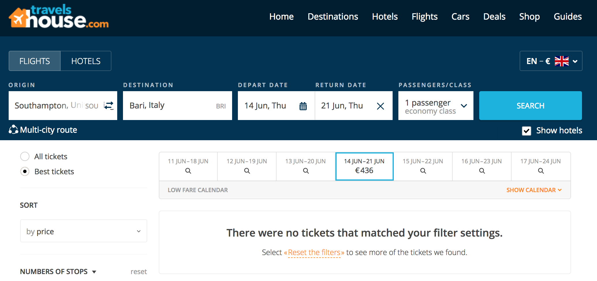
One of the things you can do with Hotjar is to identify, diagnose, and recover from errors. The best ways to do this is are to record sessions of your visitors, visualize errors messages, and see what users do after they see them. For example, on my travel blog Travelshouse, I offer a flight and hotel search engine for all over the world. When users search for a flight between two cities that are not connected with a flight option, my search engine gives an error message.
This error message "There were no tickets that matched your filter settings" is a result of many recordings with Hotjar. Before implementing this solution, I had noticed users were seeing an error message without the opportunity to take further action. Simply put, my error message wasn't actionable.
This issue translated into high bounce rates, which is precisely the opposite of a good thing in UX.
However, by changing the error message, I fixed a problem because it is much easier for users to find a different solution for their destination. All they need to do is reset the filters:

Another goal with Hotjar is to use feedback to learn about users pain points and make the users return to your website - saving your money on remarketing. For example, in the case of my travel blog, I have asked questions like:
"What stopped you from making a booking today?"
I have received answers like this:
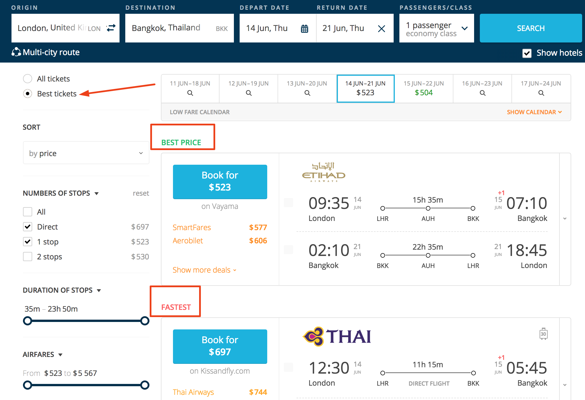
"The flight is too expensive." "The flight I was looking for wasn't displayed." "I need to speak to someone before I book."All these answers are actionable. You can decide to do several things to improve users' experience. Show a filter to find the best tickets, so even if the flight is a bit more expensive, you can show users it is a shorter trip; offer to save time instead of money. Or maybe you can show the optimal flight, a combination of cheap and fast.

This trick can also improve internal linking, which should be a part of the structure of your website. In SEO, internal linking is fundamental because it helps bots to crawl your website much easier, without seeing errors of any sort.
How to Get Useful Qualitative Data
Feedback questions depend on what you want to find out. For example, if you want to push sales, ask questions before purchase such as "What is missing on this page that would make buying easier?" More on questions to users. Ask questions on pages that you think are key for your business (landing, products, homepage).UX Analysis Principle 4: Consistency
Another principle of UX analysis for SEO is consistency. Why is this important? Consistency reduces learning, meaning that users do not have to apply extra brain resources to learn new representations of each task. This process translates into faster and quicker actions on the website, especially on websites designed to be as transactional as possible. In terms of analytics data, consistency shows lower bounce and exits rates and lower avg. time on page (because tasks are completed quicker). We all know how vital these metrics are in SEO.
Think of consistency with this metaphor: you get into your car, and you know exactly where your sunglasses are, on the side of your door. It didn't take you 10 minutes to complete this task, because your sunglasses were in the same place the day before. You were expecting to find them there, and you found them quickly, almost subconsciously.
The same instinctive user-experience should be apparent on your website too.
Consistency applies to several components of your website, as follows:
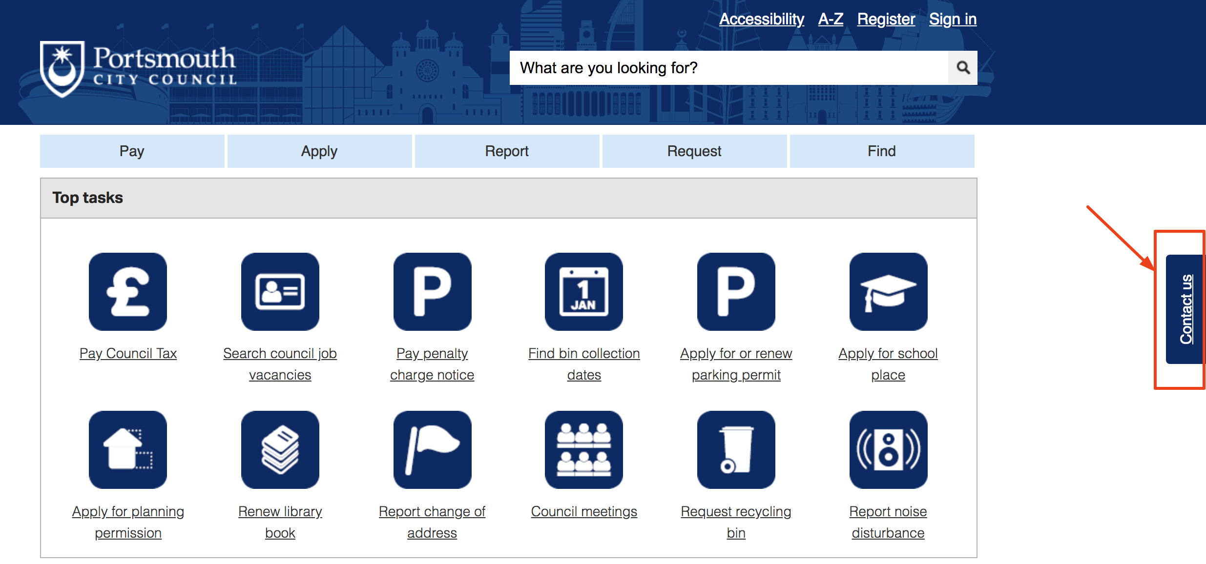
Intuitive navigation: when users land on your page, the first thing they see is what is visible above the fold. It is therefore essential your users intuitively understand, particularly the new ones, what the site does and what is about. For example, one of the public authorities I was working for showed a bar on top with 6 buttons (Pay, Apply, Report, Request, Find and Contact). We called it "channel shift bar" because it was the place where users complete tasks that are normally completed offline - hence the shift - like apply for parking permits, pay taxes, request a copy of your bills, etc.... Of these 6 buttons, one was out of place, the "contact us" button. So we have decided, for consistency, to move it away and found another place for it on the right of the page with a floating button.
It might seem like a small change, but for a website designed to transact quickly, it makes a big difference. We not only increased the number of clicks to the channel shift bar and increased page visits, but we also reduced direct telephone contacts. This means avg. session duration on the website is longer and engagement improved.
Layout. When designing or re-designing a website, you have the opportunity to build the layout before publishing it online. Buttons, typography, colors, size, images, and positions should be defined and centralized, then applied to the whole website. Think about visuals and what people see first, second and third and so on.
The strong visual layout allows users to find what they need faster and the structure of the page allows users to find secondary and tertiary elements if needed.
Content. When we talk about content consistency, we talk about UX. You need consistency in website content. Think about this blog post; it had to adhere to SEMrush guest post guidelines, which show precise rules of what to write and not to write, what content will be accepted and what will not. All this to make sure guest posts are consistent with the SEMrush brand. For example, one of the most important consistency rules is not to write basic stuff; the audience here already know the basics.How to Become Consistent
Prioritize and invest in user testing: get random visitors to test your website and ask them to answer specific questions related to consistency. Define specific goals for your website, and they will help you direct your efforts to become consistent. Make users go through your funnel smoothly and without any issue. Invest time to improve it and fix all issues consistently.Conclusion
With this article, I am not giving any guarantee, but UX analysis can definitely improve your odds to get on the top position in search engines. Take these 4 principles as guidelines for putting users first, simply because it matches Google's goals to put users first too.
Search engines use their billions of search data to provide better user experience, but often they don't know what and why certain things happen on a website, this is your job to find out.
Innovative SEO services
SEO is a patience game; no secret there. We`ll work with you to develop a Search strategy focused on producing increased traffic rankings in as early as 3-months.
A proven Allinclusive. SEO services for measuring, executing, and optimizing for Search Engine success. We say what we do and do what we say.
Our company as Semrush Agency Partner has designed a search engine optimization service that is both ethical and result-driven. We use the latest tools, strategies, and trends to help you move up in the search engines for the right keywords to get noticed by the right audience.
Today, you can schedule a Discovery call with us about your company needs.
Source:


