Have you ever clicked on a blog post, only to be greeted by an ugly wall of text? Chances are, you left. That is why images (and formatting) are a crucial part of creating bookmark-worthy content. Without them, you'll lose visitors to the back button.
And guess what? Articles that include images get 94% more total views than articles that don’t.
It doesn't stop there. Posts on Facebook that include an image get 53% more likes than posts without an image. They also make up 93% of the most engaging posts.
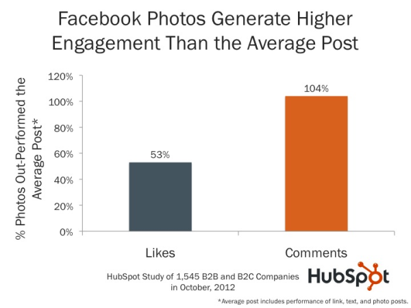
Plus, images benefit SEO.
But know this: You can’t just grab any image off Google as it could be protected by copyright laws. You might get away with it for a while, but you could get sued at any time and be forced into an expensive lawsuit.
Don't let that scare you, though. I'm writing this post so you never have to worry about legal mumbo jumbo, and so you can create truly amazing images for your blog posts (and beyond). And, you don't need to hire an expensive designer to do it.
You are about to take the first step in creating an attractive blog post. Grab a coffee, find your favorite reading nook, and settle in.
Tools to Create Drool-Worthy Blog Images
You don't just want good blog images. You want drool-worthy images; the kind that make your readers stick around a click on your calls to action.
While it's easy enough to hire a designer to do this for you, that's not what this post is about. We want free (or very cheap) quality blog images. Designers aren't free, but some design tools are!
Let's take a look at some of the best free (or affordable) blog image creation tools on the web.
1. PromoRepublic
PromoRepublic is a content builder tool that allows you to "Create stunning posts in seconds with 100,000+ handcrafted templates, ideas and visuals." You can use it to put quotes on images for your social posts, create banners and opt-ins for your blog articles, and build fun designs for your brand.
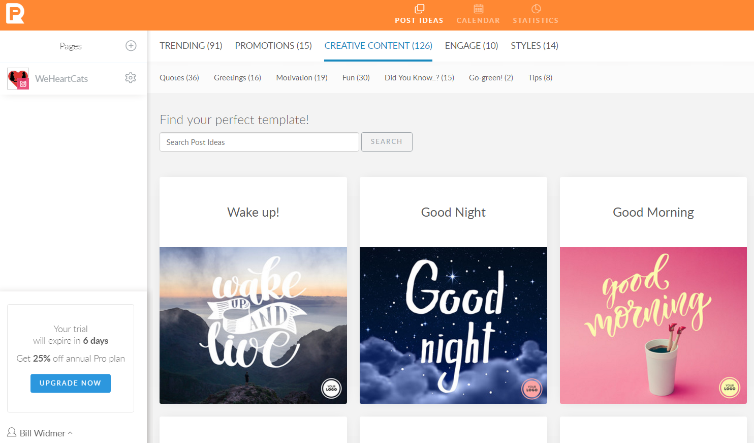
While it's not free, they do offer a 14-day free trial and pricing starts as low as $15 per month.
Check out their blog for tutorials and tips for creating better images.
2. Canva
Canva is a "design tool for non-designers". They give you a drag-and-drop editor with templates for nearly every image size. Plus, you even get a ton of free photos and graphics to use in your images.
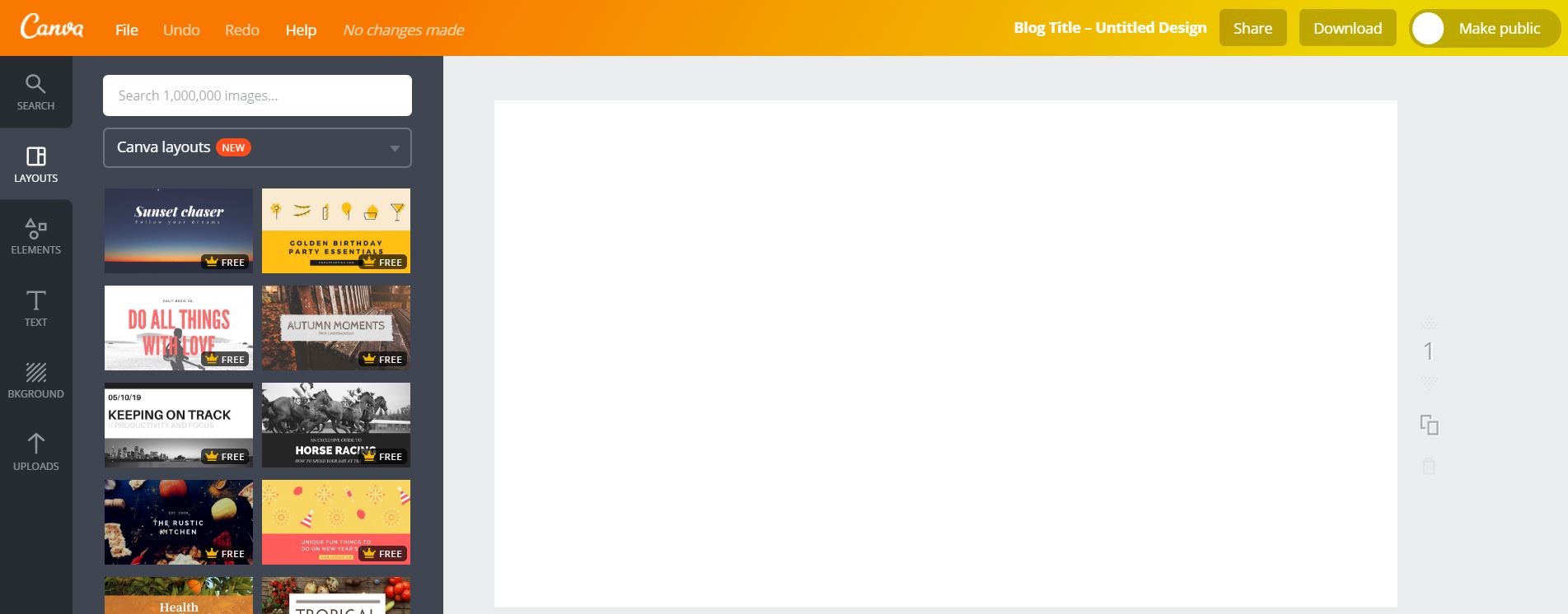
Canva is free to use, but they also have a paid version called Canva for Work, which lets you save design templates, instantly resize your images, and more.
Check out this guide to get started using Canva.
3. Gimp
Gimp is one of my favorite image editing tools. It's like a free, open source version of Photoshop.
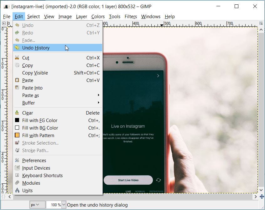
They also have a tutorial section on their site to help you get started using it. My favorite use of Gimp is scaling down images to reduce their file size and speed up the web page your image is on. Check out this post to learn how to do that.
A Few Other Noteworthy Tools
There are a lot of image editing tools out there. While the three I mentioned are my go-to's, I wanted to give you as many resources as possible to ensure you get what you need.
Here are some other great image editing tools:
Adobe Express: Quickly create images with text overlayed, with templates for most needs. Venngage: A tool to make infographics. Pixlr: Free photo editor you can use right in your web browser. Photoshop: I'm sure you're aware of this one. Adobe's mega-popular image manipulator.Now let's talk about how to find legal images to use with these tools.
Where to Find Legal Images
The majority of images you see are made up of multiple graphics layered together. Take this one, for example:
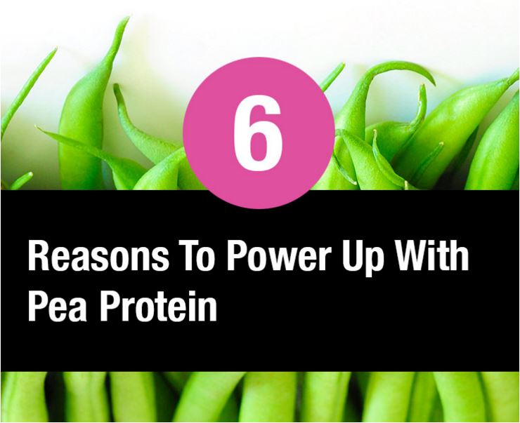
The background image is one layer. The text overtop is another layer. And there's something you need to know...
Even if you made this image, doesn't mean you are legally allowed to use it. You need to own the rights to each icon, graphic, or picture you used in the image, or they have to be free to use.
So, where do you find free, legal images?
Free Public Domain Images
The public domain refers to images that are either very old (no longer copyright) or the creator released them for public use. While you can attribute the creator in content if you would like, you aren't legally required to.
The only drawback is the general quality and number available. Apparently, few good designers actually want others using their images without getting credit. (That was sarcasm, in case you couldn't tell.)
Here are some of the best public domain image search engines:
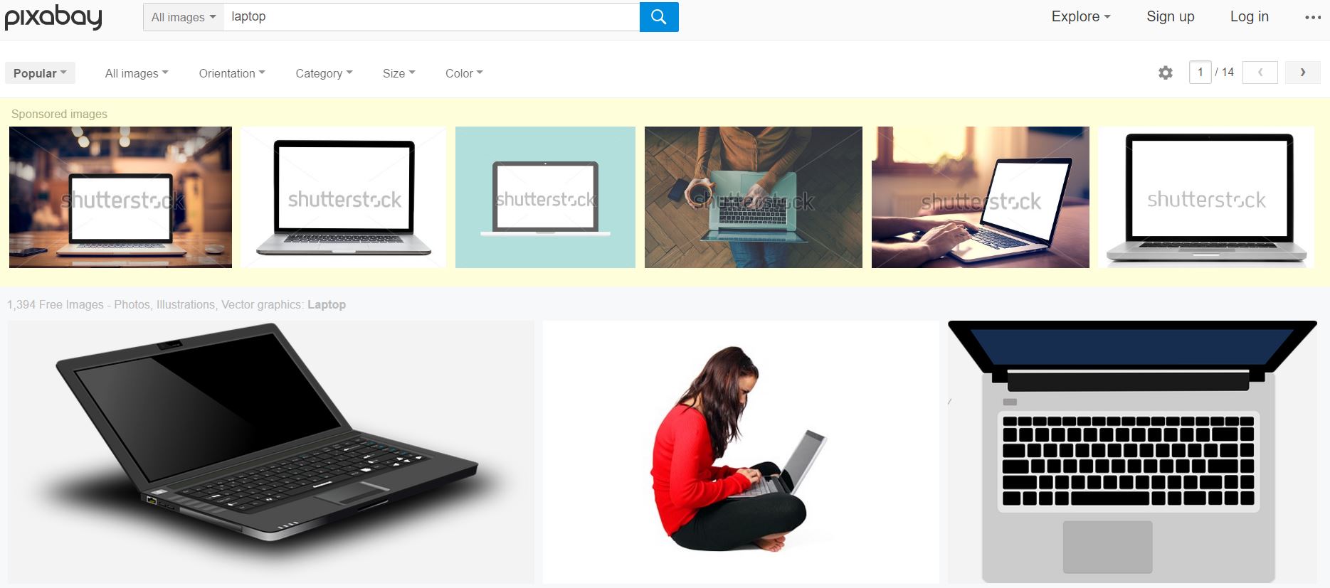
1. Pixabay
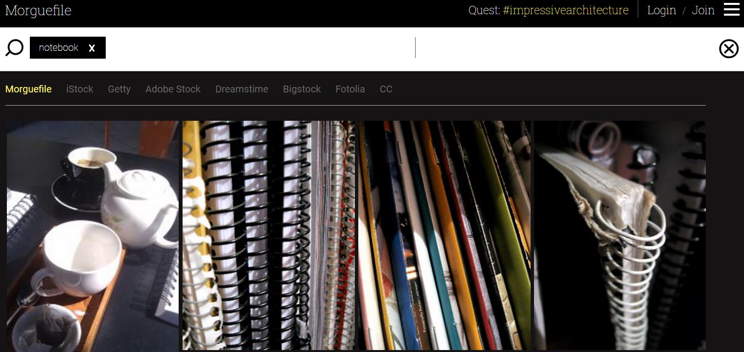
2. Morguefile
3. Public Domain Pictures
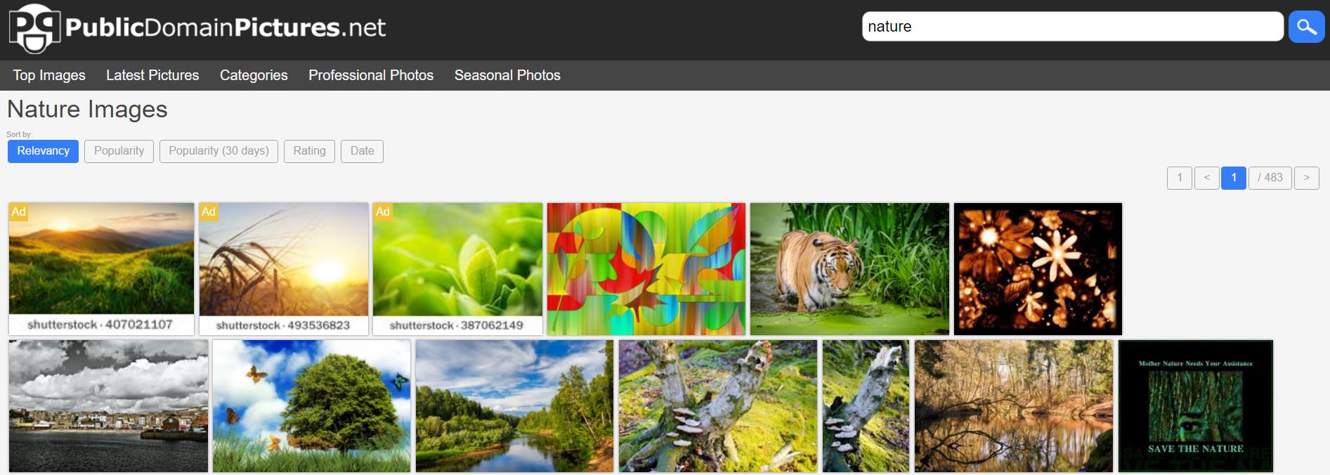
Again, the quality is lackluster, but the price is right!
There is, however, a way to get high-quality stock images for free.
Stock Images
Stock images get a bad rep for being cheesy and irrelevant. I have even told people not to use them.
But, you can absolutely use them if you can make them relevant. Like using them as a featured image or as the background for an image with a text overlay, for example.
Here are a few great sites to find free, high-quality stock photography:
UnSplash StockSnap Gratisography (Watch for images that require attribution) Death to the Stock PhotoAnother option, while not free, is to go with royalty-free images. These are images you pay a one-time fee (typically $0.20 to $5) for the rights to use forever.
Here are a few great royalty-free image sites:
Fotolia Big Stock Photo Deposit Photos iStockIf you still aren't satisfied, there is one option that gives you the ease of Google without risking a lawsuit.
Using Google to Find Free Images
Google's image search has an advanced feature that lets you filter images by license. Just type in what you're looking for, then click "Tools", then the dropdown "Usage Rights". You can choose one of two options:
Labeled for reuse Labeled for reuse with modification (if you want to modify the image)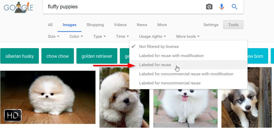
Hopefully, you're able to find the image you need for any project with these methods. Now I'll show you what you can do with them to make awesome blog images.
3 Elements of Great Design (For Non-Designers)
There are three major elements to great design work. These are:
Font choice Color scheme StyleLet's start with your font.
1. Font Choice
Font choice is really important to great design. In Canva's guide to font choice, they say that:
Designers (including Erik Spiekermann, Dan Mayer, and Jessica Hische) have been known to compare choosing fonts for design projects to choosing an outfit to wear.
Think about what your clothes might say about you: based on what you wear, people might rightly or wrongly make assumptions about your style, your personality, your socio-economic background, your age (or the age you wish you were), or the kind of impression you want to make. And different occasions and situations call for different apparel (or font).
There are four font categories you can choose from.
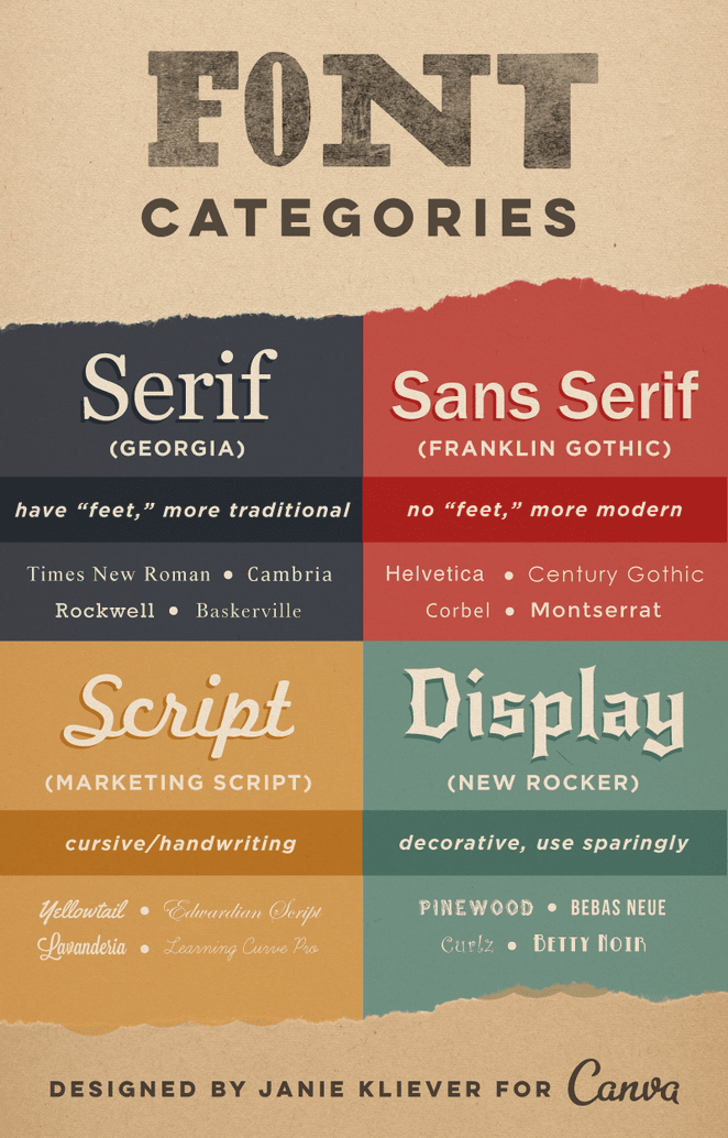
As a rule of thumb, stick to a maximum of two different fonts (not categories, but specific fonts) in any design. This keeps your design from looking like a mish-mash of different text.
Wondering which font to use? Here are 10 popular font ideas found by a Hongkiat survey:
Myriad Pro League Gothic Cabin Corbel Museo Slab Bebas Neue Ubuntu Lobster Franchise PT SerifAnother analysis of fonts used by designers revealed these three as other popular choices:
Helvetica Garamond FuturaCheck out Word Mark to see what each of these fonts looks like before you use them. Once you've chosen your fonts, the next important element in a design is color choice.
2. Color Scheme
Colors are powerful. There's actually a psychology behind color choice. Certain colors pair well, while others "clash". Each is associated with its own emotions. When choosing colors for your design, it's important to use no more than three colors in any image. And, less is often better.
So, how do you choose the right colors? There are generally four ways to find colors that pair well.
Monochromatic pairings: A monochromatic image has different shades of the same color. Use Google's color tool to find good monochromatic pairings. Analogous pairings: An analogous image includes colors next to each other on the color wheel. For example, you could pick any two or three from the following colors and they'd pair well.
3. Complementary pairings: An image containing two colors opposite each other on the color wheel. Good for creating contrast, especially for a call to action. You can choose any shade of either color to fit your design.

4. Triadic pairings: A triadic color image has exactly three colors, each complementary. Take a triangle and put it in a color wheel to find the right combination.
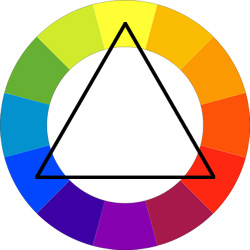
You can use a tool like Paletton to help you find the right color pairings. Once your happy with your font and your colors, our last element is style.
3. Style
Your style is like your brand's signature traits. The style of your images should match the style of your blog and brand.
Your ultimate goal is to have your followers instantly recognize your images and associate them with your brand. This is done through consistency in your marketing and design efforts. Let me give you an example.
Formilla live chat always uses a featured image on their blog posts. Take a look:
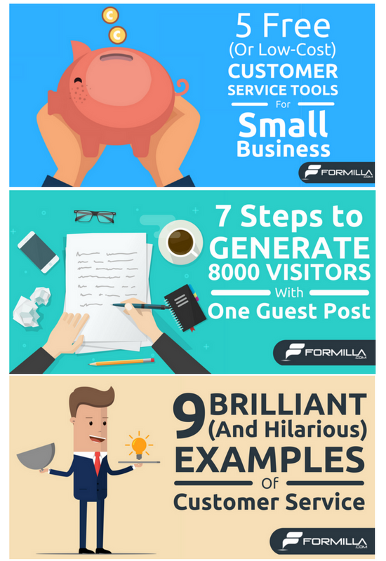
As you can see, they use the same design elements consistently. All of their images uses the same font (Ubuntu), uses their primary business color for their branding, and has the same graphical style. Even without the brand name, when someone sees the other elements, they can recognize it as Formilla's work.
When choosing a style, the important thing is to be consistent. It takes a lot of time for your readers to associate certain style elements with your brand. If you keep changing things, nothing's going to stick.
Here's another example:
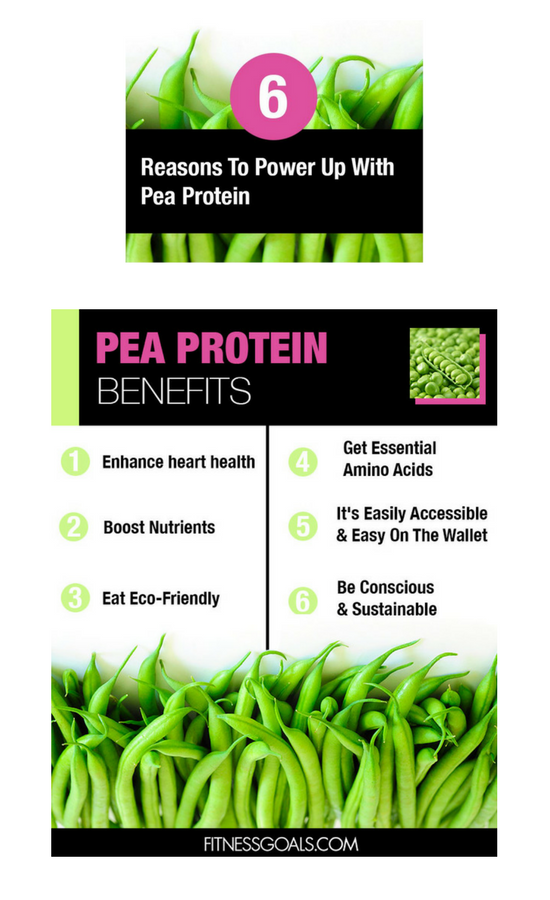
These are two images from a blog post by Fitness Goals on pea protein. They use the same background image, the same font, and the same color combination to create familiarity. It's also nice to look at.
One last tip: Don't forget to add your brand name. The second image above is actually a pinnable image made to fit perfectly in Pinterest, and showing the website helps people know where it's from. And that brings us to the end of our lesson!
Conclusion
By now I hope you understand that images aren't just a way to fill space or break up text. While they help with formatting, their main purpose should be to help the reader easily understand the idea you're trying to convey.
If you follow the principles you just learned, you should start to see greater engagement with your blog. Over time, you'll see more time on page, more organic backlinks, and a lower bounce rate.
And don't get caught up with making every image amazing. Like all skills, learning design takes time. Practice makes perfect, and any image is usually better than no image.
Innovative SEO services
SEO is a patience game; no secret there. We`ll work with you to develop a Search strategy focused on producing increased traffic rankings in as early as 3-months.
A proven Allinclusive. SEO services for measuring, executing, and optimizing for Search Engine success. We say what we do and do what we say.
Our company as Semrush Agency Partner has designed a search engine optimization service that is both ethical and result-driven. We use the latest tools, strategies, and trends to help you move up in the search engines for the right keywords to get noticed by the right audience.
Today, you can schedule a Discovery call with us about your company needs.
Source:



![How To Create a Strategic Dashboard in Excel Using Semrush Data [Excel Template Included]](https://allinclusive.agency/uploads/images/how-to-create-a-strategic-dashboard-in-excel-using-semrush-data-excel-template-included.svg)
