Visual content is a powerful instrument that can boost traffic and conversions. This is easily demonstrated by viewing a successful blog or the social media posts of leading companies. Although many understand the importance of images, a lot of bloggers and marketers find creating unique, relevant visuals difficult.
Are there any tools that can help? What images are more likely to engage your audience? Today we’re going to discuss some of the best techniques for creating and using visual content with the Snappa.io graphic design tool team and our other SEMrush chat participants.
Without further ado, let’s begin with question number one. A lot of people say images are important for engagement. But why is that? The first question applies to the very basics of content marketing.
A1. Studies have shown that people respond better to visual content, as opposed to textual. #semrushchat
— Matthew Young (@MatthewAYoung) October 14, 2015
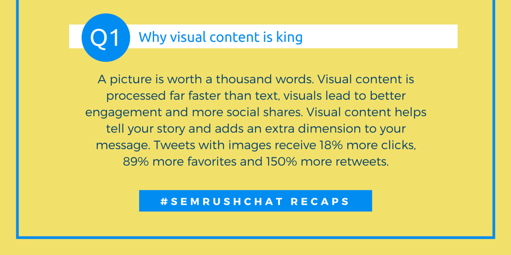
Images grab users’ attention because they don’t require a lot of time to dig into. A lot of studies show that modern customers are more likely to respond to images than traditional textual content.
A1: Beyond the text, the first optical attraction is generally a visual image. Great way to have something to grab a users attn #semrushchat — Martin Kelly (@MartinKSEO) October 14, 2015
Another obstacle worth mentioning is that each user perceives things differently. Some are into books and long reads, some are fascinated by music and others are fond of video or images.
@semrush A1: Tweets with images receive 18% more clicks, 89% more favorites and 150% more retweets via @hubspot #Semrushchat
— Livewire (@JFLivewire) October 14, 2015
Social media posts will get more shares if followed by an image – many studies show that. A more SEO-related approach is to use images’ own meta tags to increase your page rankings in search engines for specific queries.
A1. Another answer is pictures have their own meta like alt tags, descriptions etc. This is GOLD for SEO if you do it right #semrushchat — Chris Desadoy (@EliteYouTubePro) October 14, 2015
Bill Slawski @bill_slawski added that images can increase content engagement by illustrating it in memorable ways, and Laurel Marcus @ljmarcus noticed that sometimes visual media packs the 1-2 punch that text just doesn’t. You should consider its impact. Let’s sum up all these opinions with this phrase: a picture is worth a thousand words!
Are there any rules or ideas that help make a business-related image catchy? The next question is related to the anatomy of visual content.
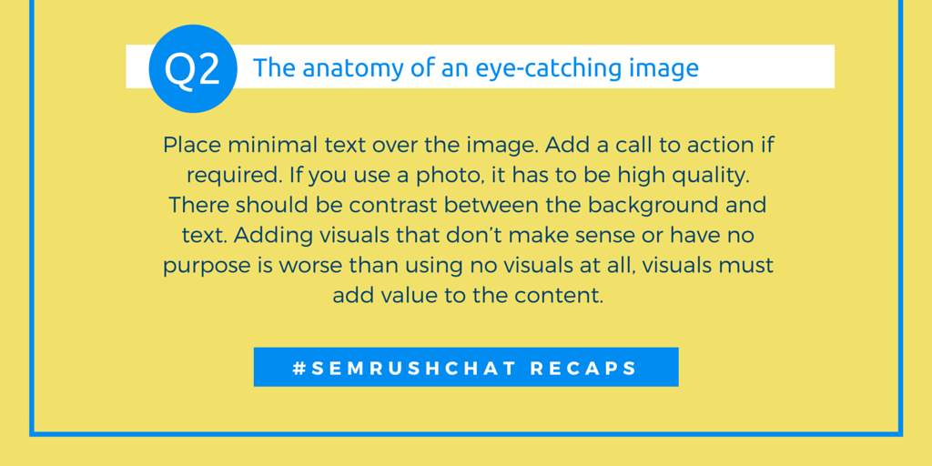
Balance is the key. In fact, you do not expect a service or product to be good if it uses low quality photos, and the professionals at Snappa.io have kindly pointed this out.
A2 A high quality photo, a nice colour palette and balanced typography. Contrast between background and text is also important. #semrushchat
— Snappa.io (@SnappaIO) October 14, 2015
Creating an image usually means spending a lot of time on photo stock sites or galleries, but as you may have noticed, most of them are filled with ordinary clipart and images. This implies the following rule:
A2 Be unique. Typical is boring. My team @ExpWriters has tried a dozen stock photo sites to pick out the most unique one #semrushchat
— Julia McCoy (@JuliaEMcCoy) October 14, 2015
Choosing an exclusive, non-ordinary image is the first step. Other participants also included relevancy as a rule of thumb for creating catchy visuals. A lot of studies have been done, and some of them cast doubt on the role of visual content.
@semrush A2 Text over image. GOOG study shows users perfer text with images to ease cognitive load of interpeting image #semrushchat — Marianne Sweeny (@msweeny) October 14, 2015
Unique data and analysis often get into some public mass media to illustrate news or articles. This provides an excellent opportunity for PR interactions. Infographics can act act as a magnet for your audience if they’re designed well.
A2: For infographics, make sure the visual clearly represents the stat eg scale, axes, etc. Simple advice but often overlooked #semrushchat — Laurel Marcus (@ljmarcus) October 14, 2015
All in all, images are fuel for your blog or social media posts, but you should keep them simple, clear, unambiguous and emotional. Let’s recap with the best suggestions:
In a business environment, it’s not enough to simply pick the right image from your stock. Sometimes you need to add lines of text and combine several images. It’s time for a helping hand.
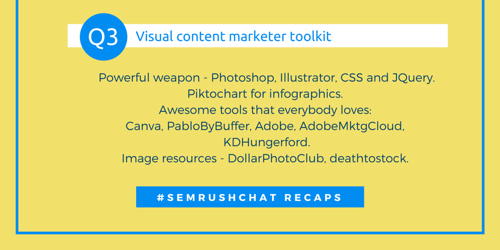
Let’s open a typical visual content marketer toolbox and see what’s inside? Here are some examples.
@semrush A3: Canva, Infogr.am, Piktochart ! #semrushchat
— IPSSWEB SOLUTIONS (@ipssweb) October 14, 2015
Yes, Canva is one of the best indeed – think Photoshop’s power meets Shutterstock’s diversity and web interface agility! Here at SEMrush, we also use it very often for social media publications. Anything else?
A3 @semrush My fav @canva , then @pikochart @photoshop @unsplash @Thinkstock #semrushchat — Janil Jean (@JanilJean) October 14, 2015
Nice list, Janil! Photoshop and other Adobe applications are powerful tools for creating astonishing images, if you have some spare time. Let’s recap.
The next question has a lot in common with the previous. Obviously if you steal images for your site from other authors, sooner or later it will lead to complaints or even charges. What are the most popular free image stocks that marketers should use to avoid this?
 Let’s continue to delve into the typical toolkit of a visual content marketer.
A4 @semrush I refer to @unsplash and @googleimages, @canva free images. Due credits given though. #semrushchat
— Janil Jean (@JanilJean) October 14, 2015
Yes, these are the most well-known stocks where every marketer can find not only images, but inspiration. Are there any other sources?
A4 I also like using Creative Commons licensed images from Flickr (give proper attribution!) https://t.co/M7QZqZCrsi #semrushchat — Bill Slawski (@bill_slawski) October 14, 2015
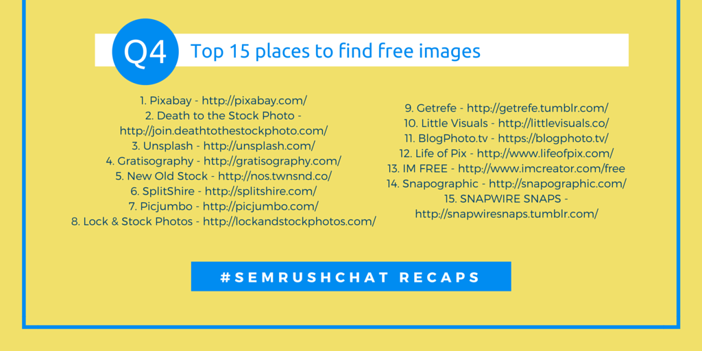
The Creative Commons license and photo stocks are a godsend when it comes to designing on the fly. So what are the top five free image sources, according to our participants: 1. Pixabay, 2. Death to the Stock Photo, 3. Unsplash, 4. Gratisography, 5. New Old Stock. You will find an enhanced version of this list in the recap of question four!
Now let’s turn to the applied techniques visual marketers use when creating images. Combining colors is sometimes complicated, especially if you are a newbie. The next question reveals some general principles.
As a matter of fact, your brand colors should prevail if your message is brand-specific.
A5: Keep brand colours in mind so there’s a consistent customer brand perception, then use shades/contrasting colours #semrushchat
— Magentrix (@magentrix) October 14, 2015
What about the science and psychology behind colors? If you use complementary colors for specific buttons, people are more likely to click them, which will bring you leads and conversions.
A5: Use a complementary color for your CTA to ensure it stands out. #semrushchat pic.twitter.com/lcJtxY3sN3 — Andrea Fine (@AndreaFine) October 14, 2015
The general image atmosphere also matters: if you a use dark pattern, it may apply to gadgets or gaming; and bright colors are more likely to appear in an Internet store or travelling site/blog. Choose wisely!
A5: Colours evoke consumers emotions, light bright colors can replicate a fresh bright idea. @semrush #semrushchat
— GML Team (@GMLConsulting) October 14, 2015
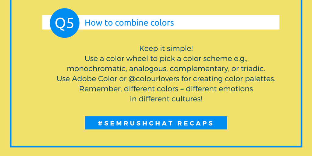
The bottom line for this question: use color theories, human psychology and your common sense! The wrong colors may lead to the wrong branding or perception of your idea. Let’s summarize all the advice we received.
Speaking of the wrong visual content marketing decisions, what are the most common mistakes marketers have to deal with? Let’s ask our participants.
Remember, when text lines merge into the background, it’s impossible for your users to read them quickly.
A6. Make sure there is contrast between text and background. Keep it clean and simple. #semrushchat — Snappa.io (@SnappaIO) October 14, 2015
A6) Do not put important text (stuff for search crawlers) into images. Don't make images so big that they slow load time. #semrushchat
— Ryan Johnson (@rsj8000) October 14, 2015
Crawlers are unable to read text that is combined with an image. Larger images will significantly decrease your page’s loading speed and make it harder to read from mobile devices.
A6: Don't just create an image for the sake of creating an image. Keep photos/written content relevant to your brand & message. #semrushchat — Morgan Mandriota (@MorganMandriota) October 14, 2015
Determine your target audience before creating any image or publication. That way all your efforts will be brand and message relevant.
A6 Avoid stealing images and not providing attribution/compensation. It'll cost you in bad press and social pushback. #semrushchat
— James Svoboda (@Realicity) October 14, 2015
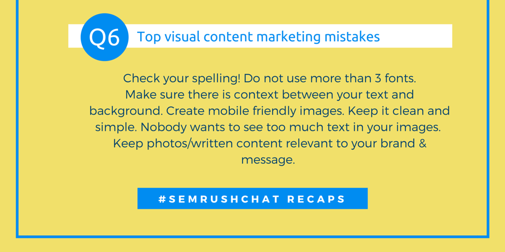
Yes, stealing images is what we talked about above and it’s a huge mistake. You should never take an image if it is not for public use, unless you have the necessary rights for commercial use. Let’s summarize all your opinions.
For our last last question, we have asked our guests and participants to share their ultimate tip or lifehack for making their daily visual content marketing routine easier.
Many marketers find it a bit complicated to create images and support(ing?) content, but with experience, it will become a piece of cake. Here’s a ‘pro’ tip from the Snappa.io team:
A7 Great visual content shouldn't make the user think. There should be a clear message, clean look, and appropriate typography #semrushchat — Snappa.io (@SnappaIO) October 14, 2015
Another good piece of advice is to use social media to research your audience. What are their habits? What do they like? Instagram and Pinterest are a wise choice for discovering which pictures they prefer more.
A7 Think about what your audience loves. Research Pinterest to see what they like. Strategize around that. #semrushchat
— James Svoboda (@Realicity) October 14, 2015
Research is king in visual marketing — the more you know about your customers, the more you will sell and the better you will communicate with them. Your strategy should always be based on facts and numbers.
A7: Do your research and create a visual content strategy that targets and engages your audience/brand community. #semrushchat
— Morgan Mandriota (@MorganMandriota) October 14, 2015
All things considered, your image message should be obvious. Create a story with simple text punches and a CTA, and practice as much as you can.

Images, if used correctly, can act like a magnet for your audience. Choose your visual strategy wisely, research your audienceand keep it simple. Avoid inappropriate or stolen images, and always check your meta description and alt tags for consistency.
Your message should be straight to the point and brand specific. Use science and psychology and you will increase both your social media and search engine traffic and increase your conversion rates as a result.
That’s it for today!
A big thank you to the Snappa.io team for their expertise and to all SEMrush chat guests for their participation.
We hope to see you this Wednesday for our new Twitter Chat:
Join @yigitkonur on #SEMrushchat next Wednesday at 11 ET/ 8 am PT to discuss top #linkbuilding tips! pic.twitter.com/rWyfeeXEDr — SEMrush (@semrush) October 17, 2015
Innovative SEO services
SEO is a patience game; no secret there. We`ll work with you to develop a Search strategy focused on producing increased traffic rankings in as early as 3-months.
A proven Allinclusive. SEO services for measuring, executing, and optimizing for Search Engine success. We say what we do and do what we say.
Our company as Semrush Agency Partner has designed a search engine optimization service that is both ethical and result-driven. We use the latest tools, strategies, and trends to help you move up in the search engines for the right keywords to get noticed by the right audience.
Today, you can schedule a Discovery call with us about your company needs.
Source:


![How To Create a Strategic Dashboard in Excel Using Semrush Data [Excel Template Included]](https://allinclusive.agency/uploads/images/how-to-create-a-strategic-dashboard-in-excel-using-semrush-data-excel-template-included.svg)
