Popups are used on almost every website nowadays. But let’s admit it: they are hard to love. They are often synonymous with being interrupted and spammed.
While popups can be a powerful way to change a user’s focus and provide valuable suggestions, they sometimes do more harm than good for brands. Unfortunately, it's easy to find many instances where popups are being poorly implemented. They often present the wrong information or offer along with a terrible design.
No tricks! People catch on quickly if you look to be scamming them to sign up to a useless mailing list.
In this article, I'll present 5 different types of popups and their most effective implementations for improving user engagement and lead generation on your site (for all industries).
Popups Can Be Powerful For Engagement
While for many people popups have a bad connotation, they can be a very powerful way to help users really engage with websites. Exit-intent detection technology, behavior tracking predictions and machine learning algorithms are fancy terms most modern marketers use to help you make millions.
Since SumoMe popups became popular, it seems as if everyone who has a blog or some other website has taken 5 minutes to install this famously primitive popup on all their subpages.
The biggest mistake that 95% of the websites make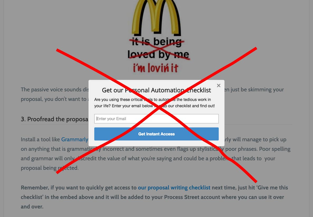
Why is this popup ineffective? Two reasons:
Unappealing text and design Unrelated to the browsing context (the article that I’m reading or my engagement level)I can hardly imagine this popup to be effective for anyone other than robots!
Leading the User with Different Popup Types
Before you make a popup, you must define what your goal is for the popup.
How will you take advantage of popups in all their variations in a way that actually helps to lead the user to reach your desired goal? What valuable proposition are you offering to the user? Is it something they find valuable enough to entice them to download your content or sign up for your email list?
Let's take a look at some different types of popups.
1. On-load Popups
An on-load popup is a popup which is displayed directly after the page is loaded and is the most primitive type of all existing popups. It transitions the focus from the site to the popup as soon as we land on the page. It is useful for so-called “soft” promotions where we don’t want to “push” something too much.
The on-load popups are the most effective for lead generation when we present them to the users who are already familiar with our website or brand. Users who have previously visited our website are more likely to subscribe and get engaged with our mailing list.
An on-load popup inviting you to sign up for a newsletter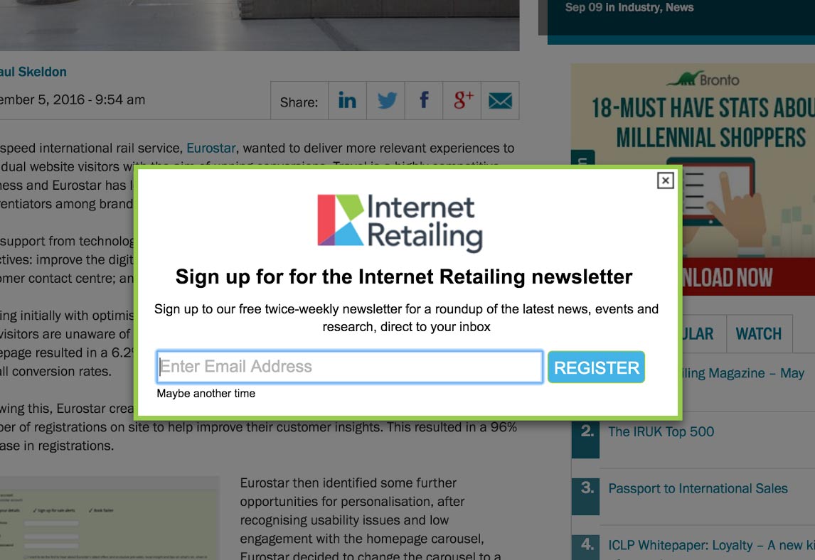
Examples:
When we want the users to know something important about our products or services which is crucial for their further understanding and browser experience on our website –
Say we owned a brand called Themper - which is a WordPress theme directory that has a unique advantage over its competitors allowing you to preview any existing Wordpress theme with a single click. Since this very fact is important information (which would determine the user’s further understanding and experience), we need to communicate that through an elegant popup.
When we want to invite our users to subscribe to our mailing list or participate in some other activity related to our brand –
Say we own a Charming Makeup brand and we want to invite users to join our newsletter to receive weekly news and tips on how to do makeup. The on-load popups are the most common of all because they are the easiest for the implementation.
But, beware. There are hundreds of marketing tools that provide you with ugly-looking templates, allowing you to install them on your website in 5 minutes and letting you kill your bounce rates and engagement by bewitching you with their marketing illusions (and delusions). Make sure your popups provide value to the viewer without hurting their eyes.
2. Exit-Intent Popups
Exit-intent popups have been growing in popularity in the last 3 years and you probably know about the “must have,” overly expensive services that no-one can afford (except the enterprise businesses out there) that promise to improve your website conversions up to 30% or more. In reality that sounds amazing, but in reality… it’s not really like that.
First, let’s explain how exit-intent detection works.
How does exit-intent detection work?
The idea behind the exit-intent popup is that it should appear right before the user decides to leave the website.
The problem is getting to know when the user is leaving the website. Well.. there are solutions for that, but none of them are perfect. The most popular solution, used as a major exit-intent trigger by most exit-intent applications, is monitoring the mouse-out javascript event on the browser visible surface (technically called the body element of the site) which basically triggers when the visitor mouse moves out of the browser area.
A sketch of exit-intent detection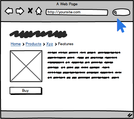
The problem with such an approach is that this event is triggered every time the user moves out of the browser screen area but might not really be leaving the website. For example – the user can move his or her mouse out of the browser to bookmark a page, close an unused tab or move the mouse to the scroller.
In these cases, the tool will detect a false “exit-intent,” but in reality the user won’t really be leaving the site and the popup can disturb his focus. In addition, if we are pushing promo codes with ineffective exit-intent detection, we can be losing our money.
This is a very basic and simplified version of exit-intent detection and is what most existing solutions use. It sounds fancy but it’s far from being effective.
Improved, but still not the perfect exit-intent –
More sophisticated solutions would also track mouse movement and look at the mouse pattern to detect if the mouse movement matched areas that potentially mean closing the browser window.
Even though this approach minimizes the exit-intent popup from triggering in some situations (like when scrolling the page and some other more predictable ones), it is still not perfect and could still make the popup trigger in situations where the user is not really exiting the site.
The point with this is that there is no optimal solution for exit-intent, but the question is if we should really bother with finding the perfect solution? Probably not. The most important point should be the result of our exit-intent popup and the fact that we should minimize and control the cases when the user is not exiting – and thereby prevent the popup from triggering in such a scenario.
We also have to keep in mind that there is no exit-intent detection on mobile phones (as there is no mouse to track).
There are, however, some more important aspects that you should be looking at when exposing a popup (an offer or information) to a user.
Examples:
We want to prevent users from leaving the checkout or basket page (or any step after he showed interest in the products) –
Maria comes to our website and adds the Red Nike shoes to the basket. She starts the check-out process but decides to leave halfway. We can try to detect the exit-intent and we show her a popup, which invites her to a VIP club by which she gets free shipping or a 10% discount if she subscribes with her email. This way we get her email and can easily follow-up with her any time later on.
We want to prevent an impulsive user from leaving the site quickly –
Matt gets to our blog from by searching for a solution on Google. He only reads 5% of the article and decides to leave the site.
A good and clean implementation of an exit popup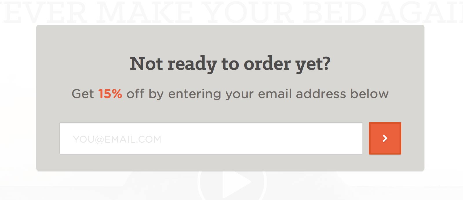
We want to try to retain a user who didn’t complete the desired goal and decides to leave the site –
On our landing page RankTrackr.com we are selling an SEO tracking tool. Joe comes to our site, scrolls down and looks at its features and some other information. He doesn’t decide to proceed with the registration but instead decides to continue research on other existing similar tools.
We can detect his exit-intent and offer something valuable to him such as a ‘Free SEO Course’ teaching10 tricks he can take advantage of to better rank his websites.
3. Site-lock Popups
A site-lock popup is a special type of a load popup mentioned in the beginning of this article. It's useful when we want to force the user to take a certain action before he can access the content or interact with the website. The most famous example of such an approach is probably quora.com where, before you can read the answers and discussions in response to a particular question, you have to sign up for an account.
Site-lock popups are not really that common. They are useful if you’re offering content to a user which has a relatively perceived high value or if you know that the users who take the required action convert more than the users who drop off because of such a request. (This you can only confirm with an A/B test.)
A good example of a soft site-lock popup –
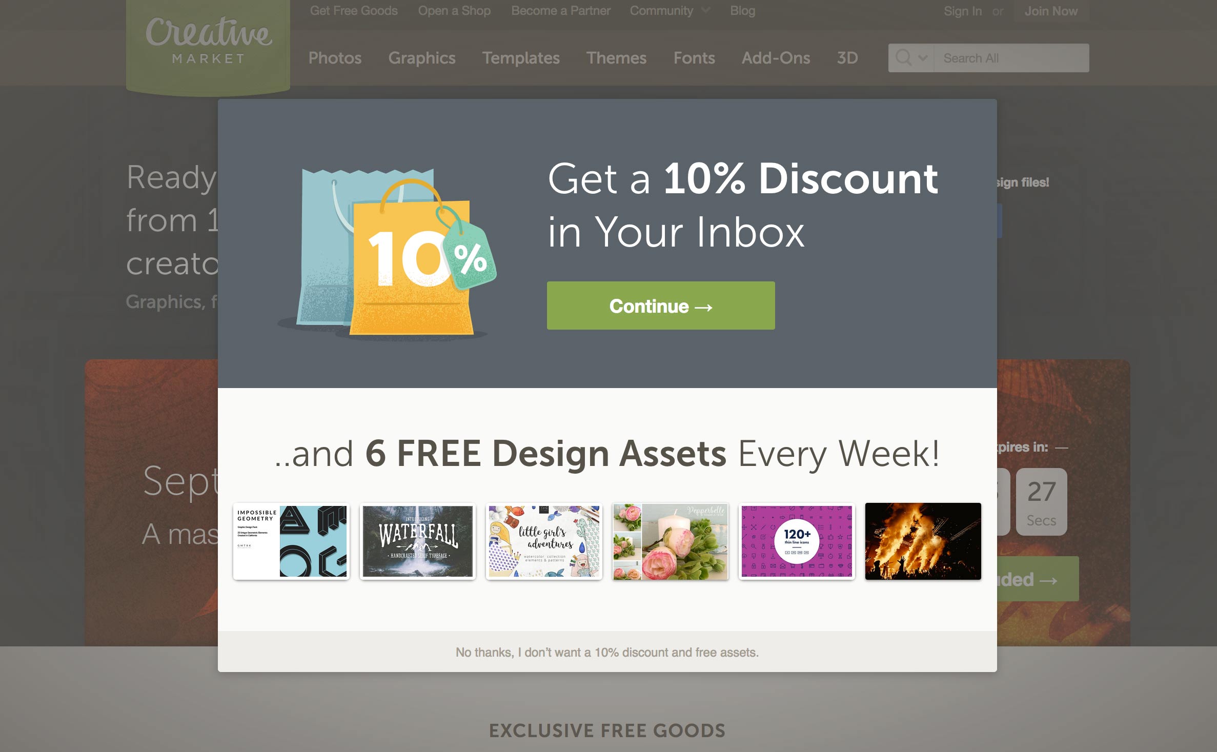
The popup has the user make a decision between getting a 10% discount or to continue browsing. This can be a very effective approach when we want to get more opt-ins on our list – by providing options and offering a benefit.
4. Engagement Popups
Engagement popups are probably the most effective types of popups. It’s a popup which shows up after a user has already been engaged by our website. It could be that they visited a specific number of pages, that they scrolled a particular area of some page or they spent a certain amount of time browsing the site.
They are the most effective because, when they take user's behavior into consideration, they can be key to effective lead generation and long-term success.
With engagement popups, we need to take user context in consideration. What does that mean? It means, before we expose a popup to a user and take their focus away from the site, we should consider the following:
Is user the first time on our site?
Has the user already visited this website?
How many pages he viewed previously?
How much time he spent on the site previously?
What pages has he already visited / what is he interested in?
Has the user engaged with our site on this visit?
How much time has the user spent on the site?
How much did he scroll the site?
How much did he move the mouse?
How many subpages he visited with this visit?
How did the user come to our site?
Did he come from a search engine?
Did he come from Facebook?
Did he visit the site directly?
Coming to grips with the wider user context will provide us with much better results for lead generation and email response.
Engagement popups effective solutions
Scrolling / pageviews indicator –
A web agency has a blog in which they write about different topics – from SEO to Paid advertising and so on. Matthew browses their blog and starts reading the articles. He reads an article about SEO (scrolling more than 60% of the page) and opens two other related articles from the same category. After detecting his behavior, we could:
Offer him a sign up to our newsletter where he can get an email whenever new articles are published.
Offer him a sign up for a free SEO course or ebook.
Option 2 would clearly be more effective when done properly, but it would require more work in content writing and implementation. However, as your site gets bigger, it would definitely pay off.
Repeated views without a completed goal action –
An e-commerce store is selling sport shoes. Emma comes to the site a couple of times to see the shoes she likes. When she returns the fifth time to look at the shoes again – it‘s time to take action. After detecting her behavior, we could:
Offer a discount or free shipping in exchange for entering her email in the popup. (A coupon is sent to her email and we can effectively advertise to her for years to come.)
Offer price change notifications to be sent to her email or news about new shoe styles (if our business is not hard promotion-oriented).
5. Sticky Popups
Sticky popups can be a hybrid, a compromise, between engagement popups and on-load popups. They don’t consume the whole user focus and they stay visible for longer periods – to remind the user or suggest taking a certain action.
Below is an example of a sticky popup from a lovely travel blog.
Nice implementation of a sticky popup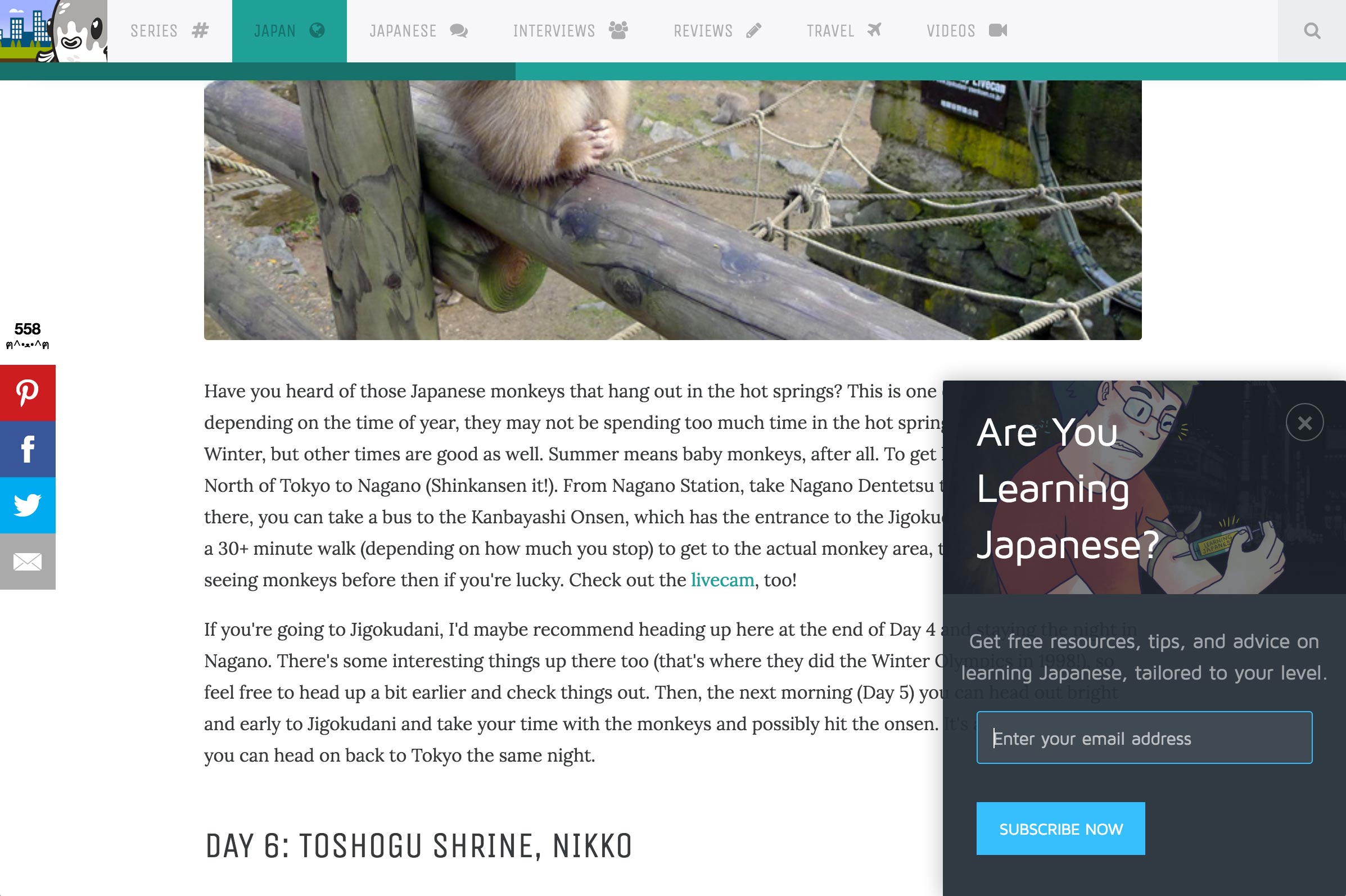
Final Thoughts about Popup Implementation
Regardless of which popup tools you implement, it’s important to always take user context into consideration.
There really is nothing more beneficial than getting into the user’s shoes and actually seeing how we might improve the overall experience for each of them individually. Whether you decide to use just one or a combination of all the above popup types – when used in the right manner, they are bound to grow any type of business.
Remember: testing makes things perfect!
What popup experiments have you tried lately? Share your insights below in the comments!
Innovative SEO services
SEO is a patience game; no secret there. We`ll work with you to develop a Search strategy focused on producing increased traffic rankings in as early as 3-months.
A proven Allinclusive. SEO services for measuring, executing, and optimizing for Search Engine success. We say what we do and do what we say.
Our company as Semrush Agency Partner has designed a search engine optimization service that is both ethical and result-driven. We use the latest tools, strategies, and trends to help you move up in the search engines for the right keywords to get noticed by the right audience.
Today, you can schedule a Discovery call with us about your company needs.
Source:


![How To Create a Strategic Dashboard in Excel Using Semrush Data [Excel Template Included]](https://allinclusive.agency/uploads/images/how-to-create-a-strategic-dashboard-in-excel-using-semrush-data-excel-template-included.svg)
