

Google has been working on mobile-first indexing for some time, developed in response to the drastic shift in the way people search (and browse) the web, and the widespread adoption of mobile devices in pretty much every part of our lives.
It is safe to say that we now live and work in a truly mobile-first world.
The first announcement that Google was moving away from their algorithms typically looking at the desktop version of a site towards a mobile-first approach came in 2016.
At the time, Google announced that:
Today, most people are searching on Google using a mobile device. However, our ranking systems still typically look at the desktop version of a page’s content to evaluate its relevance to the user. This can cause issues when the mobile page has less content than the desktop page because our algorithms are not evaluating the actual page that is seen by a mobile searcher.
But between 2016 and today, we have seen an almost full shift by Google to mobile-first indexing.
By March 2021, Google will have switched ALL websites from desktop-first to mobile-first indexing, having been through a transitional period of moving sites over when their systems recognized that they were ready to do so.
Any new websites launched after July 2019 automatically went to mobile-first indexing, but some existing sites have yet to be moved over.
And, while many of you will have had your sites crawled by a smartphone Googlebot for some time, it is something that every SEO and digital marketer now needs to be paying close attention to.
Over the coming months, Google will be 100% mobile-first, and that means you need to make sure you understand what this means and how to optimize for it.
And in this guide, we will help you to do just that, specifically looking at:
What Is Mobile-First Indexing? 9 Things You Need To Know About Mobile-First Indexing 1. You Can Check If Your Site is on Mobile-First Indexing 2. You Can't Opt-Out of Mobile-First Indexing 3. There Is Only One Index 4. You Can Test Your Site's Mobile-Friendliness 5. Your Website Should Provide The Same Experience Across Mobile and Desktop Devices 6. Google Gives Advice On Mobile-First Best-Practices 7. Don't Confuse Mobile-First Indexing and Mobile Usability 8. Page Speed Is Hugely Important 9. Handling Separate Mobile and Desktop SitesWhat Is Mobile-First Indexing?
Mobile isn't going anywhere, and, as of 2019, a staggering 63% of US search traffic originated from a mobile device. This means that a website's mobile version is the one that should take preference, and Google acknowledges this with mobile-first indexing.
While it might sound complex, mobile-first indexing is actually pretty simple to get your head around.
Google themselves refer to it by saying:
Mobile-first indexing means Google predominantly uses the mobile version of the content for indexing and ranking.
In the past, Googlebot primarily used a website's desktop version to determine a page's relevance to a search query, but this has since shifted to mobile variants.
And for many businesses, this won't cause any issues as the site that is served to mobile users is a responsive version of the desktop site, with no other changes to the actual content that's served. But if a website serves different desktop and mobile versions, there are things that need to be considered.
If you are still one of the few businesses that don't have a mobile-friendly website (sadly, there are still a few of these that exist), you can expect to see a negative impact on your search rankings across both mobile and desktop searches.
A well thought out mobile-friendly website could drive a noticeable increase in organic visibility.
But even if you don't think it is something that you need to worry about, it still pays to understand what mobile-first indexing is and how it works, as well as the considerations you need to be making, not just now, but in the future, too.
A 2019 study revealed that "only 13% of websites get to retain the exact same position across devices," showcasing in itself the importance of getting your site's mobile experience and search-engine-friendliness right.
In simple terms, mobile-first indexing means that Google's algorithms are using the content from your site's mobile site when ranking your pages on the SERPs.
9 Things You Need To Know About Mobile-First Indexing
Mobile-first indexing is something that all SEOs should understand inside out.
Once you have got your head around a few key facts and know how it could potentially impact your site's organic visibility, you will find that it is pretty easy to adapt your own processes to work mobile-first.
Here are 9 things you need to know about mobile-first indexing that can help you check your site for issues and fix any that already exist.
1. You Can Check If Your Site is on Mobile-First Indexing
While most sites have now moved over to mobile-first indexing, there are still a few months until Google will be analyzing and ranking your site’s mobile version.
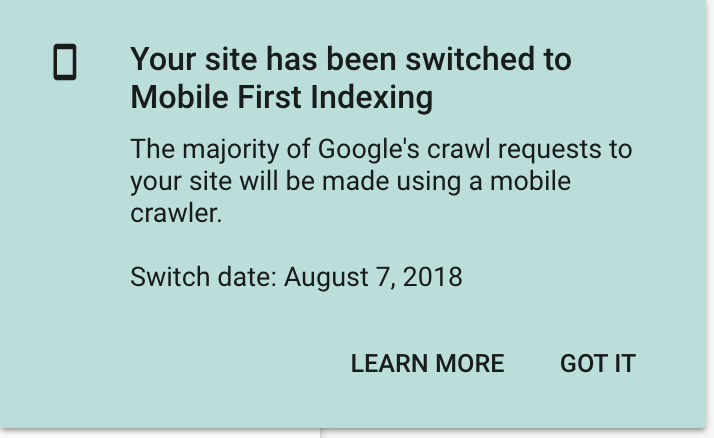
If you have already been moved over to mobile-first, you have likely already seen a Google Search Console notification telling you so. If you have missed this, haven’t yet seen one, or simply want confirmation that you are on mobile-first indexing, there is an easy way to check this.
Load up Search Console and run a URL inspection for one of your site's pages by entering this into the text box at the top of your screen.

You will then see the "coverage" results for your inputted URL once the results show:

Notice that it has crawled as "Googlebot smartphone"? This is a quick and easy way to see how Google is crawling your site; in this case, mobile-first.
2. You Can't Opt-Out of Mobile-First Indexing
You need to know that once you have been moved over to mobile-first indexing, there is no going back. There is no way to opt-out. Likewise, you have not been able to opt-in manually.
And this means that you absolutely must be thinking mobile-first when designing and developing your site, planning content, and considering how your site displays to users on mobile devices.
But don’t panic. Most sites won’t need to make significant changes.
Google has previously confirmed that “If you have a responsive site or a dynamic serving site where the primary content and markup is equivalent across mobile and desktop, you shouldn’t have to change anything.”
Have these conversations with your developers and designers, educating them on the importance of considering how mobile-first indexing impacts their way of working and make sure they truly understand what they should and shouldn’t be doing.
Equally, don’t be afraid to push back on changes that could cause your site’s mobile version to differ from your desktop version in terms of the content that’s available.
Mobile-first indexing is here to stay, and there is nothing you can do to change that. If your business is still to make the shift to thinking mobile-first, now is the time.
3. There Is Only One Index
One of the common misconceptions that arose from mobile-first indexing announcement in 2016 was that Google holds two indexes; a mobile index and a desktop index.
But that is simply not true — there is only one index, and mobile-first indexing relates to the Googlebot that crawls and indexes your site, not the index of web pages that Google holds. The reality is that where websites have equivalent content across their mobile and desktop sites, they are not likely to see any impact from moving to mobile-first indexing.
Historically, Google crawled your desktop site first and considered a mobile site to be an alternate version, if you had one (rather than a responsive design). Now, your site's mobile site is the primary version.
And where things get confusing is that, if you have a separate mobile site, it will be these URLs that show to users on the SERPs.
But there is only one index.
4. You Can Test Your Site's Mobile-Friendliness
You can easily and quickly test your website's mobile-friendliness using Google's mobile-friendly test tool.
Enter the URL of a web page and identify any mobile-usability issues that exist.
And while, as we will discuss below, mobile-usability and mobile-first indexing aren't the same things, it is important to understand how Google is crawling your mobile versions.
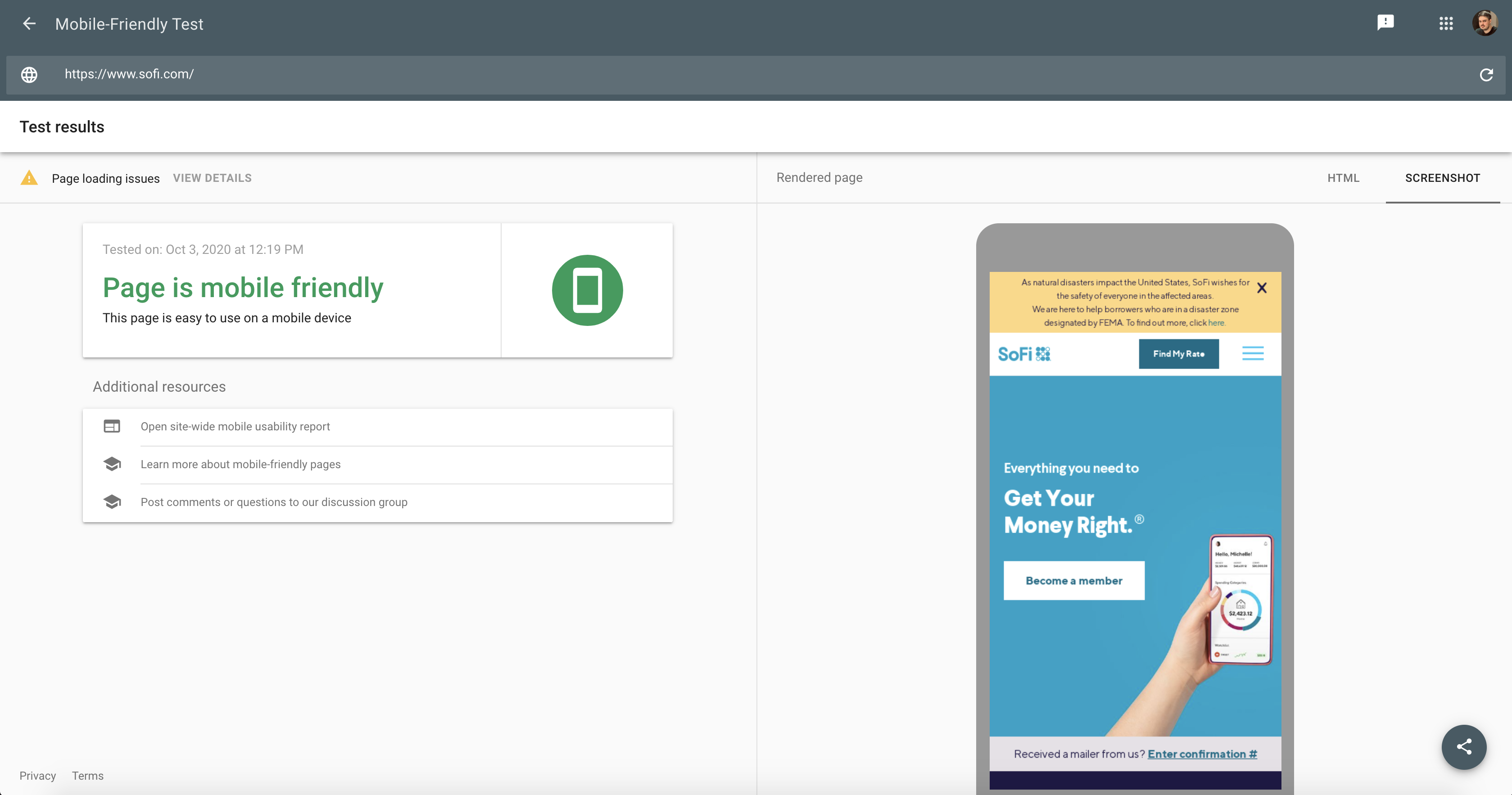
In this instance, the page passes the mobile-friendly test but flags a number of page loading issues that may need further investigation.
A particular issue to pay attention to here is blocked resources, something that Google explains by saying that "If a blocked resource is important, it could have a big effect on how Google understands the page. For example, a blocked large image could make a page appear to be mobile-friendly when it is not, or a blocked CSS file could result in incorrect font styles being applied (for example, too small for a device).
This affects both the mobile usability score and Google's ability to crawl your page. You should make sure that important resources are not blocked to Googlebot by robots.txt and are generally accessible."
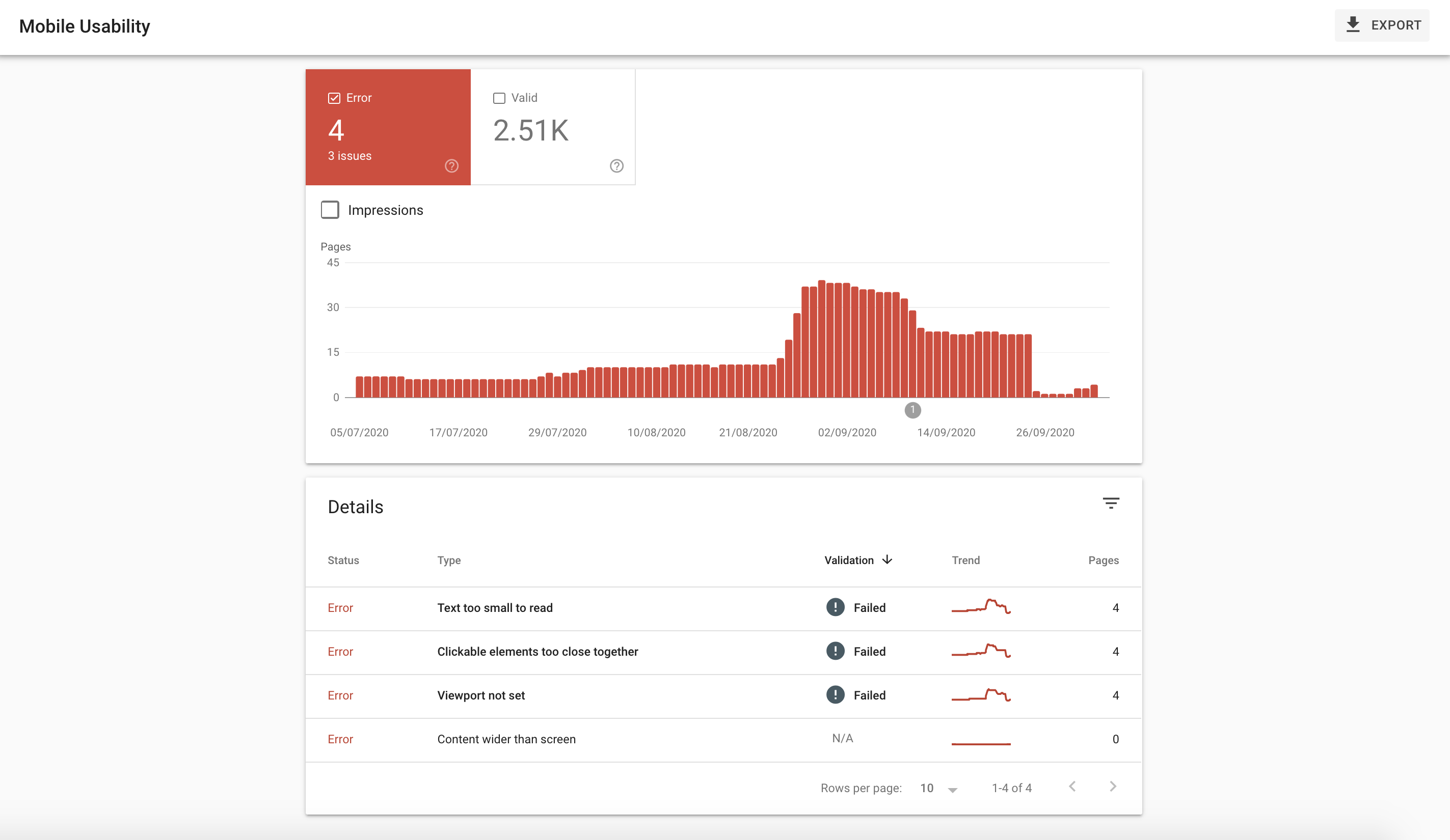
You can also analyze your site's mobile usability by visiting the corresponding tab under the "enhancements" menu in Search Console, allowing you to see any errors that need attention.
5. Your Website Should Provide The Same Experience Across Mobile and Desktop Devices
It is relatively commonplace for designers and developers to focus their efforts on a site's mobile UX, and this is great.
However, the problem that often arises is that this is attempted by hiding numerous desktop elements when a page is viewed on a mobile device — this can cause all sorts of issues with mobile-first indexing.
Google advises that a website provides the same experience across both mobile and desktop devices, which is especially important when it comes to content. Specifically, their mobile-first indexing guidelines state:
If your mobile site has less content than your desktop site, consider updating your mobile site so that its primary content is equivalent to your desktop site. Almost all indexing on your site comes from the mobile site.
It can't get much clearer than that.
But to back this up, this advice comes with a warning:

While designers might be tempted to improve mobile usability by removing content, this can result in traffic losses.
Our recommendation is to take the time to educate all stakeholders involved in a site and justify why it is important to work on displaying content in a user-friendly way for mobile users, rather than hiding or removing it.
It is also another reason why SEO should be integrated into the wider website team within a business, allowing these considerations to be made before it is too late.
But there is more to consider than just your content, despite this being hugely important.
Key considerations to make in terms of consistently between mobile and desktop sites are:
Structured data Metadata Meta robots tags Ad placement Images and videosIt is important that you keep these elements the same across mobile and desktop devices to avoid problems that could arise from mobile-first indexing.
6. Google Gives Advice On Mobile-First Best-Practices
While some areas of Google's algorithm are kept well under wraps, the search engine offers plenty of advice to help webmasters and SEOs understand mobile-first indexing. There is a whole guide available on Mobile-first indexing best practices, published by Google "to make sure that your users have the best experience."
This is a great reference point for any marketer trying to get their head around mobile-first indexing.
Specifically, the guide helps you to understand best-practices around:
Making sure that Googlebot can access and render your content Making sure that content is the same on desktop and mobile Checking your structured data Putting the same metadata on both versions of your site Checking the placement of your ads Checking visual content Additional best practices for separate URLs Troubleshooting mobile-first issuesTake the time to read it and refer back to if you experience issues that arise from your mobile site or site moving over.
7. Don't Confuse Mobile-First Indexing and Mobile Usability
One important thing to understand is that mobile-first indexing and mobile usability aren't the same things.
Your website can have mobile-usability issues yet still have been moved over to mobile-first indexing.
And Google's John Mueller has previously said on this that:
"A site can or cannot be usable from a mobile point of view, but it can still contain all of the content that we need for mobile-first indexing.
An extreme example, if you take something like a PDF file, then on mobile, that would be terrible to navigate. The links will be hard to click; the text will be hard to read. But all of the text is still there, and we could perfectly index that with mobile-first indexing."

All this means is that smartphone Googlebot can, and will, crawl pages that are not deemed mobile-friendly. But that doesn't mean that the mobile usability of a page doesn't impact your site's mobile rankings.
If you are offering a poor experience, hiding content, or images or your site has other mobile issues, these are all things that could affect your page's ability to rank.
It comes back to the point that is often made about optimizing for your users, not just Googlebot.
Focus your efforts on serving the best possible experience for your site users, while accounting for the things that we know Google is taking into account with mobile-first indexing, and you shouldn't run into issues.
8. Page Speed Is Hugely Important
No one wants to browse a slow web page. In fact, users continue to want faster websites, and the speed of a site continues to be an important ranking factor.
And during a session about mobile-first at SMX in 2017, Google's Gary Illyes confirmed that page speed is incorporated into mobile-first indexing. The reality is that having a slow page speed likely acts as a demoting factor, rather than there being a boost in ranking potential for faster sites.
Once again, though, be sure to optimize for users and not just search engines.
Slow page speeds can negatively impact bounce rates and the time that users spend on your site, as well as your conversion rate and taking the time to speed up your loading times, can have a noticeable impact across a number of areas.
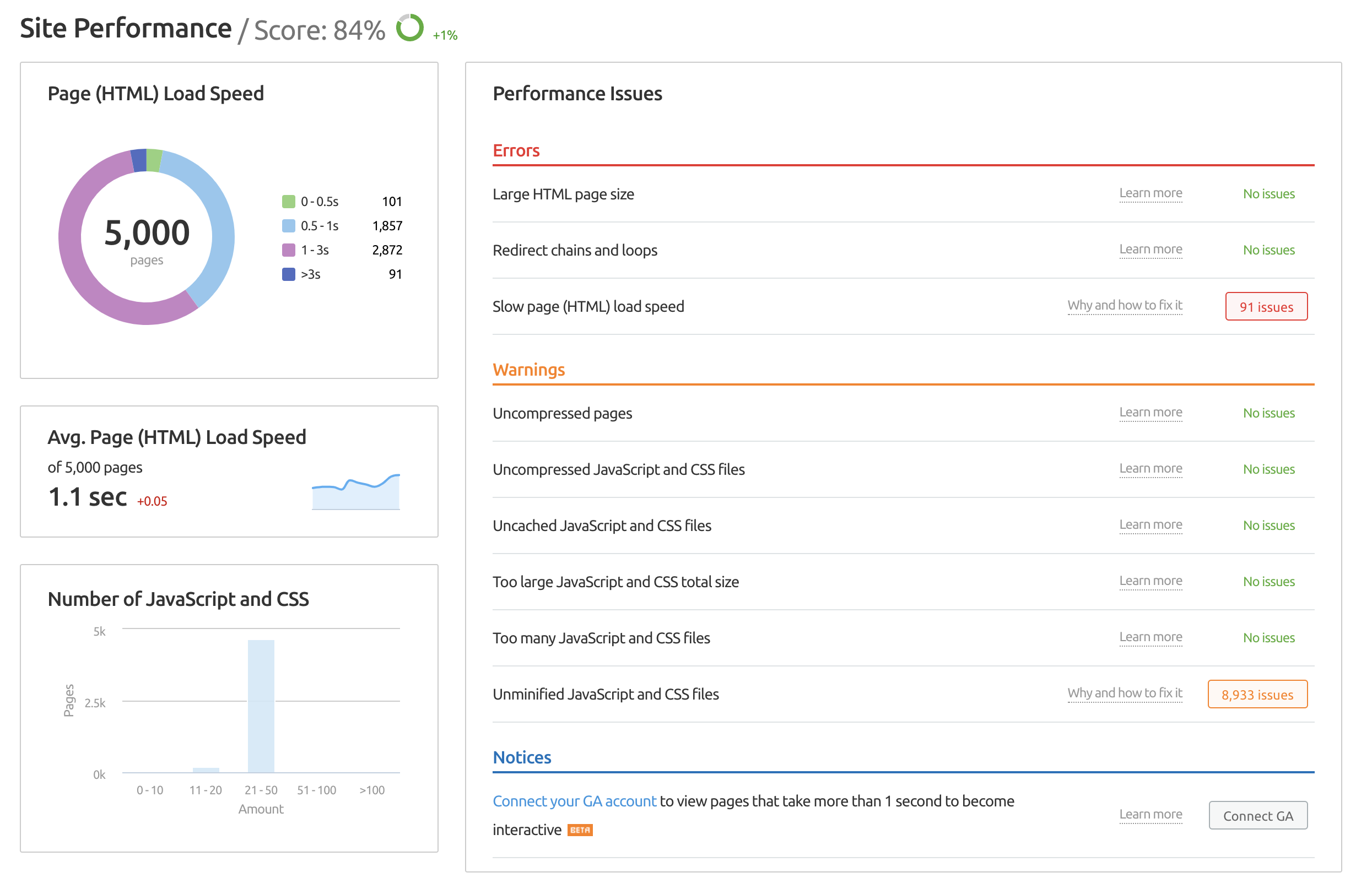
You can analyze your site's speed and related issues using the SEMrush Site Audit tool, specifically looking at the site performance report.
9. Handling Separate Mobile and Desktop Sites
The last point that you need to know, yet by no means the least important, is how to effectively and efficiently handle mobile-first indexing when you have separate mobile and desktop sites.
And while this is becoming less commonplace than it once was, thanks to the rise in popularity of responsive sites, there are still sites that run separate mobile and desktop versions.
So, how do you handle these to ensure you don't fall foul of mobile-first indexing?
Follow these key considerations:
Ensure that you correctly implement rel=canonical and rel=alternate elements between the mobile and desktop versions of your site. Ensure that the robots.txt file on both versions is not blocking key parts of your site from being crawled. In particular, ensure that your mobile site is not blocking crawlers. Carefully check rel=hreflang implementation to make sure that desktop URLs reference desktop URLs and vice versa for mobile URLs. Set up and verify both versions of your site in Google Search Console to allow access to all of your data, warnings, and messages. Ensure that your site's desktop pages have corresponding mobile pages. It is sometimes the case that pages are left out of a mobile version, but in doing this, these pages wouldn't appear in Google's index with mobile-first indexing.That said, Google doesn't recommend Separate URLs as a site setup because it is difficult to implement and maintain. A responsive site is recommended in 2020, but if it is not possible for whatever reason, just be sure to take the time to check the two versions extensively to prevent any issues from occurring.
Mobile-first indexing sounds scary, especially to those who remember mobilegeddon in 2015, but the reality is that if you are already serving an awesome mobile-experience and have ensured that you have got the same content between both desktop and mobile devices, you have got little to worry about.
But mobile-first indexing is here to stay, and the more you can communicate what it means to your designers, developers, and others in your team, the easier it is to address the best-practices that are recommended before they become an issue.
Innovative SEO services
SEO is a patience game; no secret there. We`ll work with you to develop a Search strategy focused on producing increased traffic rankings in as early as 3-months.
A proven Allinclusive. SEO services for measuring, executing, and optimizing for Search Engine success. We say what we do and do what we say.
Our company as Semrush Agency Partner has designed a search engine optimization service that is both ethical and result-driven. We use the latest tools, strategies, and trends to help you move up in the search engines for the right keywords to get noticed by the right audience.
Today, you can schedule a Discovery call with us about your company needs.
Source:


