

14 Influential Infographic Examples to Inspire You
The infographic started to rise as a trend in 2011/2012 when they became popular as linkbait for generating links. They quickly exploded to the point where everyone and their florist was trying to share an infographic that they ‘thought you might want to share’ and ‘please link to me.’
Subsequently, the quality of infographics degraded, and the perception of this style of data visualization was damaged.
‘Infographic’ as a search term peaked in 2015 but still holds strong today.
I’m a huge advocate of infographics and data visualization and was sad to see this beautiful artform ground down and misused.
What is an Infographic?
The very first infographic is sometimes considered as John Snow’s Cholera map in 1854 or William Playfair’s trade-balance time-series chart in 1786. For some, it could be ancient Egyptian hieroglyphics.
What is agreed, is that Infographics have been used to communicate complex information for a long time.
To define, an infographic is a visual representation of information that can be grasped easily and quickly.
Pure data visualization and infographics are graphic design art forms—communication of complex information that is comprehensible and beautiful at the same time.
An infographic is not adding icons or an illustration to a paragraph of text.
What is a Good Infographic?
Creating content for outreach is not about using a medium for the medium’s sake - which is how infographics imploded.
A good infographic starts and ends with the concept and data strong enough to support the content.
If you have valuable data that others will want to cite, then how you present it is almost secondary. A bit like cooking, take quality ingredients and do as little to them as possible. If you start with weak data, then nothing will make it stand up.
Infographics still have the capacity to build great links. But, only when they have the data that is of interest to your audience.
14 Influential Infographic Examples From the Last 10 Years
For inspiration, I will share examples of infographics that were highly influential over the last 10 years.
These infographics were ground-breaking at their time of publishing and heavily imitated in their style across content marketing.
These are all true evergreen pieces of content that keep on giving through links and page views, which is the aim of all great content creation.
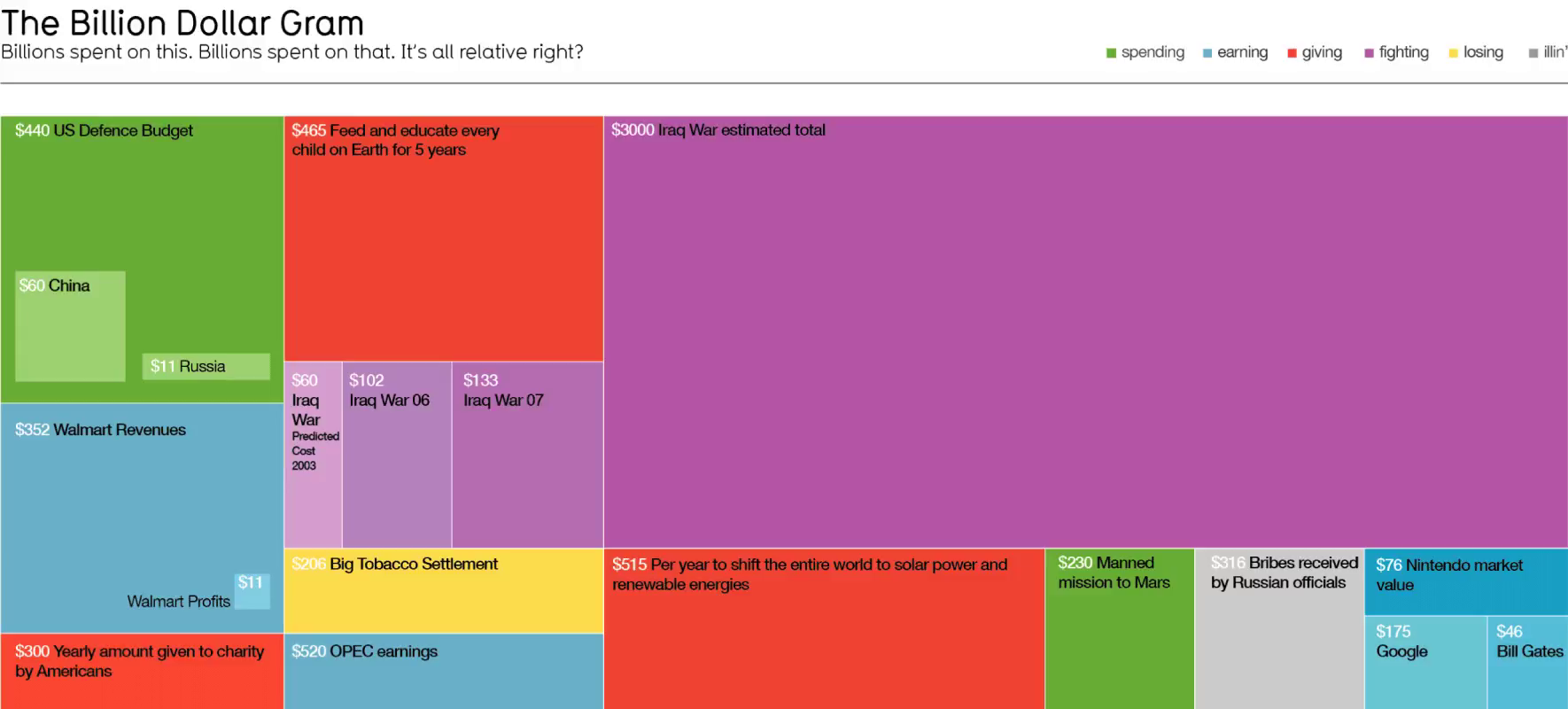
1. The Billion Dollar Gram
David McCandless is perhaps the most well-known infographic designer, and his work is truly brilliant. With a background in journalism for the Guardian, he understands how to take data and communicate a story in a way that a journalist wants to share.
All of his work is presented in the most elegant and beautifully minimalist way.
It wasn't easy to choose just one of his pieces, so I would recommend checking out most of Information Is Beautiful.
Billion Dollar Gram was first published in 2009 and has been updated since. The piece works based on shock through context. If you want to make someone understand and quickly grasp what you are trying to say, then show in context.
Backlinks 2.8k – Referring Domains 367 – Authority Page Score 63
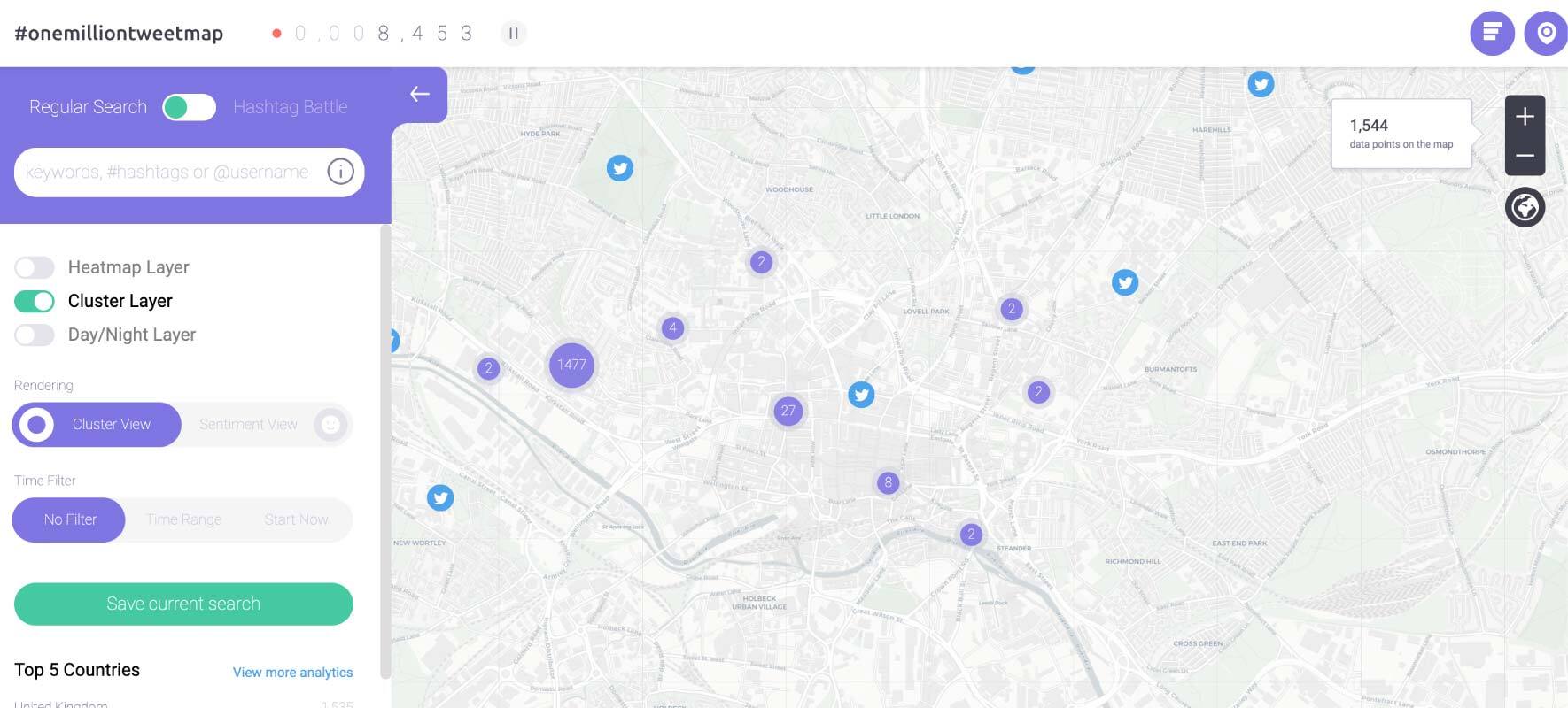
2. #onemilliontweetmap
First published in 2012. Onemilliontweetmap was one of the first infographics to take advantage of API to overlay information onto a live map. And the effect is powerful.
I can drill down to my exact location to see who and what is being tweeted. I can also search for hashtags and keywords.
Maps have become an incredibly popular form of an interactive infographic and can be used to great effect. If you have the right concept and data.
Backlinks 1.4K – Referring Domains 360 – Authority Page Score 65
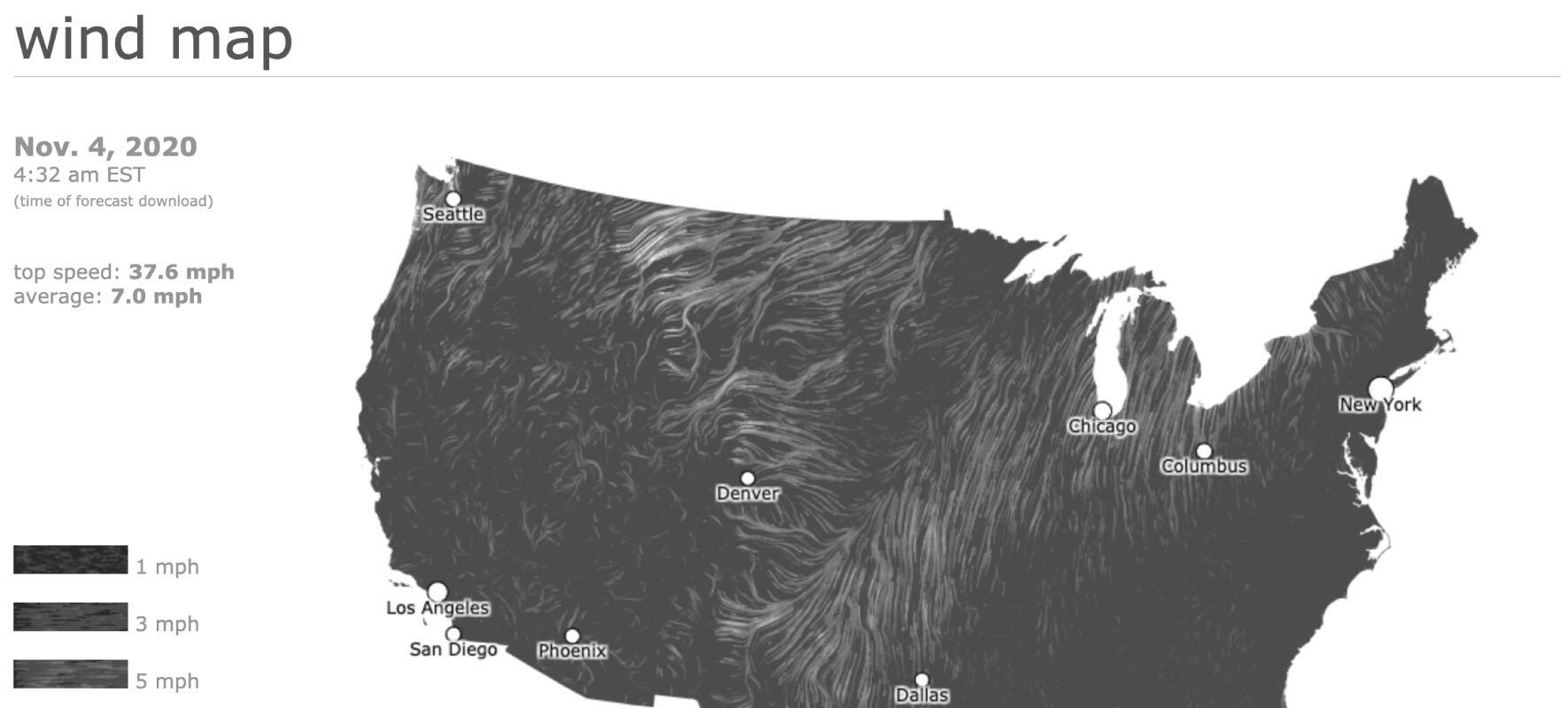
3. Wind Map
Following up with another map is the masterpiece of the Wind Map. Also published in 2012 (it was a great year for infographics), this map shows live data of the direction and speed of winds across America.
It’s mesmerizing. And a prime example of how a simple concept - to visualize wind - can be so powerful.
Backlinks 127k – Referring Domains 3.5k – Authority Page Score 79
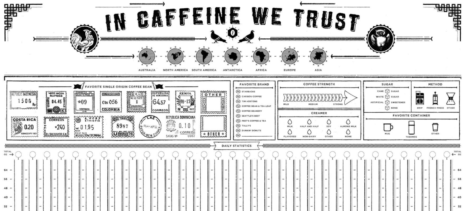
4. In Caffeine We Trust
The brilliance of this infographic is that it combines interactivity in an offline capacity.
In Caffeine We Trust is a printed poster that tracks your coffee consumption. Interaction is achieved by filling in the sections using a brush and coffee. Column Five created this to send to clients as a promotional tool.
At the time, this style of retro design was quite new and still feels fresh today. The secret to great design is to produce a timeless style. And that is not easy.
The publish date of the page is 2014, but I think the page has been moved.
Backlinks 319 – Referring Domains 46 – Authority Page Score 44
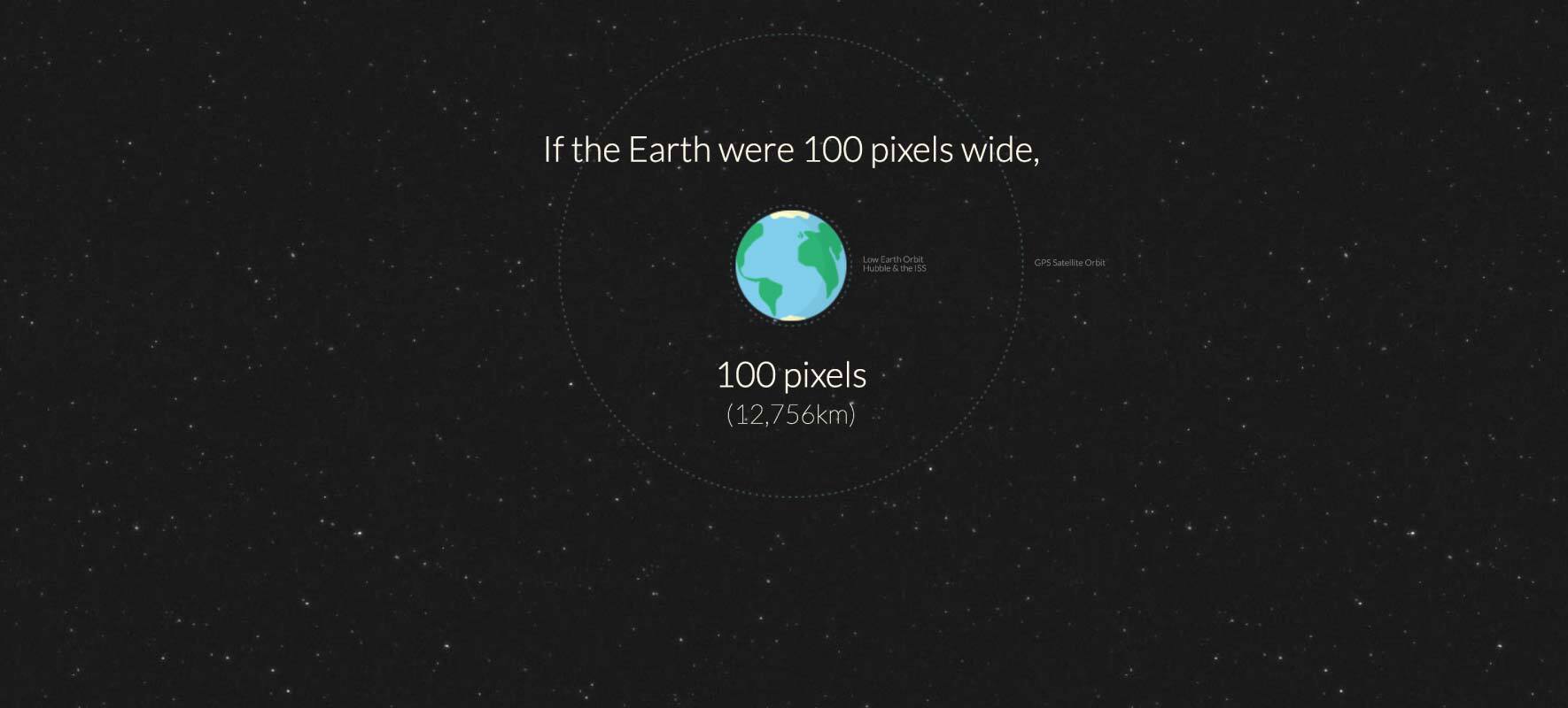
5. Distance to Mars
Published in 2013. One of the original scrolling pages that took advantage of Parallax.
The concept is simple, using scrolling/movement and the context of distance to pixel, to communicate just how far Mars is from the Earth.
There were other similar pieces at the time, such as If The Moon is Only One Pixel, but Distance to Mars was one of the originals.
I will probably keep repeating that putting information into context is the fastest way for a reader to fully grasp and understand. When presenting information, this always should be your aim.
Backlinks 48.6k – Referring Domains 1.2k – Authority Page Score 42
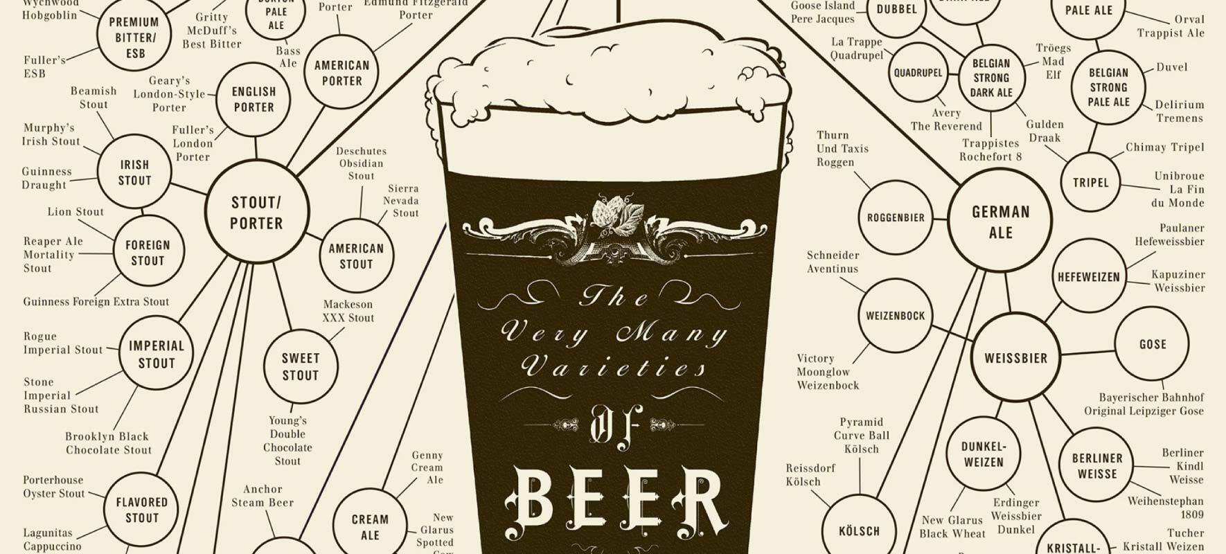
6. The Very Many Varieties of Beer
Pop Chart Labs was founded in 2010, and circa 2011, they started to sell printed infographic posters.
One of the first posters was The Many Varieties of Beer and was a taxonomy based graphic that grouped types of beer. It helped to launch the success of the company and hundreds of their other infographic style posters.
Although this is an offline poster, the simple idea of showing taxonomies has been hugely influential across digital infographic design and copied heavily.
Link data incomplete; the page has moved.
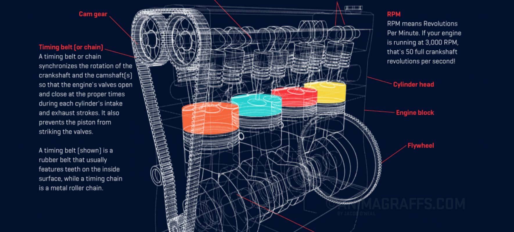
7. How a Car Engine Works
In 2014, Animagraffs blew us away with their complex graphic gifs that showed the framework of how things worked.
With a clear inspiration from Haynes Manuals, this infographic is a masterpiece in making the complex easy to grasp.
Alongside the car engine, Animagraffs also produced How a Handgun Works and, since then, many other engineered items.
Although I said at the beginning not to rely on a medium for content, this is an example where it does work. The wow factor is the presentation and the skill of the animator not easily replicated.
It also helps that the information provided is fascinating.
Backlinks 38.3k – Referring Domains 361 – Authority Page Score 62
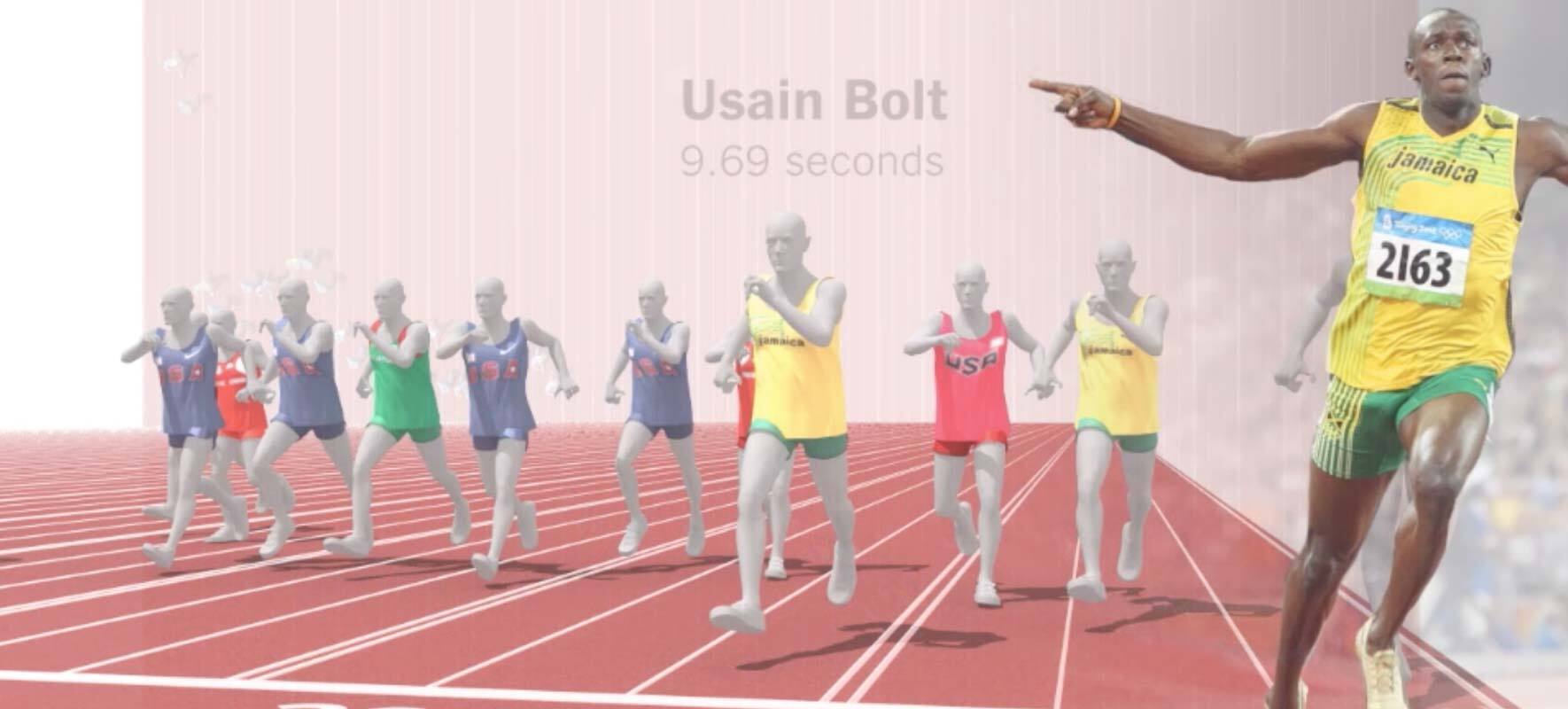
8. One Race, Every Medallist Ever
In 2012, Usain Bolt smashed the 100m world record.
Not long after, the NYT produced this ground-breaking infographic.
The combination of concept, content, and animation was astounding.
To compare all the winners of the men’s 100m race through history showing the evolution of man’s progression. A simple and powerful visual.
The most impressive part of the visualization is the motion graphic that shows the runners on a track. The birds-eye view really conveys just how much faster sprinters have become.
Part history lesson. Part record of news. This is how to present information.
Backlinks 56 – Referring Domains 30 – Authority Page Score 27
Link data incomplete - the page has been archived.
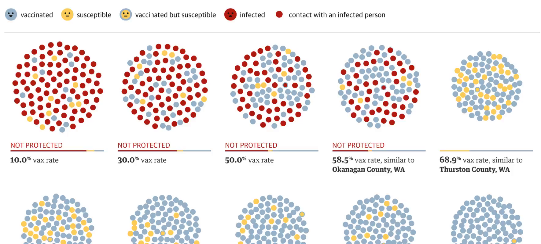
9. How the Measles Outbreak Spreads
The measles vaccine is a contentious issue with a lot of misinformation.
This infographic cuts right through the misinformation and makes its case by presenting facts.
Such a basic graphic instantly conveys what the impact of a vaccine on society and makes its case for vaccination better than any argument could.
Simple. Elegant. Powerful. Watch out for the animated red dot.
Backlinks 461 – Referring Domains 138 – Authority Page Score n/a
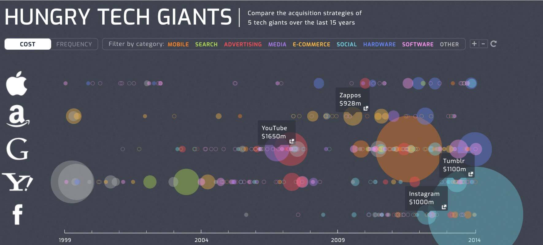
10. Hungry Tech Giants
A prime example of how to use data from a niche industry.
Why do people place links? Usually, it’s as a citation or reference to information. If you have a curated list of information, like an index or a list of major tech acquisitions, this has value for others writing/researching the subject.
The page looks relatively simple at face value, but there is actually a lot of research here.
Hungry Tech Giants is fundamentally a curated list but presented in a visual way. First, it has information you can reference, and then it looks great—a winning combination.
Originally published in 2014, It would be useful to keep refreshing the information on a page like this. Every time there was a major acquisition, the page could be promoted again.
Backlinks 525 – Referring Domains 128 – Authority Page Score 62
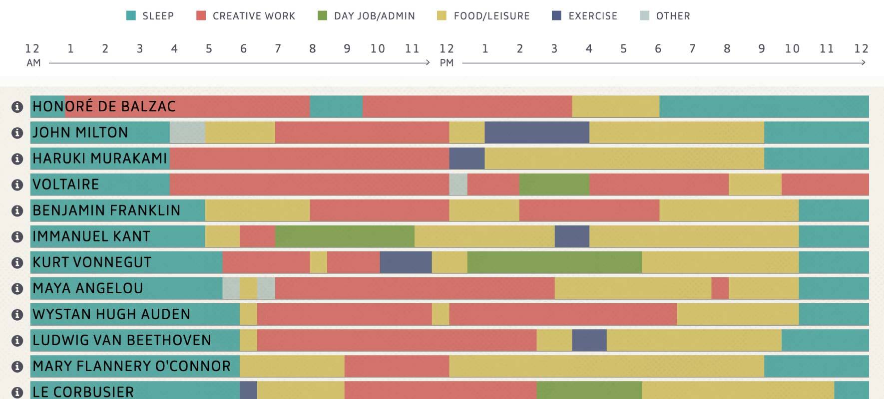
11. The Daily Routines of Creative People
Published in 2014, this infographic was the start of various pieces that focused on routines and simple stacked bar chart presentations.
All good infographics start with a quality data set, and this one was fortunate to find theirs in an existing book. Finding or creating a unique data set is most of the challenge, so it's a real treat when you are the first to ‘discover’ a data set no one else has used.
And because the data is so strong, the more simple and elegant the visualization, the better.
Backlinks 7.9K – Referring Domains 911 – Authority Page Score 65
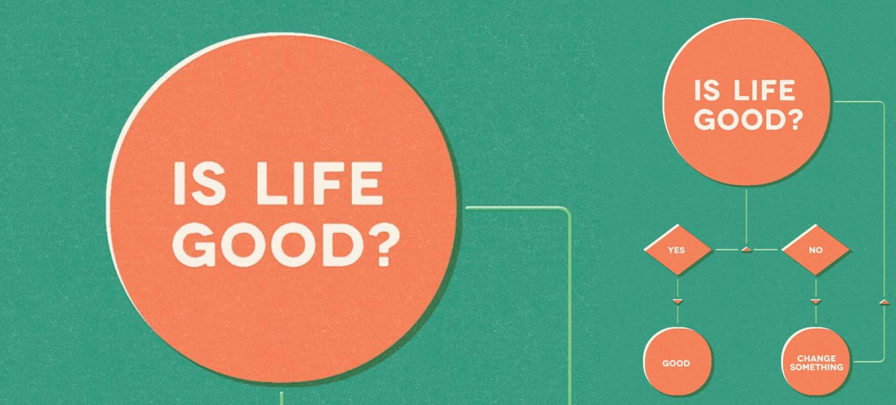
12. How to Be Happy
I’m a huge advocate for simplicity. And as any good designer knows, the more you remove, the more something has to stand up for itself. Minimalist design is hard.
How To Be Happy could be considered a meme combined with an infographic, and it sums up everything about a timeless concept.
Flow charts are one of my favorite types of charts, and this one stripped to the basic essence of all that matters could not be more poignant.
As this shows, you just need a strong concept. No frills.
Created by Gustavo Vieira Dias, circa 2013, this page is possibly the source, but link data is incomplete.
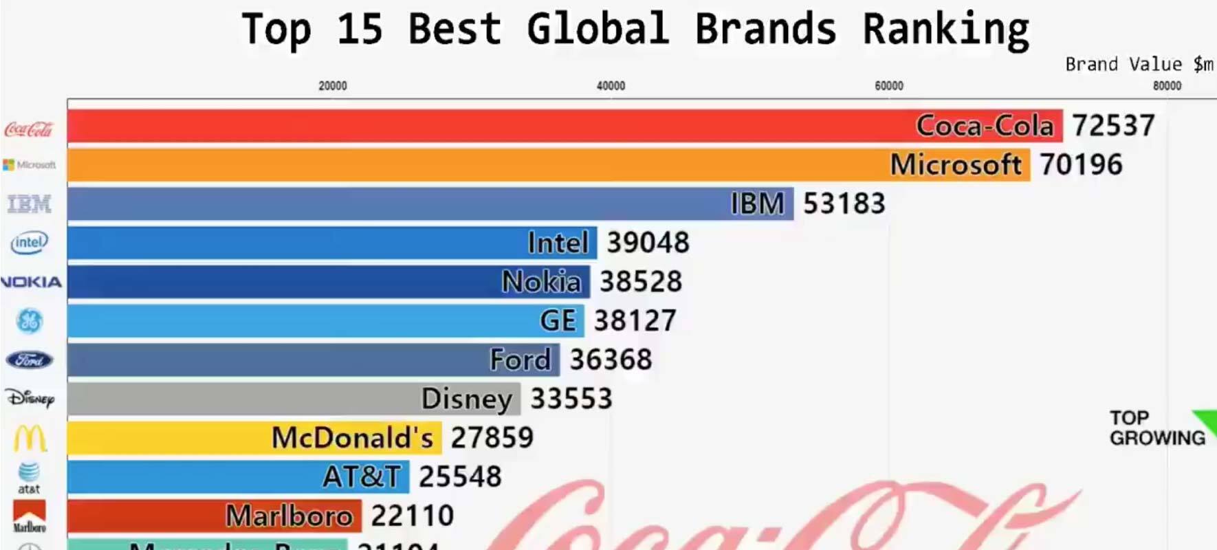
13. Top 15 Best Brands Global Ranking
The biggest development in infographics in the last few years was the bar chart race.
In 2019, possibly, the first bar chart race appeared in a tweet and went viral with 13.7k retweets.
Following this were endless copycat bar chart races, but Best Brands Global Ranking remains the best example.
Again, it relies on strong data with real interest and is executed in a simple visual way (there’s a theme here).
Ideas to think about here are what data has changed over time that you can visualize.
There isn’t a page we can attribute to this infographic as it only ever existed in a tweet. Link counts are for the tweet.
Backlinks 77 – Referring Domains 26 – Authority Page Score n/a
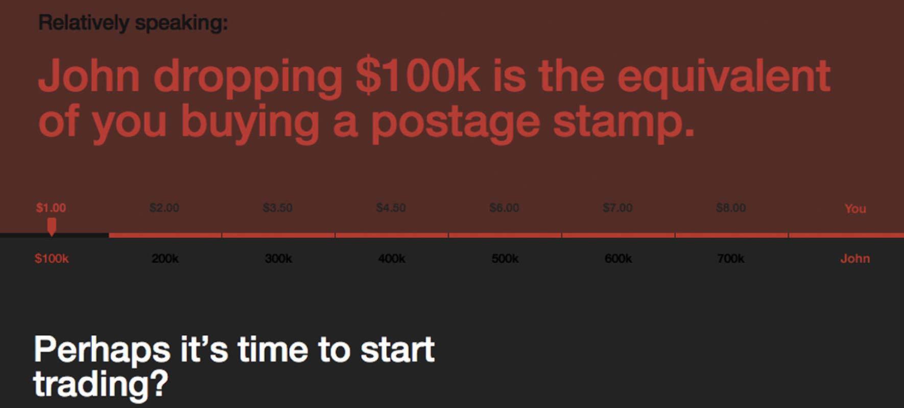
14. You vs. John Paulson
I’ve saved one of the best for last.
After the financial crisis of 2008, the huge sums of money that traders and bankers were making became the focus of much anger.
What any audience thinks is important more than anything else is themselves. If you can connect your content to your audience, you have a hook. When a user can benchmark themselves to others, it’s irresistible.
This interactive piece is actually a relatively simple calculation but looks complex. And the minimalist simplicity of the bold typography frames it perfectly, suiting the topic.
You vs. John Paulson was the catalyst for so many other copycat interactive calculators, but this remains forever the best.
First published in 2011 on the home page (as a classic linkbait and switch) before the site was launched. Possibly, one of my all-time favorite CTAs at the end of the infographic – ’perhaps it’s time to start trading?’.
Backlinks 1.7k – Referring Domains 99 – Authority Page Score 52
All screenshots were taken in November 2020. Backlink data taken from the SEMrush Backlink Analytics Tool.
Innovative SEO services
SEO is a patience game; no secret there. We`ll work with you to develop a Search strategy focused on producing increased traffic rankings in as early as 3-months.
A proven Allinclusive. SEO services for measuring, executing, and optimizing for Search Engine success. We say what we do and do what we say.
Our company as Semrush Agency Partner has designed a search engine optimization service that is both ethical and result-driven. We use the latest tools, strategies, and trends to help you move up in the search engines for the right keywords to get noticed by the right audience.
Today, you can schedule a Discovery call with us about your company needs.
Source:


