

While they all serve one purpose, product pages across eCommerce stores can look very different from one another. Some offer fancy and complicated layouts; others opt to keep it simple and focus on having a more significant impact on conversions.
However, product pages are not given as much love and attention as they should. Many companies are investing an awful lot of time and resources into A/B testing different layouts and user experience. After all, they are perhaps the most crucial conversion point on any eCommerce retailer's online store.
To help you to feel inspired, we have rounded up 14 of the best product page design examples that we could find, looking at the layouts of some fantastic brands and businesses.
Specifically, we'll look at:
The Importance of Your Product Pages What Makes a Great Product Page? 14 Product Page Examples You Need to Know AboutThe Importance of Your Product Pages
Let's get one thing out of the way.
Your product pages have the potential to make or break your store's sales, as well as the effectiveness of your marketing efforts.
Use a well-structured product page that makes it easy for site visitors to purchase from you, and you can enjoy increased revenues from the same marketing performance. But get this significant page wrong, and you will be missing out massively on sales that would otherwise have converted.
As consumers, we have become inherently used to unique experiences across the web in recent years. And we often associate sleek and impressive design with trust. And eCommerce marketers are going to be working hard to gain a potential customer's confidence.
Do not underestimate the importance of your product pages. Many do, and you should use this to your advantage and turn them into your store's secret conversion weapon.
What Makes a Great Product Page?
You are probably wondering: what makes a great product page?
To answer this, we first need to understand the purpose of these pages in a customer's purchase journey.
Your product pages exist to give a potential customer the information they need to decide to buy an item from you while doing so clearly and effectively.
But what should you include as standard on your product pages? As far as we are concerned, these are the must-haves you should not overlook:
A clear CTA (call-to-action) Amazing product photos and images Visible product variations Pricing information Product information Shipping information Sales-focused copy Product reviews and social proofBut where the magic happens is when you take the time to present these elements in a way that engages your audience and makes them want to buy your products.
When you can effectively communicate your offering in a way that buying feels natural, you can win big. It is when your product pages are boring or difficult to use that you'll struggle to convert browsers into customers.
14 Product Page Examples You Need to Know About
If you want to create the best product page experience for your customers, you need to be continually A/B testing different layouts and making improvements.
If you are not doing this, you stand a good chance of being left behind by the competition.
Be the business that continues to make small but regular improvements, and you will come out on top.
But to give you ideas and inspiration on things that you can try out yourself, here are 14 of our favorite product page designs that we hope will leave you wanting to make changes to your own store's templates right away.
1. Apple
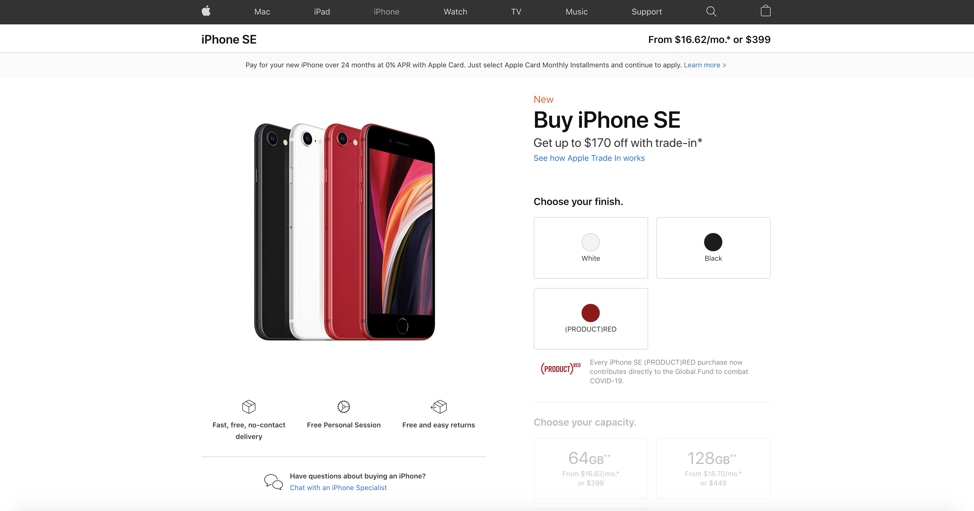
Apple is all about customer experience, and their online store is no different. Their product pages combine a simple yet highly effective layout with the vital information that you need to make a purchase.
If we take a look at the product page for the iPhone SE, we can see just why this is such a great example.
Despite being available in multiple different configurations of size and color, the tech giant has chosen a single page that heavily focuses on the finish and capacity. Another thing that we love is Apple's focus on using the attention that people give the page to call out a trade-in offer.
Please go check out their product pages; they are as inspirational as the products themselves.
2. Gymshark
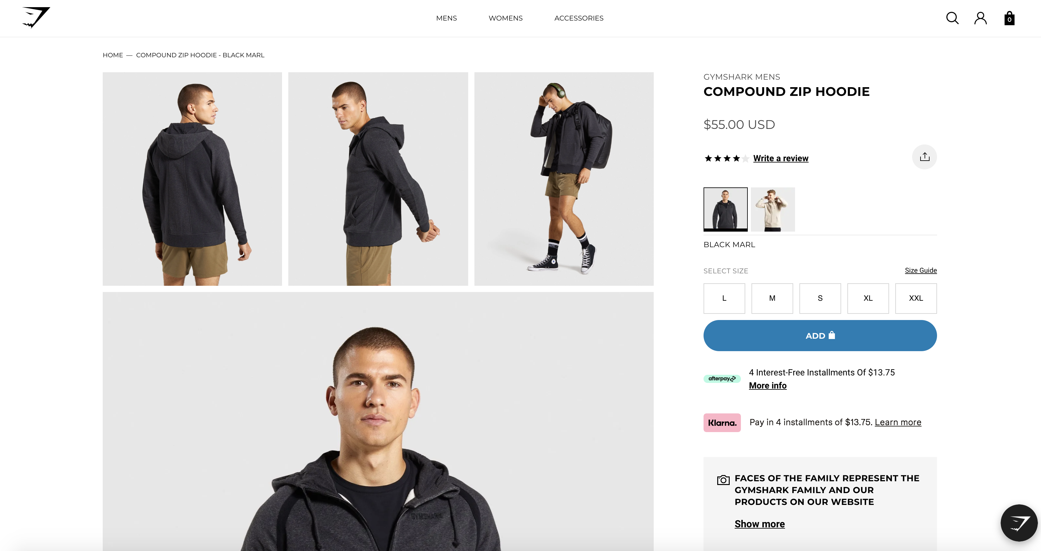
Fashion has found its way online in recent years, but one thing that is often missed is the experience that is found when shopping on the high street.
If you choose to buy online, you cannot try on items and style them on yourself. This means there's an inherent need to rely upon fantastic imagery to help you to visualize a product on yourself.
But that is not all.
Precise sizing, color variants, and payment options are all essential when selling clothing online. Gymshark does a fantastic job presenting an engaging product page that is led by the right balance of images that do the product justice and serve a purpose.
Take a look at the product page for the brand's Compound Zip Hoodie and enjoy the experience for yourself.
3. Leesa
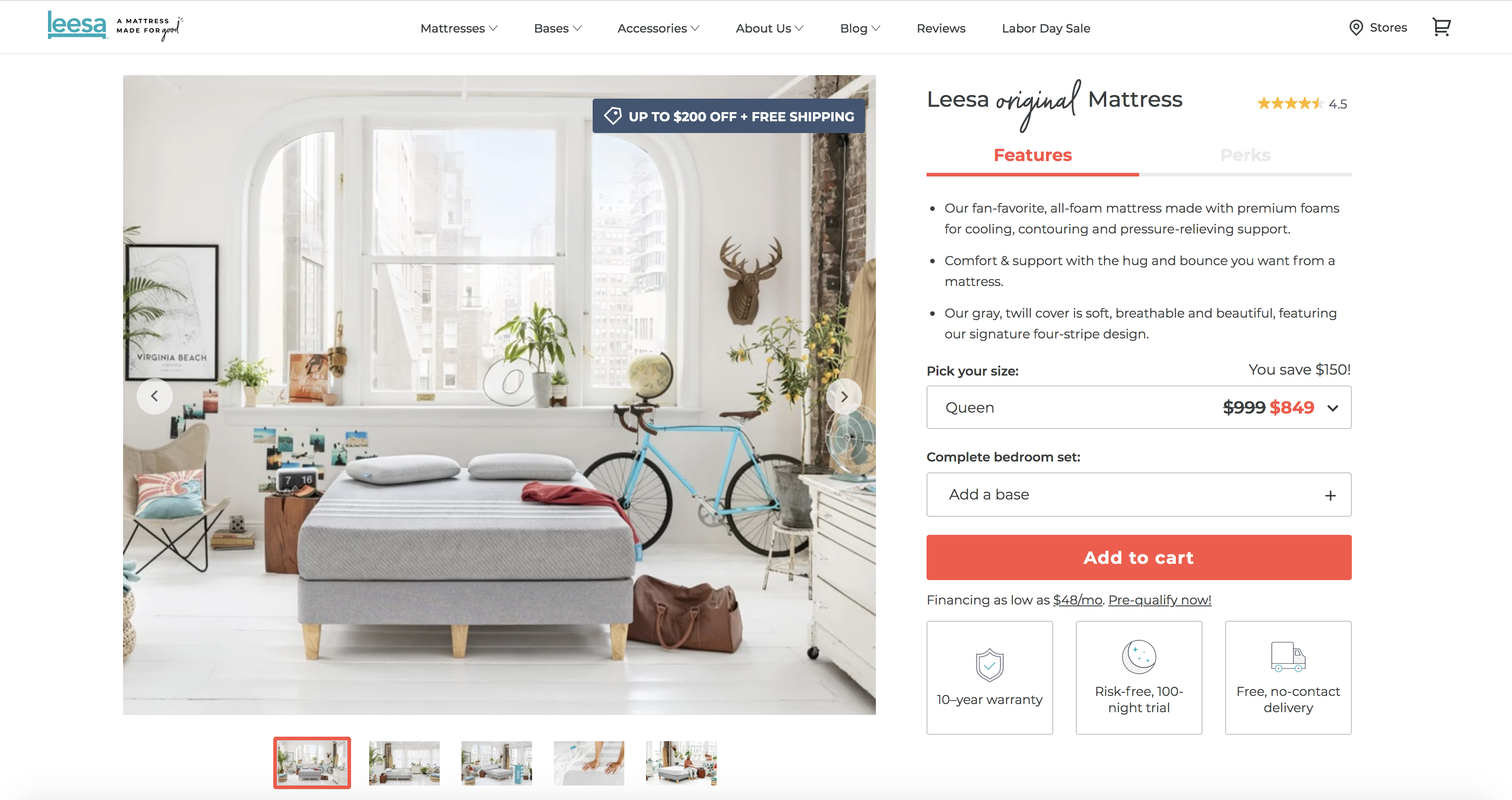
When buying a new mattress, you are essentially investing in getting a better night's sleep.
And this is another product that, when buying online, you are not able to try out yourself for comfort.
But the perfect example of a brand that has nailed its product page in this space is Leesa. Their online store perfectly portrays features, perks, and photos (in a lifestyle setting, something that is so important for helping you to picture the final look and style) with sizing options, unique selling points, and even an obvious highlight on available discounts.
The product page for Leesa's Original Mattress sells a better night's sleep perfectly... ?.
4. Anova
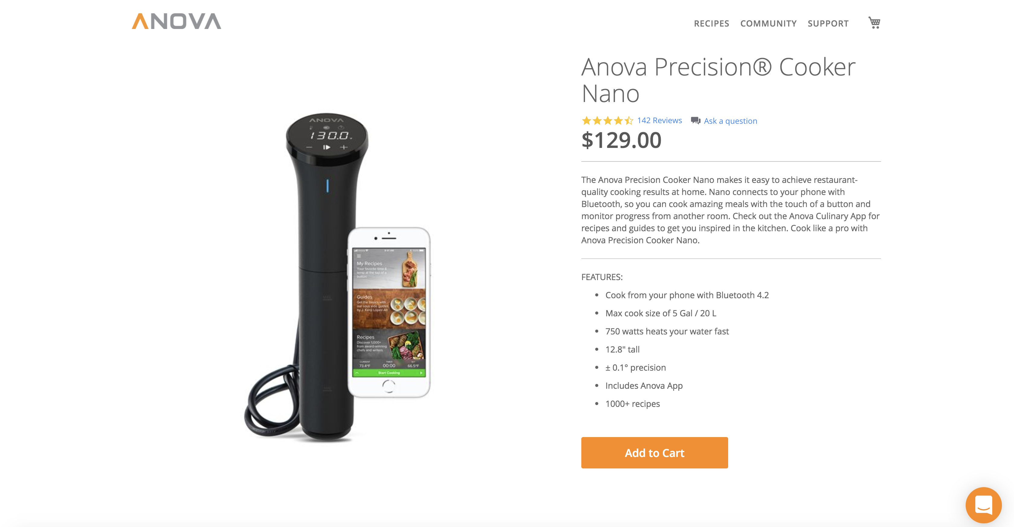
Sometimes, a product page can be simple yet still be useful, and this example from Anova is the perfect example.
Now, there is a good chance you don't know Anova or their products, but they are a leading brand of upper-echelon cooking equipment.
These product pages aren't over the top, nor are they massively exciting, but they very clearly explain the product. If you are buying one of these devices, you know what you are buying. You have already done your research.
So the product pages need to serve one primary purpose, and that is to take a visitor and encourage them to add the product to their basket. The clear standout elements here are an impactful product image, and the 'add to cart' CTA, and the price, which is conveniently situated right alongside a review rating.
You do not always need to overthink your product pages.
5. MVMT
Another example of an entirely simplistic product page design is MVMT.
There is a clear focus on the product itself, just as you would expect. But, interestingly, far less of an emphasis on the price. It is evident that these guys are selling by creating a desire for the product itself, and when you can portray this to your audience, the price becomes a secondary consideration.
Understand what the one thing is that matters the most to your audience and emphasize it, and we can see this done brilliantly on the product page for the MVMT Blair watch.
6. Boohoo
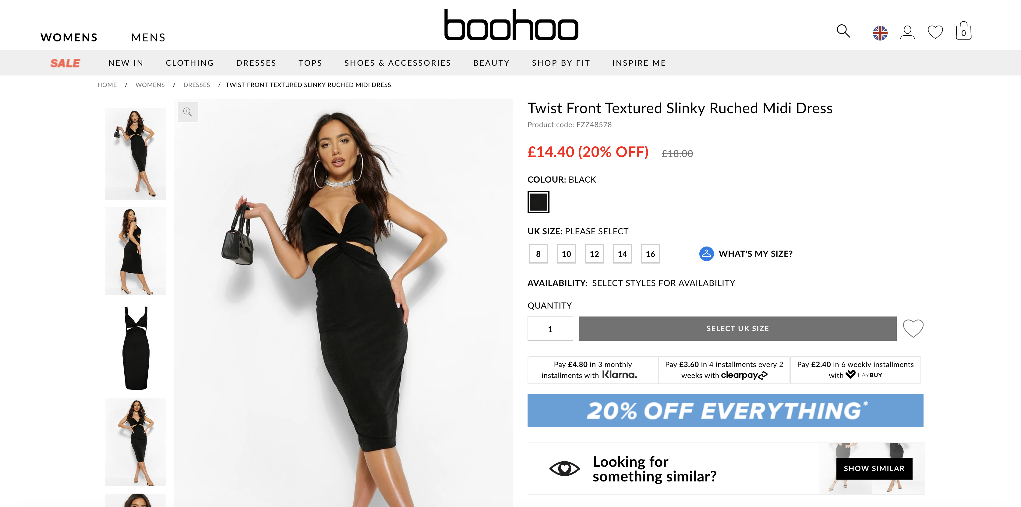
In contrast to some of the other examples shared here, Boohoo's product page is busy.
But what is the one thing that stands out?
The '20 % off everything banner,' we'd guess.
For a brand such as Boohoo, they are known for all-year-long sales and discounts. This example shows another brand that understands its audience perfectly.
Boohoo's customers want discounts, so they emphasize this alongside a great selection of photos that show as much detail as possible, clear payment plan options, and the actual price you will pay.
7. Kombu
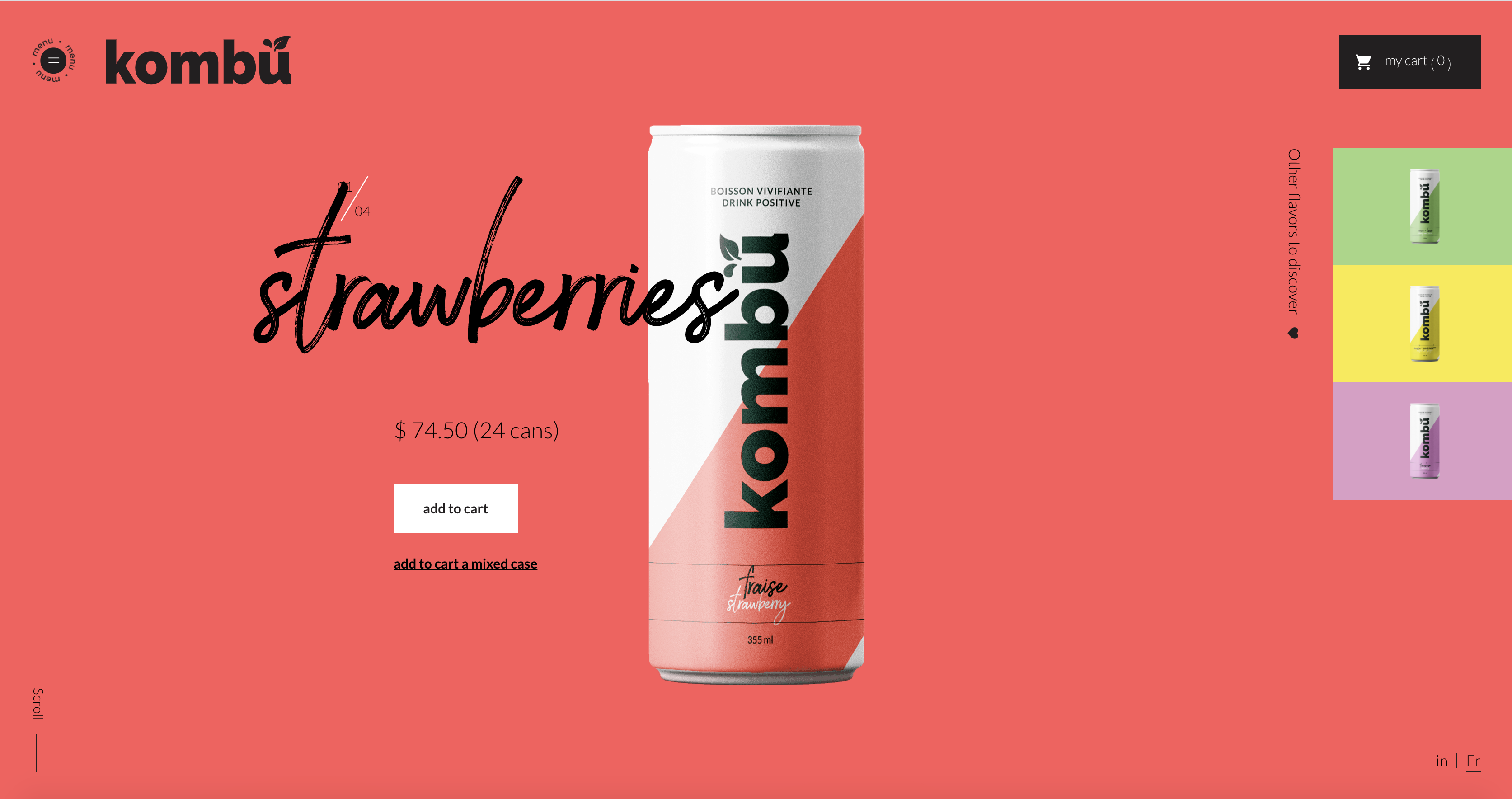
This example from Kombu is stunning and is an excellent example that shows you do not always need to conform with what is expected as the 'normal' product page.
Dare to be bold and do something that stands out if your brand allows for it.
If we dig a little deeper, we can learn an awful lot from this layout about the product, perhaps without even realizing there is so much going on until we stop to think.
Every pixel has been well thought out to create a simple yet bold design that demands attention. It is not your standard product page, but it certainly makes the cut as an inspiring design.
8. On
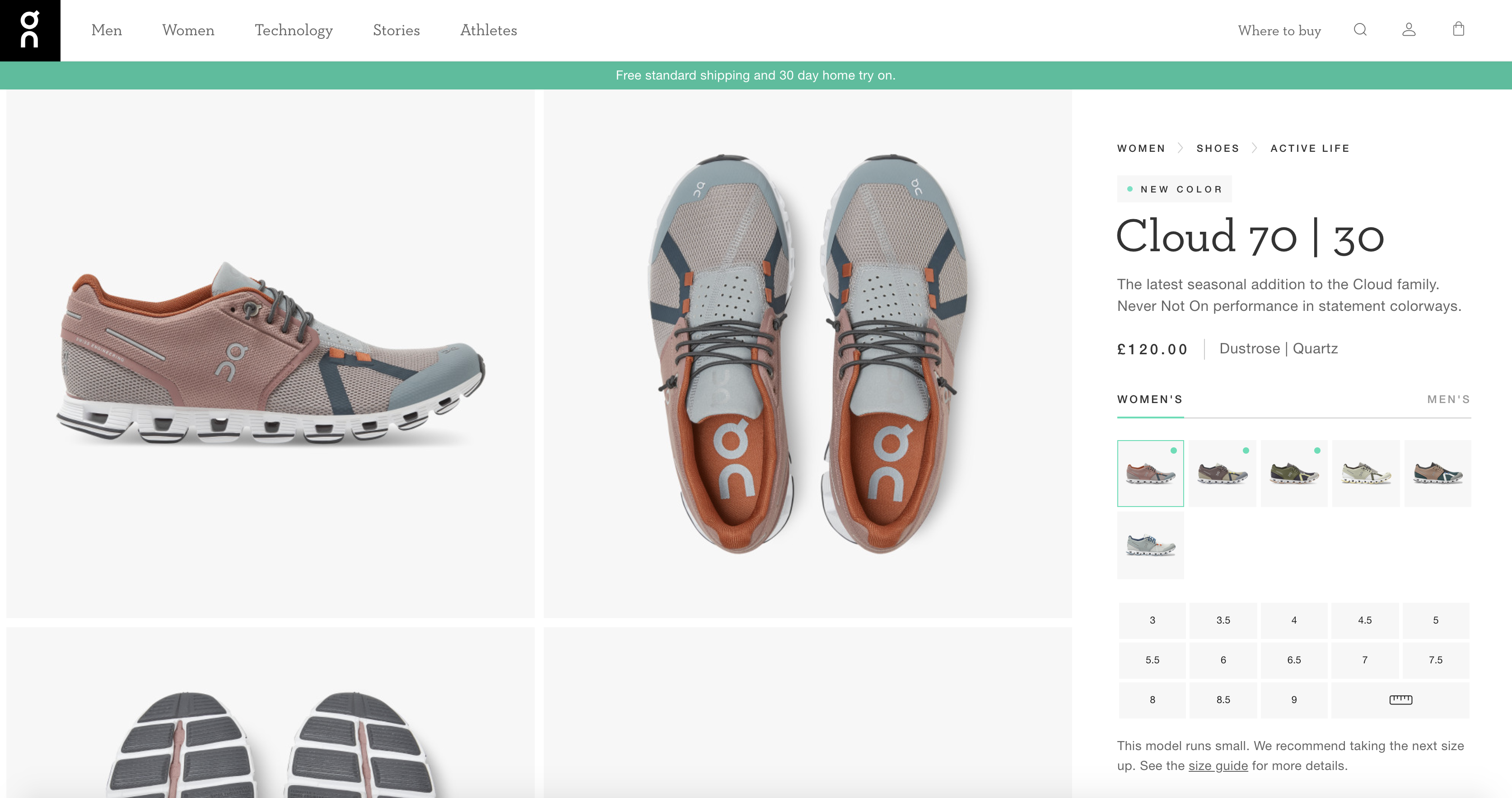
When you are selling products that offer lots of customizations, you need to think carefully about how you present this to your customers without sacrificing a focus on the product itself.
And the product page for On's Cloud 70 running shoe does a great job of this.
But you can quickly see that there are six different color variations and a whole host of sizes available. It is clear, and it is simple without taking away from the product.
However, the little extra detail which probably works far harder than you might think, is the line under the size selector that says, "This model runs small: We recommend taking the next size up." It's simple, but it builds trust and presents the consumer with important information before continuing through their purchasing journey.
9. Barner
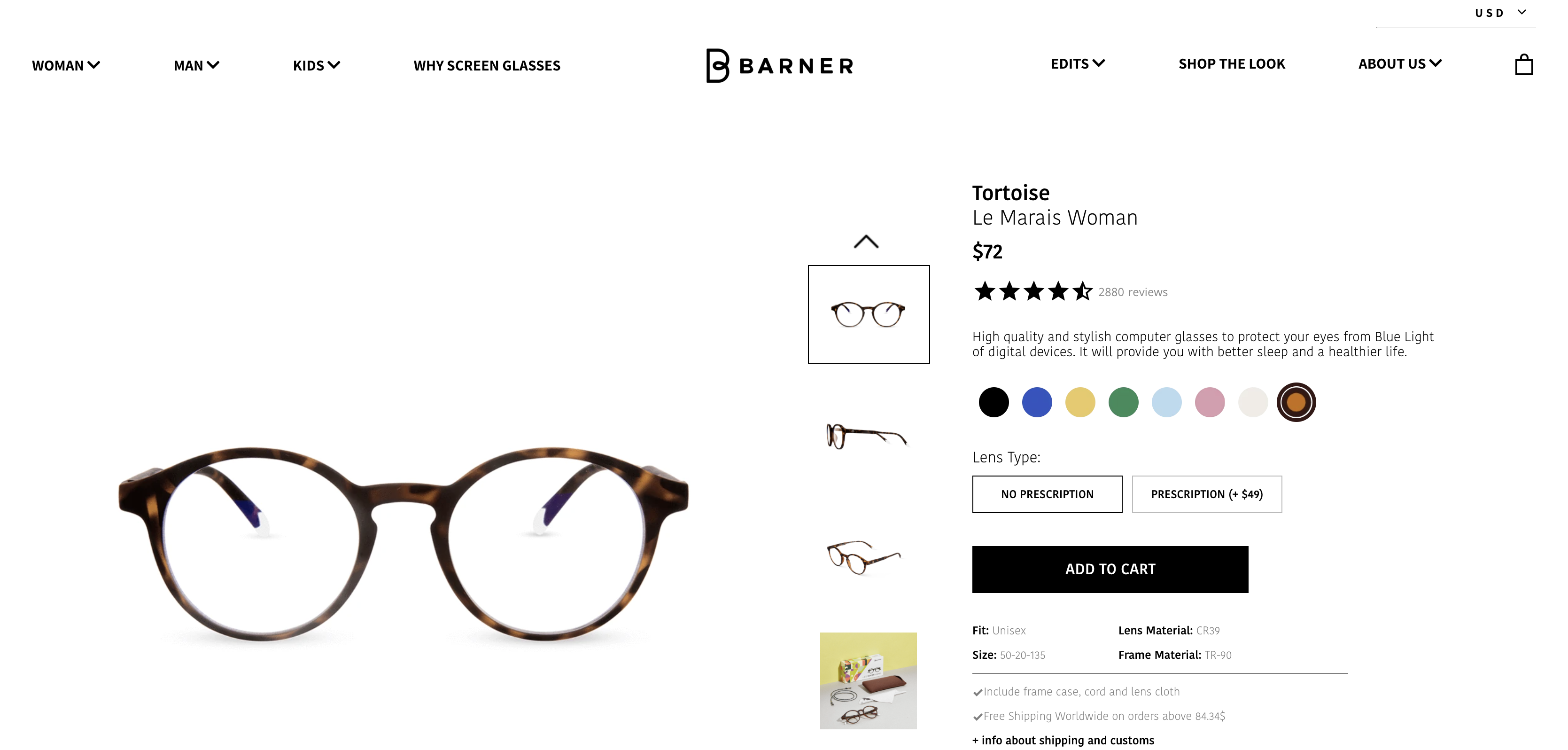
Another simple but striking example: online glasses retailers. People who wear glasses want to ensure they know exactly what they are buying and know that it fits and looks good. Barner has taken the time to think about how they can best present their products, as well as to showcase the key selling points, and offer several options creatively.
If we take a look at the product page for Barner's Tortoise Le Marais Woman glasses, it does not take long to conclude that they have thought through all those glasses shoppers would want to see.
10. Silver Cross
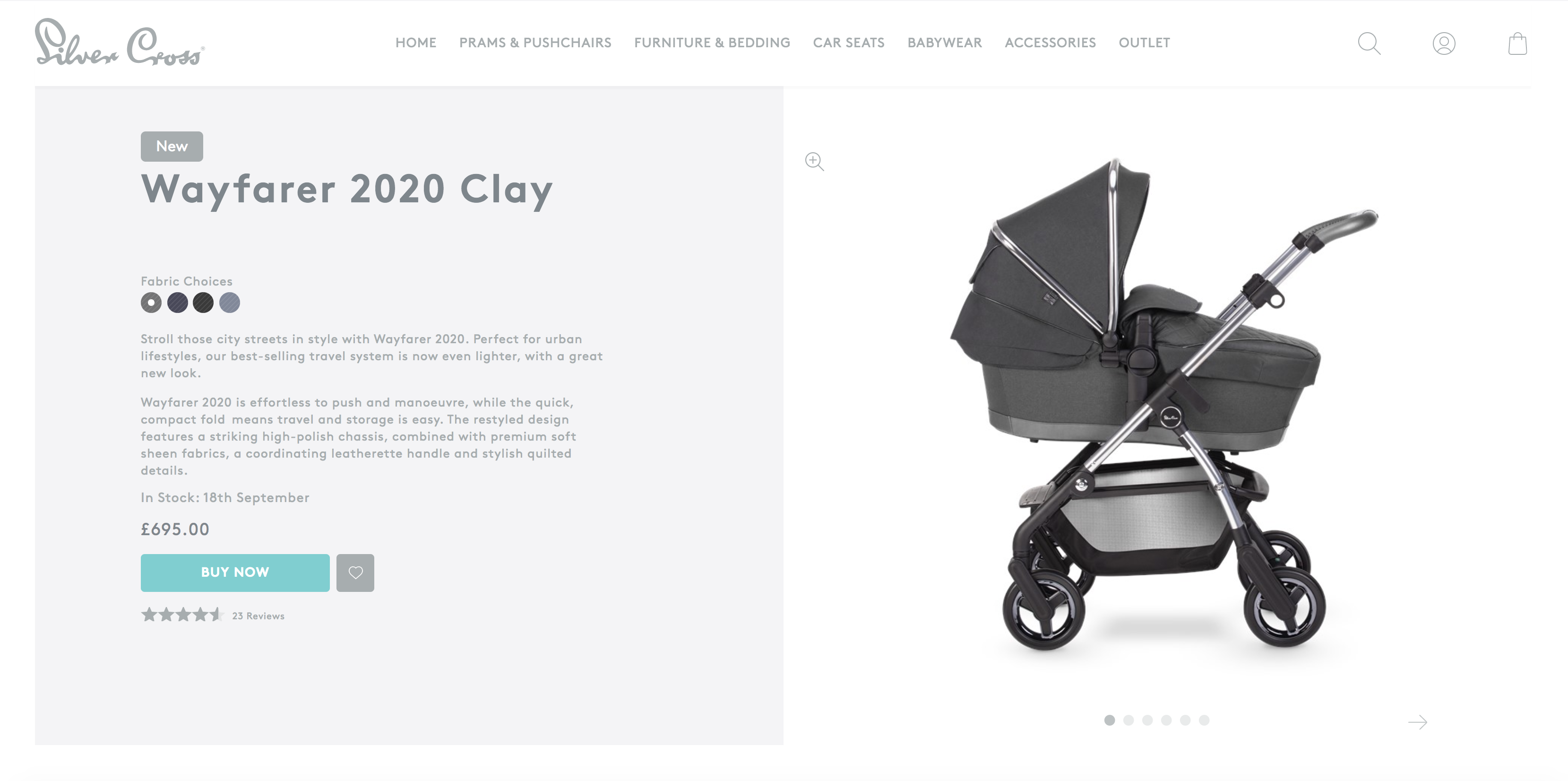
Where are your eyes drawn on this product page?
Most likely the incredibly impactful photography.
And the product page for the Silver Cross Wayfarer provides the information that you need to want the product and nothing beyond this.
Focus your audience's attention and make it clear what you want their next step to be. And here, a 'BUY NOW' button in a highly contrasting color does the trick nicely.
11. Garmin
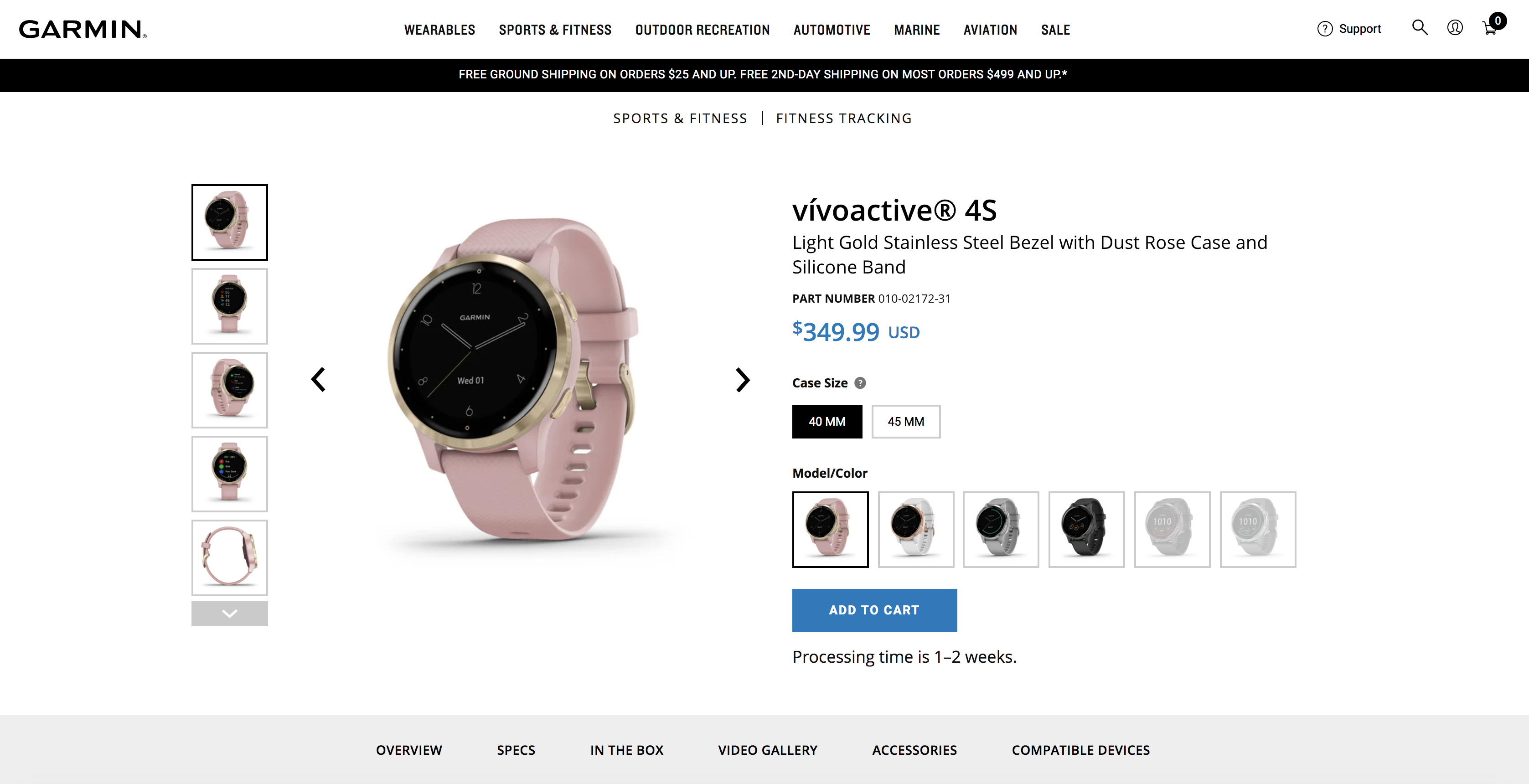
Here's another example, this time from Garmin, of a product page that understands the different audiences who will likely be considering making a purchase.
It is unlikely that someone would be buying a product like this without doing their research, and so the page primarily focuses on the elements that mean something to a visitor—things like color and size options.
But that is only above the fold; head further down the page, and you are served with all the information you might need to know to help you make a decision. From specs and videos to suitable accessories and compatible services, Garmin has you covered.
12. Made.com
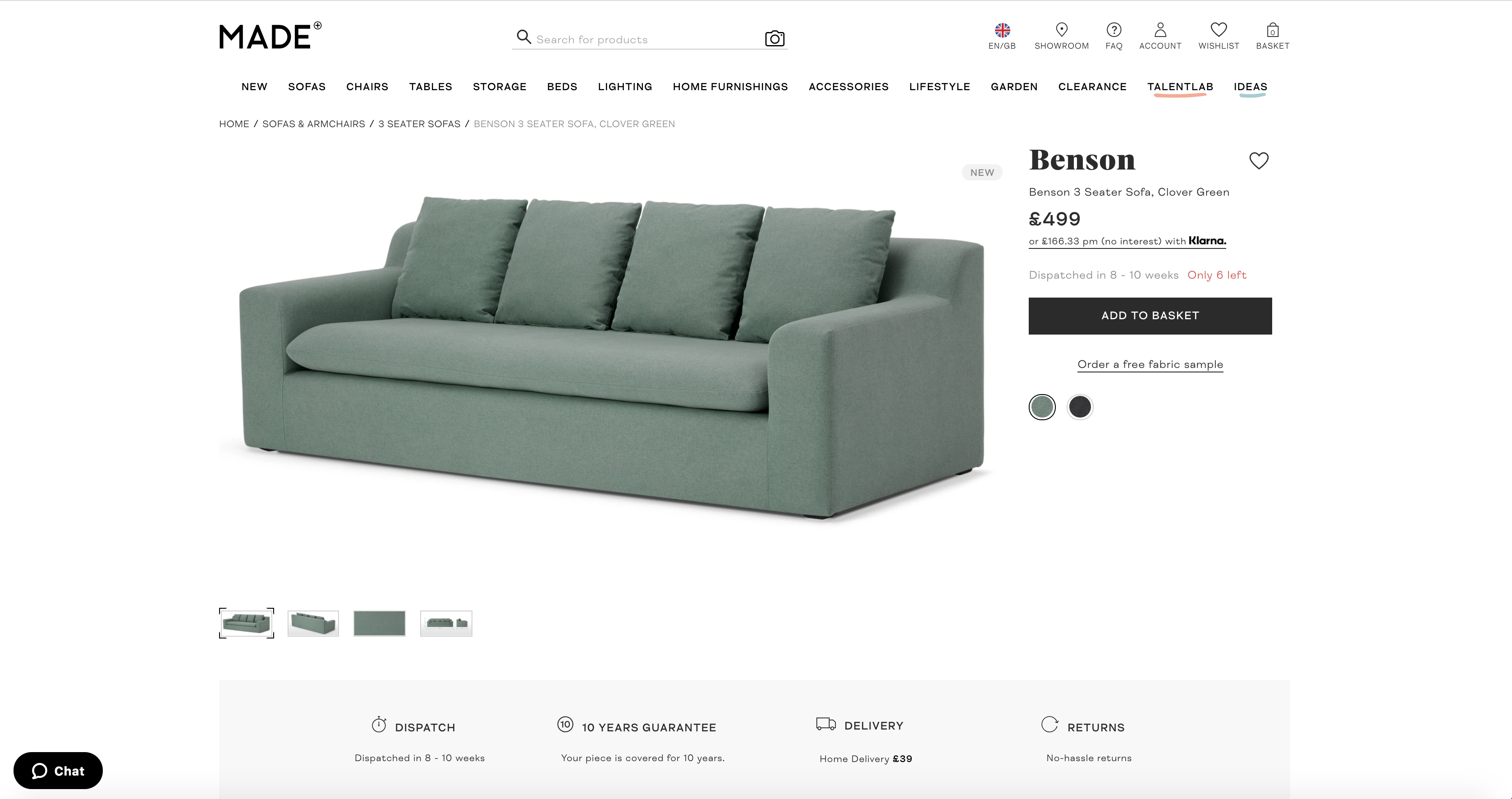
Great images sell products in eCommerce. That is as simple as it gets.
The quality of your product's images can have a significant impact on your visitor's perception of your offering. By having eye-catching, high-quality photos, and visuals, you can help to focus attention on your product.
You need to give a great first impression to your customers, even if they are browsing. In this case, an example from Made.com helps give inspiration on how to make your images as large as physically possible without compromising on the other important information you need to display.
13. Zara
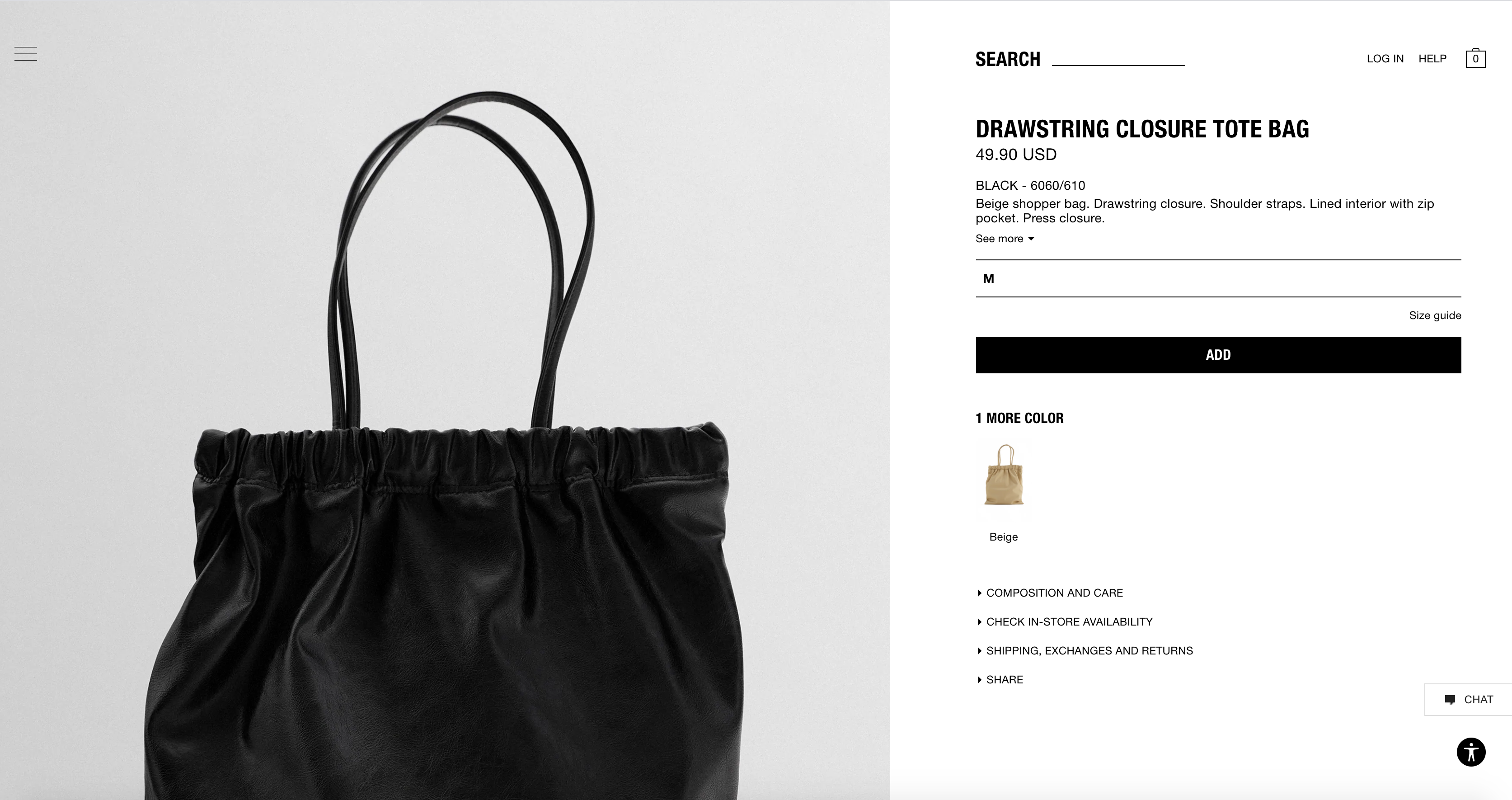
It is rare to see product images that span the full height of a web page, but the Zara website might be the one that changes your mindset.
You need to make sure that you grab your customer's attention and keep hold of it. Otherwise, you are not going to land that sale.
But every online store is different, as is everyone's audience.
Sometimes it pays to be bold and different to stand out from the crowd, but you do not want to go and make changes like this on the fly. Make small, but measurable. Changes to your layouts and get that perfectly converting product page.
14. Amazon
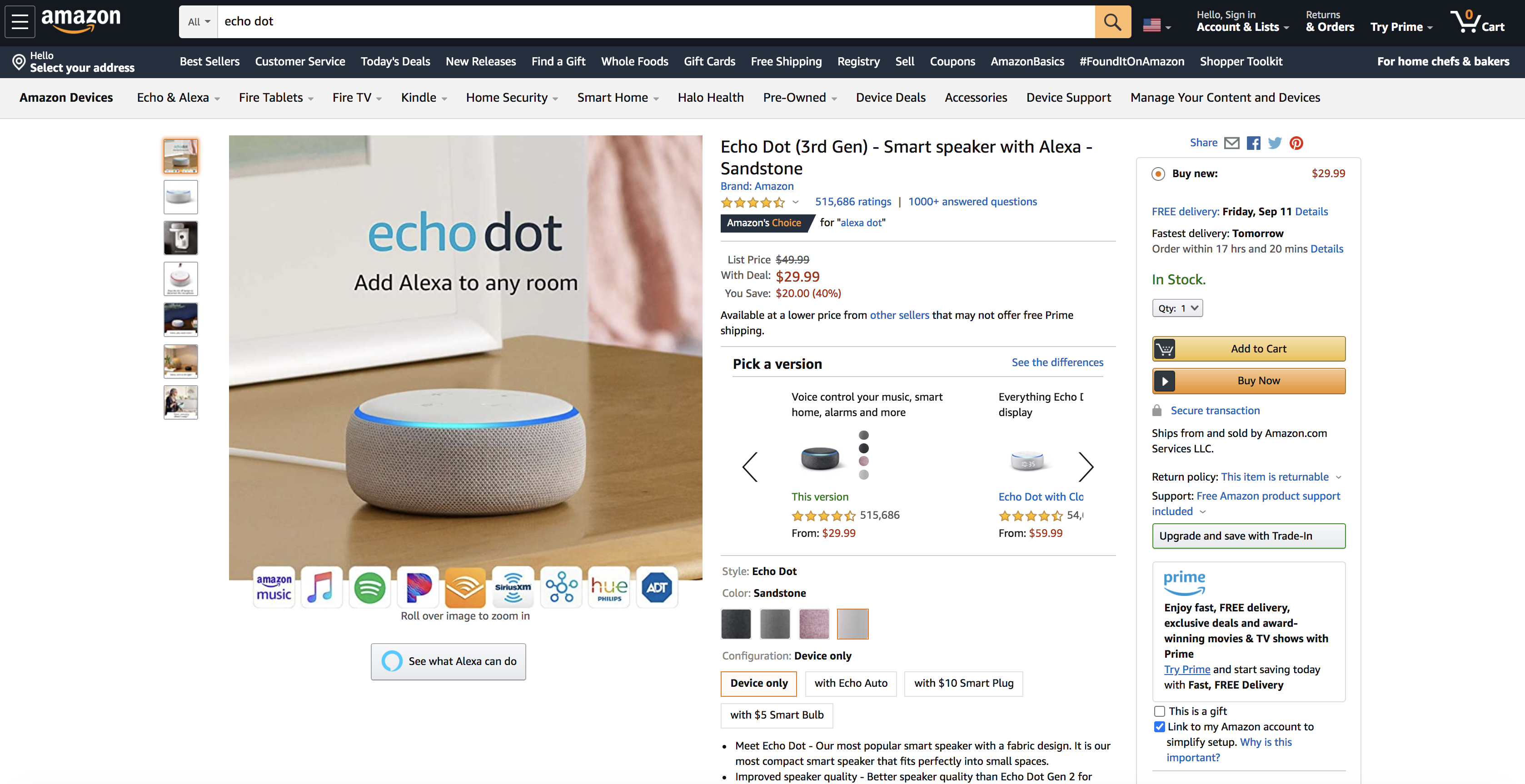
How could we round up the best product page examples without mentioning Amazon?
Amazon is the no. 1 threat that many online eCommerce businesses fear, as it has managed to dominate pretty much every market imaginable. Plus, they have built up an unprecedented level of trust that many others have never developed.
But it is not necessarily pretty, and it probably won't be winning any design awards and time soon. However, for the purpose that it has, it works.
A lot is going on, and if we take a look at the product page for the Amazon Echo Dot, we can see this.
That said, you can bet that the brightest minds in CRO, UX, and UI will have been involved in signing off and testing this layout. But the key takeaway here is: it works.
Your product page is of vital importance as it can be one of the first ways a user interacts with your site. That's why it is crucial to get it right because it can supercharge your store's conversions.
Spend time analyzing what others are doing, take your time, and test everything.
Innovative SEO services
SEO is a patience game; no secret there. We`ll work with you to develop a Search strategy focused on producing increased traffic rankings in as early as 3-months.
A proven Allinclusive. SEO services for measuring, executing, and optimizing for Search Engine success. We say what we do and do what we say.
Our company as Semrush Agency Partner has designed a search engine optimization service that is both ethical and result-driven. We use the latest tools, strategies, and trends to help you move up in the search engines for the right keywords to get noticed by the right audience.
Today, you can schedule a Discovery call with us about your company needs.
Source:

![15 Most Challenging Tasks of Content Marketers [Semrush & CMI Joint Study 2018]](https://allinclusive.agency/uploads/images/15-most-challenging-tasks-of-content-marketers-semrush-amp-cmi-joint-study-2018.svg)
