

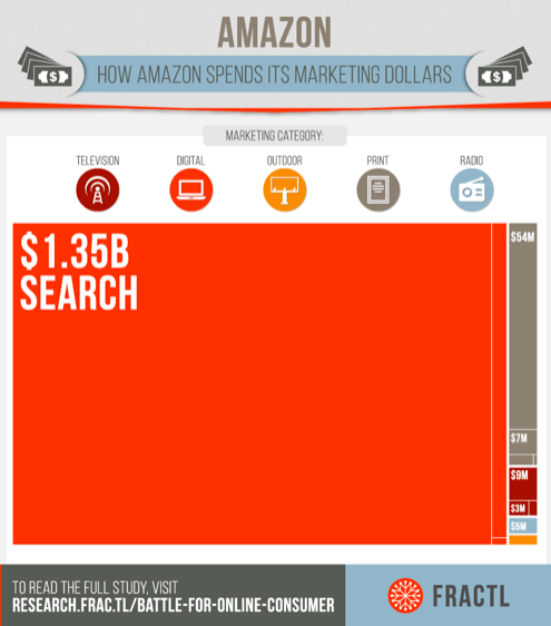
E-commerce companies are spending huge sums of money to bring visitors to their site. As per a study conducted by Frac.tl, it was revealed that Amazon spent around $1.35 billion in search advertising in the year 2015, which was a whopping 97% of its marketing budget.
When companies are spending such vast sums of money on advertising, it becomes crucial to have a site navigation that guides the user to easily complete a sale.
It can be safely said that navigation is one of the most critical parts of your store’s design. Good navigation provides an improved user experience leading to more sales and revenue. On the other hand, a poor navigation frustrates the users leading to a higher bounce rate.
Baymard carried out a study on mobile e-commerce usability on 50 benchmarked e-commerce sites and found that the users were unable to find the items they are looking for due to poor interface. Users misunderstood that the items were not present on the site and this directly affected not only the current sales but also the future sales because the users were unlikely to return to the site when they were looking for that type of product.
Each site was given a score based on 17-35 guidelines, and the below scatter plot represents the summarized score of one site. The black lines denote the benchmark average. Red dots indicate “poor” usability, yellow indicates “acceptable” performance, and green denotes “good” usability.

It is pretty evident from the graph that most of the e-commerce sites do not have good navigation for an impressive user experience.
Now, the bigger question is, which sites have the best e-commerce navigation? I have compiled a list of 11 sites that I feel have the best e-commerce navigation; you can consider which aspects could help improve your sales.
1. Autocomplete By Waterstones
We all are extremely satisfied with the way Google provides Autocomplete suggestions. It helps to narrow down our search, minimize the risk of misspellings and speeds up the entire search process leading to accurate results in a lesser time. But, when we conduct a product search on an e-commerce site, the autocomplete suggestions are not that useful.
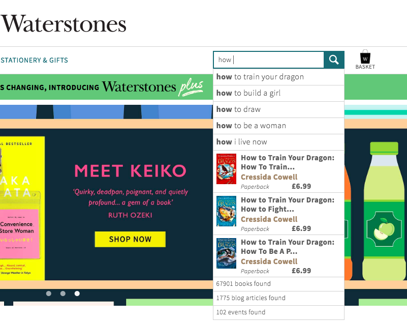
This is where Waterstones does an incredible job. It provides accurate and fast autocomplete suggestions that let the user find a product of their choice instantly.
When I entered the word “how” in the search box, the search returned a list of popular book titles starting with the word “how.” Moreover, the search results were “rich” meaning I was able to see the book cover and the price along with the title. When you can see such complete information while looking for choices, you can make a better and much-informed decision.
Why is Autosuggest Helpful?
It provides a genuine boost to the conversion rates because people can search and find the exact product they need with minimal effort.
Users also rely on autosuggest for the correct spelling of the product, and if the e-store doesn’t return the correct spelling, then the product is "not found" in the inventory, meaning the product remains unsold although the users came looking for it; this is why autosuggest plays an incredible role in e-commerce conversions.
2. Faceted Search By Rollie Nation
Great product discovery is an essential key to conversion. You don’t want your customers to browse several pages before they find the product of their choice; this is indeed a bad shopping experience. Faceted search is a great way to provide valuable information about your product in an easy to browse format which makes it easy for the shoppers to browse, filter and shop based on their specific choices.
Have a look at how Rollie Nation, an online shoe store has implemented faceted search in their navigation.
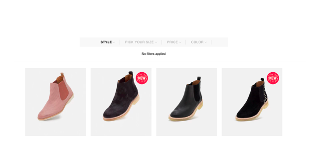
Customers can sort their shoe of choice by the following options:
Style - Like Boot, Derby, Mira, Sport, etc. Size - Depending on the shoe size of the customer. Price - Filtering options based on a maximum or minimum price. Color - Filtering options based on the choice of color by the customer.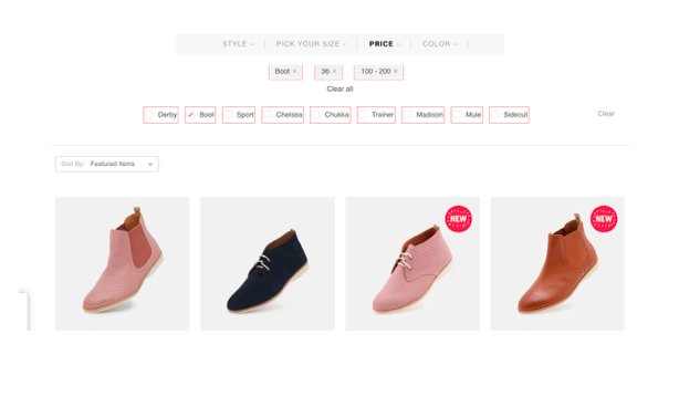
In a case study for BigCommerce, Rollie Nation Founder Vince Lebon highlighted the importance of using faceted search and product filtering. Building faceted search into their navigation helped them to explode their sales.
“In footwear, there can be up to 14 sizes and multiple options per SKU,” he said. “Given how quickly we turnover inventory, customers were previously clicking three or four styles before finding a shoe available in their size, which is a frustrating shopping experience. Once we were able to build faceted search into our navigation, sales exploded” – to the tune of 2.7% lift in average order value.
Why is Faceted Search Helpful?
It presents your catalog in the most relevant way before your audience. This way you can turn browsing into sales.
Your visitors are not turned down as faceted search helps customers find what they are looking for in a faster manner, meaning the customer acquisition costs are reduced.
Please note: With Faceted navigation, there are multiple navigational paths that your visitors can take to reach the same content. For example, in order to reach red-colored women's t-shirts, users can choose any of the following paths depending on the structure of your site:
site.com/womens/t-shirts/red site.com/t-shirts/womens/red site.com/t-shirts/red/womensThis option can cause massive duplication issues. To fix/avoid it, you can consider the following options:
Use JavaScript to prevent generation of similar URLs. This option will take some time to implement as you need to manually check every combination of pages that you wish to index. Make sure all your essential pages get indexed, and duplicate URLs don't. Use no-index, follow to disallow indexing of duplicate URL combinations; this will reduce the number of duplicate pages on your site, but your crawl budget and link equity might be wasted. Use Canonical tags to let Google choose one URL as the canonical version and all other URLs will be considered as duplicate URLs. This option will save link equity but crawl budget will still be wasted. Use robots.txt to disallow similar URLs using specific parameters. One disadvantage with this option is that URLs can still get crawled if there are any follow links pointing to the page disallowed using robots.txt.In most of the cases, you need to choose a combination of the above fixes depending on your exact needs.
3. Bigger and Visually Pleasing Navigation Menu By Big Chill
The top-level e-commerce navigation plays a decisive role in conversions. You don’t need to confuse the users here. Use a bigger and visually pleasing menu option as used by Big Chill.
Most of the top level menu labels are simple and comprises of a single word. It is a minimalistic design that offers less scope for any distractions.
When I placed the cursor on the shop label, the drop down was opened, and I was amazed to see large and visually pleasing menu options.
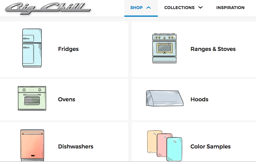
You can clearly see from the above screenshot that the menu items are displayed in the full-screen size, uses images to make it easier for the user to recognize and choose a category of their choice.
Why Is a Bigger Menu Helpful?
The top-level menu is easily clickable and tappable. Users can easily recognize images without the need to read the category names leading to improved user experience.
Shoppers can easily scan the menu labels and move to the category of their choice; this means the user can find what they are looking for immediately.
4. Fat Footer By GrubHub
Fat footers are a good way to provide a quick view of your entire site, or the most important pages on your site, to your audience. Your goal should be a better user experience for them. If your business serves multiple locations then including them in your footer is a good way to improve your chances of ranking particular pages (but there is no guarantee; don't stuff your footer).
GrubHub displays each of its business locations in the footer making it a real big fat footer.
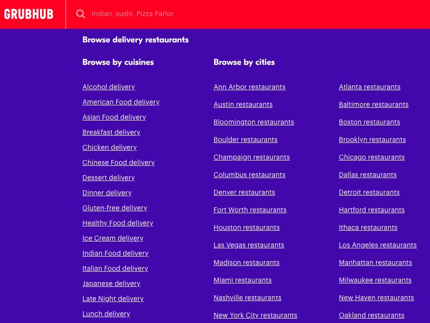
Why is a Fat Footer Helpful?
Fat footers are a good way to keep the users on site because it helps them find what they are looking for quickly.
You can also offer a boost to your SEO by linking to the important pages (either category or location) in your footer. This strategy will help in a better flow of link juice thereby increasing the importance of the inner pages. An increased importance could lead to higher rankings leading to higher traffic and more sales.
Please note: Do not use the fat footer to spam people. Many webmasters use fat footers to gain link equity and forget about the UX. Always remember that your sole purpose of having a fat footer in your website is to improve the user experience. Hence, identify the purpose of your website and think carefully about the links you must include in the fat footer. Do not use the fat footer to overly target locations, and forget about having over-optimized anchor text for gaining SEO value because Google does not value anchor text used in footers.
For example, it makes sense for an e-commerce website to have a fat footer because it helps the visitors to browse the popular categories and products on the site which otherwise are hard to find. However, the practice of linking to each and every inner page of a website from the fat footer is not acceptable because this can be judged as spam by Google.
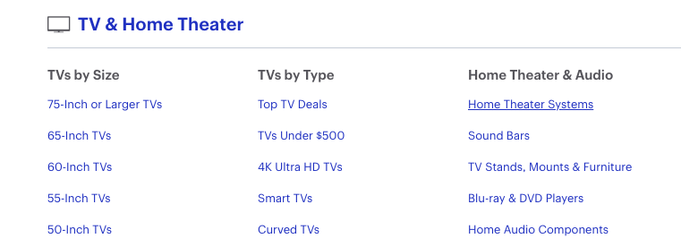
5. Same Subcategory Display Under Different Parent Categories By Best Buy
Ever thought of having duplicate subcategories? Bestbuy.com displays the same sub-category under different parent categories. The same sub-category “Home Theatre Systems” can be found under the categories “Audio” and “TV and Home Theatre”.
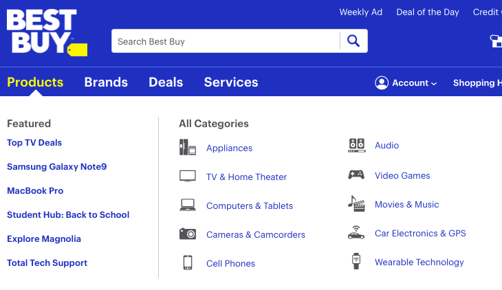
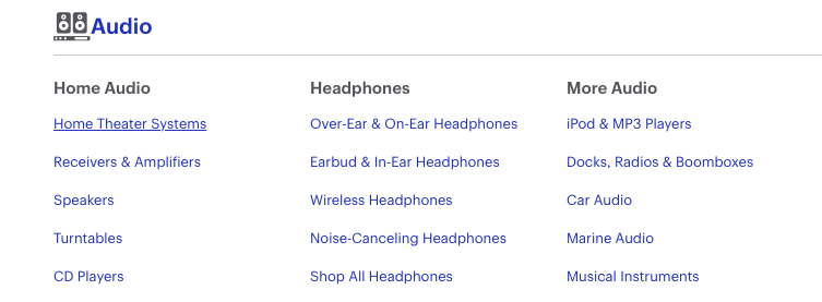
Why is Same Category Display Under Several Parent Categories Helpful?
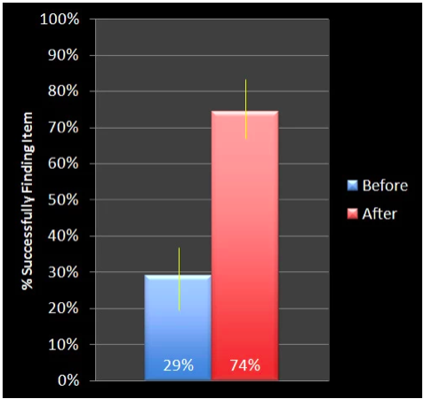
As per a finding by Measuring Usability, when one item of a children furniture store was included under different categories, the percentage of users who successfully found the item increased from 29% to 74%.
With improved product visibility, the chances of sales are always higher.
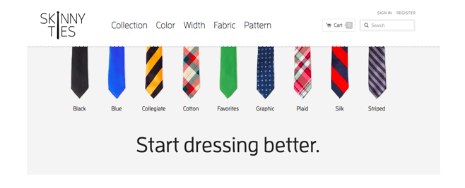
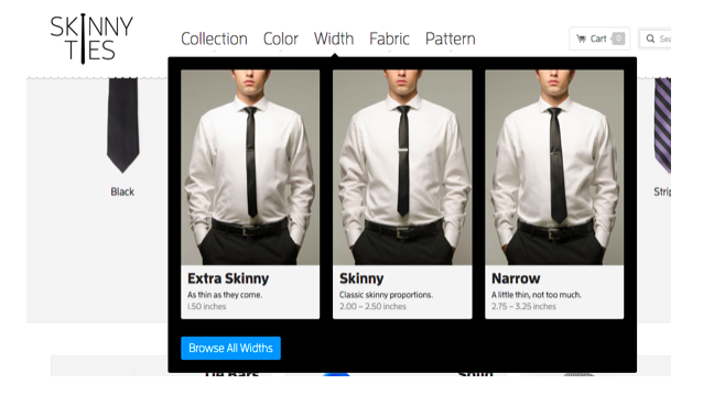
6. Colorful Animation By Skinny Ties
SEO doesn't have to be boring; there is always animation! I recommend you add a bit of colorful animation to your navigation and see the magic it can do for you.
Online tie seller Skinny Ties does an awesome job of displaying their collection of ties using colorful animations that are enough to win the heart of their audiences. Here is what differentiates them from their competitors:
They display a range of their ties like silk, striped, cotton, graphics, etc. right on their homepage in an animated format.
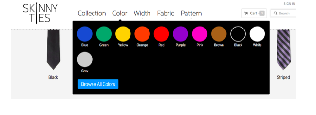
The top menu displays category choices having ample visual cues. The color options are not written red but have a color palette associated to it so that the user can grasp it right away.
Under the width menu, we can see that the width of the tie is not just written by conveyed with a human image so that you can see how it might look on you when you wear it. Excellent! Isn’t it?
Why is Colorful Animation Helpful?
Having a colorful menu helps to instantly grab the attention of the user. He can place the cursor on the selected choice and can’t resist clicking on it.
Provide ample visual cues right in the navigation helps the users to understand what the product offers and they can judge appropriately whether the product is right for them. When you help the users decide on a product choice, they feel valued and refer other customers due to the ease of shopping. This ease of shopping can lead to more sales and higher revenue.
7. Cookie Retargeting By Asos
It is always convenient for the user to visit sites which already know their preferences. For example, when I visit Asos, it automatically gets redirected to the men’s section, and the top menu features all men’s categories. The retargeting means I don’t have to click on the men’s category every time I visit the site, and this speeds up the entire purchase process and improves the user experience leading to more sales.
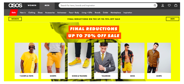
Technically, this is called “cookie retargeting” where a small cookie is placed in the browser that tracks visitors choices.
Why is Cookie Retargeting Helpful?
Cookie retargeting helps to dynamically update the menu and presents appropriate product choices before the users based on their earlier preferences. Estores that are already doing this are witnessing a jump in their sales.
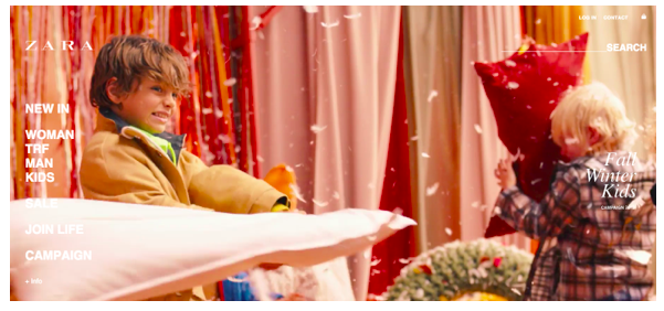
8. Easily Visible Search Option By Zara
The search box is often referred to as the “Holy Search Box”. An efficient search option is crucial to keep the visitors on the site.
I have often seen e-commerce sites have a smaller search option that is difficult to find; this stops the users from finding the product of their choice leading to a higher bounce rate.
Have a look at how Zara uses a more prominent and highly visible search bar that users can use the moment they land on the website.
Why is a Bigger Search Bar Helpful?
It is the user’s last resort to find the product of their choice when every other navigation option has failed. An easy to find search box is often the best way for the customers to directly move to their desired product page.
Internal site search option makes the website more customer-centric meaning and appeals to the visitors who are more search savvy.
Installing a site search function lets you uncover the crucial data that you can use to optimize your website and the overall marketing strategy further.
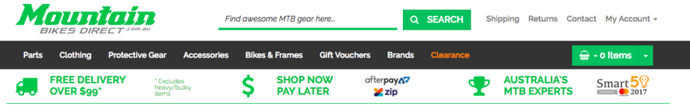
9. Benefit Bar By Mountain Bikes Direct
If you want people to buy your products you need to win their trust. A benefit bar is an interesting element you could add to your website design that helps to increase trust in your customer's mind regarding the website and its product. And this leading to more sales.
Mountain Bikes Direct does a great job in winning the trust of the customers by displaying a benefit bar right under the top menu. The benefit can mention your main USP, your trusted courier or payment gateway partners, free return or refund policy, any awards and recognition that your business has received in the past or other option that helps to win the trust of the customers.
Why is a Benefit Bar Helpful?
Customers are definitely going to see the content present in the benefit bar, and if they can instantly find the information they need and see that others trust your company, it is easier to create trust with a new customer. This confidence in your brand means they are more likely to buy products from you.
A benefit bar serves as a confidence booster for customers who are hesitant to purchase products from your site.
10. Feature-Rich Drop-Down Menu By New Balance
A custom navigation menu containing more information about the products will always contribute to a better user experience; this is what the footwear brand New Balance does on its website. The top navigation menu displays the full image of the product along with the product name in the navigation itself, and this helps the visitors be more engaged with the product, which leads to an improved user experience.
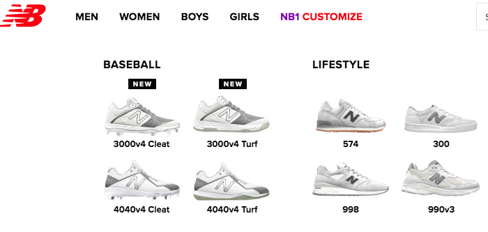
Why is a Feature-Rich Drop-Down Menu Helpful?
The users are pushed towards the products without the need to browse the category pages to get a look of the product. When you take less time in showcasing your best products, the chances of customers getting interested in your products increases, and leads to a remarkable user experience leading to more sales.
The full-width rich drop-down menu is an excellent way to enable your users to engage with your site. Increased engagement will lead to lower bounce rate and increased time on site. The more time users will spend on your site, the more interested they will become to buy your products.
11. Nua Bikes' Clean Vertical Navigation
If you have a single page layout site, then a clean vertical navigation menu is your best bet. The reason is pretty straightforward; you don’t want your visitors to get confused. Here is what Nua Bikes does in its navigation.
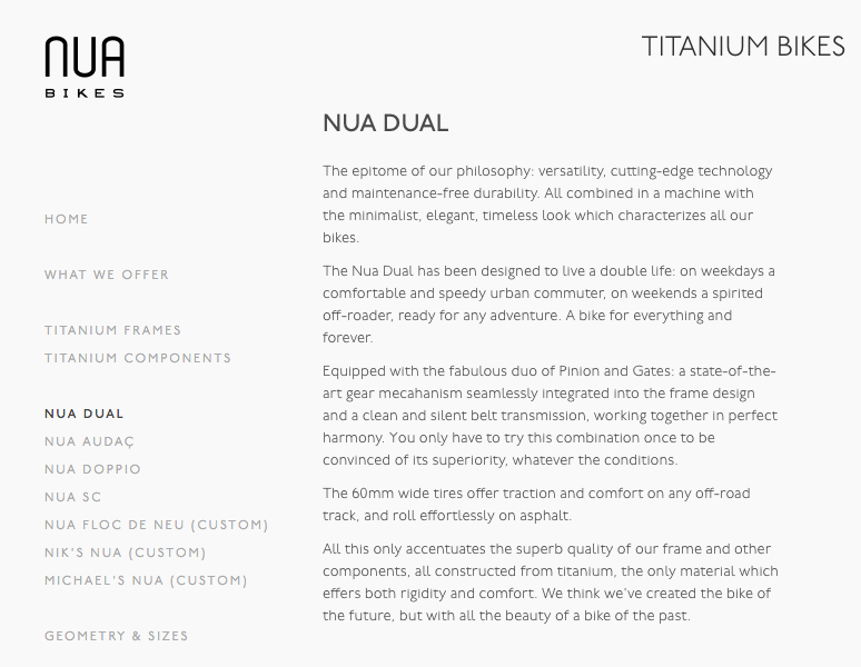
The left side navigation presents a neat design where users can find the product of their choice in a faster and more straightforward manner.
Why is a Clean Vertical Navigation Helpful?
A clean navigation is helpful for sites who have a limited product inventory. The products can be loaded faster, and the customers can easily move towards the end of the sales funnel.
The vertical navigation should have the same background as the main content so that it perfectly blends with the rest of the elements in the page. This way it becomes easier for the user to access all the contents of the site without getting confused.Conclusion
One of the biggest mistakes webmasters make is not implementing the features they already know can work wonders. Review the options above and consider which would be most helpful for your audience, and which would lead to more sales; try it out. You will be amazed to see the positive differences it can make to your sales.
Innovative SEO services
SEO is a patience game; no secret there. We`ll work with you to develop a Search strategy focused on producing increased traffic rankings in as early as 3-months.
A proven Allinclusive. SEO services for measuring, executing, and optimizing for Search Engine success. We say what we do and do what we say.
Our company as Semrush Agency Partner has designed a search engine optimization service that is both ethical and result-driven. We use the latest tools, strategies, and trends to help you move up in the search engines for the right keywords to get noticed by the right audience.
Today, you can schedule a Discovery call with us about your company needs.
Source:


