There’s a good reason why Semrush’s .Trends tools are considered some of the most powerful in our suite. With .Trends tools — Traffic Analytics, Market Explorer, and EyeOn — you gain access to an instant overview of your market and deep competitive insights that offer a clear view of emerging trends and growth opportunities for your business.
Even if you’ve already spent time exploring .Trends, we’re willing to bet there are features you haven’t yet uncovered. The .Trends tools include customizable widgets, charts and graphs, filtering options, and historical data, all of which broaden the scope of insights available to you.
In this article, we analyze the financial services industry to highlight the top 10 .Trends features every marketer should explore.
#1 Market Explorer’s Market Summary
Broadly, Market Explorer allows you to gain an understanding of your market. You can use it to identify competitors, examine how the market is evolving, and better understand your in-market audience.
The Market Summary widget provides high-level information about the market that can help you conceptualize the market as a whole, including:
The level of market competition Key players and their individual market share Market traffic Market traffic cost Market sizeHere’s an example depicting data for 8 top domains in the financial services industry.
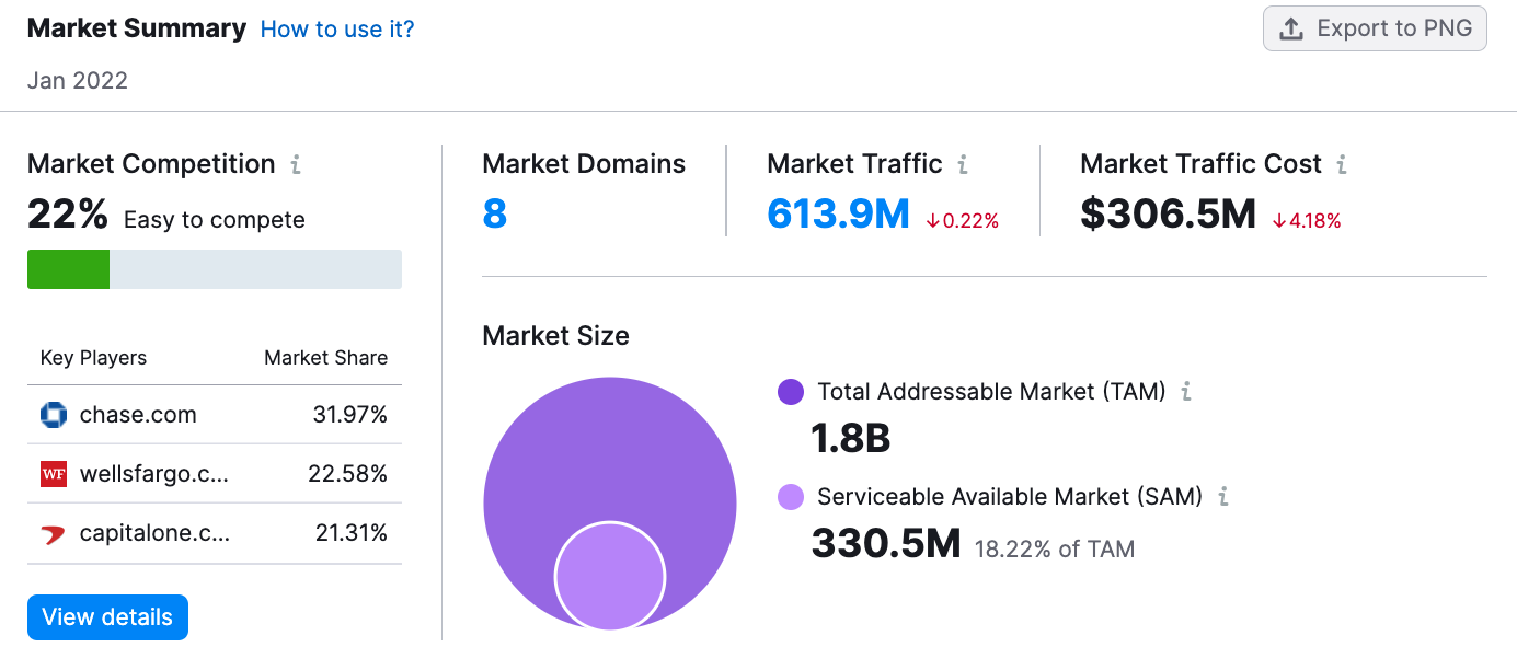
Let’s hone in on Market Competition and Market Size to explore how this data might be useful.
Market Competition
The market competition graph shows you the level of competition within the market under consideration. The higher the percentage, the harder it will be to compete.
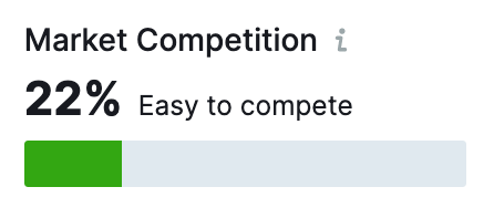
When it comes to financial services, the market competition is at 22%, making it relatively easy to compete. More specifically, this number means market share among competitors is pretty even, despite the presence of many players.
This information might help a new company determine the strategy for entering the market, their positioning among other brands, or the budget size for a specific product launch.
Market Size
Market size is the total number of potential customers in your market. This total number is broken into two more specific metrics:
Total Addressable Market (TAM) Serviceable Available Market (SAM)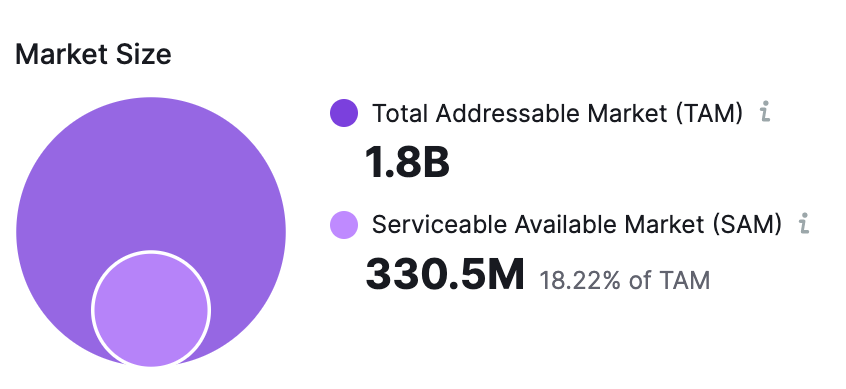
For the domains within our selected market, the TAM is 1.8 billion. This number reflects everyone in the target audience, including those who are unable or not ready to make a purchase.
The SAM, however, is much smaller at 330.5 million. This is the number of people who are ready and able to purchase a financial product.
Looking at these numbers individually, comparing them to one another, and examining them across various months can inform your strategy when launching new products, developing business or marketing strategies, or projecting potential ROI.
#2 Market Explorer’s Growth Quadrant
The Growth Quadrant featured in the Market Explorer tool helps you visualize the competitive landscape and identify which competitors in your market are Game Changers, Niche Players, Leaders, or Established Players. Their positions on the competitive matrix are determined by their traffic metrics and their traffic growth percentage.
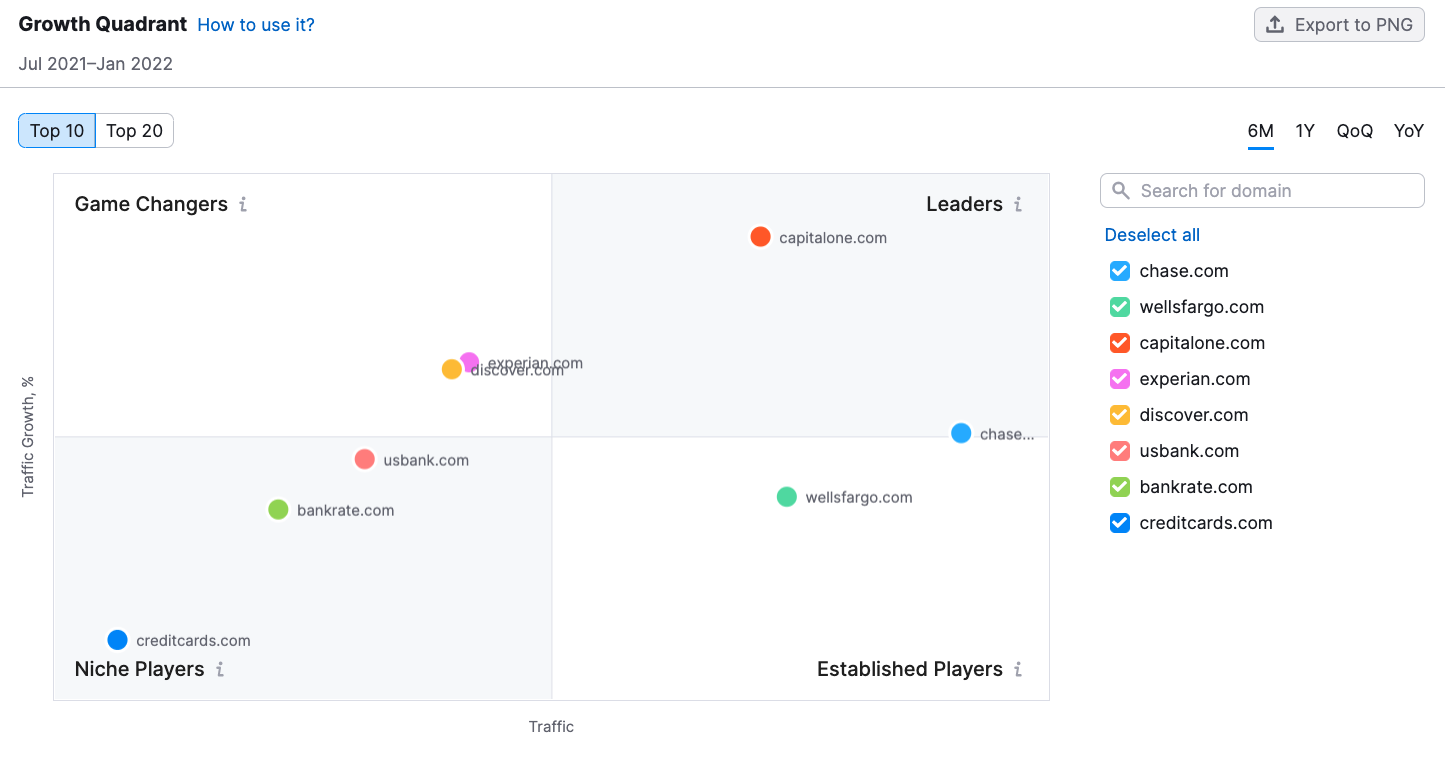
This example shows the placement of financial services companies based on traffic data from the last six months, July 2021 to January 2022.
If you want to see how the competitive positioning has changed over time, select the Quarter-over-Quarter (QoQ) or Year-over-year (YoY) option in the upper right-hand corner of the widget.
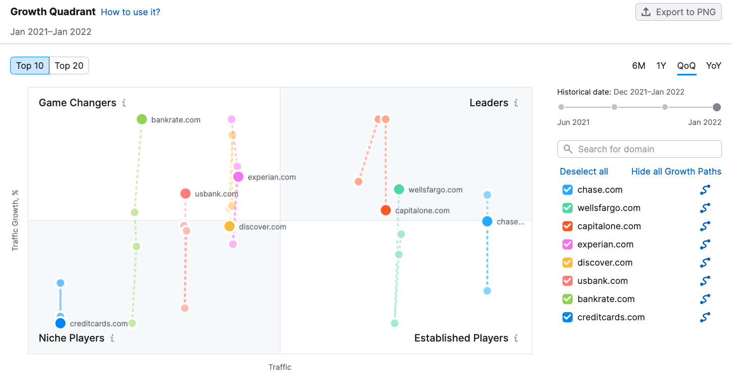
The QoQ option shows the movement of competitors across the growth quadrant over each quarter for the past year. With this view, you can see how the positioning has changed, providing insights into shifting trends in the market as a whole or the activities of the individual players within the market.
#3 Market Explorer’s Demographics Report
The Demographics report includes several widgets that can give you a breadth of information about your market’s audience demographics, including their age and gender breakdown, their Social Media Preferences, and their interests.
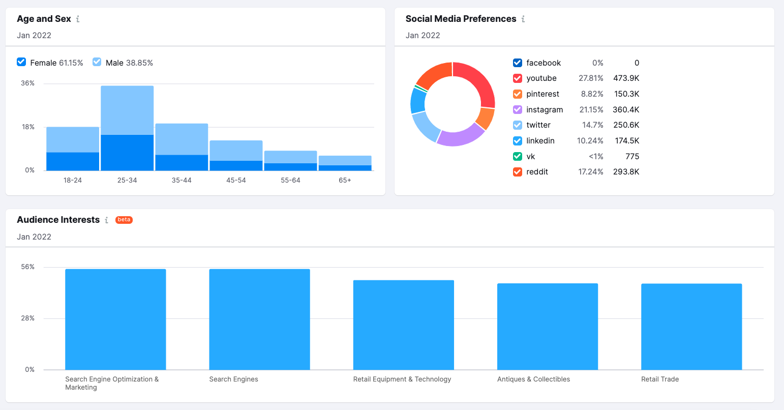
Understanding your market’s demographics can help you better communicate with them and meet their needs. For example, The Social Media Preferences chart shows that the largest percentage of people in our audience use Youtube, with Instagram coming in second place. There’s also a large overlap within the market audience with SEO and marketing.
With this information, it becomes easier to make strategic decisions about where to place ads, form partnerships, or develop additional marketing efforts.
#4 Market Explorer’s Benchmarking Report
Market Explorer’s Benchmarking report makes it easy to compare competitors against one another, and against the market as a whole. It provides a number of widgets that depict different metrics side-by-side for easy analysis.
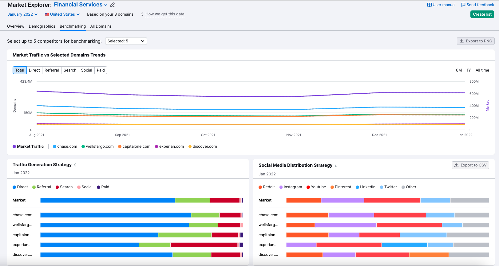
When considering the individual graphs, you can view changes among competitors over time by adjusting the date in the upper right-hand corner of the tool.
Take the Social Media Distribution Strategy Graph below for example. In January 2020, Capital One focused just under 10% of their social media marketing efforts on Youtube, despite the fact that the market trend for Youtube promotion was relatively small.
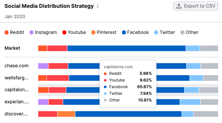
In December 2021, however, they didn’t market on Youtube at all, even though Youtube became much more popular with the overall market — notice how Discover upped their Youtube marketing in the graph for 2021.
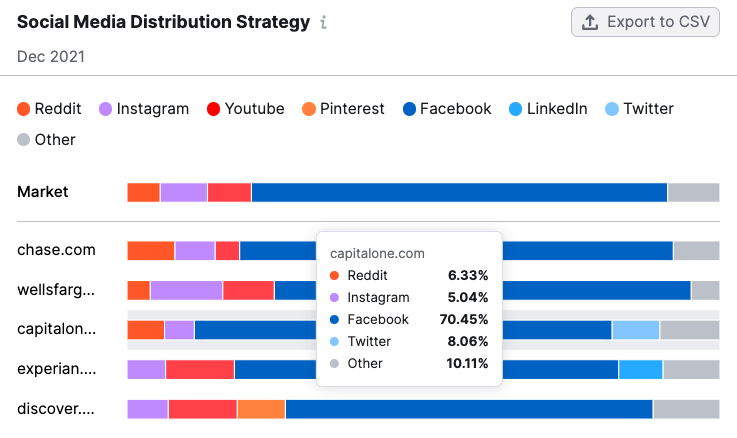
Viewing this data across time periods can alert you to shifts in the market, and illuminate your competitors’ strategies, allowing you to better develop your own.
#5 Traffic Analytics’ Audience Overlap
Moving on to Traffic Analytics, the audience overlap graph can reveal how much of your audience you share with your competitors, and what audiences you may be missing out on capturing. Hover over the section of the graph you’re interested in for more details.
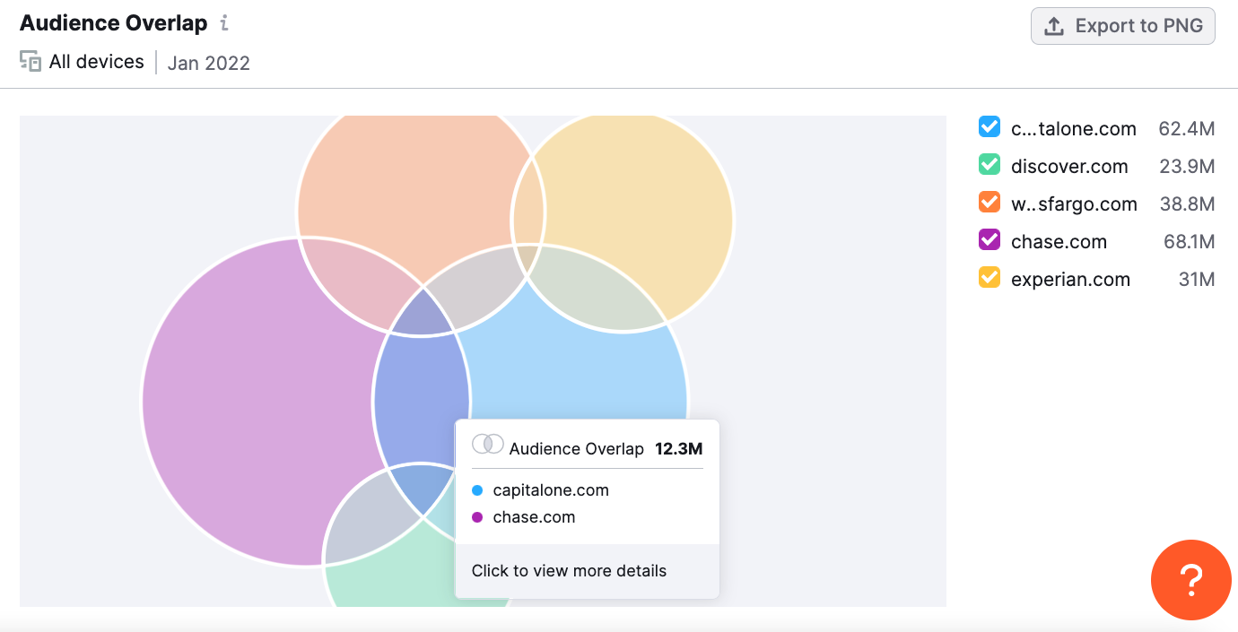
Based on our selected financial services domains, Chase.com has the largest number of site visits, and they share the largest audience with Capitalone.com.
You can also simplify the graph by clicking the check boxes to the right of the graph to look at specific websites. For example, if we wanted to see how Experian.com’s audience overlapped with the two largest competitors, Chase and Capital One, we could just select these three websites.
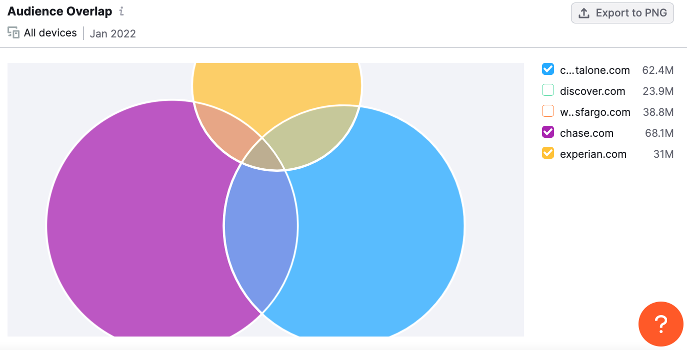
Experian.com might note that their shared audience with Capital One is larger than their share with Chase by almost 2M visitors. With this in mind, they might begin thinking strategically about how to capture some of the audience they’re missing. This new strategy based on the audience overlap data might involve partnerships, ad placements, or business expansions.
#6 Traffic Analytics’ Traffic Journey
Leveraging petabytes of clickstream data, the Traffic Journey graph presents a visual flow of where your competitor’s traffic comes from and where it goes after leaving their site. With this widget, you can build an understanding of what sites send the most traffic to competitors, and what sites they visit after leaving.
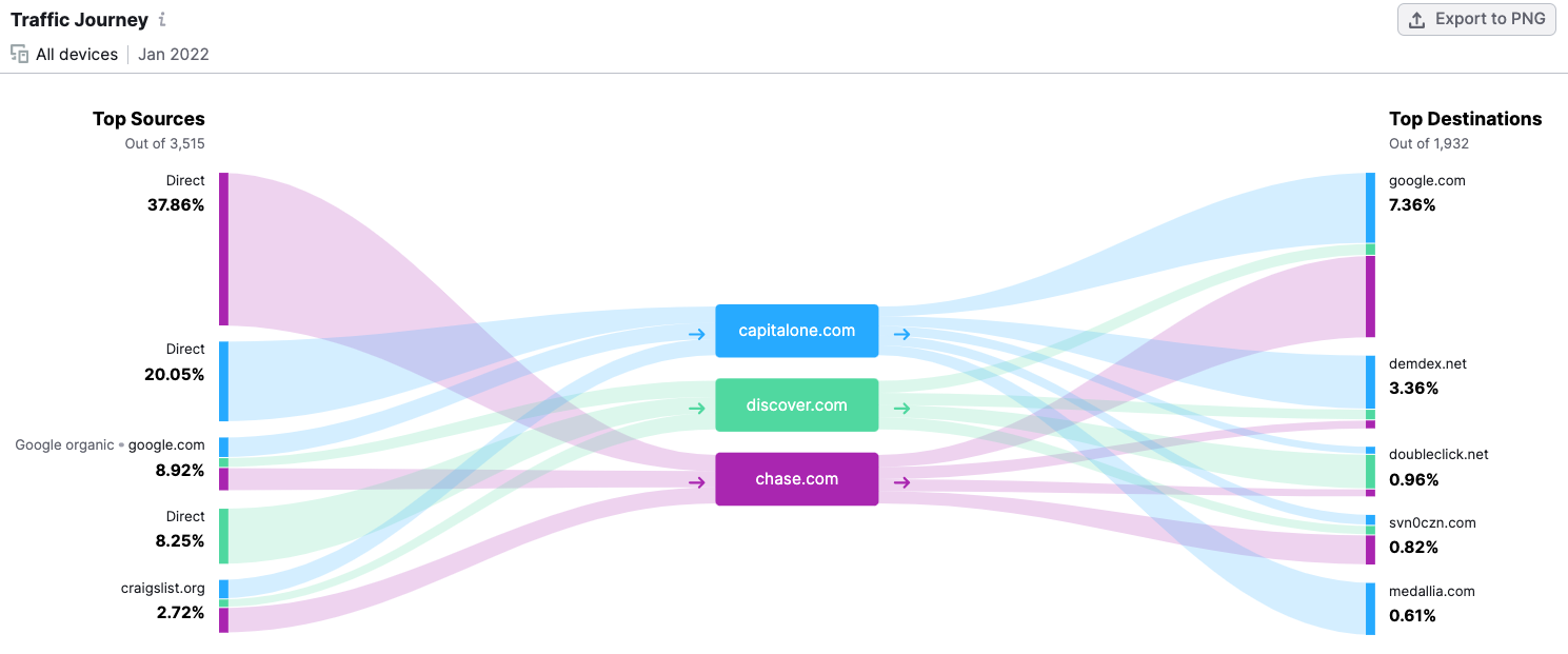
In terms of traffic sources, Direct, Google organic search, and Craigslist are the top channels through which people land on our selected domains. This can tell us a lot about the way people search for financial services and how much brand awareness exists for these companies.
When looking at the top destinations, the chart depicts a number of sites that users tend to go to after leaving. By looking at the distinctions between the different companies' outgoing traffic, we can derive insights about customer experience.
For example, While over 40% of users return to Google.com after visiting Chase and Capital One’s websites, only 7% of Discover’s users land back on Google. This information could lead to a deeper dive to understand what Discover is doing differently, and why Chase and Capital One users return to Google to continue searching.
#7 Traffic Analytics’ Top Pages Report
The Top Pages Report provides invaluable insight into which pages on competitor sites are receiving the most traffic. The numbers are broken down into several categories to help you determine Unique Visitors, Pageviews, and Traffic Sources.
To gain more specific information, this tool provides a variety of filtering options. You can use the “Filter by Page” search option by entering a word specific to your interest. The tool will filter to show pages that include the word in the URL.
For example, to get a sense of how many people are applying for Discover Card’s products, we entered “Apply”.
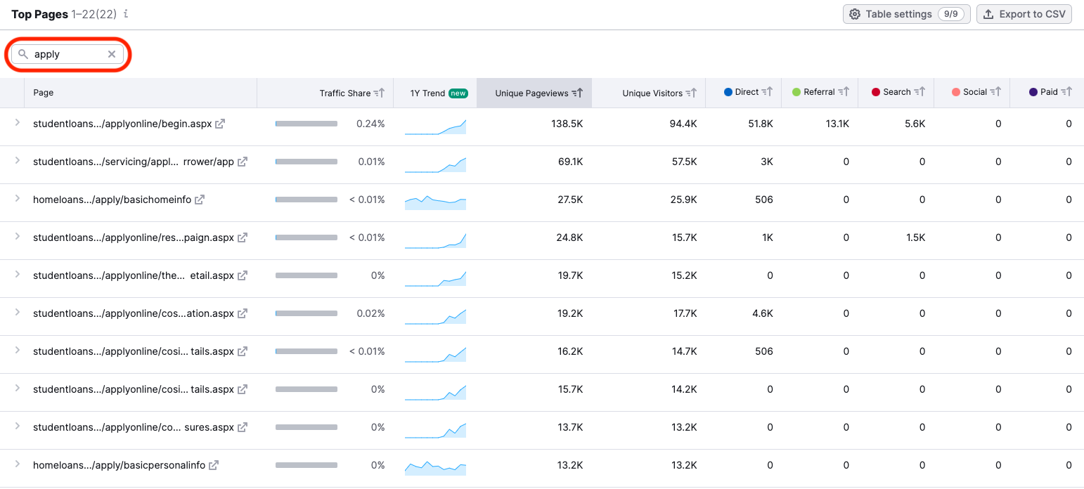
This filter reveals that student loans and home loans are some of Discover’s most popular products people are applying for. To get a sense of the number of conversions your competitors are receiving, you can also try entering terms such as, “Confirmation”, “Check out”, or “Thank you”.
You can also use the filters along the top of the graph. For example, to view pages that are receiving the most traffic due to paid sources, you can filter by clicking on the “Paid” tab.
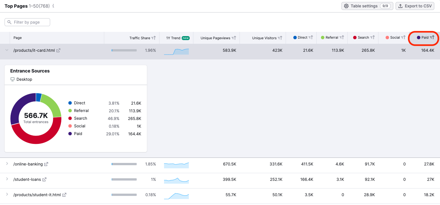
With this filter, the pages receiving the most traffic from paid sources are presented at the top of the chart, showing you the products being successfully promoted by your competitor. For example, Discover’s IT Card receives about 25% of its traffic from paid search, suggesting this product is being heavily promoted.
#8 Traffic Analytics’ Regional Traffic Analytics
The Geo Distribution report inside the Traffic Analytics tool offers a breadth of data about a competitor’s activities across the globe. You can view countries where their business is performing best, and identify what regional markets they may be targeting for expansion.
The Traffic Trend by Country graph is a great place to look when it comes to identifying competitor activity across the globe. This graph allows you to select the countries you’d like to examine in terms of traffic and filter for specific time frames, such as the current month, the last 6 months, last year, or all time.
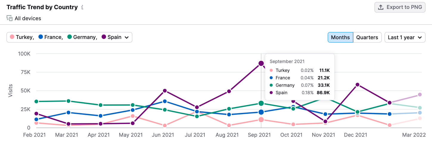
Considering this graph of Discover’s traffic across several European countries, it’s clear they’re making significant progress in breaking into the Spanish market, while their numbers in German seem to be on a slight down trend.
This information might inform decision-making about potential market strength in different countries, the levels of competition there among competitors, or possible entrance strategies if you were looking to break into a new market.
#9 EyeOn’s Trends and Timeline
.Trends’ newest tool, EyeOn, lets you keep a close watch on the competition. You can enter up to 5 competitors and EyeOn will automatically track their Google Search Ads and new blog content.
The Trend graph in the EyeOn tool allows you to see trends in your competitors’ ads and content posting. For example, here is a look at Discover.com’s Google Search Ads Trend over the month of February, 2022.
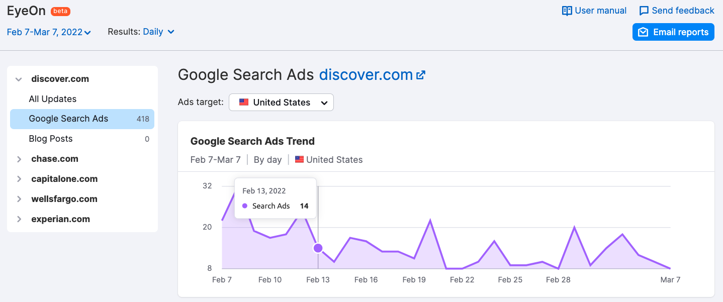
The graph shows several peaks in Google search ads that might be of interest if we wanted to dig deeper into their marketing strategy.
You can also view the Timeline of ads and new content releases. The Timeline provides a link to the landing page and the ad text organized by day, week, or month. Here’s an example of Discover’s Google Search Ads in the United States for the month of February, 2022.
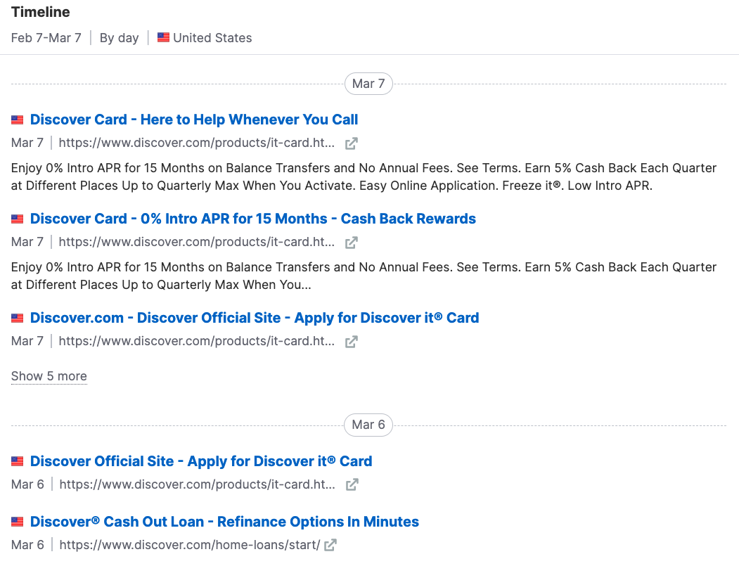
With all of your competitors' activity visible in one report, you can uncover trends in their marketing activities, track seasonal shifts in their advertising and content creation, and stay aware of new products or campaigns that may impact your business.
#10 EyeOn’s Weekly Competitor Update Emails
Keeping track of competitors can be overwhelming. The EyeOn tool makes it easy by sending you a weekly email update that includes an overview of your competitors' activities online.
With automated reports sent directly to your email, you’ll be able to easily overview your competitor’s activities and focus your energy on your own marketing efforts.
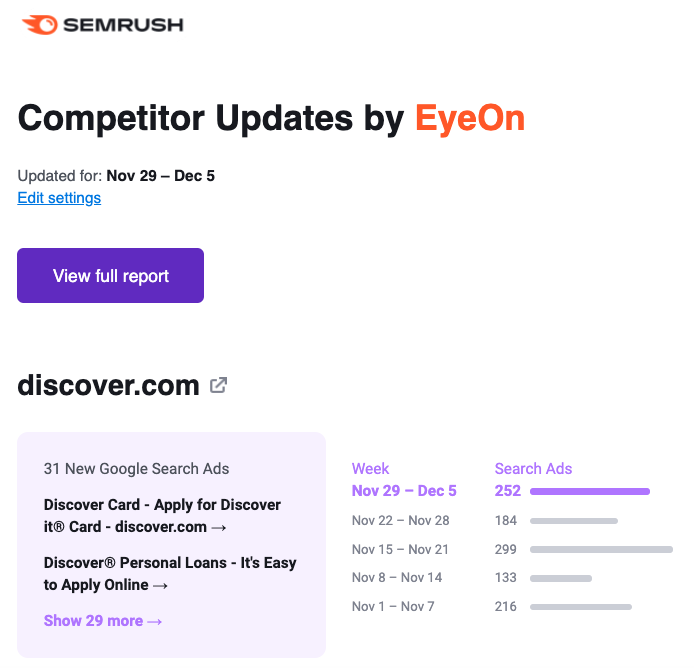
If you notice something of interest, you can navigate directly from the email to your Semrush .Trends account and begin to dig deeper.
Way More than a Simple Snapshot...
Now that we’ve covered a few of our favorite Semrush .Trends features in depth, we hope you have a better understanding of the true power and utility of the .Trends tools.
Markets are never static. In order to keep your finger on the pulse, you need tools that allow you to gain an understanding of ever-changing conditions. The tools included with Semrush .Trends not only offer easy to understand charts and graphs, they include features such as filtering, historical data, and automated reporting that allow you to derive the deepest possible insights.
Maintaining an edge isn’t just about reviewing past market conditions and peeking at competitor traffic numbers, it’s about understanding shifting market dynamics, emerging trends, and competitor’s evolving strategies. With Semrush .Trends, you can stay ahead of the curve and continue to outpace the competition.
Innovative SEO services
SEO is a patience game; no secret there. We`ll work with you to develop a Search strategy focused on producing increased traffic rankings in as early as 3-months.
A proven Allinclusive. SEO services for measuring, executing, and optimizing for Search Engine success. We say what we do and do what we say.
Our company as Semrush Agency Partner has designed a search engine optimization service that is both ethical and result-driven. We use the latest tools, strategies, and trends to help you move up in the search engines for the right keywords to get noticed by the right audience.
Today, you can schedule a Discovery call with us about your company needs.
Source:


