On December 1, 2021, Google announced it had begun to roll out the December 2021 Product Review Update. The update is meant to better serve users by rewarding in-depth product reviews while avoiding those that merely serve as a segue to affiliate revenue without offering much actual value.
Google described the update as being “designed to promote high quality product reviews.” Of course, the devil is in the details. What does Google consider to be “high quality product reviews”?
I’ll take a look at a variety of pages that were either rewarded or demoted at the hands of the update so that we might have a better idea of what sort of product review content Google is looking for.
What Are Google’s Product Review Updates?
In order to up the quality of review content being shown on the SERP, Google has instituted what it calls a “Product Review Update” (PRU). As the name suggests, the update is meant to hone in on product review content of all types. (This is not to say that a PRU cannot impact other sites. As Google shifts product review pages up/down the SERP during a PRU, all other sorts of pages, such as product pages per se, can be impacted residually).
The first PRU was released in April 2021 and was simply known as the “Product Review Update.” With its release, Google released a handful of guidelines to help SEOs and content creators better understand what constitutes a high-quality product review. These guidelines included:
Demonstrating expert knowledge of the products under review Utilizing quantitative measurements to assess products Creating content that deals with the pros and cons of a product Pointing out key factors that would go into the decision to purchase a productWith the December 2021 Product Review Update, two additional guidelines were released. These asked product review pages to:
Show evidence that demonstrates personal experience with the product Include links to multiple sellers to provide users with purchasing optionsThe latter, I am sure, is quite the sticking point for affiliate sites but shows you where Google is not so subtly nudging things. A product review page should be a product review first and foremost and a pathway to revenue secondarily.
For the record, these two new guidelines were not implemented in the December update. That is, sites that did not link to multiple sellers, for example, were not subject to ranking losses for not doing as such. The guidelines are pointing to where things will be going according to Google, not where the algorithm is at the moment.
What Made the December 2021 Product Update Unique?
The December 2021 Product Review Update was a bit different than the initial version seen in April 2021. For starters, with the December 2021 PRU, we’re not talking about the revelation that an entirely new algorithm exists out there in the ether! Also, like many other types of updates, the release of a second iteration can mean finally being restored after being hit by the update’s previous (in this case, initial) version.
However, the December 2021 PRU was unique for other reasons as well. Most notably the length of its roll-out. At the onset of its release, Google stated that the December 2021 PRU will take three weeks to roll out, which is evidenced by the consistent level of rank volatility seen during those three weeks.
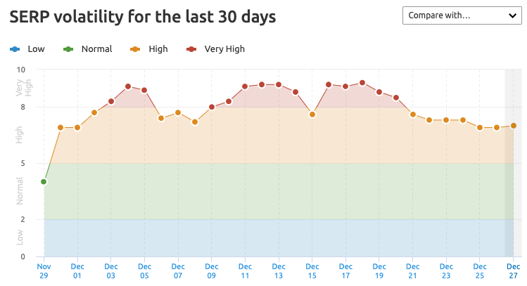
To complicate matters beyond a considerably long update roll-out was the fact that volatility was consistent throughout.
The Dec. Product Review Update... is NOT over.It's also not simple because there are more than a few sites that saw movement during both this update AND the Nov. Core Update! pic.twitter.com/VUKeu7tm1n
— Mordy Oberstein (@MordyOberstein) December 15, 2021Unlike a Core Update, where you see large amounts of volatility initially with smaller tremors over the following days, this PRU was incredibly volatile all throughout the three-week roll-out. (For the record, a PRU is not a Core Update, though both are laser-focused on content quality). This, obviously, made it hard for a site to understand just how the update was impacting as there were all sorts of reversals and additional volatility for the entire roll-out period.
To make matters more confusing, the December 2021 PRU was immediately preceded by the November 2021 Core Update! Throughout the course of the research that I’ll soon present, there was evidence that the November 2021 Core Update and the December 2021 PRU were not homogeneous. A site or page that was positively impacted by the November 2021 Core Update might have lost those ranking gains at the hands of the December 2021 PRU (or vice versa). As Glenn Gabe pointed out in his analysis, this is something that Google is going to have to reconcile.
Approaching the Sites Impacted by the PRU
With a general understanding of Product Review Updates under our belts, we’re in a position to start diving into a bit of what transpired.
Before that — and yes, you can skip this section, but I 100% recommend that you don’t — let me explain the research and analysis that I’m about to present.
As opposed to looking at the performance of an entire domain over the course of the December 2021 PRU, I focused almost exclusively on pages. That’s not because I don’t think the quality of the entire site or of a specific part of the site is a factor with these kinds of updates. Rather, I wanted to see what pages Google rewarded or demoted, preferably both, for one specific keyword. I wanted to see what was happening, in terms of content, on the product review pages Google rewarded or demoted or kept at high (or low) ranking positions throughout.
The idea was to see, as best as possible, what is it that Google was looking for when ranking a product review page (and what was it averted to).
I analyzed the ranking trends of the top 20 ranking pages for dozens of keywords being tracked in our Sensor. For each, I was looking for product review pages that underwent ranking shifts during the update. For each of these pages, I would analyze the content found on the site — literally reading through the review content. (I now know a lot about mini sewing machines.)
The upshot of doing this tedious type of analysis is that it provides an in-depth look at what content seems to be working for the pages that were rewarded by the update.
There are however limitations to this type of analysis. For starters, analyzing a few dozen keywords and pages manually is a lot when you’re the one doing the work; it’s not a lot from a data point of view. Also, I don’t work for Google, and I can’t say with certainty what did and did not contribute to a page’s ranking trajectory.
Still, having analyzed so many of Google’s updates at this point, a lot of the content patterns that I saw aligned to what are considered to be best practices and to what Google was looking for with the initial PRU back in April 2021.
Regardless, I’ll let you be the judge.
Page-Level Insights Into the December 2021 Product Review Update
What characteristics did the content Google rewarded during the December 2021 Product Review Update tend to exhibit? Were there specific things that Google was looking for from a product review page? What sort of content traits were looked on unfavorably by the search engine?
Here’s a look at four keywords, the pages impacted by the update, and an analysis of the content placed before the reader:
1. For the Love of God — Write for the User (Keyword: sewing machine mini)
Synopsis:
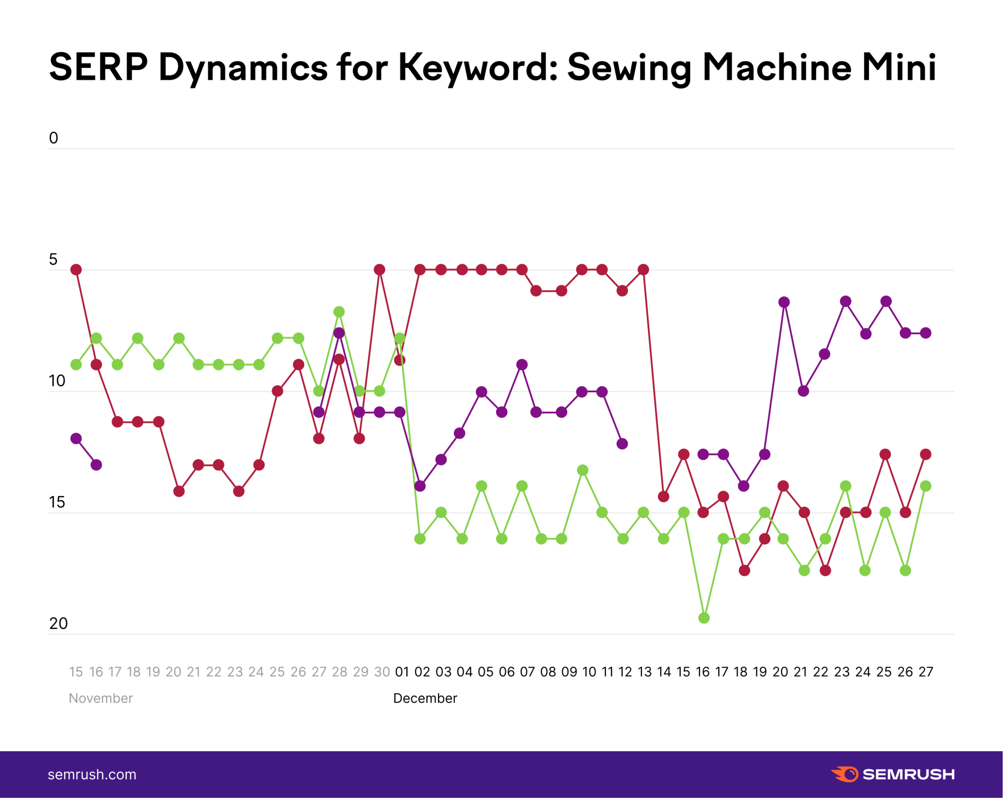
The product here is mini sewing machines, with Google having taken away the November 2021 Core Update ranking gains of one URL (represented by the red line) mid-way through the update.
There was also a second page that lost rankings as soon as the PRU went live (green line) followed by a page (purple line) that began to rank consistently circa December 1st. This page not only began ranking in the top 20 more consistently but at higher positions as the update went on. (For the record, the lapse in ranking you see circa December 13th was not odd with this particular update for some reason).
Analysis:
Site #1 (loss of rank): Let’s start with the page that lost some ranking as soon as the update went live (again, see the green line in the graph above).
If you were to look at the Table of Contents for this page, you’d think it didn’t deserve to lose any rankings. There are all sorts of ancillary information, such as “What to look for in the best small sewing machines” that would seemingly help a reader make a better purchasing decision.
However, when you look a bit closer, it doesn’t seem to hold up.
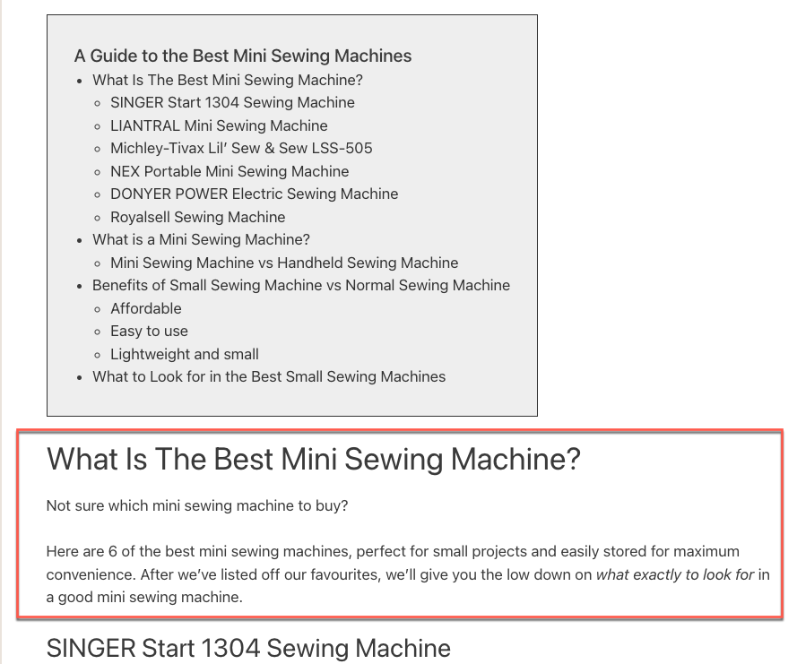
To start, the section on “What Is The Best Mini Sewing Machine” almost feels like it’s there for “SEO purposes” alone — as if to rank for all sorts of queries related to “best” and “sewing machine.”
There’s not much content that actually supports it, other than the reviews themselves, which isn’t really a full analysis of what the best mini sewing machines are.
That, and if you look at the article’s title and the site’s menu, it becomes kind of obvious what’s going on here:

On top of that, the reviews themselves are a bit thin. There’s not a lot of nuance that lends any sort of feeling that this is an expert review of a product.
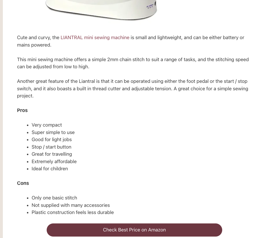
Sure, there’s a list of pros and cons; but that again feels like it was put there less for the good of the user and more because it was part of some SEO’s checklist.
It’s really the same theme throughout the page. There are all sorts of elements that seem to be on the page in an effort to rank it more than in an effort to make it usable to folks. Take the section on what you should look for in a sewing machine as a good example of this.
Having such a section is a good idea, but you have to come through with the content itself. Here it feels again like the section exists just so the page could show Google it’s there.
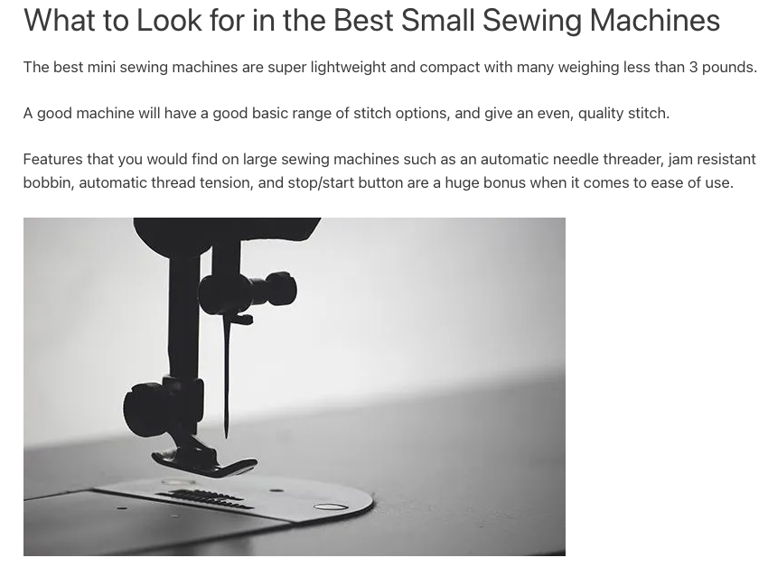
There’s not a lot of detail or even content of any kind. It’s not very helpful to users.
Site #2 (loss of rank): With the second page to lose rankings (red line on the graph) the only puzzling thing was why it was rewarded during the November 2021 Core Update.
The page makes no attempt to help the reader navigate the buying process or to offer any sort of comprehensive content experience.
Rather, the reader is treated to a short blurb on the product, and that is it. There is no comparison table, no specs, pros and cons, buying guide, etc.
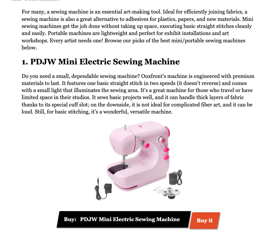
Even the writing itself is quite generalized. There’s little to no discussion about the features and how they impact the product or anything of the like. The reader really has to make a decision based on the word of the author without being able to substantiate anything with any sort of contextual information.
Site #3 (gained ranking): This is the site that got it right. Here’s why I think it did: It wrote the page for the user because it was written by someone who used the products.
Let’s start with who wrote the reviews. It’s someone who has hands-on experience using, if not these very products, products of a similar nature. That’s a huge advantage because as you’ll see, it 100% impacts the quality of the content.

That’s not to say every aspect of the content here is amazing and above and beyond — this is far from the perfect page. There’s a whole section dedicated to full-size sewing machines vs smaller machines and it’s… OK. There’s not much unique value there. It could have gotten a bit deeper. But the page still holds a ton of value regardless.
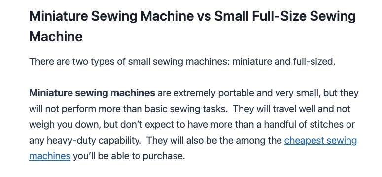
Have a look at a section where the page dives into features of these kinds of machines and what to consider when buying:
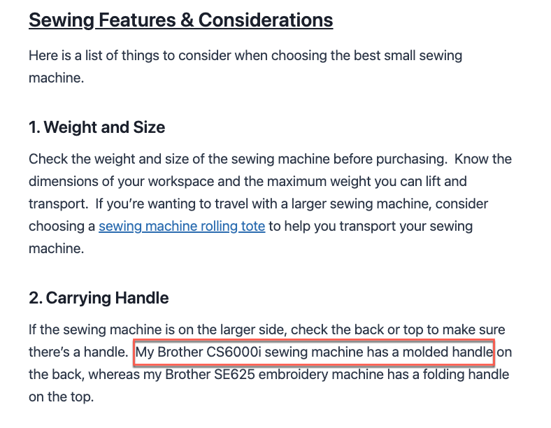
There’s an incredible level of added value here. The writer has personal experience with a specific product, and based on that experience is offering, a tip you probably won’t read anywhere else. This is what Google is talking about — its PRU guidelines that call for expertise. It’s a perfect example of it, and clearly it is content that is helpful for buying the most compact product (which is a big part of the idea here).
Looking at the review content per se and it’s actually pretty good. It may not be the most comprehensive thing on the planet and it may lack some formatting (such as a master comparison table), but the page gets past that based on the personal experience and nuance it offers and because the needed information is there.
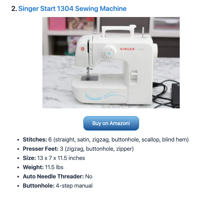
The reviews here start well with the basic specs but shines in how it offers a nuanced take that speaks right to the user.
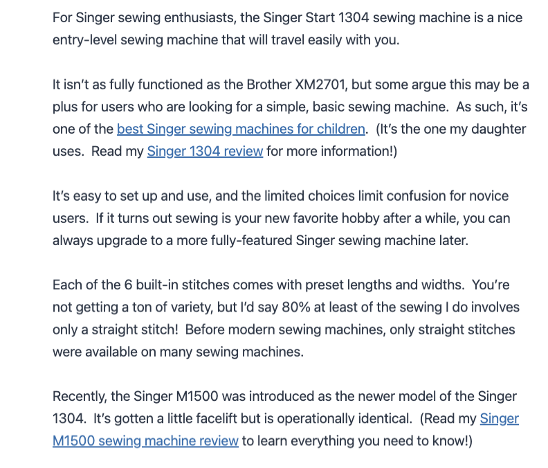
What I mean to say here is if you look at the content, it might not be the most comprehensive or sleek product review copy on the web. However, what it does do well is tell you how the features or limitations of the product will impact your use of it or dictate what kind of user is best suited for it.
Take the line “You’re not getting a ton of variety, but I’d say 80% at least of the sewing I do involves only a straight stitch.”
Another post might point out the lack of variety in the product but the user is not fully served until they know how that limitation impacts their effectiveness as a product user. That’s the added value of this review. You know how significant the limitation is because the author has real experience.
So is it the most prolific review out there? No. But it does so many things well and more importantly, it genuinely helps the user!
Bottom Line:
Google knows when you add page elements for the sake of some SEO checklist vs for the sake of the reader. Also, things like comparison tables and incredibly prolific reviews are important; but nothing outweighs the significance of content that reflects expertise via experience as that is what enables you to talk to users in a substantial way.
2. The Demands on a YMYL Product Review Page (Keyword: home gym weights)
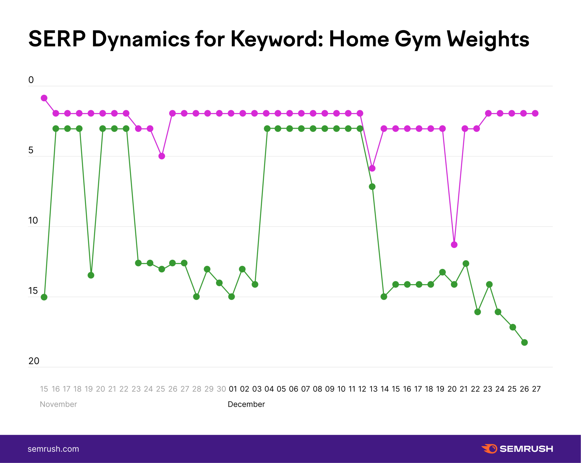
Synopsis:
What you have here is one very stable, top-ranking page that seems to have undergone residual “blips” during the update (i.e., the pink line on the graph) and then a page that seems like it was going to win big at the start of the update only to be reversed and ultimately sent on a trajectory towards a slight ranking loss.
Looking at the content on the page would make you ask why it would lose any rankings — it’s pretty good!
Analysis:
Site #1 (loss of rank): Why would this page undergo so much volatility and be set on what looks like a ranking loss trajectory?
It seems like it does everything right.
For starters, it’s reviewed and fact-checked because it’s health content:
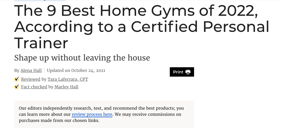
The review content itself looks fine, or no worse than most. Sure, the pros and cons section is kind of thin (but the truth is, most are).
The review itself is a bit generalized and so forth, but it does have the specs and even has more than one place to buy the product!
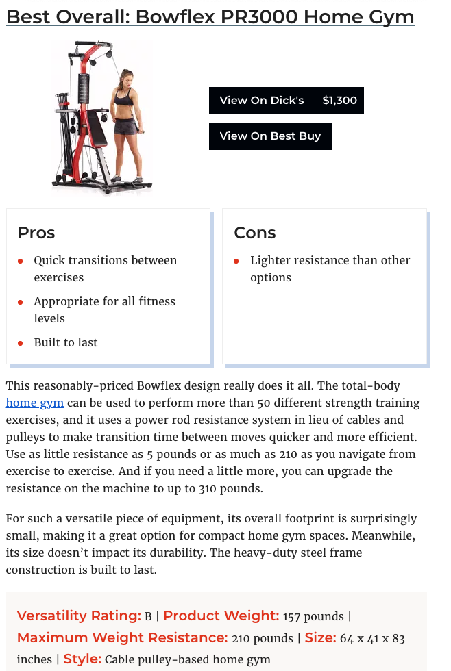
The lack of what I think could be a more in-depth review, the page seems to do some really nice things.
It offers a buying guide that’s not all that bad, considering the variety of products it has to cover:
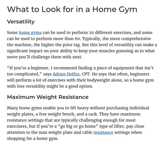
It has an FAQ:
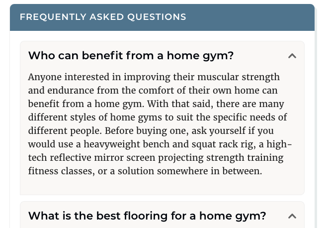
There’s even a section about why you should trust the site that focuses on the personal experience and expertise of the author:
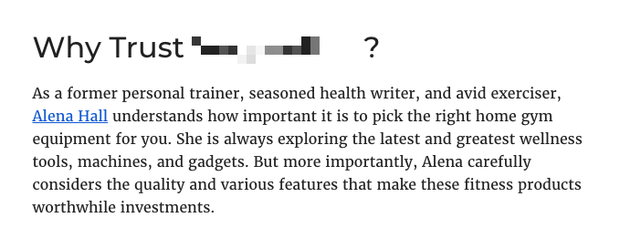
The problem, as I see it, is that aside from the section about why you should trust the author/site, it’s a bit perfunctory.
Looking back at the FAQ, the first question doesn’t really ask anything urgent or really pertinent. It seems like it’s there because there’s a notion that FAQ bring value. They do when they are basic on empathizing with the needs, and therefore, questions of users.
That’s really my issue with the page. Everything is there, but is it really helpful or is it trying too hard to look like it’s a quality page?
Being fact-checked and whatnot for health content is important but so is diving into the products to better understand their quality, how they’re used, how to best use them, and who should or shouldn’t use them, etc. That’s actually more important than a fancy abbreviation at the end of someone’s name.
Site #2 (stable top-ranking): Oddly enough the page that consistently did well took an entirely different approach to product reviews. It didn’t have much of the usual structure: no formal pros or cons section or a well-formatted box with specs.
Rather, it was one massive comprehensive blog post-like piece of content built on other massively informative and expertly created pieces of content.
All you had to do was spend just a few minutes reading the page to realize these people are serious experts on the products.
For starters, this “best of” list comes from a collection of in-depth pieces on each product type discussed on the page:
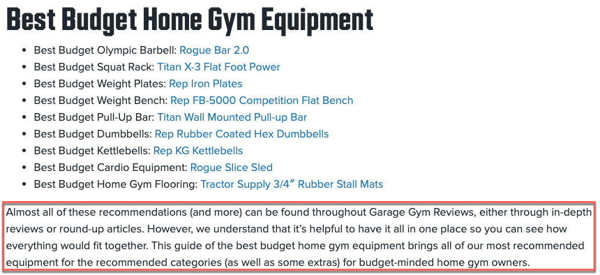
Then they offer the criteria they used as well as a statement that everything they recommend they personally tested:
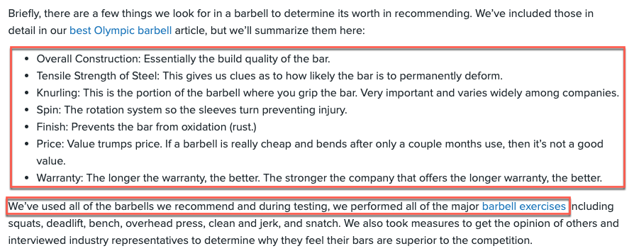
On top of that, throughout the page, they bring up the consideration of safety as is applicable, which it is here considering it’s their budget pick:
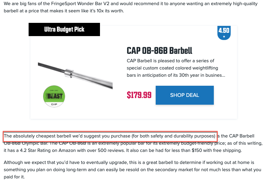
All throughout the page, they offer an extreme level of detail regarding the products under review which clearly demonstrates total mastery over these products:

The page also includes ancillary information to help give the reader some direction in making their purchases:
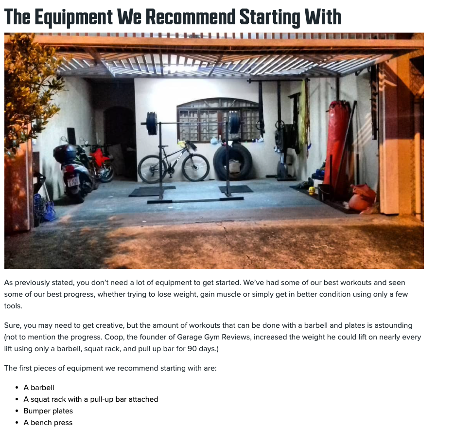
And again, the page is laced with other articles that support an even deeper dive into each of the products being discussed.
For example, where the page discusses weight plates, it links to an in-depth post that goes down the “weight plate rabbit hole” to such an extent that it breaks down the materials used in various plates and the implications of such usage:
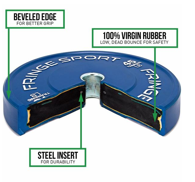
Notice here too, they do not forget to focus on safety as the topic comes up.
While this page lacks almost all of the traditional formatting you might expect from a product review page, the information on it is fantastic. Moreover, it’s the kind of detail that exudes authority, which is really important when dealing with a Your Money Your Life (YMYL) product.
Bottom Line:
Having all of the right elements on the page, from comparative charts to boxes listing pros and cons, is not beneficial unless the content within those elements is substantial and helpful. This is especially true within the YMYL context, where one page clearly demonstrated a superior understanding of the products it was reviewing and took a far more genuinely helpful approach that lent credence to the notion that the content was filled with expertise, authoritativeness, and trustworthiness.
3. Don’t Forget the SPECIFIC Product You’re Reviewing (Keyword: best 8 subwoofer)
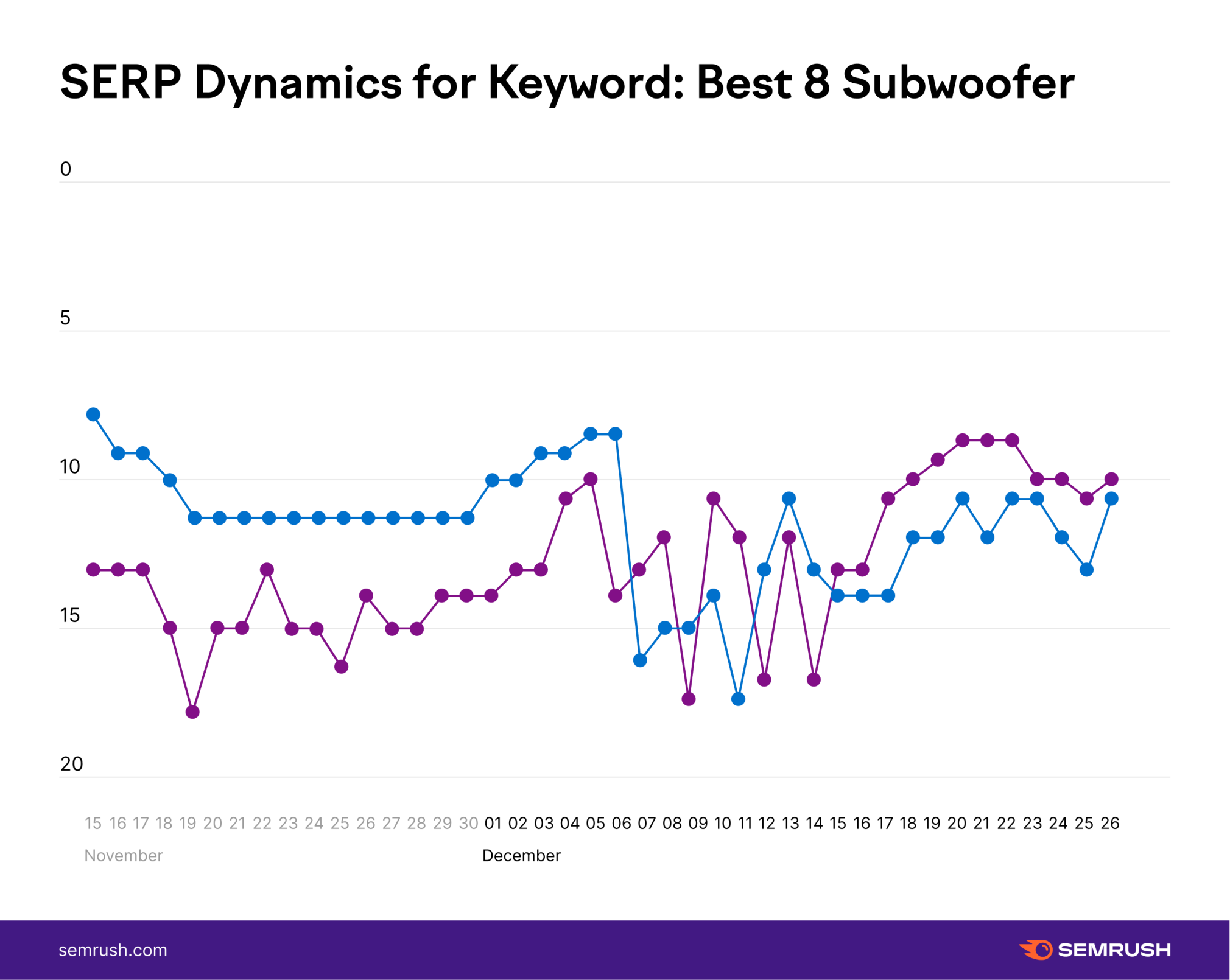
Synopsis:
Though both pages here have ended up around the same ranking position on the SERP, they have vastly different trajectories. One site (blue line) saw a drastic loss of ranking towards the early part of the December 2021 PRU with a slight rebound in rankings as the update moved on. This is in contradistinction to the other page which gained rankings starting on December 17th before losing a bit of those gains by the time the update finished.
Analysis:
Site #1 (loss of rank): Trying to find a possible reason behind why Google preferred one of these pages while forgoing the rankings of the other was a bit hard at first.
Initially, I thought the page that lost rankings did so because the review content was on the thinner side — which all things being equal, I’m sure did have an impact.
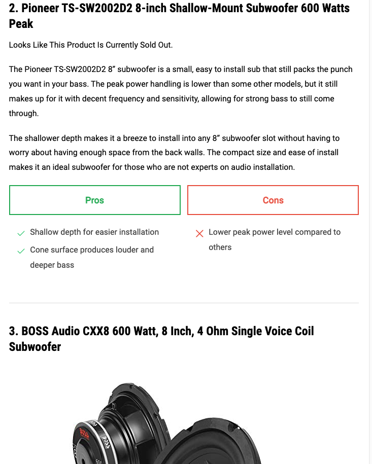
That’s not a lot here. There are no specs or details about the products. In this case, there isn’t even an image to go with this specific product. (For the record, most of the products on the page did contain an image.) Even the pros and cons lack much of any nuance and specifics.
At the same time, I thought the page did a nice job with its section on buying considerations.
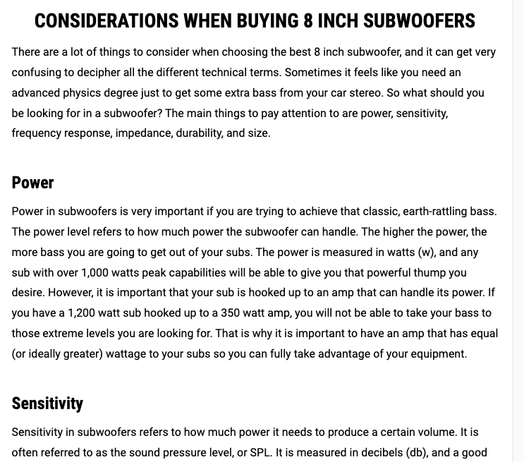
There’s a lot of detail in there about watts and amps and all sorts of science stuff that make it seem pretty authoritative…until I saw what the other page did with the same sort of content.
Site #2 (ranking gains): To start, the page that gained rankings (represented by the purple line on the graph) does a better job with the review itself:
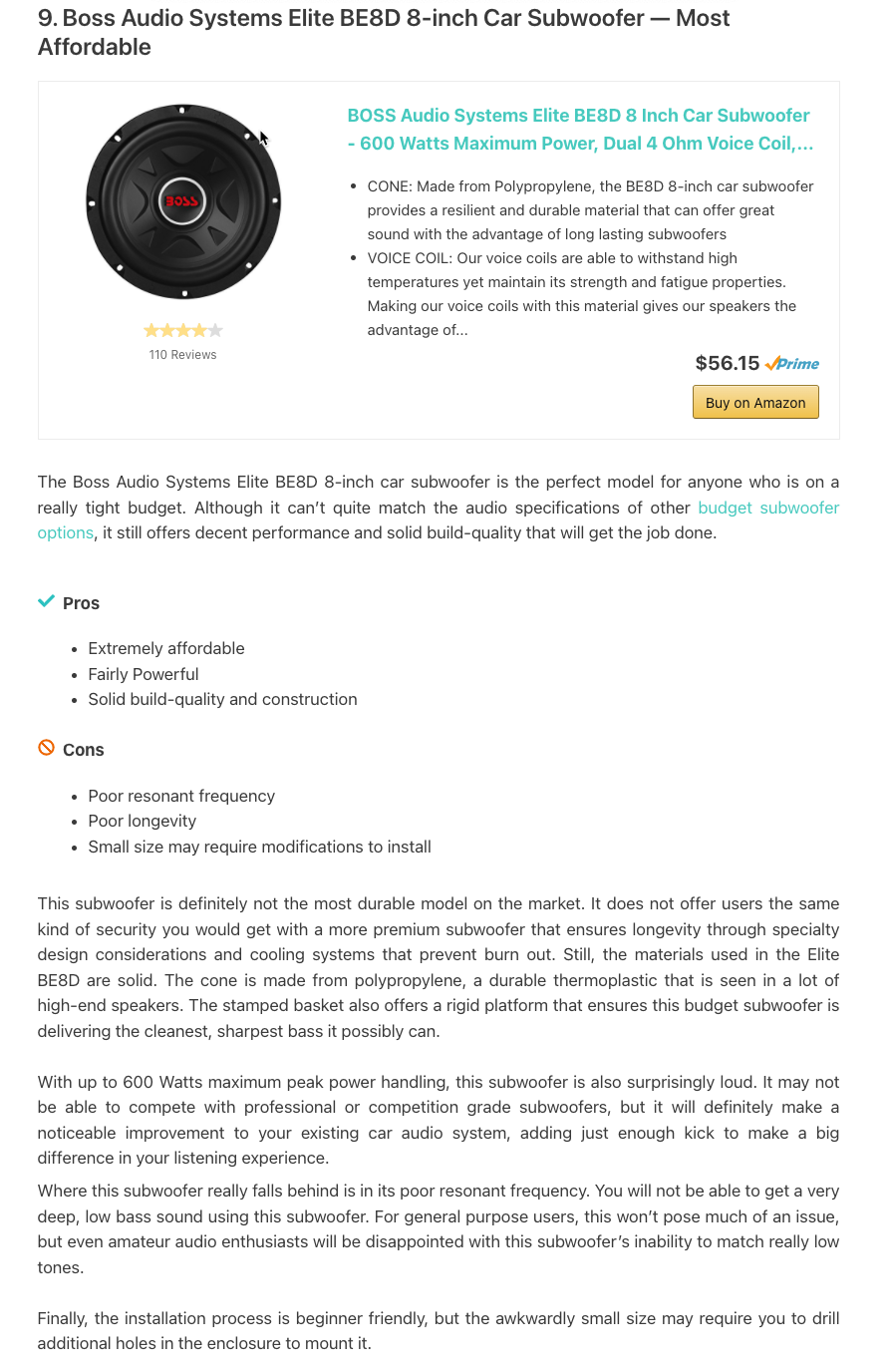
While the pros and cons section is nothing to write home about and while the review copy lacks in the way of technical details that I think should be there, it’s a lot more specific about the speaker’s performance than the other page. A lot more.
Like the example around sewing machines we saw earlier, the information here helps you make a decision about the importance of performance limitations. At the same time, you get the sense that the author has listened to the speaker personally and is basing the assessment off of real use. I don’t know if that’s true or not, but it’s written in a way that makes me think it is. That and the author’s bio lean into that notion:

For the sake of comparison, here’s the bio for the author of the page that lost rankings:

Not that the bio above paints the author in anything but a good light, but it’s not focused on a personal connection to the specific topic at hand.
Now to the buying guide I mentioned earlier:
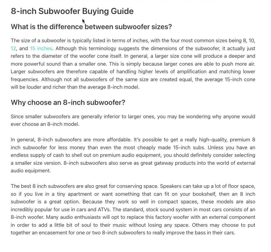
It’s not as technical as the buying guide on the page that lost rank, but it is more “on topic” in the sense that it speaks to the specific product in question here: 8-inch subwoofers.
While the buying guide on the page that lost rankings added a lot of value regarding the technical side of subwoofers, it felt as if it could be about 8-inch subwoofers or 18-inch subwoofers.
Here, however, the content didn’t forget the specific product it was dealing with and created a buying guide that spoke to the unique consideration of someone in the market for that specific product.
I want to showcase one last thing the page here did well: it added a list of resources…

I really liked seeing this on the page. It adds to the overall authority and expertise of the author, it connects this page topically to other strong pages, and it can be really helpful to people who are trying to get a grasp on the product, etc.
Bottom Line:
Great content is great, but good content that speaks more closely to the user’s intent might be even better. In this case, the buyer’s guide, while not as detailed or technical, was more relevant; while the overall review content demonstrated personal experience that even though it lacked in some detail, it helps users make a good buying decision.
4. Product Reviews — Intent Matters (Keyword: home theater system wireless)
Synopsis:
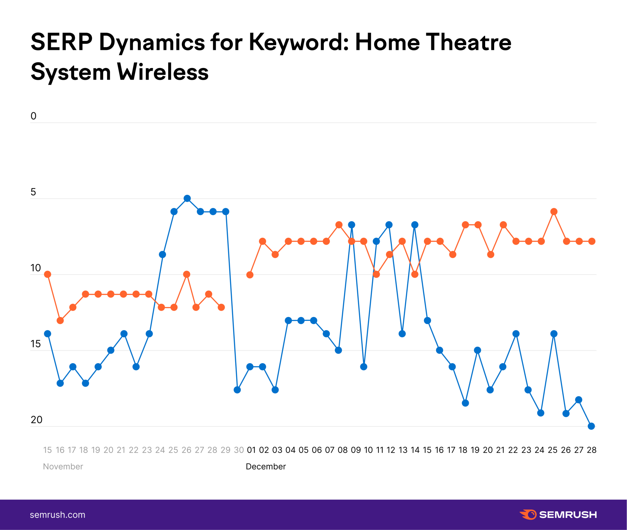
We’re looking at two pages with this keyword: A page that saw some ranking gains over the course of the update (in orange in the graph above) and a page that was ranking around position 14 that’s now barely hanging on at position 20 (in blue).
To the latter, here’s a page that was rewarded by the November 2021 Core Update only to see those gains wiped out by the PRU. You can see Google flirts with restoring the page to its former glory around December 10th, only to finally settle on what is about a 5-6 position loss from where the page ranked even before the November update.
Analysis:
Site #1 (loss of rank): I chose this example because it’s a great example of the power of intent. Most of the analysis around the PRU, including mine, is around page elements, review quality, etc. However, intent has the potential to play a major role here as well. That’s what I think is at play here with this page as the review content itself looks solid. I mean, really solid.
The page starts off with a ton of information on home theater systems, and it’s really good content. Even where the page goes into what a home theater is, the content is unique and helpful:
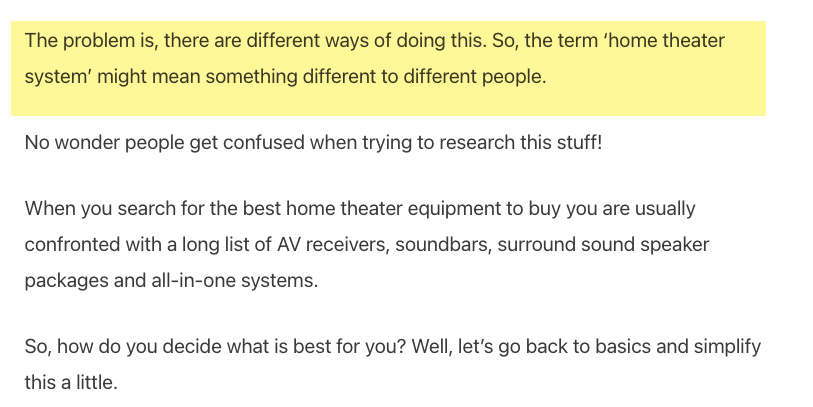
Personally, I was left with clarity since the term “home theater system” does feel really ill-defined.
Before you’re treated to the reviews per se, the page does a lot to help set users up for success in their purchase with a series of content running through everything, from connection types to optimal speaker layouts to the amount of power needed to run a system.
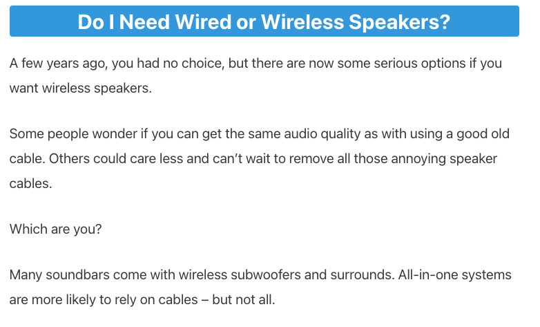
It’s too much to run through it all here, but there’s a ton of content; and it’s all really helpful and nuanced.
Now for the reviews themselves, which are some of the best I saw while doing research on this.
Just look at how the page starts this one with a history of the company to help you understand that this product is made by a solid brand:
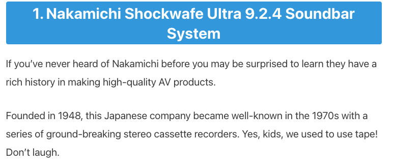
You get a nice list of pros and cons that have a bit more detail than a lot of what’s out there:
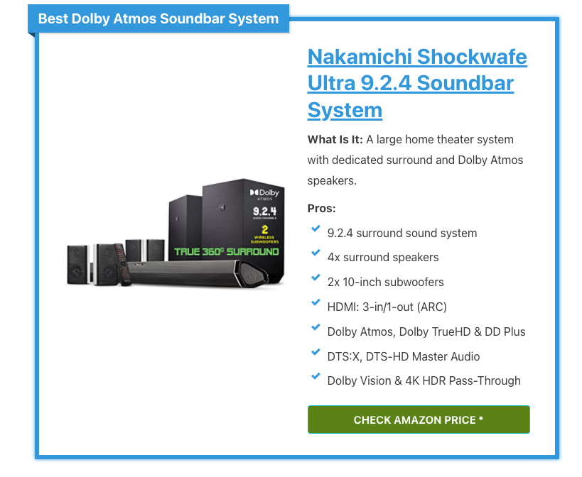
As the review continues (some of them go for pages), the reader gets a nuanced look at the product in the context of their potential needs with additional specs and details spattered in:
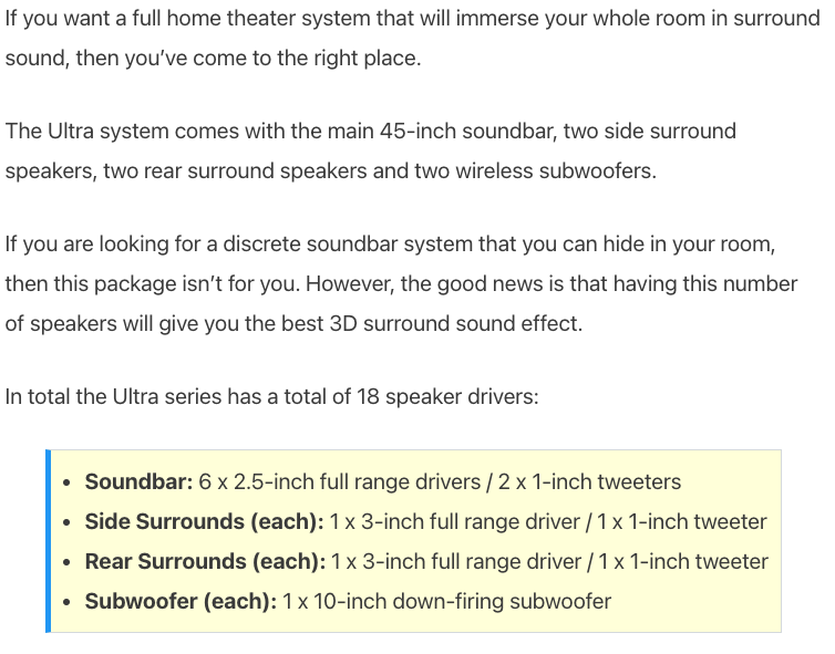
You can really tell, whoever wrote this knows a lot about these products and is giving you an honest take. It’s clear he has the user’s best interest in mind:
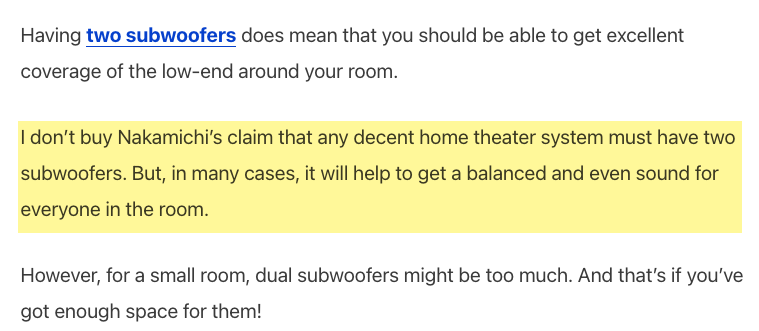
There’s honestly an overabundance of information, endless product details, etc. as you can see here with yet another table that breaks down the product specs/features:
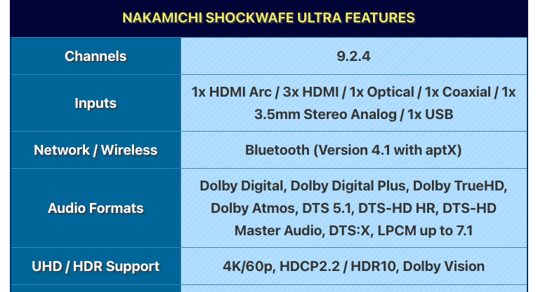
Just have a look at how the page ends the review for this specific product with a video that lets you hear the sound quality yourself!
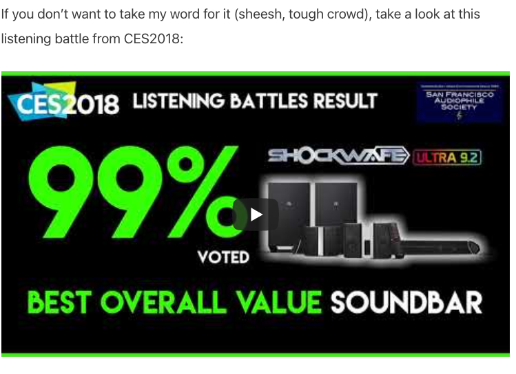
You can see why Google wanted to reward this page back in November and why even during the PRU, it flirted with the idea of keeping its rankings high.
What’s the problem then? Intent.
Look back at the keyword: it’s all about wireless systems. This is a page for all systems. In one of the screenshots I shared above, the page goes into whether or not you need a wireless or wired system when the intent of the keyword reflects someone who has already decided what they need.
Just have a look at the initial comparison chart the page offers:
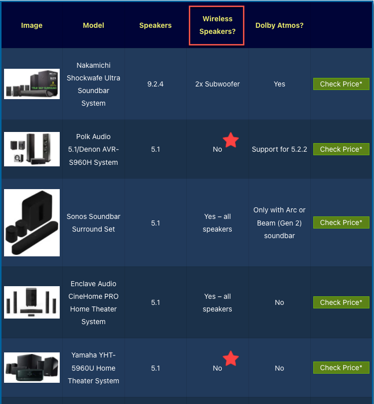
Of the 10 products, the page reviewed only five represent fully wireless options.
The page is incredibly helpful, and it does an amazing job reviewing these products; but only half of the page is entirely relevant to query.
I think what we have here is Google struggling with looking at content that is above and beyond but that is only partially relevant to the query.
It’s interesting if not fascinating to see that the core update went with the overall quality of the page, while the PRU seems to have weighed the intent more heavily.
Site #2 (gained ranking): This is not a product review site. It sells furniture for home theaters (sofas and seating, rugs and decor, etc.), which made the content on this page incredibly surprising because it was very well done (for the most part).
Before I dive into this page, just know this is not a product review page per se. It’s a page that guides you through home theater systems, specifically wireless ones. Along the way, there are product recommendations and ultimately, offers for a series of systems they also recommend that you buy.
I’m including this page here because I think it showcases the kind of information and strong topical focus that a good product review page should have. The page’s placement on the SERP highlights the demand for content that helps the user know how to go about buying something and what to look for. It’s the kind of intent that we’ve seen Google call for on review pages. Seeing this page rank so well with such a soft focus on a specific product shows how much Google values this kind of information and how it is a large part of user intent.
With that, here’s how this page kicks off:
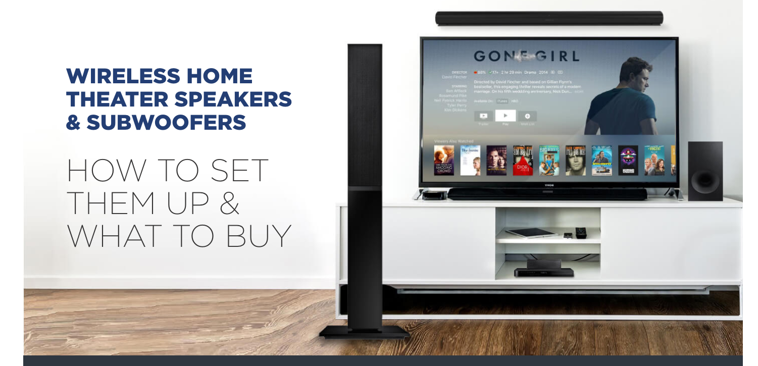
Again, it’s entirely focused on wireless products in line with the obvious intent of the query.
The page does a fantastic job of helping you understand the subtleties that come along with this type of product. As I mentioned, and as we saw with the page that lost rankings for this keyword, the topic of home theaters is very confusing and a bit misleading.
The page here tackles that head-on and does it well:
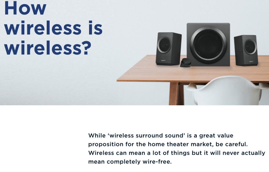
The page then goes into a really digestible deep-dive into the various wireless technologies that exist, discussing their pros and cons, etc.:
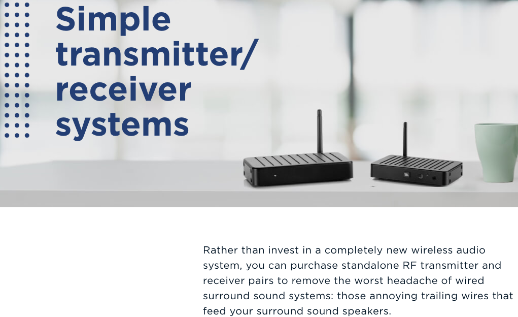
As part of this, the page does discuss specific products, makes specific recommendations, and links to places to buy these products:
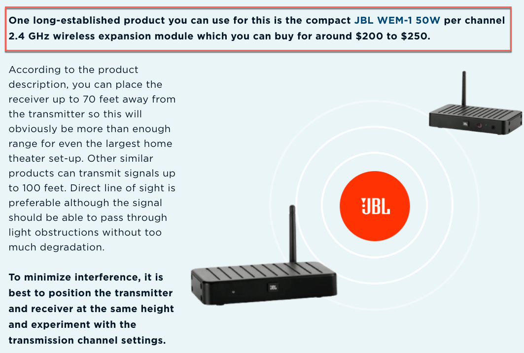
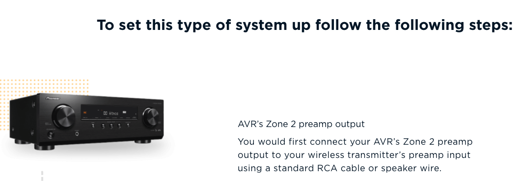
While the description here seems pretty “plain,” you can see there are tips on how to use the product. More importantly, all of the discussion around the product type offers a lot of information as well. For example, as part of the discussion around this “aspect” of wireless home theaters, the page tells you how to set up a system that utilizes this product:
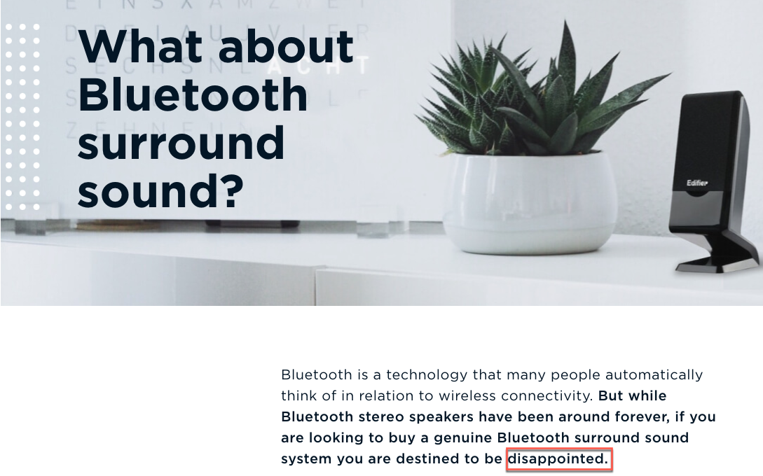
Similarly, the page runs through the kind of products you should not use:
Here too, the page goes through specific products:
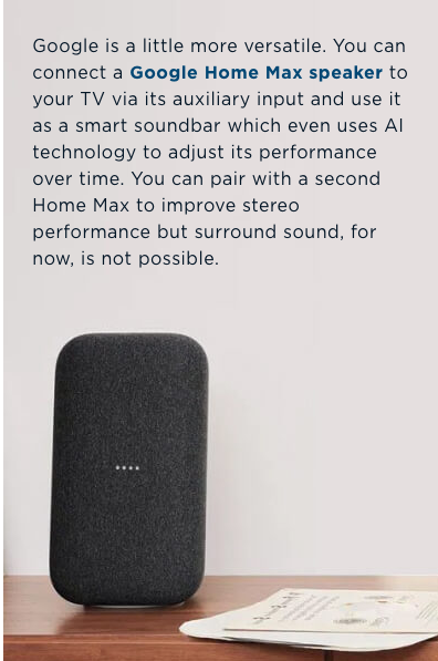
While the information shown in the image above seems far too little, remember the page gives this little blurb a ton of context as it deep-dives into the use of Bluetooth for wireless home theaters.
And yes, the page does list specific products in a dedicated section:
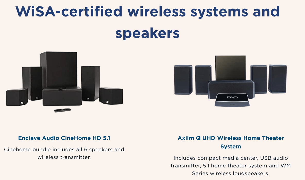
While this content is very thin from a pure product review standpoint, it’s not when you look at the products from a categorical point of view.
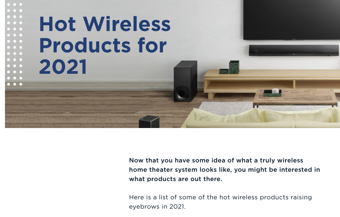
By the time you get to the specific products, you have a good understanding of the pros and cons of the various technologies that are available.
In other words, I think Google is ranking this page because of its awesome product recommendations. The fact that there are product recommendations makes this dive into the types of available products more pertinent and a little bit more relevant to the query. I think the page fundamentally ranks because it gives the user the information they need to ultimately decide on the right type of product.
This sort of categorical information would serve any product review page well.
Bottom Line:
Two things here. One, don’t get lost in the specific reviews. Make sure that the user has enough background information to make an educated decision. If the products you are reviewing make use of different technologies, make sure to include a run-down on those various technologies and what they mean in terms of their use after purchase.
Secondly, you might run into a situation where you have to segment your reviews into multiple lists. In the case here, the site that lost rankings for their page might do well to create a separate list of reviews solely around wireless options as well. While the reviews on this page were far more relevant than those on the page that gained rankings, the page overall was less aligned to the intent implied by the query.
You can have a great page with unbelievable reviews, but it has to be well aligned to the intent.
What Stands Out
One of the dangers in analyzing both the April 2021 and December 2021 Product Review updates is you could walk away thinking that elements such as comparative tables, buying guides, and pros and cons lists are vital.
But what is vital is offering content that makes it easier for people to decide what product to buy. Elements like comparative tables and buying guides can definitely help facilitate this. However, they are not helpful to users in and of themselves. The content within them needs to be detailed and nuanced. These page elements need to be surrounded by context and any variety of other pieces of content.
Analyzing a PRU shouldn’t make us run to create a checklist of things to add to product review pages.
I think if you look at the pages above that did well, a few things stand out:
They relied on real experience that made the information genuinely helpful. They considered not just a pro or con of a product but how that pro or con would really impact the use of the product. They were specific. They honed in on and provided information that was highly relevant to the specific product in question.It seemed to almost be a theme. Pages that perhaps didn’t have a comparison chart but did speak from real experience and did target real pain points did well.
Of course, in highly competitive spaces, you may need to have the comparison chart with the type of content I’m talking about. I’m not saying no. What I am saying is that these page elements are not some sort of inherent factor but help accent the main value of a product review page, which is, of course, the level of detail and nuance and user targeting that makes the content genuinely helpful to folks.
Innovative SEO services
SEO is a patience game; no secret there. We`ll work with you to develop a Search strategy focused on producing increased traffic rankings in as early as 3-months.
A proven Allinclusive. SEO services for measuring, executing, and optimizing for Search Engine success. We say what we do and do what we say.
Our company as Semrush Agency Partner has designed a search engine optimization service that is both ethical and result-driven. We use the latest tools, strategies, and trends to help you move up in the search engines for the right keywords to get noticed by the right audience.
Today, you can schedule a Discovery call with us about your company needs.
Source:


![How To Create a Strategic Dashboard in Excel Using Semrush Data [Excel Template Included]](https://allinclusive.agency/uploads/images/how-to-create-a-strategic-dashboard-in-excel-using-semrush-data-excel-template-included.svg)
