Whether you’re a marketing executive, a content creator, or even just an avid media consumer, you’ve probably already noticed: infographics are everywhere these days. Reading the latest blog post from your favorite thought leader? An infographic is there to support the content. Your favorite educational youtube videos? Also using infographics as a visual aid. And all over your twitter, instagram, and even facebook feeds? You can probably find them there, too.
But what’s the deal with these things? Sure, brands of all shapes and sizes love to use them, and audiences love to share their favorites. But why? What makes them so great — and how the heck do you start using them yourself?
Why Should I Use Infographics?
From an educational point of view, infographics as a content type have a lot of advantages. Because they use bright colors, bold visuals, and shorter snippets of text, they appeal to visual learners who may not have connected to longer texts. And because they can so easily be transformed and used across various platforms — from social media to video to in-person presentation aids — they can help you connect with even more people.
But what does this have to do with content marketing? A lot, actually. Put simply, everyone absorbs information in different ways. Because of this, experienced teachers often design their lessons to appeal to all different types of students. This way they can make sure that whether they learn best by seeing, reading, or doing, their students will remember all the most important info from the lesson. (In fact, that’s one more place you can probably find infographics — think about all those educational posters your teacher had hanging up around the classroom. Yep! Those are infographics, too.)
Why it matters for you: there’s no reason why we, as content creators, can’t do the same thing those teachers are doing and connect with our audiences in a more powerful way. A thoughtful, diverse content strategy communicates with your audience on their own level — wherever that level happens to be. Infographics may be just one tool in your arsenal, but they’re a powerful tool with a ton of versatility to connect with a lot of different people.
Here are just a few advantages infographics have to offer:
They’re visually appealing and easily shareable They break down complicated data into short, easy-to-consume bites Their color palettes and designs can align with your branding — or you can flex your creative muscles They can communicate all the most important information from your article in a much shorter reading time They’re a great way to repurpose older content, and make use of research you’ve already done In addition to standing alone, they can be used to support content in a variety of other formats including text and video.Common Challenges When Creating Infographics
Adding infographics to your content strategy may seem intimidating at first, especially if your team doesn’t have writers or graphic designers who have created them before. Luckily, lots of free infographic templates are available and easily modified. Not only that, but your team probably already has many of the most important skills for building infographics — even if you don’t already have a graphic designer.
Some important skills for infographic creation that your content team is probably already using:
Generating new content ideas, and reimagining old content for new formats Organizing your information in a clear and understandable way Doing effective research and citing your sources Making sure all the design elements are engaging and reader-friendlyIf you don’t have a graphic designer on your team, don’t worry! You still have plenty of options. For example, you could download and modify pre-existing infographics templates yourself (though you may run the risk of using a familiar design your competitors have also used), or you could contract a designer to create custom infographics according to the research you provide. Semrush Marketplace is a great place to find the perfect infographic designer to do just that.
Types of Infographics & When to Use Them
One of the most important factors in using infographics effectively is making sure that the design you’re using serves the content, rather than the other way around. Despite being visual in nature, infographics should always start content-first — that is, with the story you want to tell, and all the supporting research — and all design elements must be chosen carefully to make sure that content is being communicated in the best way possible.
Below, we’ll go through each of the major types of infographics you can find, why you might use them, and what makes them powerful. Keep in mind, however, that this is not an exhaustive list. For example, you might need to come up with your own design to tell a particular story one day, or combine two or more infographic types to suit your needs. The possibilities are limitless.
Timelines
Timelines are one of the most common types of infographics, and for good reason. They can be used in many different ways, including:
Explaining historical events (such as the story of your organization and how it came to be) Telling a story (such as an important case study) Illustrating a time-sensitive process (such as employee onboarding) Event planning timelines (especially those with incremental deadlines)Here’s a good example of a timeline infographic from the SEO Reality Show by Semrush, which illustrates a process by telling the story of how one trucking company used it to improve their organic SEO performance.
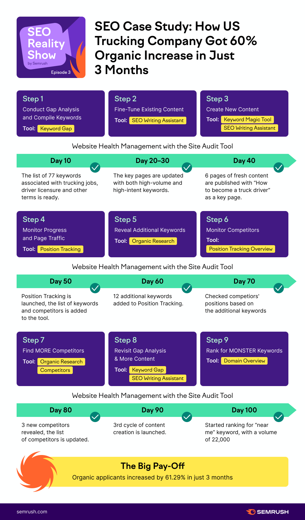
This is a good infographic because it is simple, easy to follow and understand, but still contains a ton of information. Here are a few reasons why it works:
Both the text and the graphic elements (especially the arrows) guide the reader through the infographic, making it easy to follow. The bold colors and icons are eye-catching, but simple enough that they don’t distract from the story. The timeline is broken down into clear, easy-to-understand increments. There is an obvious relationship between each step of the process and each segment of the timeline. The supporting text is informative but brief, with only necessary information, so that it is easy to read and absorb quickly.If you want to make your own timeline infographic, start by ironing out your order of events. First, decide how much time you want to cover, and then which events are the most important to include to tell your story. Make sure you’re only including pertinent information, because the more content you squeeze in, the harder it might be for the reader to follow. Once your timeline is complete, then choose your design. It should be something that guides the reader through the content, and supports your story, without being distracting.
Visual Articles
Just like it sounds, a visual article repurposes the content from an article or blog post in a graphic format. As such, these infographics are often more dense and take longer to read than other common designs.
Visual Articles are powerful for a few reasons. For one, they’re a great way to repurpose content you already have, transforming it into a new medium. Because all the most important information from your article is included, you can share your infographic on social media, or even print it out to display, without worrying that your audience will miss important context. They’re also a great way to save effort. You’re already doing all that research for your article anyway. Why not get extra use out of it by creating an infographic as well?
Here’s an example of a Visual Article from this Semrush blog post about ordering great copy, which uses a simple design to organize a collection of copywriting advice by category:
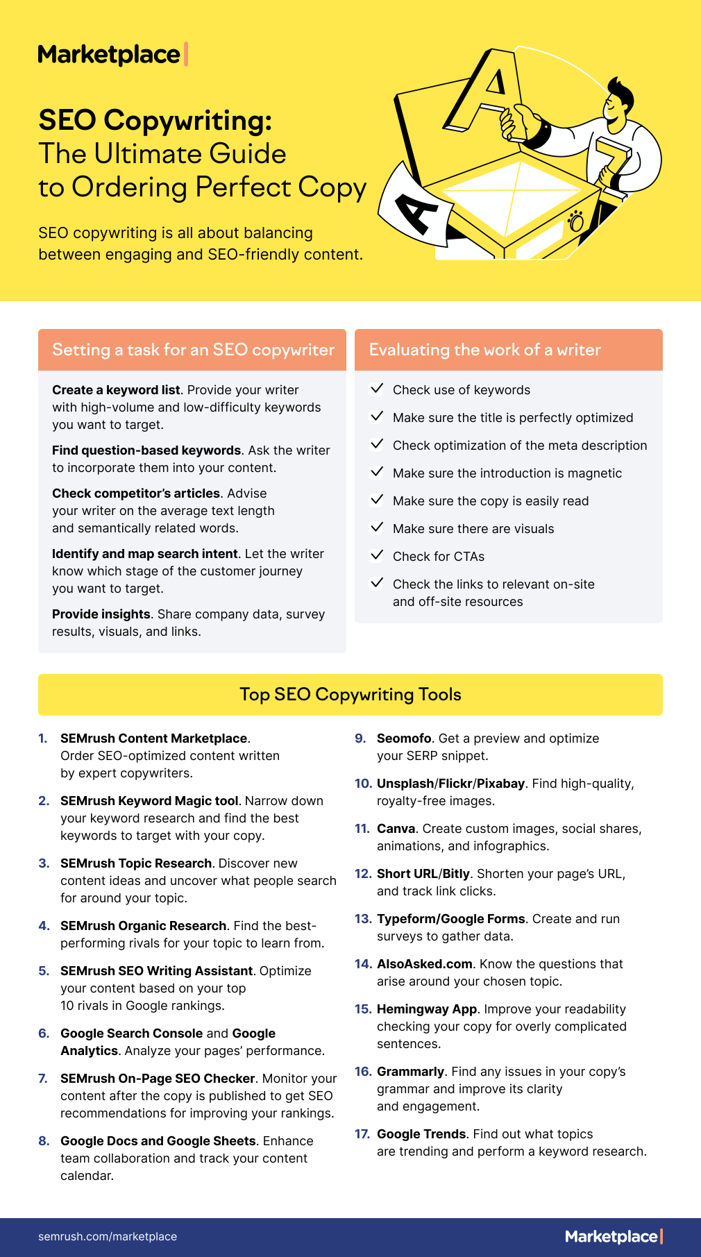
In this case, the design of the infographic mirrors the organization of the article in question, grouping each list of advice by topic. It also uses colorful headers and bold text to provide important contextual information, and to make the content easily scannable for readers to take in at a glance, even if they choose not to read it too closely.
Because of its simple, clear organization, it’s especially useful as a reference for readers of the original article to take with them and use again and again.
Of course, that’s not the only way visual articles can be useful. Here’s another example from the Semrush Blog, which uses a more visual approach:
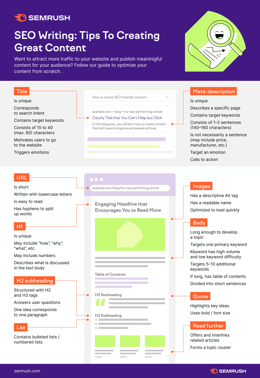
In this case, the infographic also serves as a visual aid to support the original article, which is a guide to creating effective, SEO-friendly content. The infographic uses a diagram illustrating a piece of web content to show the reader exactly what the article’s advice looks like in practice. Like the first example, it still contains all the most important information from the article, so it, too, can be used as a reference later or shared on social media.
Lists
You can also use infographics to transform lists into engaging visual content. These are an especially useful option for shorter, more bite-sized lists, because they’re highly shareable and easy to consume quickly. You can use them to illustrate part of a larger piece of content, like a blog post, as a reference in a presentation, or create list infographics to share on social media in and of themselves. They’re highly versatile, and allow for a lot of creativity in both content and design.

In this example from Venngage, the design uses bright, bold colors and iconography to engage the eye and enhance an otherwise simple five item list. Here are a few things it does really well:
The icons are simple, but colorful, in a very uniform style, and have a clear relationship with the content The most important content — the advice — is in bigger, bolder font, making the infographic easier to read quickly, with additional details in smaller text The use of numbers and arrows helps guide the reader through the infographic, so they always know what comes next Because the advice offered is uplifting and fairly universal, it’s also very shareable on social media.Because list infographics are relatively simple, you can really flex your creativity when creating your own. Just make sure that your design choices support your theme, are consistent with one another (like how the icons above are all in the same style), and that it’s easy to read, understand, and share.
Processes and Flow Charts
Process or flow chart infographics illustrate a series of steps or decisions that a reader might follow. Like any flow chart, the specific layout you choose depends on the process you’re illustrating. A more complex, branching decision tree, for example, would require a more complicated format than a more simple, step-by-step process. Whatever your process looks like, your design choices should assist the reader in following along.
Using an infographic to illustrate a step-by-step process is beneficial because the design elements can help to clarify each step, making it as simple and easy-to-understand as possible.
Here’s one example from our blog post about B2B writing, illustrating a workflow for writing and optimizing B2B content:
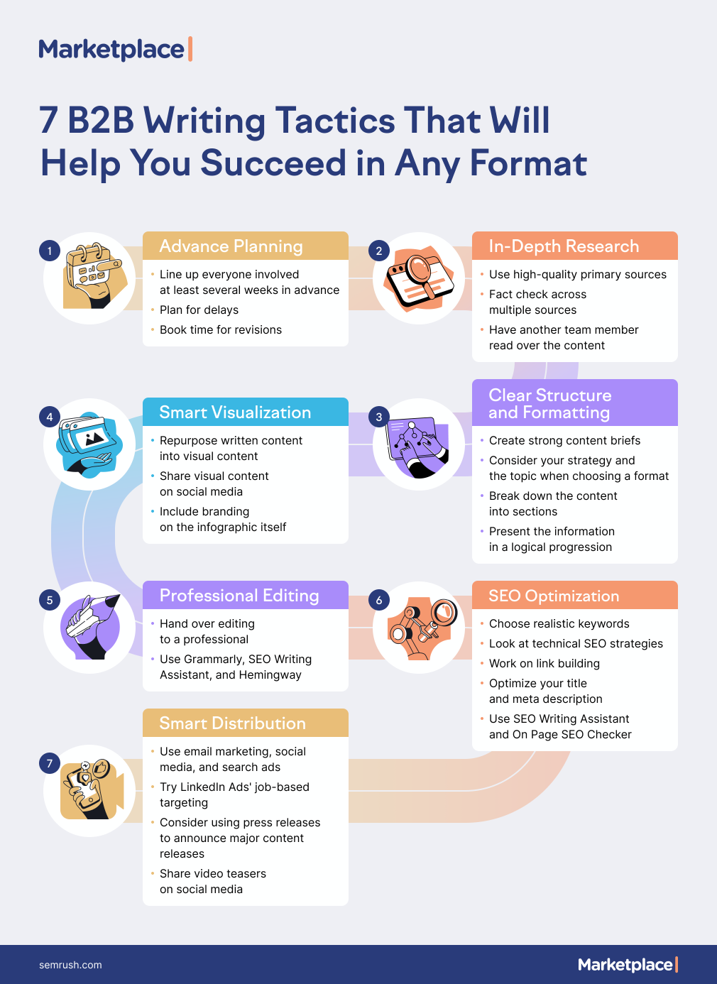
This relatively simple infographic uses a colorful pathway design to guide the reader through a seven-step process. That pathway, combined with color-coordinated text boxes and icons, are visually engaging while still assisting with organization of the content. Not only that, but the bold headings make the infographic easy to read quickly, while the bullet points within each text box provide more detailed advice if the reader chooses to read more closely.
If you want to create your own process infographic, the first step is to write out your process. Make sure each step is clearly expressed. Next, think about the format you’d need to use to illustrate it. Is it a simple, numbered list of steps, or are there branching decisions? Once you choose the layout that best supports your process, then you can start on the creative design, such as icons, colors, and fonts.
Data, Charts and Numbers
Infographics are commonly used for data visualization, illustrating complex data and numerical values to help readers, even those who aren’t particularly mathematical or data-driven thinkers, understand them better. You might use bar graphs, pie charts, or even pictograms — whatever works best for telling your data story.
For example, here’s one infographic from our Marketing Strategy Hub that breaks down web traffic channels for car dealerships using pie charts:
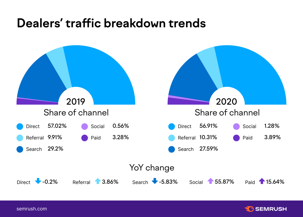
You’ll notice that, in this case, the design isn’t terribly different from most other pie or doughnut charts you might use when reporting. In this case, the goal was to give readers a visual representation of each channel’s share compared to the others. It’s not always necessary to reinvent the wheel — sometimes the simplest, most direct way of representing information is the best one.
But that doesn’t mean you can’t be creative with your data-driven infographics. Here’s another example by Nigel Holmes that combines text, illustration, and pictographs to tell a data-driven story about ultralight backpacking:
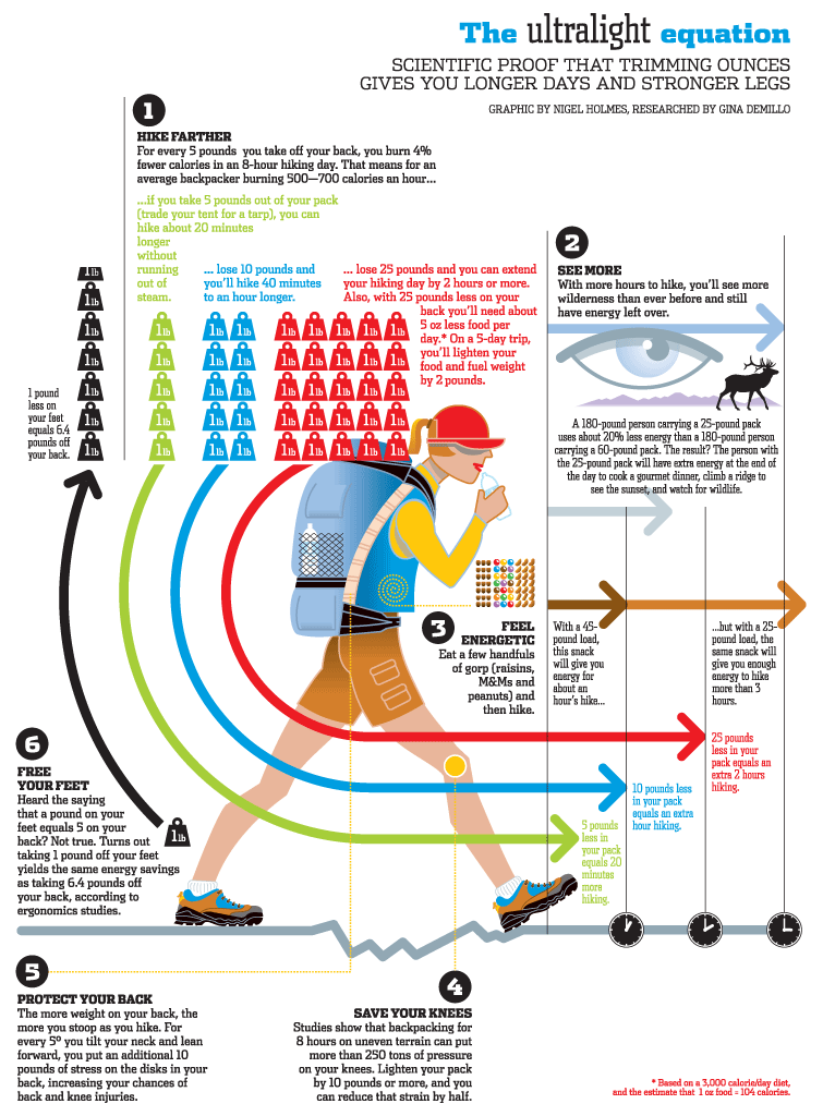
This example is much more dense than the previous one, with lots of text and small print, meaning it might not be suitable for all screens or social media platforms. However, overall, it’s still a great infographic. The image is eye-catching, and uses icons, color-coding, and design elements, which all relate back to the text. This makes it interesting to look at, especially for readers already interested in hiking or backpacking.
Whatever charts and graphs you decide to use, the most important thing to remember is to cite your sources. Whether you’re explaining a study you performed yourself, or collecting data from a variety of sources, make sure to include that in your infographic. Not only does this make the data feel more trustworthy, but it also makes sure that, even if the graphic gets shared outside the original article you design it for, the appropriate credits will still be available for anyone who wants to check.
Comparisons
Comparison infographics are exactly what they sound like: a comparison of two or more things in a simple, graphic format. They’re useful for laying out clear contrasts between two or more things, and also for showing similarities and differences. As such, these infographics need to be organized as clearly and obviously as possible to avoid confusion.
Here’s one example from Venngage, which contrasts facts about sharks with common misconceptions.
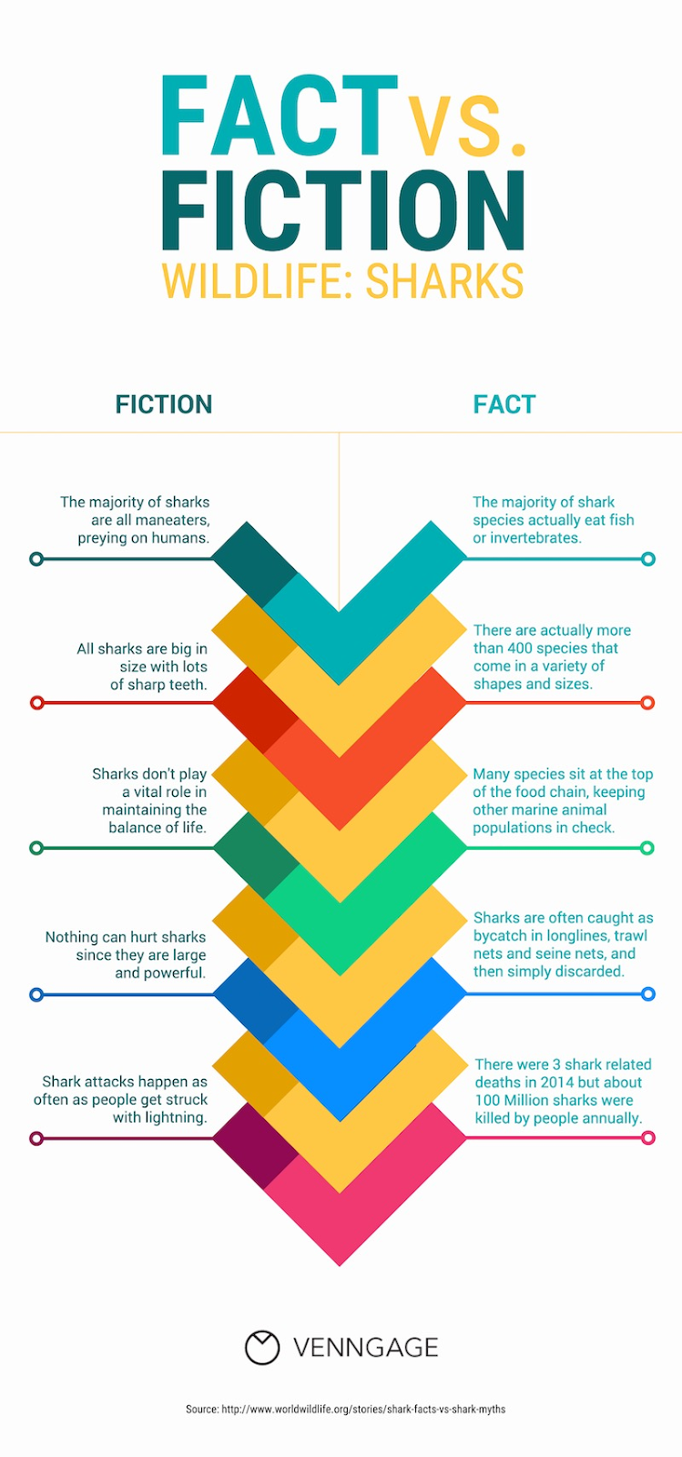
This is an effective infographic design not because it has anything to do with the subject matter — it doesn’t — but because it’s easy to follow. The graphic in the middle helps to organize the text on either side, keeping them separate while still expressing a connection between them. It also guides the eye down, encouraging the reader to continue reading it.
Of course, you don’t have to use columns. Another popular way to organize comparison infographics is to use venn diagrams, just like in this popular Marvel Cinematic Universe infographic by The Geek Twins:
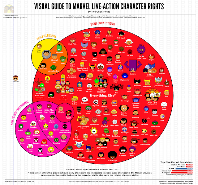
In this example, simple but recognizable icons are used to represent Marvel comics characters, with the venn diagram representing each studio with the rights to use those characters. It’s simple, detailed, and fun to look at — and frequently shared in articles and blog posts around the internet.
In this case, a venn diagram was the best choice of format, because many characters are shared between film studios. If you’re creating a comparison infographic and some data overlaps, a venn diagram might be the best option for you. Otherwise, if you’re strictly drawing a contrast between two things, simple columns may be the way to go.
Geographical Data
If you want to break down data by location, geographical infographics are an eye-catching yet informative way to do this, often using only the bare minimum of text to get the message across. Take this example below by Ken Bromley Art Supplies, which illustrates the most popular artist in each country according to Google search data.
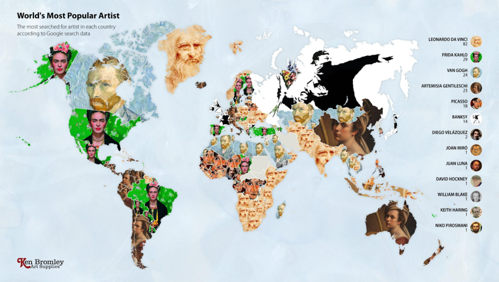
This beautiful infographic works because, despite having almost no text, it’s still extremely informative even at a glance. That’s because it uses one of the most iconic and well-recognized pieces by each artist, so at a glance. At a glance, it’s easy to tell, for example, that Frieda Kahlo is the most popular artist in the United States, and that Banksy is the most popular in Russia.
Conclusion
The limits to what your infographics can look like are limited only by your creativity, design savvy, and the story you want to tell. Getting started might seem difficult, but you’re not without resources. If you want to learn even more about creating infographics, check out this guide on our blog.
And when you’re ready to start designing your own custom infographic, we can help. With the Semrush Marketplace, you can partner with the perfect designer to create a custom infographic to tell your unique data story.
Innovative SEO services
SEO is a patience game; no secret there. We`ll work with you to develop a Search strategy focused on producing increased traffic rankings in as early as 3-months.
A proven Allinclusive. SEO services for measuring, executing, and optimizing for Search Engine success. We say what we do and do what we say.
Our company as Semrush Agency Partner has designed a search engine optimization service that is both ethical and result-driven. We use the latest tools, strategies, and trends to help you move up in the search engines for the right keywords to get noticed by the right audience.
Today, you can schedule a Discovery call with us about your company needs.
Source:


