Pop-ups suck. Half of the marketers say “Pop-ups are annoying; they make people leave the website and we lose the profit.” Another half claim “Pop-ups can be of a high value and drive sales, increase the conversion rates and average order value.”
Who is right?
When I stumble upon a website with five pop-ups visible at the same time, I have only one thought on my mind: stop it! But, is this the problem of the pop-up itself or the manner in which it is delivered?
In this article, you will learn seven rules that will help you create pop-ups that will work for your business.
1. Keep in Mind That all Customers are Different
A promo code for a first purchase may serve as an excellent stimulus for those new to your site. Keep in mind, repeat customers who already trust the store may be interested in the special gifts and cumulative discounts as well. You can estimate what promotions drive the most engagement among the active users and among the new visitors separately.
Another strategy is to ask your returning visitors about their experience with the store and what kind of changes they would love to see in it. Be creative with your pop-ups, remember that pop-up blindness makes visitors ignore your messages.
Creative Example
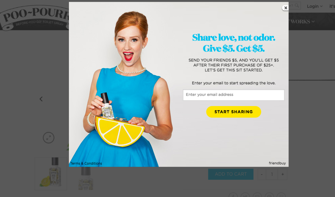
See how Poo-Pourri talks about their referral program, and notice the design of the banner — bright colors and contrasting elements. They promote a referral program with very simple rules: give $5 to your friend and get $5 off your next purchase.
After one sends a promo code to a friend, they get this message:
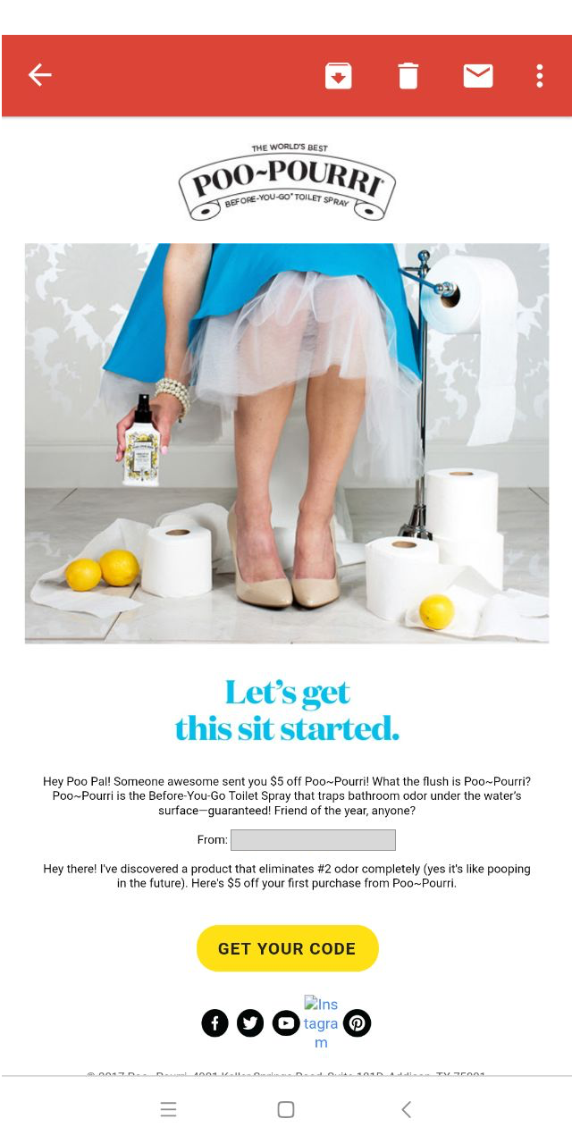
Unfortunately, it is not optimized for mobile devices. When planning pop-ups, always consider what happens next for the user; what email will a person get and how easy it will be for him/her to use your offer.
2. Use the Data About On-Site Behavior to Show the Most Engaging Messages
Imagine a user that keeps scrolling through the same page and does not perform a target action (Example: adding to the cart). In this situation, you can ask if they need any help with the purchase or want to see similar items.
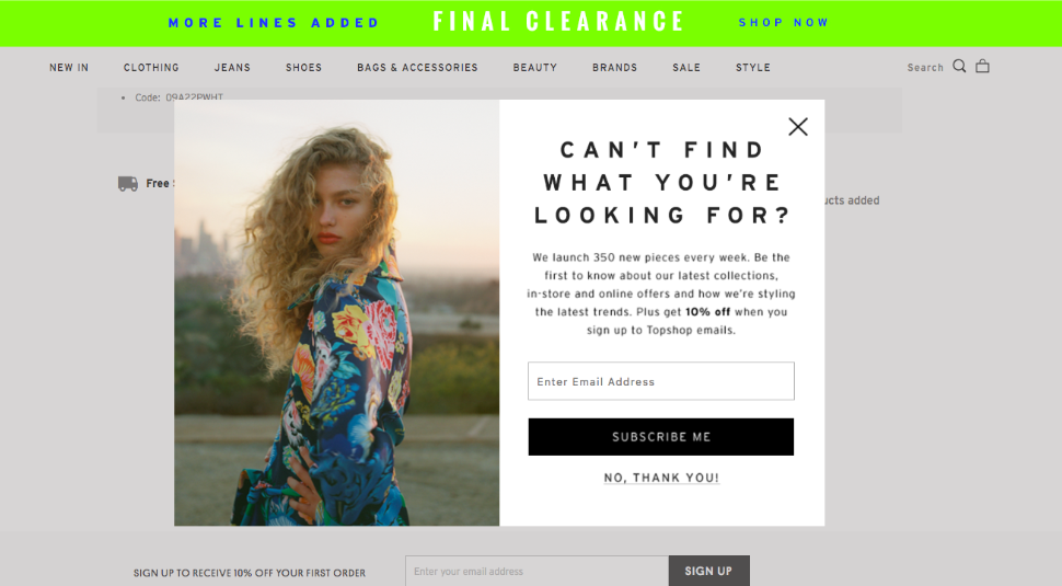
It is critical to choose the right timing for your offers. Pop-ups that are shown after three pages visited and 30 seconds spent on the website are closed less than those that are presented right on the landing.
For some sites, a landing page pop-up could make sense. Coursera asks users to log in after a few seconds on the website. The goal of this online courses’ website is to onboard you as soon as possible and let you try the first course.
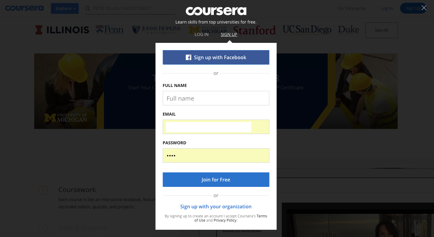
What could be done better:
From a personal perspective, I have already registered at Coursera, so I don't need to sign up. Instead, showing the right option for different users could remove some irritation. For example, they could show a "login window" for those who have an account and a "sign-up window" for those who don't.
3. Think of Your Store Features
If you are selling to both men and women, it could be wise to ask the gender of a visitor and then target him with relevant offers. You can also segment users based on the pages they often visit. However, not all products are gender-related.
For the products that are related to a hobby, it could better to ask how your user spends his free time and not make conclusions based on the on-page events.
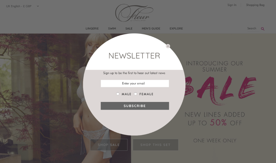
Things to consider:
Take into account all the needs of your audience. If a woman is looking for a nice dress on your website, it doesn't mean that she doesn't want to get information about new pants for her kids. Sometimes it makes sense to ask for details to create a greater value for your customers.
4. Stop Spamming
On this site, the tabbed “Welcome offer” does not force a user to subscribe right away to get a promo code, but they can click on it and see a big traditional pop-up.
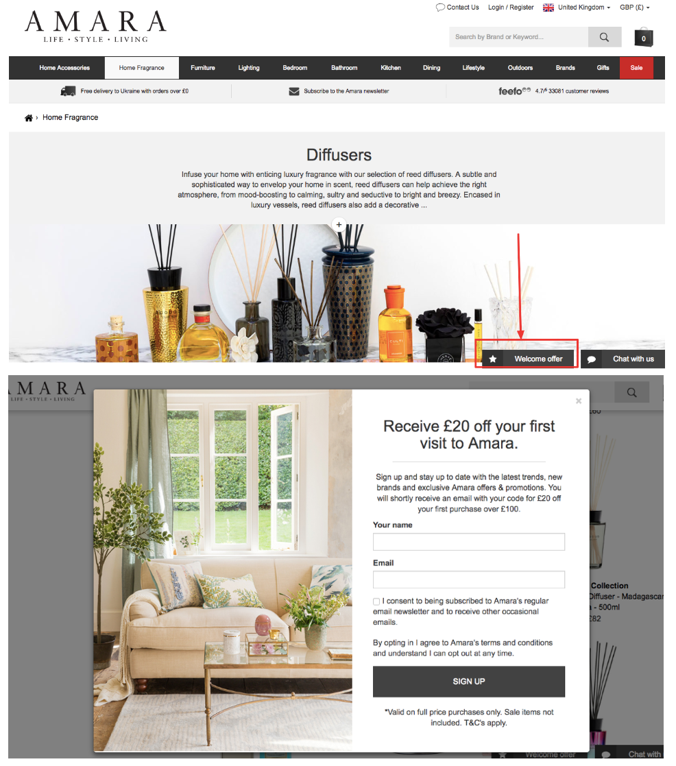
What could be done better:
On this site, there is little difference in the design between the chat bar and welcome offer. Animation for the welcome offer would help draw attention to it and increase CTR for this announcement.
Example 2:
Pop-ups should be always timely and not overload the visitor.
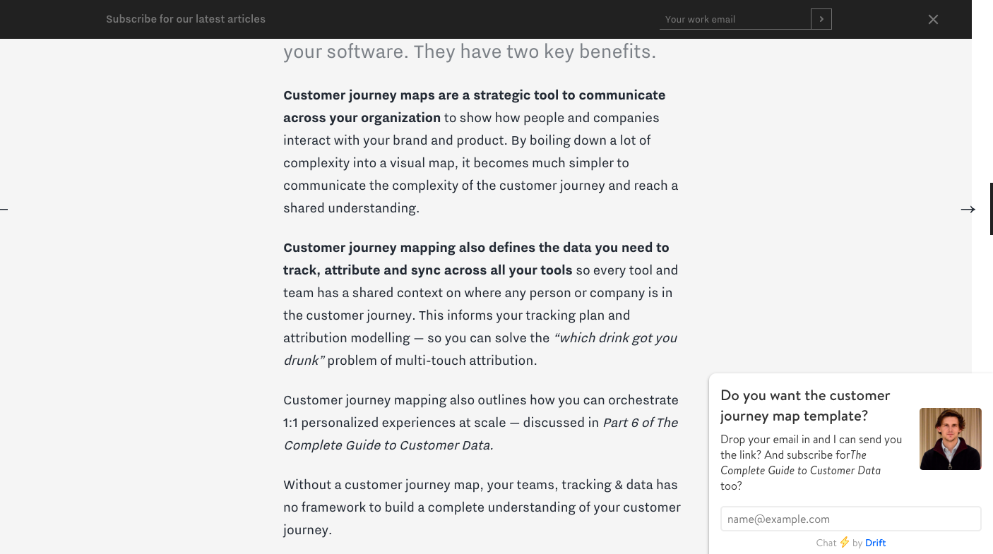
I scrolled through the first one or two screens and was offered a customer journey map template. To start, a person who has no trust in a website would never provide their contact details to strangers. The headline makes sense, as I am reading about the subject customer journey mapping. However, I am not yet sure the website provides great content.
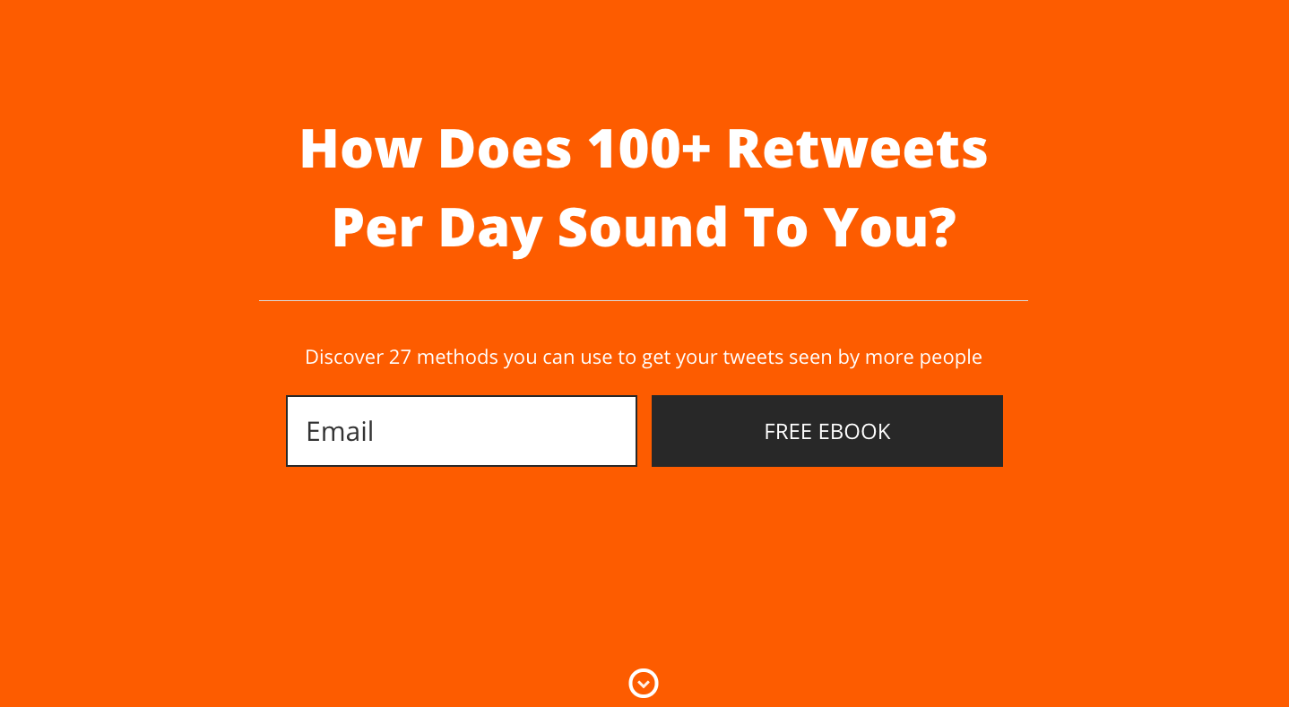
One thing that is even worse is showing a welcome mat to people not interested in the material you are promoting. I came to read a blog post about copywriting tips but was bombarded with social media hacks. Thanks, not interested.
Test Messenger instead of the classic email subscription form. It is easier to press the button “Send to Messenger” than to type in all contact details. A neat pop-up at the bottom left corner can work for you:
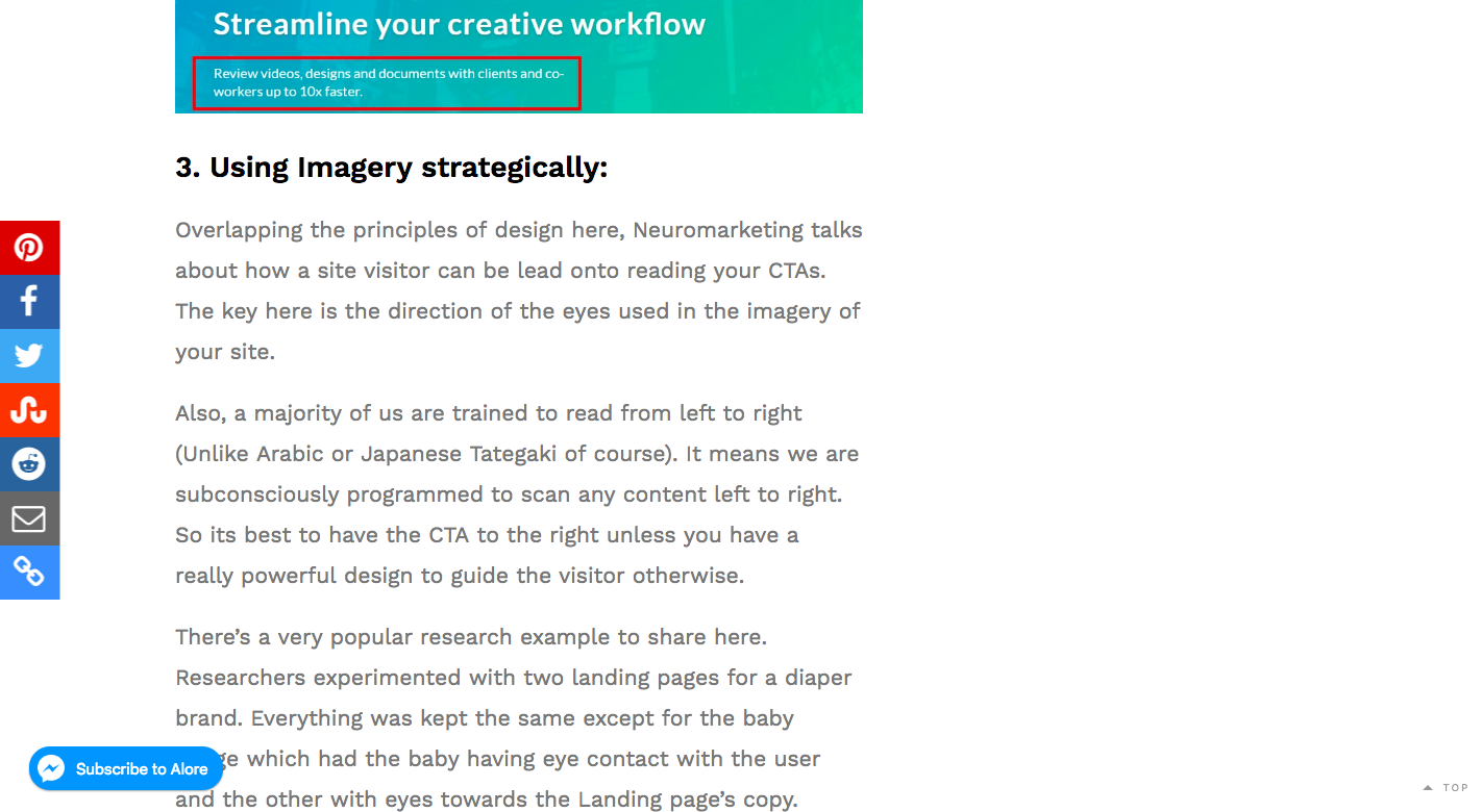
What could be done better:
Show the visitors one pop-up after 10-30 seconds on the website. They will know more about the website and if the content you provide is valuable, and might be more inclined to share their emails for more information.
Track the blocks visitor interacts with. This way you will be able to give them more information on the relevant topics with smart notifications.
If a user interacted with a couple of videos about Facebook ads, they may find your guide to Facebook advertising interesting. In this case, you can show the notification about it in the right bottom corner.
5. Use Engaging Content for Pop-ups
Tony Robbins shows a pop-up with the link to a test right after a user lands on the website. Not a form to leave your contact details or a promo code for another 10% off, but a CTA leading to interactive content.
A great idea.
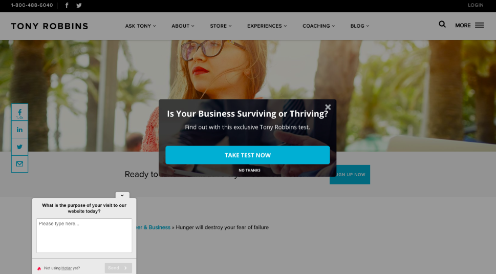
However, he also opens a Hotjar pop-up form at the same time; it does not hover over the main content and in general, is neat and easy to close, but it creates tension. Which action should I perform first?
What could be done better:
Instead of offering the test right away, a time delay may help you to gain some loyalty and allow the site to introduce itself to the visitors.
Plus: Pop-up that propose more value and drive more engagement.
Minus: Multiple pop-ups.
The brand Pura Vida makes the visitor dive into their world straight from the first visit.
Visitors land on the welcome mat with a “great deals” wheel. Here I can spin it and win a promo code. It is a more exciting way to engage with customers than just showing them a form to fill in to get a promo code.
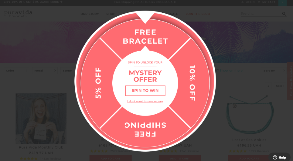
If you skip the wheel “Mystery offer” you are then bombarded with another hot deal - even better - 15% off. Now you can get a promo code even without leaving contact details.
People who got a smaller discount may want to look for a better deal next time. If they fail, they may consider the brand less fair because they charge different prices for similar orders and buyers within minutes.
6. Think of the Value You Can Provide Apart From the Price Reduction
Ecco gives a 10 euro off promo code when landing on the main page and Adidas gives 20 dollars off for the first $75 purchase.
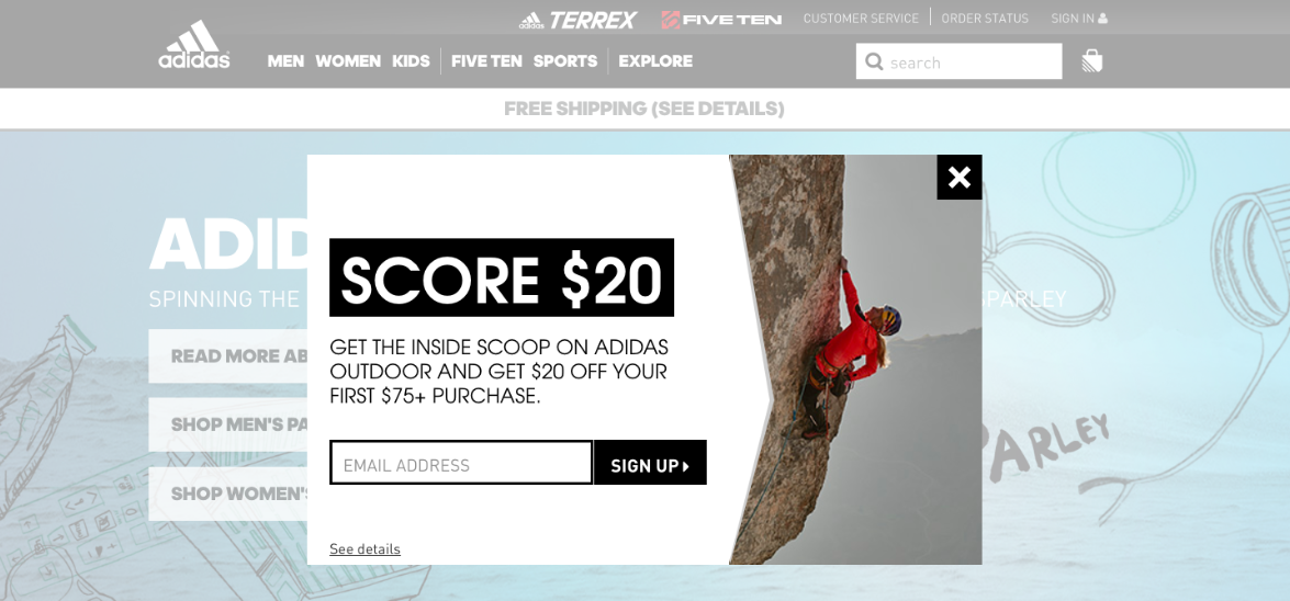
Possible Minus: A welcome pop-up with a discount for everybody creates an impression that the shoes actually cost less than stated on the website.
7. Test Different Formats
You may create a pop-up and either ask for an email, request all contact details, propose to send information to a visitor’s Messenger or announce a new collection. Obviously, you will get completely different results. Write down the goals of the pop-up campaign to get as much information about each customer or get as many prospects' emails as possible.
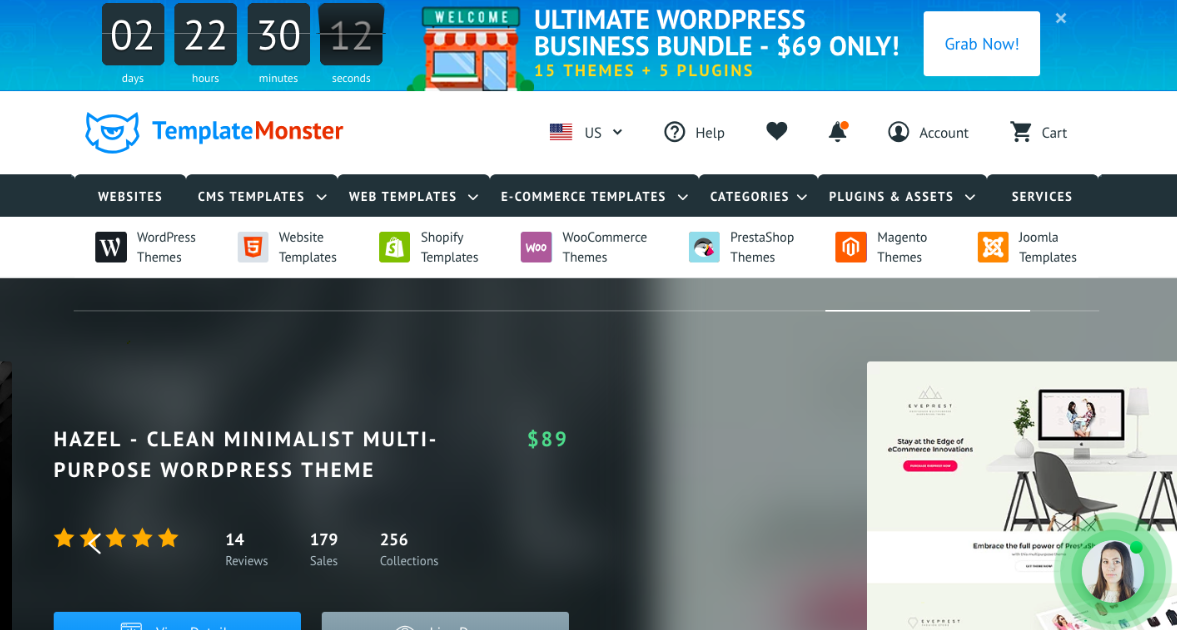
You can show a small bar at the top of the main page to promote your current offer or use a huge pop-up with a countdown timer to deliver the same message.
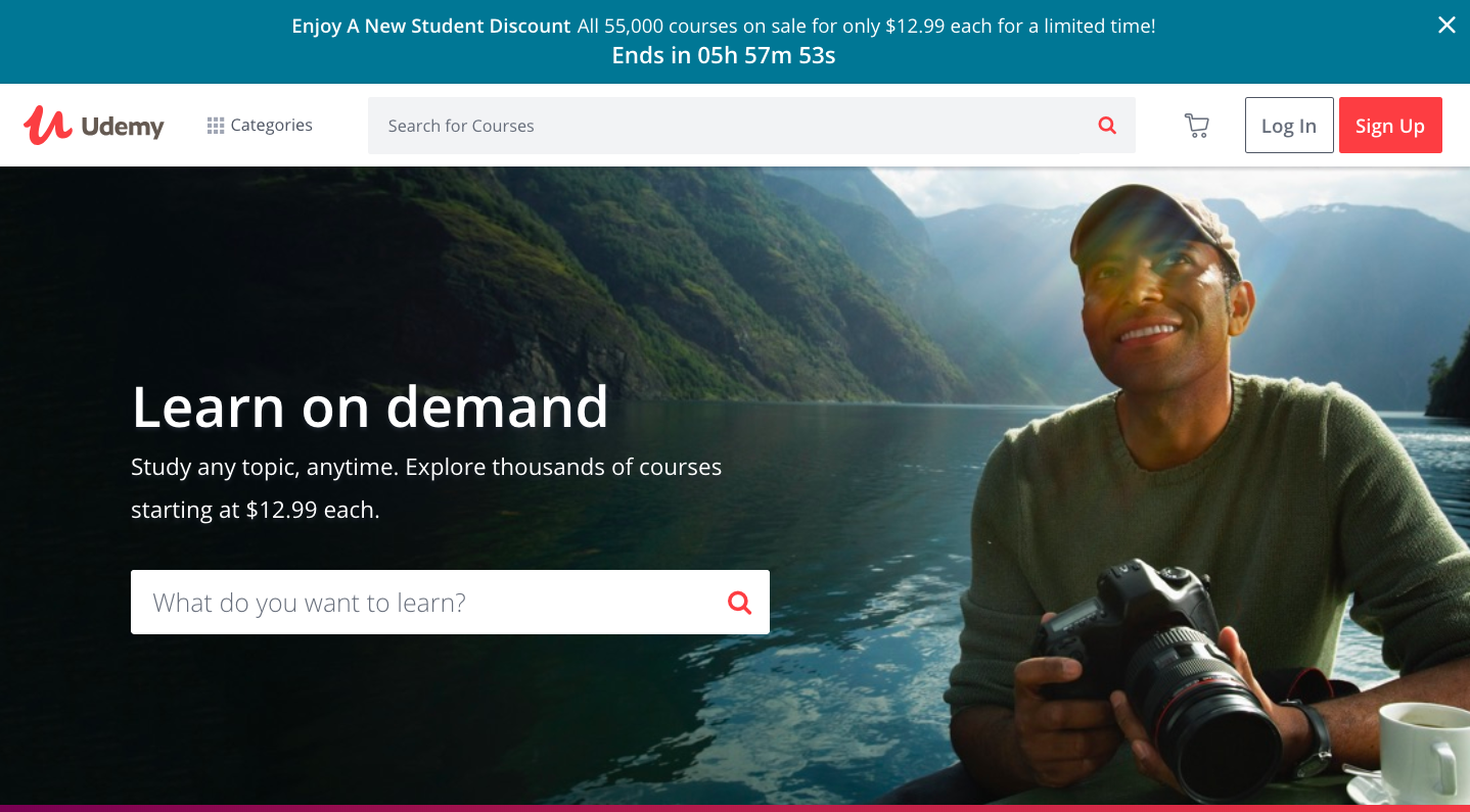
With the different designs of these bars, you can find out what your best-performing banners are. Udemy and Template Monster both use the same type of the pop-ups, but look how different they are!
Summary
Pop-up seems to be not a big deal for a marketer in charge of the whole website with dozens of offers and products. There are lots of instruments and tactics on how to make a visitor buy. Pop-ups may or may not be a great add-on to your store's success.
Key insights on how to create a great on-page campaign:
1. Be creative with your offer. If everybody offers the same, people will not pay attention to one more similar message.
2. Stay focused: show only one pop-up at a time.
3. Make sure your user is the most receptive at the time you deliver your message. He read your content, visited a couple of pages or performed another valuable action.
4. Test your messages: different types of pop-ups, messages, and visuals.
5. Take into account the characteristics of your business. If you need more info about subscriber's gender or a hobby, ask for it.
Innovative SEO services
SEO is a patience game; no secret there. We`ll work with you to develop a Search strategy focused on producing increased traffic rankings in as early as 3-months.
A proven Allinclusive. SEO services for measuring, executing, and optimizing for Search Engine success. We say what we do and do what we say.
Our company as Semrush Agency Partner has designed a search engine optimization service that is both ethical and result-driven. We use the latest tools, strategies, and trends to help you move up in the search engines for the right keywords to get noticed by the right audience.
Today, you can schedule a Discovery call with us about your company needs.
Source:


