Last Friday I was driving my daughter home from aerial yoga (yes, it is a thing) and we saw a guy with one of those big arrow signs you see people wave around trying to get you to a particular store.
This guy was a master. He flipped the sign. He spun it. He wielded it. He did somersaults over it. He loved his work. He was selling weed, by the way.
The sign read “CANNABIS.” I live in Seattle—it is legal. The performance grabbed our attention. But if his sign had just read “products,” that is all we would remember: The performance. We wouldn’t remember the store or the product.
My rambling proves that someone who runs a Seattle weed shop is a better marketer than 90% of us web nerds.
Fully Descriptive Navigation Sells
What does this company sell?
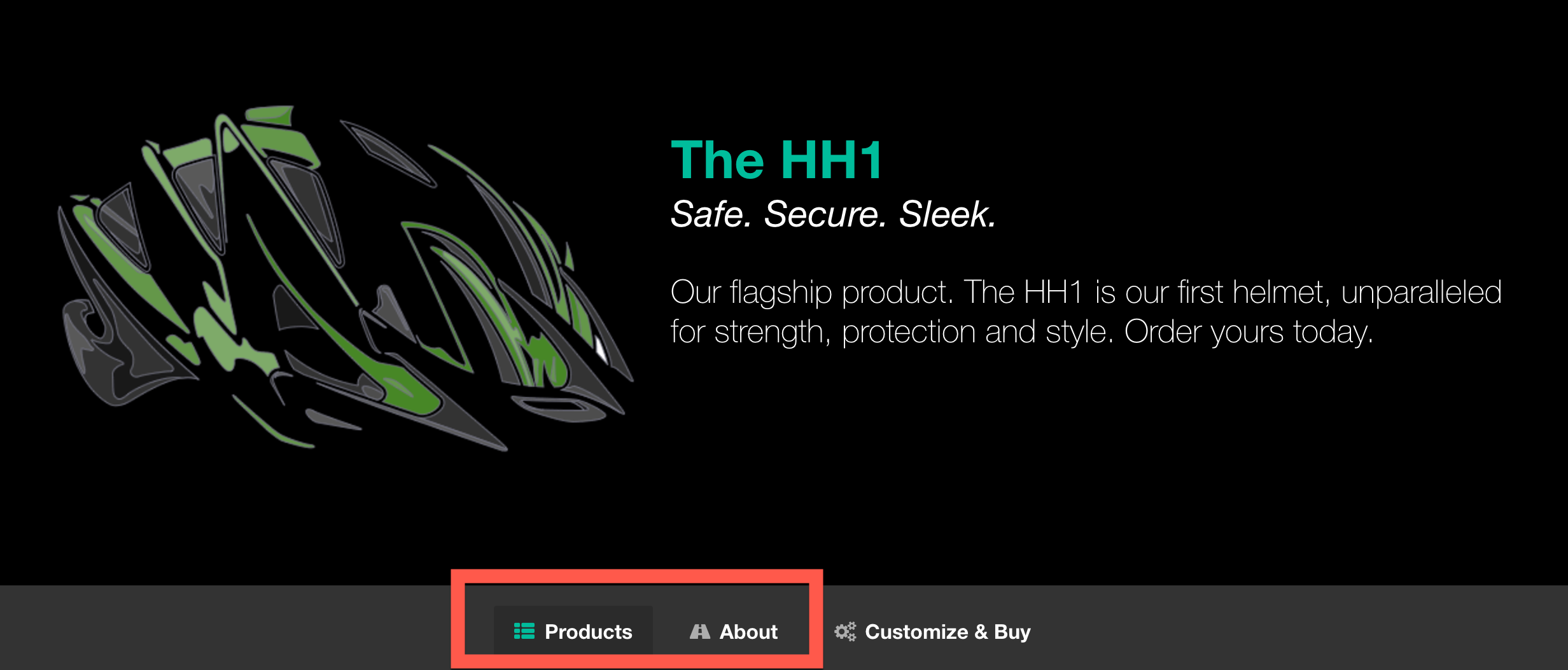 Nice helmet. But what do you sell?
 The typography is decent. That’s a gorgeous helmet, too. I know this company sells helmets. But what else do they sell? Just helmets? Helmets and broccoli? Helmets and surfboards? Helmets and socks? I have no freaking idea. Whatever it is, I can customize it. But I don’t know what ‘it’ is.
If I Google “Helmets” and land on this home page, I know the company sells helmets. What if they sell gloves, too? If I search for “gloves” and somehow land on this home page, I will assume I am in the wrong place, or that gloves are second priority.
Even worse, if I search for “Helmets” and land on another page that lacks a helmet photo, I will be completely lost. I will hesitate. That hesitation shrinks the likelihood that I will convert.
What if the designer used this navigation instead:
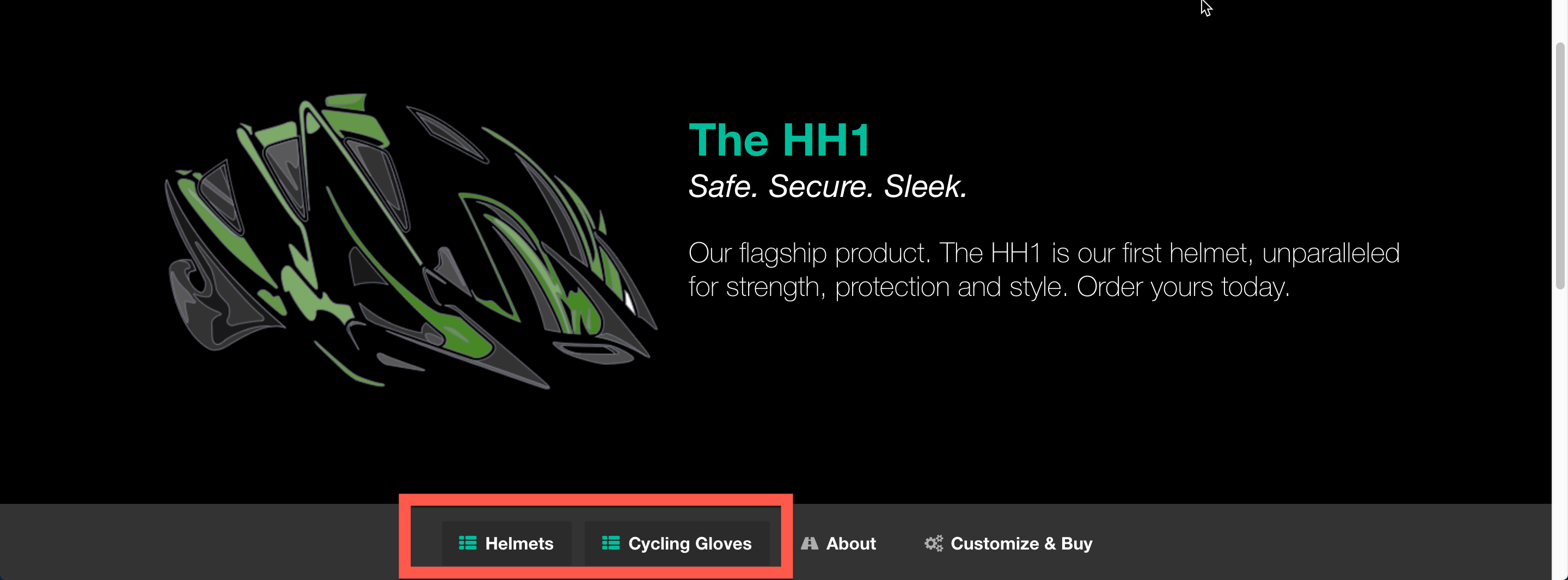 Helmets and gloves! That makes more sense
 Oohhhh. Now I get it. They sell helmets and gloves. I want my gloves or my helmet (or both). “Gloves” in the navigation tells me that I am in the right place. It is also one less task for my already over-saturated brain: I want gloves. I click gloves.
It’s as if a guy is standing out front a store waving an arrow-shaped sign that reads “Helmets and Gloves.”
The Rankings Secret Weapon
But you are on the SEMrush website right now, so you are probably more worried about rankings and organic traffic...
A fully descriptive navigation is an SEO’s secret weapon.
Search engine algorithms favor sites with fully descriptive navigation. Search engines look at link text. Not just offsite link text—all link text. Replace “products” with “[product keyword]” in your top navigation, and you just created a quality, UX-boosting link with the best possible anchor text on every page of your site. All those links point to the most relevant page.
So here, the word “Helmets” creates a link with the anchor text “Helmets” on every page of the site. Every link points at the most-relevant “helmets” page. That is a lot of SEO oomph:
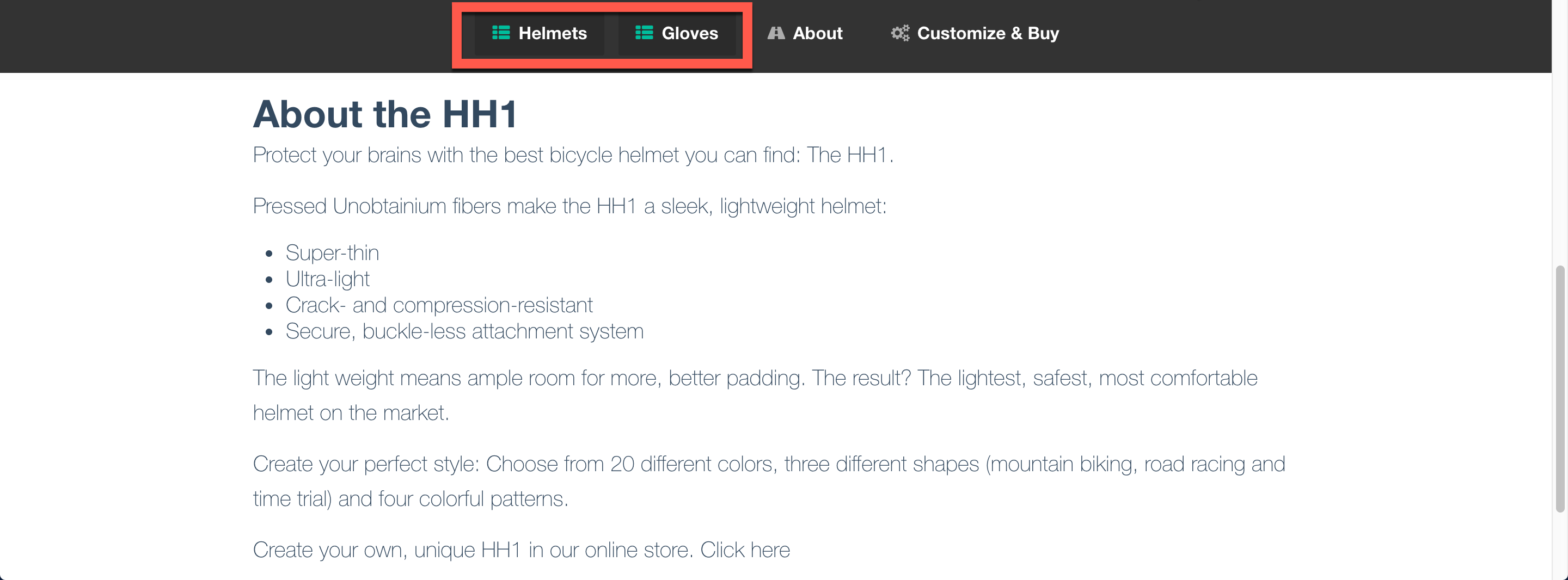 A legit, keyword-rich link from every page? Sign me up
 What You Don’t Do
Don’t manipulate or try to stuff keywords into the footer of every page on your site (like adding an extra link at the bottom every page that reads “helmets”).
Here, it’s OK to add “Cycling” to the “Gloves” nav item. Customers may use the helmet for other sports, but the gloves are just for cycling. And it reads just fine:
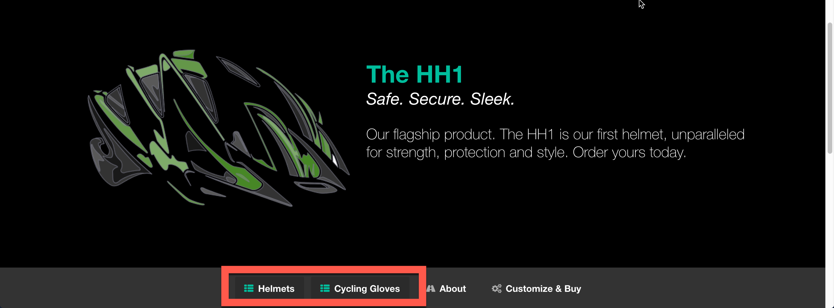 Adding Cycling works fine, if you do it like this
 Create links that improve the user experience. Create links that look good. Notice I didn’t create navigation that reads “Cycling Helmets,” Then “Cycling Gloves,” then maybe “Customize & Buy Your Cycling Helmet and Gloves.” That kind of spam might help you rank. A little. For now.
But it’s a crap user experience. And eventually, it will bite you on the behind. Google and Bing don’t like over-optimization. The rule: If you have to justify the link to yourself, or even feel like you might have to justify it, you are about to create a manipulative link. Stop.
But I Have Lots of Products/Services
If you have a diverse product set one nav item won’t do. For example, if you sell all kinds of bicycles, skateboard and cycling helmets, gloves, and apparel for ten different sports, you can’t create fully descriptive navigation for all of them.
Consider splitting your navigation, grouping relevant products under separate, fully descriptive labels. In the example above, maybe “Bicycles,” “Helmets,” and “Apparel.”
Then create sub-navigation under each. If I click on “Helmets,” show me a second set of links pointing to “Cycling” and “Skateboarding.”
You don’t want more than 6 top navigation items. If it starts to get crowded, move things like “About Us” to secondary navigation. Think about how you can consolidate products into categories.
I have never seen a business that couldn’t create a useful, fully descriptive navigation. Sometimes internal politics don’t allow it - I can’t help you with that one. You have to weigh the risks and benefits of the change.
It Works!
We’ve made this change on ten or so sites over the years. It always improves rankings and bounce rate. The bigger the site, the better the SEO result, because you have many more links to that one core page. The user experience as measured by click thru always improves, too. More people make that second click.
We have had clients move from page two to page one within a few days of the change, and seen bounce rates drop 10% or lower.
Be like the weed guy: Switch to fully descriptive navigation. You will see better rankings and user engagement.
Innovative SEO services
SEO is a patience game; no secret there. We`ll work with you to develop a Search strategy focused on producing increased traffic rankings in as early as 3-months.
A proven Allinclusive. SEO services for measuring, executing, and optimizing for Search Engine success. We say what we do and do what we say.
Our company as Semrush Agency Partner has designed a search engine optimization service that is both ethical and result-driven. We use the latest tools, strategies, and trends to help you move up in the search engines for the right keywords to get noticed by the right audience.
Today, you can schedule a Discovery call with us about your company needs.
Source:
