Last year, the search engine giant released an update on Doorway Pages. The very first line of the blog announcing the update reads “Google’s Search Quality team is continually working on ways in which to minimize the impact of webspam on users.”
The first line says it all; the update shouldn’t be looked at in the silo, but as a part of Google’s ongoing efforts to make the web more user-experience driven. That’s great, but getting rid of the doorways is not as easy as some marketers might think it is.
The Pressing Concerns
Google categorically explained doorway pages and booked them under three categories. Some of these categories can be overarching and create problems for landing page optimization. Another challenge is to implement Google’s suggestions on the mobile platform. I’d like to discuss the challenges in a detailed manner here and retrieve the takeaways for digital marketers.
Landing Page Optimization
Google defined the second type of doorways as “Pages generated to funnel visitors into the actual usable or relevant portion of your site(s).” Taken in a broad sense, this definition can make landing page optimization difficult for service providing sites.
We know that any site that sells a service/s keeps the call-to-action buttons on the landing page. Because people make purchase decisions when they are on the lead capture page, the site owners put the chunk of the optimization efforts behind those pages.
It resembles the funnel strategy, which is critical to the success of service providing sites. The funnel's top layers are pages that provide information, and the bottom layers persuade users to buy.
A comparison in terms of usability and relevance between the top and bottom layers of the funnel show they are not equally useful because bottom layers play a bigger role in the conversion.
The Hierarchy Challenge
The third category of doorways are “Substantially similar pages that are closer to search results than a clearly defined, browseable hierarchy.” Such a hierarchy works well with visual hierarchy on the desktop platform. But not on the handheld platform because reproducing a desktop site on the mobile platform invites plenty of challenges. The ball would be on the web designer’s court, as he needs to visualize the reflow of design elements depending on multiple widths.
A standard layout for the desktop screen has three to four columns, especially if it has a visual hierarchy. But a mobile screen being small can’t allow more than two columns. The HTML source order is the bottleneck, which gives rise to the issue of intermixing content.
Technical solutions may help to overcome the challenges, but only to a certain extent. The actual issue here is the device-agnostic approach, resulting in the technical hierarchy parting ways with visual hierarchy. The solutions, more often than not, come from web and UI designers, who may not give two hoots about the site’s SEO performance.
Overcoming the Challenges
Among the two challenges described above, the second is hard to overcome, chiefly because it’s a design challenge. Content choreography, according to some, can be instrumental in overcoming it.
But to choreograph content, the UI designers need to apply their imagination to media queries to create a content hierarchy on the layout. If they lack imagination, the result would be a cumbersome hierarchy.
A marketer may find comfort in the fact that doorways are only for desktop sites. But that can create even more trouble for him because his site is supposed to have a unique layout and the same number of pages for all platforms.
So far as the first challenge is concerned, it’s possible to overcome it through
Content-Based Workarounds
Brian White of Google said “we’ve seen sites try to maximize their “search footprint” without adding clear, unique value.” Informative and engaging content can make a page’s search footprint proportional to its value.
Imagine a page is appearing in the top search results, but searchers aren’t finding any value in the content that it contains. Google will most likely consider such pages as doorways. But if the content on the page is created as answers to the targeted search queries, then it won’t be flagged as a doorway.
Here, we are not talking about written content alone. Other UI elements, such as layout, fonts, etc revolve around content, and for an all-pervasive and entertaining user-experience (what Google wants), they all need to supplement each other.
The funnel conversion technique owes solely to content. The top layers of the funnel are supposed to spread awareness, draw interest, attract users and lure them to purchase the product. Google doesn’t want any individual layer to “duplicate useful aggregations of items (locations, products, etc).”
In other words, every page in the conversion funnel structure has to have something unique to offer users. That’s possible only if each page has informative and persuasive content on it, which cleverly and subtly connect users to the succeeding page, finally connecting to the product.
Homepage as the Landing Page
Traditionally, service providing sites have had the following structure:
Homepage → Product category page → Product page → Lead Capture page
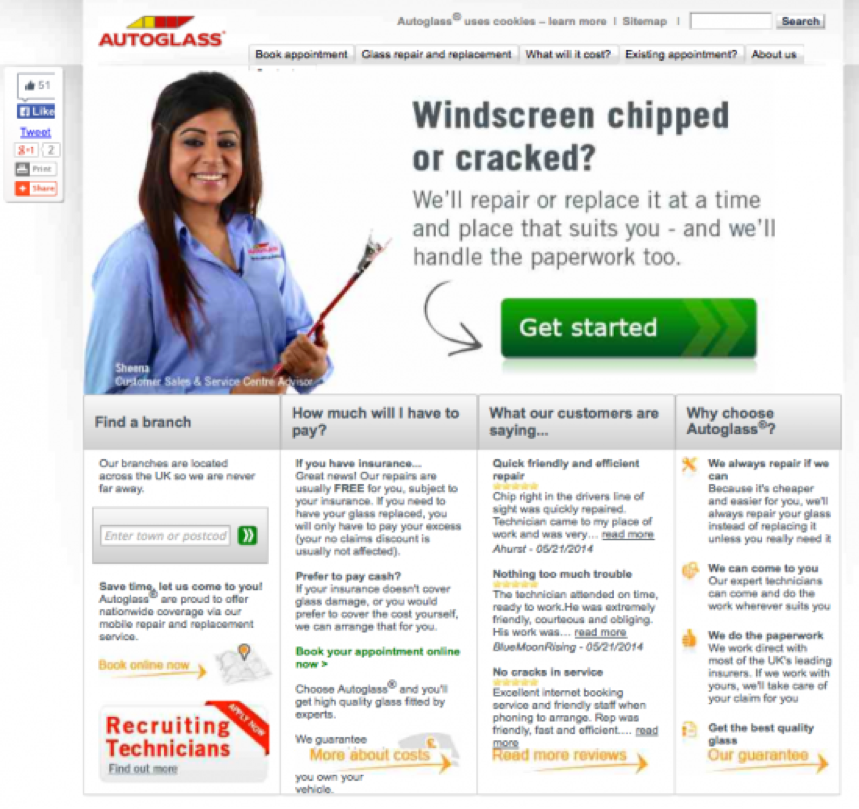
But they can revamp the UI interface and keep the homepage and the lead capture page as the same. Such sites can ensure a smooth navigation for users, declutter their interface, and shed weight by getting rid of pages that they deem unnecessary. You can see screenshots of such pages below:

Figure 1. Source: www.autoglass.co.uk
Figure 2 and 3 are screenshots from the same site. See them below:

Figure 2. Source: www.ultralase.com

Figure 3. Source: www.ultralase.com
The homepage has fade-effect image slider. The two images show that the site reveals its price list and allows visitors to meet surgeons on the homepage itself. There are no unnecessary pages, and nothing that can “lead users to intermediate pages that are not as useful as the final destination.”
Such a clean and uncluttered interface is what small scale agencies such as chimney sweeping, carpet cleaning, car repairing and legal consultation services should aim for. It doesn’t increase their marketing budget, rather lowers it and help them to achieve value-added search footprints.
The Takeaway
Discarding spammy practices such as unnecessary redirection, creating pages that don’t meet users' demands, etc. is easy to implement. But the more serious ones involve replicating the desktop experience to the mobile front and creating content that promotes a product in the garb of providing information.
To make sure the doorway page update doesn’t hurt them, digital marketers need to put time and effort to deal with the second set of challenges.
Do you have any questions about doorway pages? Leave a comment below.
Innovative SEO services
SEO is a patience game; no secret there. We`ll work with you to develop a Search strategy focused on producing increased traffic rankings in as early as 3-months.
A proven Allinclusive. SEO services for measuring, executing, and optimizing for Search Engine success. We say what we do and do what we say.
Our company as Semrush Agency Partner has designed a search engine optimization service that is both ethical and result-driven. We use the latest tools, strategies, and trends to help you move up in the search engines for the right keywords to get noticed by the right audience.
Today, you can schedule a Discovery call with us about your company needs.
Source:


![How To Create a Strategic Dashboard in Excel Using Semrush Data [Excel Template Included]](https://new.allinclusive.agency/uploads/images/how-to-create-a-strategic-dashboard-in-excel-using-semrush-data-excel-template-included.svg)
