

One of the primary responsibilities in any job today includes tracking, applying and understanding of business numbers on a daily basis. From content marketers to product design specialists to financial analysts, no function is spared the need for translating their work and its impact on the business in pure numerical format.
While spreadsheets are the simplest way to allow individual users track data related to their scope of work, dashboards become a common sight when the same piece of data is to be utilized or reviewed by multiple people. The reason for this is simple.
Data in spreadsheets may or may not have be organized in a clearly recognizable pattern. In a dashboard, data is represented in such a way as to convey clear messages at a single glance. For instance, a line graph depicting sales figures with a single upward trending line can mean only one thing: growing sales. A good dashboard aggregates data and represents it in easily understandable formats. So what does it take for a marketing dashboard to be called a “good” one?
Here are some of the more important characteristics I’d like to see in my dashboard:
1. Highlighting the Right Metrics
Before you set out to design a great dashboard, ask yourself this fundamental question: Who is your audience? The audience determines the kind of data you’ll include. It also dictates how deep you’ll go with your data representations. You’re building a dashboard, not Disneyland. It’s not meant to please everyone.
A top-level management dashboard will typically have long-term organizational goals, multi-department numbers, as well as overall KPIs for each function. Customer lifetime value, quarter-on-quarter revenue growth and market share are some of the metrics that a typical strategic level dashboard would include. Basically, these dashboards consist of long-term data and are used for taking executive-level decisions.
On the other hand, an intra-team operational dashboard shows day-to-day functions and their performance levels. It digs deeper into individual functions and represents numbers about each of them. Take a look at this operational dashboard from Cyfe:
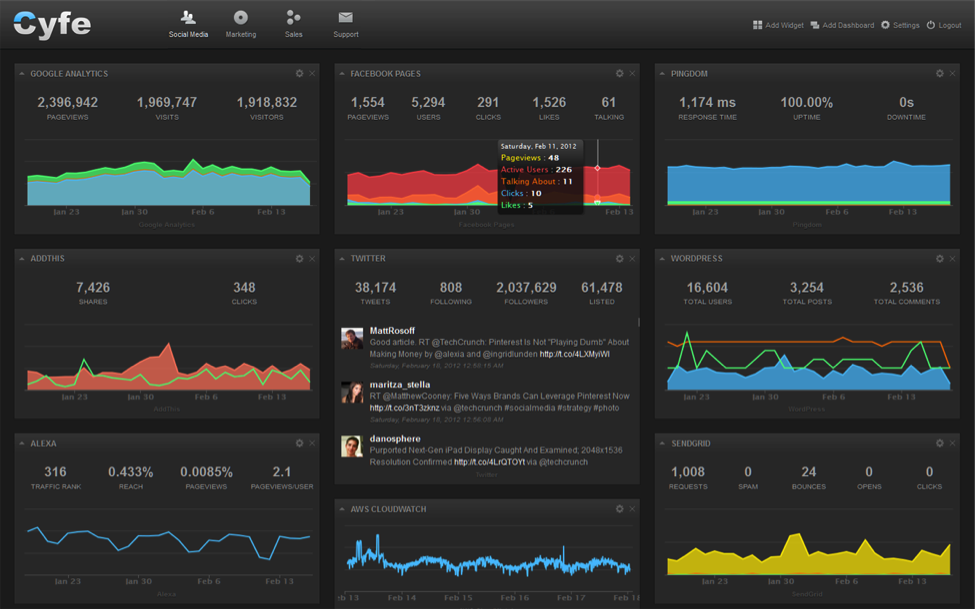
Not only does it aggregate data from multiple sources, it also drills down into the details of different marketing platforms. Number of leads from PPC campaigns, open rates for newsletters and number of inbound links for key webpages are all examples of operational metrics that would be apt for an operational dashboard.
2. Easy to Read, Interpret and Understand
A good dashboard is one that is easily understood by the “slowest” member of the team. This does not mean that you dumb down your data. It means you simplify the representation of your data so that there is absolutely no room for error or ambiguity.
This means instead of going with rows of tables densely packed with numbers, you instead opt for elegant data visualizations that bring out the gist of the data within seconds. Use colors that are symbolic to the data and its meaning. A chart that shows a dip in revenues could use reds to show the declining numbers and green to show healthy progress.
There’s no ambiguity in the charts on this Salesforce dashboard:
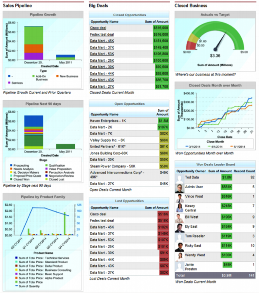
Lines, bars and pies are some of the most common ways to represent data. Feel free to go beyond these handful of common representations, but make sure you don’t sacrifice easy comprehension in the pursuit of creativity. Everyone should understand the metrics in a dashboard that is targeted at them. Do not reinvent the wheel or create niche metrics that force new definitions down users’ throats.
Simplicity is key. Typically, the most common dashboard on Salesforce has twenty or so components but they’re categorized into just three columns.
3. Freshly Baked?
There is a deeply entrenched belief among most marketers that data, when used for decision-making, ought to be as current as possible so as to reduce the probability of errors and obsolescence.
While I agree with this line of thought for the most part, it’s not always necessary or indeed, even possible to get fresh data on a daily, weekly or minute by minute basis. Often the cost of acquiring such up-to-the-minute data makes the entire prospect unviable from a financial perspective. Sometimes data that is updated on a continuous basis actually deludes the user and keeps them stuck with short-term problems. Big picture thinking calls for data that is long-term and displays a clear trend from which strategic postulations can be made.
When you design a dashboard, keep in mind the realistic needs for each data point and create data sets based on these real, not imagined needs.
4. Flexible
A good dashboard is one that can be changed with changing business needs. When a dashboard gives not just big picture trends, but also allows users to dig deeper and understand the causes of those long-term trends, it has truly served its purpose. This ability — of allowing users to filter multiple levels down into the sources of your data — is one of the primary requirements of a robust dashboard.
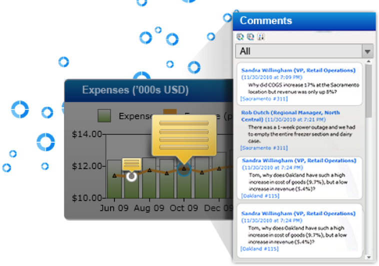
An interesting and increasingly popular function of dashboards is allowing users to annotate on dashboards in real-time and share it with other users for their inputs. Dashboards these days have gone from being static graphs and charts to being interactive pieces of data that allow user collaboration with other team members on a real-time basis. One such remarkable dashboard is offered by Dundas:
When you build a dashboard, keep in mind that there could be users who would want to relate it backwards with the source data. Some users might want to extract data specific to certain sections of the dashboard, append new datasets to those parts, and analyze the resulting information from scratch. So, allow your dashboard and its components to be downloaded in the most common formats — XLS, CSV, and so on for them to be really useful on a daily basis.
Coda
A great marketing dashboard is one that does not just reflect the realities of where your business stands today, but also lights the way ahead for overall growth. Use this as the central, critical test to judge whether your dashboard lives up to its true potential and purpose.
Innovative SEO services
SEO is a patience game; no secret there. We`ll work with you to develop a Search strategy focused on producing increased traffic rankings in as early as 3-months.
A proven Allinclusive. SEO services for measuring, executing, and optimizing for Search Engine success. We say what we do and do what we say.
Our company as Semrush Agency Partner has designed a search engine optimization service that is both ethical and result-driven. We use the latest tools, strategies, and trends to help you move up in the search engines for the right keywords to get noticed by the right audience.
Today, you can schedule a Discovery call with us about your company needs.
Source:

![How To Create a Strategic Dashboard in Excel Using Semrush Data [Excel Template Included]](https://new.allinclusive.agency/uploads/images/how-to-create-a-strategic-dashboard-in-excel-using-semrush-data-excel-template-included.svg)
