So far in our SEO Reality Show journey, we’ve shared the steps our expert agency has taken to build a strong SEO foundation for Edelweiss Bakery’s website and, eventually, improve its performance.
These steps include:
Conducting competitor analysis Identifying link building opportunities Mapping out a new site structure Coming up with a list of keywords that most accurately describe what the bakery does/offers Running a technical SEO audit to search for backend concernsWith this data thoroughly researched and compiled, the agency had the insights they needed to move on to the next stage: Updating and optimizing the bakery’s home page.
The Process
The agency followed a 4-step process to determine how to improve the home page of Edelweiss Bakery’s website:
Step 1: Analysis of the Competition’s Page Layouts
The first thing the agency did was to evaluate the home page content and design of Edelweiss’ most relevant competitors, paying careful attention to sections that they knew the bakery would also need to include on their site, as well as those that were unique to one or two sites ranking in the top 10 on SERPs.
The agency looked at between one and three keywords of the main page and searched for them in Google. In this case, the main keywords that best captured user intent for the bakery were:
German bakery Bakery cafe European bakeryThe agency searched for these keywords and then reviewed the pages that showed up. They stated that it was important to consider the following:
Due to the specifics of this business, the local SERP in each city will be different. It’s crucial to choose the search region where the site was being promoted. In this case, it was Fort Lauderdale, which is a major city in South Florida. The agency used Google’s CS location changer plugin to do this. If you’re replicating this with a local business that’s from a smaller city, you can expand to a larger area around it as there may not be enough strong sites in your niche to derive research from.
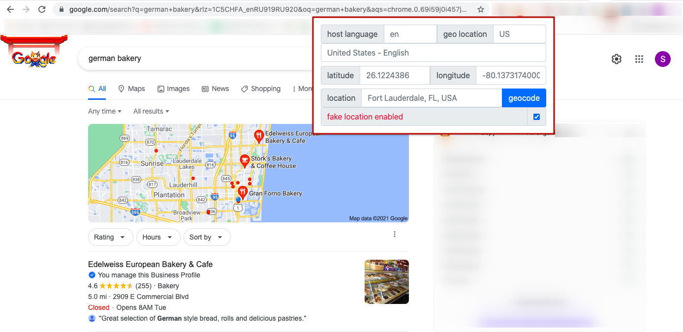 They would only analyze the sites that aligned with the search intent. This included bakeries, cases, and pastry shops. Irrelevant listings were not analyzed. It’s best to analyze the search results in incognito mode, or at least by first resetting the browser cache to get unbiased results
 After careful evaluation of various competitor’s websites, the agency refined their search to focus on two that aligned with the content, design, and user experience elements they were looking for:
https://europeanbread.com/ https://www.bonjourbakerymiami.com/European Bread Company
What the agency liked:
The lead generation form. The copy informs the user that they can get something in return by leaving their contact information.What the agency thought could be improved for Edelweiss’ site:
Although they thought the form looked great, it didn’t clearly display where a visitor should leave their contact information or what benefits they’d receive if they did.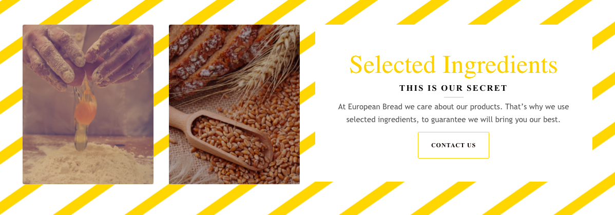 Feedback form on the https://europeanbread.com/
Bonjour Bakery Miami
What the agency liked:
Their “offer of the day” and the chef’s description. These types of content sections can help build trust with visitors and feature exciting offers, which can help increase the conversion rate.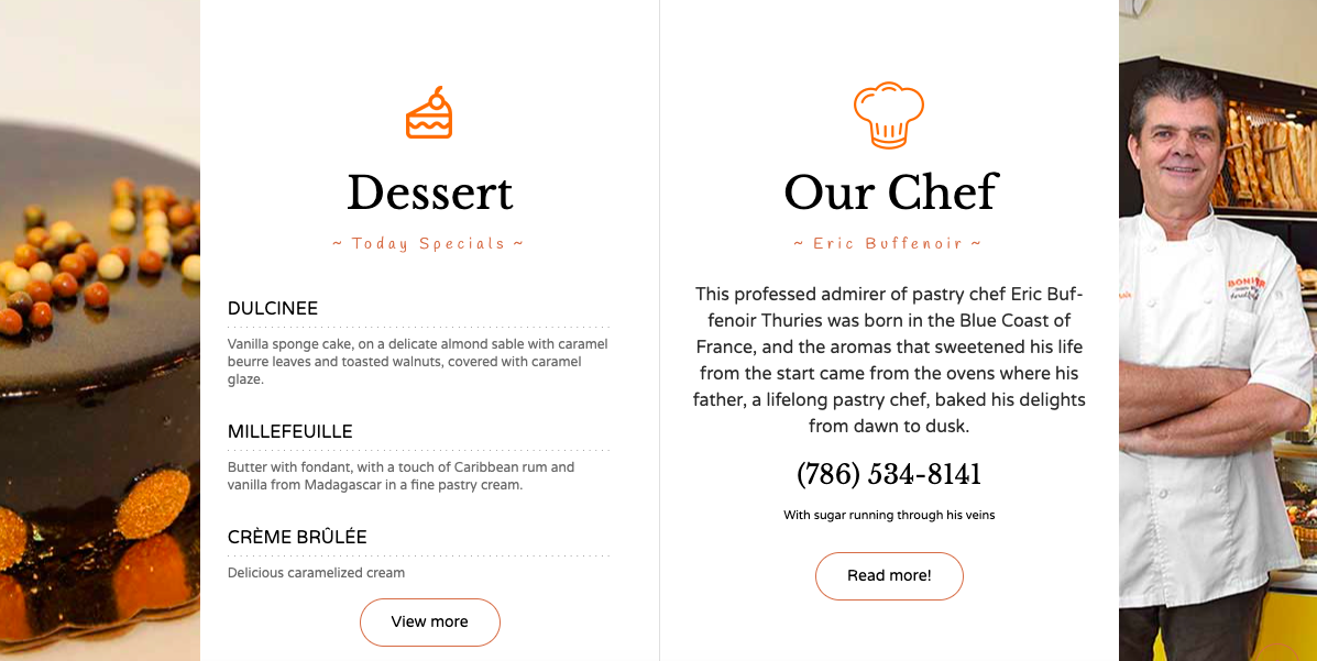 The offer of the day and brief info about the chef on the website https://www.bonjourbakerymiami.com/
Step 2: Evaluation of Edelweiss’ Website
In reviewing the bakery’s website, the agency identified a few user experience challenges that offered opportunities for improvement:
Although their delivery option was an important part of their business, their current site only hinted that this service was an option for customers. The online shopping section took too much space on the home page
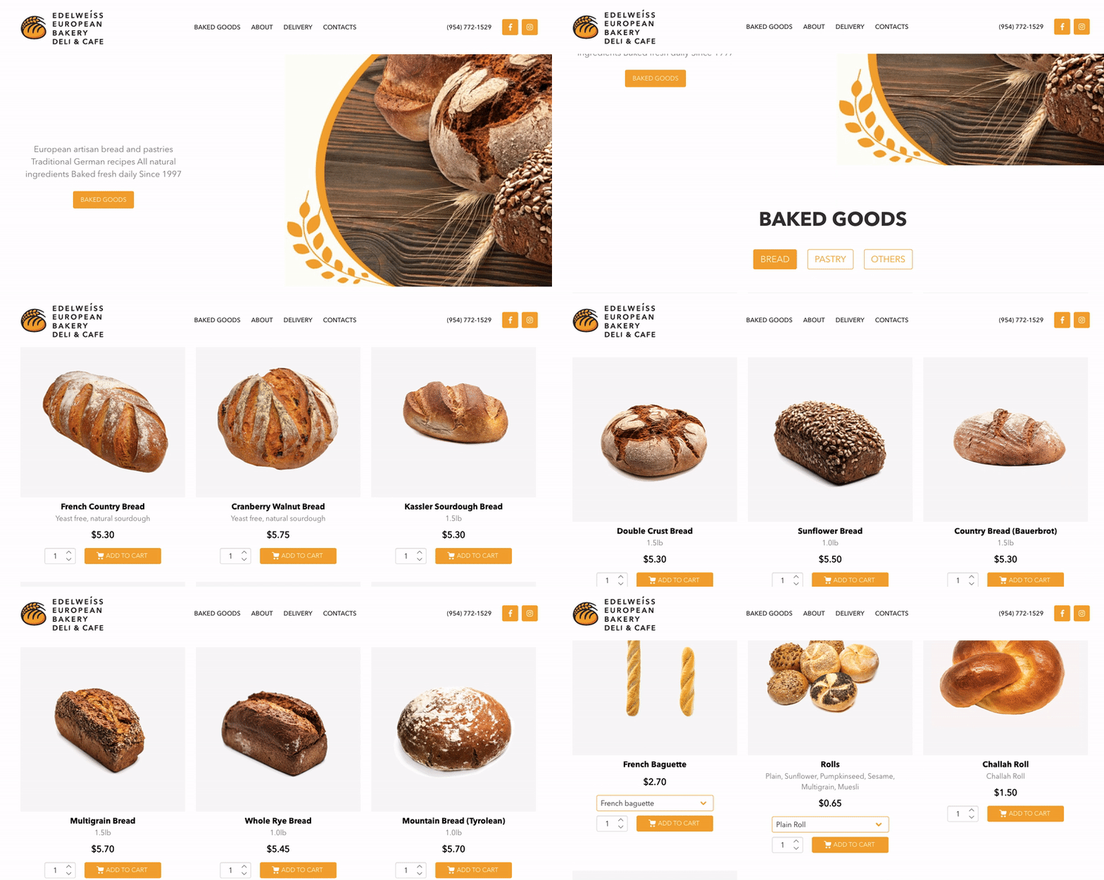 At a minimum, the agency needed to add more information about the bakery and what it offered. It made more sense to place information about delivery, wholesale goods, and cafe information on separate landing pages.
 Step 3: Main Page Mockup
Increasing conversion rates to their site and within their site is an important objective of the Edelweiss Bakery. To achieve this, the agency knew that one of the most effective strategies would be to rework the structure, content, and flow of their home page.
To help the bakery stakeholders understand what improvement ideas they had in mind, the agency created a mockup of their home page, focusing on 6 main sections:
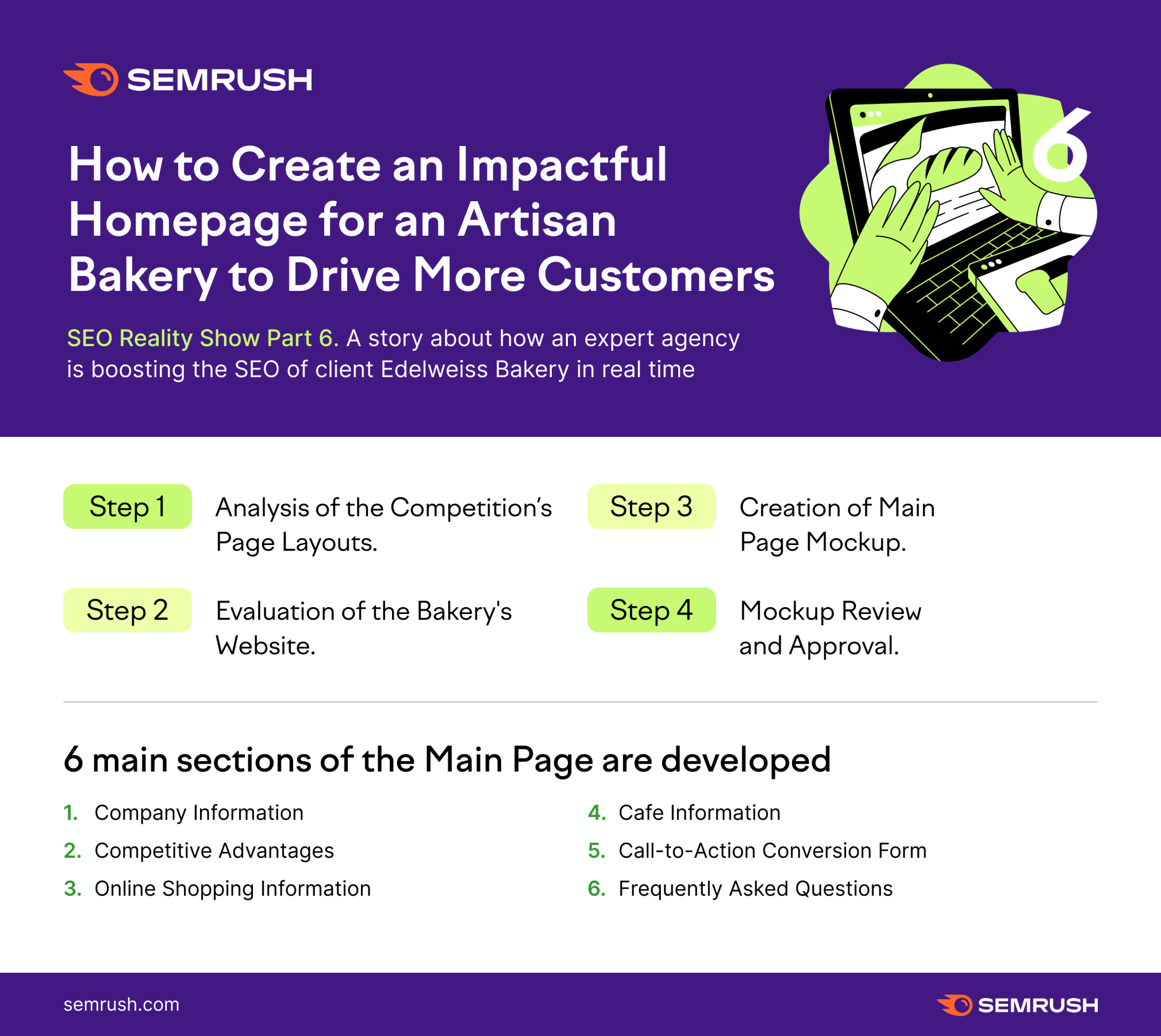
Company Information Competitive Advantages Online Shopping Information Cafe Information Call-to-Action Conversion Form Frequently Asked QuestionsTo create a mockup, the agency used Figma’s free tool.
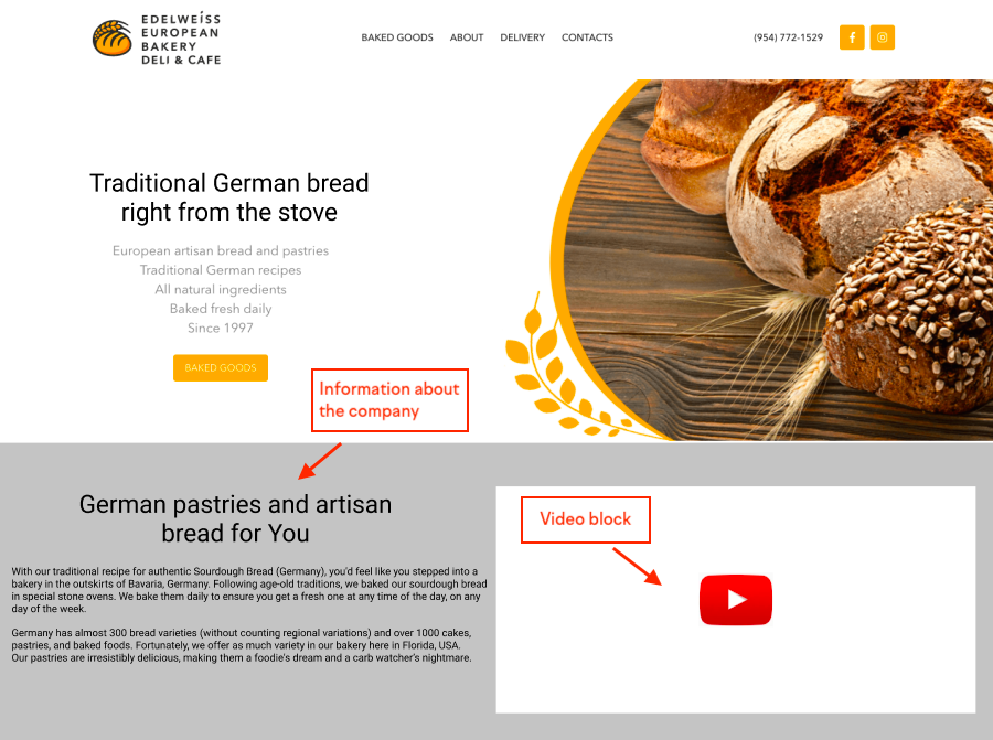
1. Company Information
The agency knew that placing information about the company and its unique assets at the top of the home page was important for capturing users’ attention. In addition, they included a short video showing bread baking, product highlights, and the bakery’s cafe. Short videos can be an effective way to keep visitors on the page, introduce users to your brand.
2. Competitive Advantages
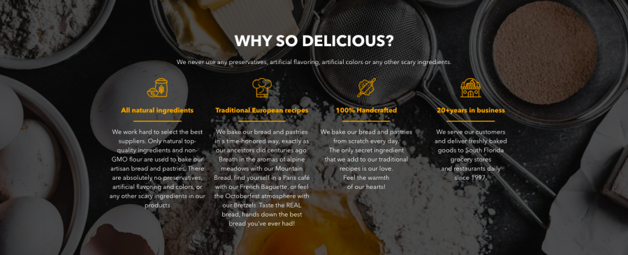
Edelweiss already had a compelling “Why So Delicious” section on their home page that the agency included as-is in their mockup. This content not only illuminated the competitive advantages that made the bakery’s food so delicious, it also helps them build trust with their visitors and reinforce their decision to make a purchase.
3. Cafe Information
Because one of the bakery’s business objectives is to grow the number of customers coming to their brick-and-mortar cafe, the agency included content sections in their mockup to spotlight this service, including:
Featuring cafe contact information and business hours alongside a carousel of pictures of the cafe. Connecting the contact information section to Google Maps. The agency felt this addition was especially important as it showcased the cafe’s rave reviews.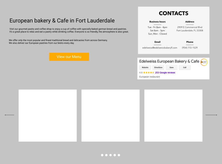
4. Online Shopping Information
Although the bakery had an online shopping section on their home page, the agency felt that it took up too much prime real estate. Their recommendation, which they illustrated in their mockup, was to reduce the size of the shopping section and rearrange it in the form of a gallery. This would allow site visitors to browse different product options more easily in a condensed view.
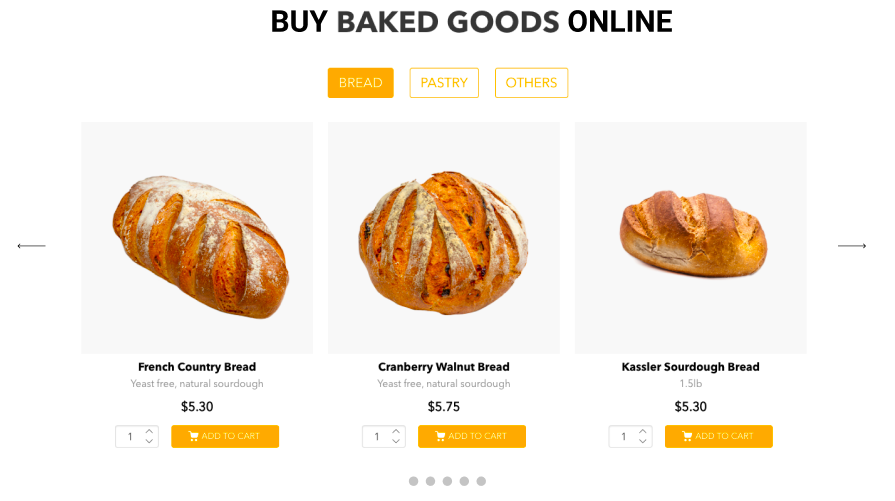 The block of buying goods online in a new gallery format
5. Call-to-Action Conversion Form
The contact us call to action at the bottom of Edelweiss’ site didn’t offer a clear value proposition to a site visitor. To improve this high-value call-to-action, the agency presented several to the bakery’s stakeholders in their mockup.
Ultimately, the bakery decided to proceed with offering a coupon for free coffee when visiting the cafe if a visitor filled out the short form.

6. FAQs
To help the bakery attract traffic to their site based on real user inquiries, while simultaneously increasing the probability of ranking for a featured snippet in the SERP, the agency recommended including a simple frequently asked questions (FAQ) section at the bottom of Edelweiss’ home page.
The idea is that this is new FAQs questions-and-answers section would be made up of real questions that users have already asked and those that they thought customers might ask in the future.
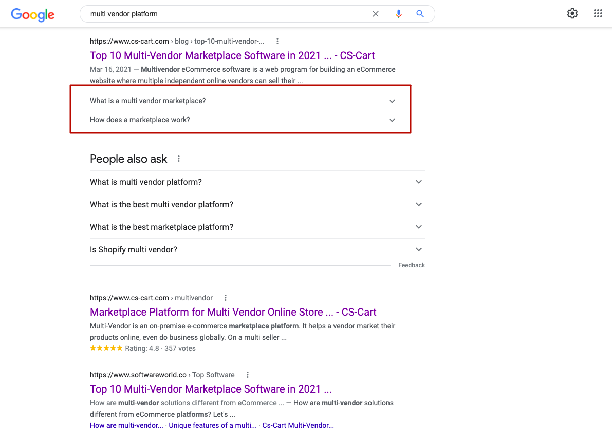
To make this FAQs section as impactful as possible, the agency researched what questions people were asking online related to the products and services that Edelweiss Bakery offered.
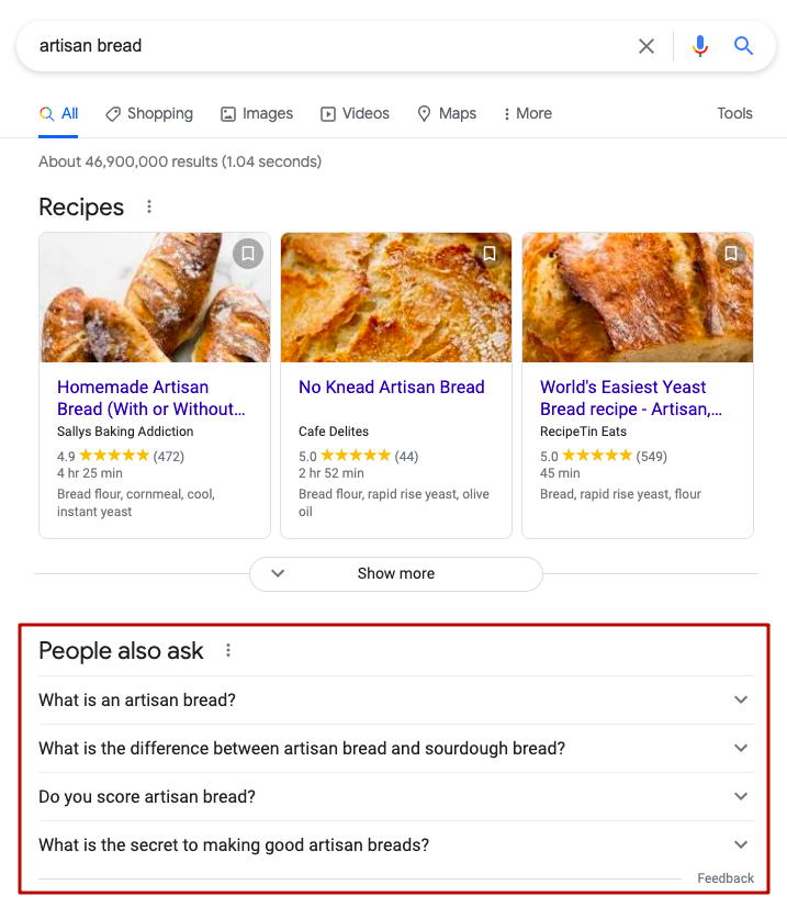
For example, they searched for the keywords the home page was ranking for in Google, reviewed the “People Also Ask” results, looking for the questions that would align with the bakery.
Searches like “german bakery” didn't yield results and the agency looked at the question a little more broadly, paying attention to the client's business basis — a homemade artisan bread baked using a custom recipe. They put the “artisan bread” query in Google and immediately saw that the People Also Ask block had relevant questions they could snag. For brands replicating this strategy, note that you should place the questions and answers in the FAQ block that allow you to best highlight the brand’s USP.
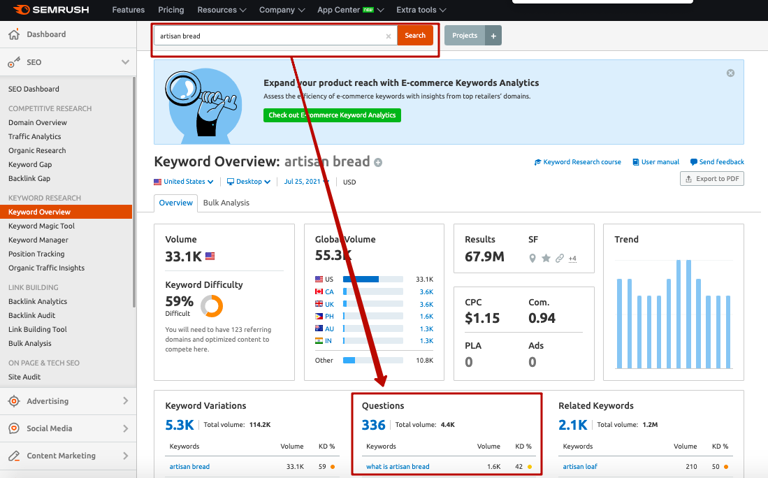
The agency also checked Semrush’s “Questions” feature in the Keyword Overview tool to find more commonly asked questions related to the keyword at hand. To do this, they went to the Keyword Overview Tool, enter the main and additional keywords, clicked on the Questions block.
After discussing all their findings with the bakery team, the agency refined the list of four questions:
What is artisan bread? Why is bakery bread better than store-bought? How to store fresh-baked bread? Why are you better than others?Step 4: Mockup Review and Approval
After a bit of back and forth between the agency and the bakery, the content mockup for Edelweiss’ home page was finalized (you can view the final version here).
The agency also wrote the technical specifications and functionality description for the implementation of this mockup for the bakery’s website developers.

Next Up
With the redesign of Edelweiss Bakery’s hoe page underway, the agency will start focusing their optimization efforts on the site’s Main Page title tags and meta descriptions in particular — to help improve their click-through rates in the SERPs.
We’ll see you next time!
Infographic
Innovative SEO services
SEO is a patience game; no secret there. We`ll work with you to develop a Search strategy focused on producing increased traffic rankings in as early as 3-months.
A proven Allinclusive. SEO services for measuring, executing, and optimizing for Search Engine success. We say what we do and do what we say.
Our company as Semrush Agency Partner has designed a search engine optimization service that is both ethical and result-driven. We use the latest tools, strategies, and trends to help you move up in the search engines for the right keywords to get noticed by the right audience.
Today, you can schedule a Discovery call with us about your company needs.
Source:


![How To Create a Strategic Dashboard in Excel Using Semrush Data [Excel Template Included]](https://new.allinclusive.agency/uploads/images/how-to-create-a-strategic-dashboard-in-excel-using-semrush-data-excel-template-included.svg)
