Everybody loves a good success story. How about the one where a plucky design company increases newsletter signups by 700 percent? This story’s not a fairy tale. We did it, and you can, too.
It is no secret — newsletters increase sales. Or to put it more accurately, they build the relationships that drive sales. Clients, particularly younger ones, are loyal to the brands they trust and admire. Taking the time to build strong relationships with potential customers will build their trust, bringing them to you when they are ready to buy.
And one great way to build those relationships is to get newsletters into inboxes. Take a look at how we did it.
Start With Content
An email newsletter and high-quality blog content are like a chicken and egg; one leads to the other leads to the other. Except I am going to tell you in this case, the content definitely comes first.
Newsletters are sent on a regular basis (whether daily, weekly or every other Tuesday in odd-numbered months). It stands to reason you want people to read and click on the articles you send more than once. If you send bad content, you are going to lose subscribers. Start with learning how to produce good content.
On the other side of things, if a visitor reads an article on your blog and finds it really educational or entertaining, they are more likely to subscribe to your newsletter. Again, good content comes first.
With that out of the way, even with great content, most readers will do nothing after they read it. Some, though— and your goal is to increase this percentage of your readers — will do what your call to action asks, whether that is signing up for your newsletter or visiting your website.
Don’t be discouraged when you see only a single digit percentage of website visitors sign up for your newsletter. Keep in mind that conversions are a numbers game, so to increase the number of them, you need to reach a wider audience.
 Figure out what’ll get emails flying onto your lists. Logo design by 99designs designer kerman.
Here Is Where We Started:
We had a successful blog. Most of our readers reached it through organic search. Our time-on-page and scroll-percentage data showed that people were actually reading what we wrote. But we felt too many of our blog visitors were one-and-dones, meaning they didn’t read more and click through to our site or make a purchase. Our goal for the newsletter was to capitalize on the fact that our content was good and we had a large readership, and to use that to stay on the forefront of readers’ minds by delivering blog posts right to them.
Early on, we had a small email list. Before we started building it up, we focused on creating content our newsletter subscribers would want to receive.
Understand What Your Readers Are Doing
Knowing how your readers interact with your content is critical to tailoring your email capture strategy to them. When we started working on the newsletter, we had an analytics tool that measured how far readers scrolled before navigating away from our pages. It showed that only 11 percent of our blog’s readers were scrolling down far enough to see the email capture we had at the bottom of each post. And since only a small percentage of people who see a capture actually subscribe, well, I think you can infer we had some pretty low rates.
Not everyone has a team of developers who can help them build custom analytics events, but if you are not using Google Analytics (or another free or cheap analytics tool) to see how your readers interact with your website, you are missing an opportunity to get inside their heads. Google Analytics is free to use, and it gives you critical insight into what users do on your website, such as:
Page views
Bounce rate
Time on page
Decide What Your Priorities Are
More isn’t always better. If you have to write that in huge letters on your dry erase board or stitch it into a sampler to hang above your desk to remember it, do it. More sales pushes are not better sales pushes. More requests for sign-ups aren’t better requests for sign-ups. So don’t just prioritize big numbers attempts—at least, not with your newsletter.
Our first priority was to collect emails from users who had an interest in reading our content. Before we identified this priority, we had one blog article that was collecting a lot of emails for us, in exchange for free email template downloads. That was working out for us...sort of. It was netting emails, sure, but it wasn’t collecting the emails we wanted. By that, I mean that we were getting email addresses for people who wanted to download free email templates, not people who wanted to read high-quality content or purchase custom graphic design. We knew that because of analytics tools we were using; we could track which users opened and clicked our emails (and/or made purchases), and which ones just got their templates and never looked back.
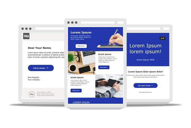 A look at the free email templates we offered, which did a great job of collecting emails, but didn’t lead to many conversions
We determined that our second priority was giving readers the best experience possible. We wanted them to be excited and amused by our newsletters, and to feel like they were getting value when they read our blog articles. We didn’t want them to be annoyed. This priority made our job harder because frankly some of the most effective marketing techniques are also the most annoying.
It might take you some time to determine what your priorities are. That is okay; it can be hard to break out of the “sell sell sell” mindset a lot of entrepreneurs find themselves in. Think about your goals for your content. What do you want the content to do and who do you want to read it?
Come Up With a Plan and Test
So you have got your priorities. Now you have to test them and see what sticks.
We tried two different strategies for capturing emails — a pop-up module and a bar at the bottom of the screen. We programmed both to appear when a reader scrolled through half of the content on the page (as that indicated they were probably enjoying what they were reading, and hence were good quality candidates for our newsletter). And to make sure we didn’t bother readers who were already subscribed, they only appeared to readers who weren’t logged into the site.
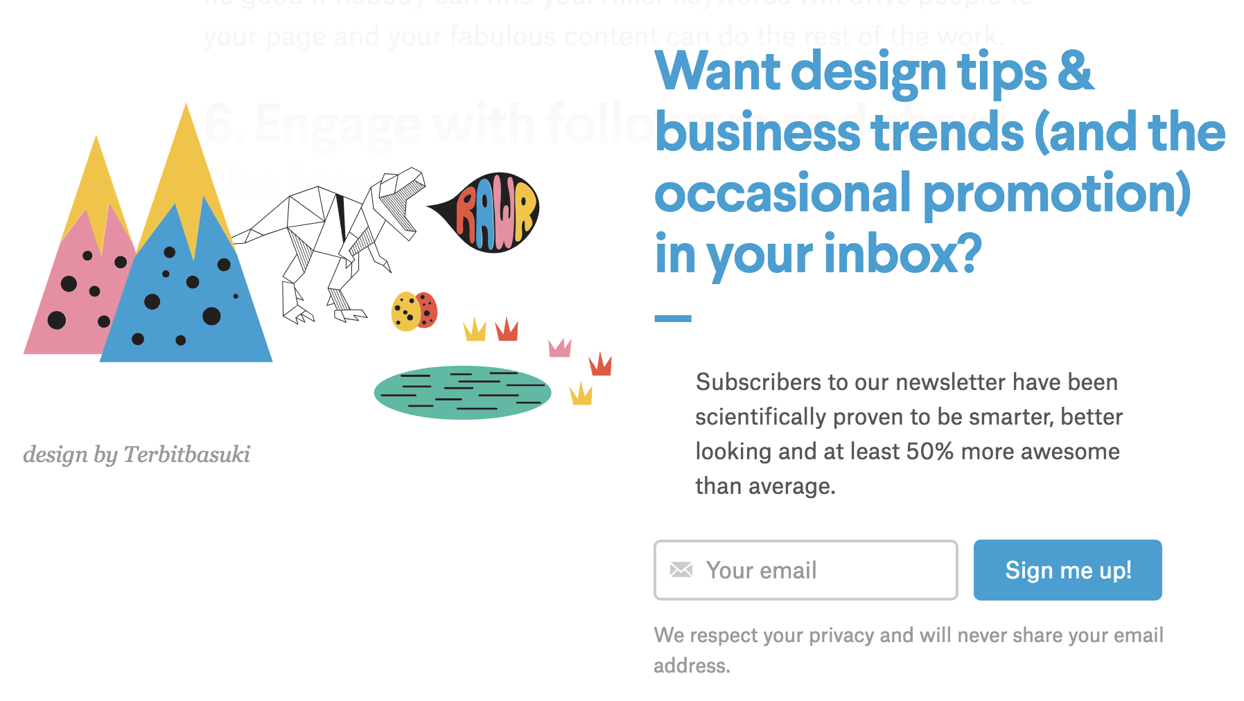 Our pop-up collection module, which appeared once new readers scrolled 75% of the way down the screen.
Remember what we said about not annoying your reader?
That is why we didn’t try a “welcome mat” pop-up. Data shows that these are one of the most effective methods for capturing emails, and maybe using one is the right choice for you. But we decided that they felt too intrusive, and took away from the quality experience we wanted to provide, so we wouldn’t use them.
We also kept reader annoyance in mind as a key metric to consider. Annoyed readers were the ones who stopped reading when the email capture appeared versus readers who continued to scroll through to at least 75 percent of the content. For us, a 5 percent drop off in readership between the 50% and 75% threshold was the highest we were willing to go. Any higher than that, we felt like we were alienating readers with our email capture attempts, which wouldn't fly. After all, we want to add value via our content, not take it away.
Here Are Our Experiments and the Data We Collected:
To start off, we needed to determine our baseline conversion rate. That is the number of readers who went on to sign up for our newsletter with the method we were already using, a box at the bottom of each article; this was our control group.
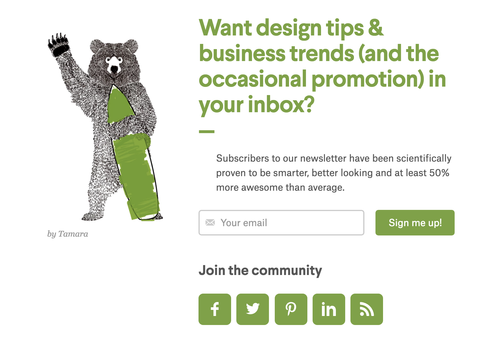 Our signup bar at the bottom of all articles looks like this.
Of the people who read control articles, 11.8% saw the email capture box and 0.19% subscribed to our newsletter.
In the first phase of our experiment, we compared this control to a floating bar at the bottom of the window. Of the floating-bar variant readers — 61,158 readers; 79.8% saw the email capture and 0.45% subscribed. Big difference, huh?
As I mentioned, we also tracked scroll percentage as an indicator of annoyance. In this test, 29.72% of control readers reached the 75% mark, and 29.45% of the floating-bar variant readers reached the same point. From this, we can glean that the floating bar wasn’t a reader turnoff. Check plus.

Phase 2 of our experiment was to iterate and compare the floating bar (now our control) to a new variant, the popup module. We found that the pop-up module had a 0.69% conversion rate, which was a 56% improvement (with 99% statistical significance) to the floating bar.
We also found that during this period, there was a 6% decline in the number of readers who scrolled to at least 75% of the page; this was just a smidge over our stated 5% tolerance, so we did some really scientific soul searching and decided it was close enough. The popup was our winner!

Overall, we found that with the pop-up module, we could get not quite three times more email addresses per visit than we were getting with our baseline signup box. Pretty impressive, right? But we said earlier that we were able to get seven times the amount of signups we had been getting before, so what gives? Where did we math wrong?
In Q2 of 2017, we had a little over one thousand newsletter signups from blog readers. In Q2 2018, we were in the tens of thousands. Sure, we can attribute some of this extreme growth to higher email capture percentages, but we can’t give the pop-up all the credit. Our readership also grew tremendously between 2017 and 2018. In Q2 of 2018, 99designs had more than double the blog traffic it had in Q2 2017. We also didn’t get rid of the old signup box at the bottom of each page. So even though we were getting a bunch of signups with the new pop-up module, we were also getting some subscriptions the old-fashioned way. We have also started to invest more in gated content.
Get Even More Targeted Emails with Gated Content
Gated content is content that’s behind a virtual “gate.” If you’ve ever had to provide your email address or sign up for a newsletter in exchange for an ebook or another type of content, you’ve accessed gated content.
Once you have got your standard email capture up and running, offering gated content is a great way to level up, as it can be a very effective strategy for capturing emails.
We write a lot about branding and brand identity on our site. This topic is also core to what we do (design logos and brand identities). We decided to offer a free, in-depth 7-day email course on brand identity.
When we added this gated download to our articles about branding, we doubled our email capture rate on that subset of articles from 1.07% (with our standard popup) to 2.16%. We also measured the percentage of readers who ended up buying something from us within 90 days of giving us their email.
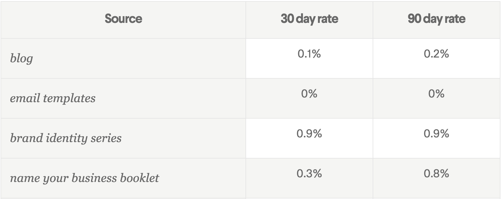
Not only did gated content get us more email addresses, but it also got us more relevant emails (of people who had a higher likelihood of converting). Score!
Note that we also tried adding the brand identity capture to some of our articles on logo design (as we thought that was close enough to branding), but the results there showed no improvement. Our takeaways: make sure your gated content is related to 1) the core of what you do and 2) very specifically what readers are looking for on a particular article.
(Our next step is to test an ebook on logo design on those logo articles.)
Experiment, Collect Data, and Then Experiment Some More
You are going to refine your strategy more than once to get it to work its best. Remember that what worked for us might not necessarily be what works for you.
I know that many small businesses don’t have a team of developers to help them set up tests and custom analytics, but that doesn’t mean you can’t run your own experiment; there are many off-the-shelf products designed specifically to help you do this. We have used Optinmonster in the past. Other lead generation services you might want to try include SharpSpring, Hatchbuck, Oracle Marketing Cloud and Growlabs.
A Final Piece of Advice:
Your newsletter is the place to have a little bit of fun. You are building brand sentiment, not sending promos. We tried things that worked—like our upside-down newsletter—and things that got more mixed responses—like our nostalgia newsletter that our CEO said was too weird, but our Twitter followers thought was just the right kind of strange.
Be playful. Have fun with it. And remember to learn from everything you do.
Innovative SEO services
SEO is a patience game; no secret there. We`ll work with you to develop a Search strategy focused on producing increased traffic rankings in as early as 3-months.
A proven Allinclusive. SEO services for measuring, executing, and optimizing for Search Engine success. We say what we do and do what we say.
Our company as Semrush Agency Partner has designed a search engine optimization service that is both ethical and result-driven. We use the latest tools, strategies, and trends to help you move up in the search engines for the right keywords to get noticed by the right audience.
Today, you can schedule a Discovery call with us about your company needs.
Source:


