Since gaining access to a paid Semrush account 11 months ago, it’s slowly become one of my favorite competitive insight tools. I use it to analyze everything from keyword rankings, international market share, to overall paid and organic visibility in Google for clients and competitors.
In this post, I’m going to show you how to use data from Semrush’s Chart tools and Google Sheet’s motion charts to help you tell a visually compelling story. Using these two tools, we’ll create a dynamic chart that will show Google organic traffic and number of total ranking keywords for multiple domains over time.
For this tutorial, I decided on a comparison of four popular backlink analysis tools including Open Site Explorer, Majestic SEO, Ahrefs and Semrush. Lets get started!
Getting Started with Semrush’s Chart Tools
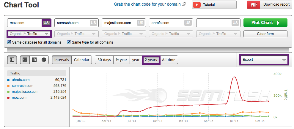
You can find Tools > Charts in either the top or left sidebar menu from the homepage. Semrush’s Charts allows users to choose from a variety of paid (Advertising) and organic search performance filters. For organic, users can analyze up to five website’s Google organic traffic, total ranking keywords, traffic price, new keywords, lost keywords, improved keywords and declining keywords.
In the below screenshot, you’ll see I’ve added all four competitor’s domains, selected Organic > Traffic from the dropdown menu below the domain, and set the time range for two years. It’s important to note that the Charts feature only provides data for domains, not subdomains, subdirectories or specific pages.

Once I’ve exported the plotted chart report to Excel, it’s time to pull in another data set. For this analysis, I’m interested to see if there’s a correlation between the number of ranking keywords and Google organic search traffic, so I’ll next select Organic > Total Keywords from the drop down menu below domains, select Plot Chart and export to Excel.
Putting the Data Together in Google Sheets
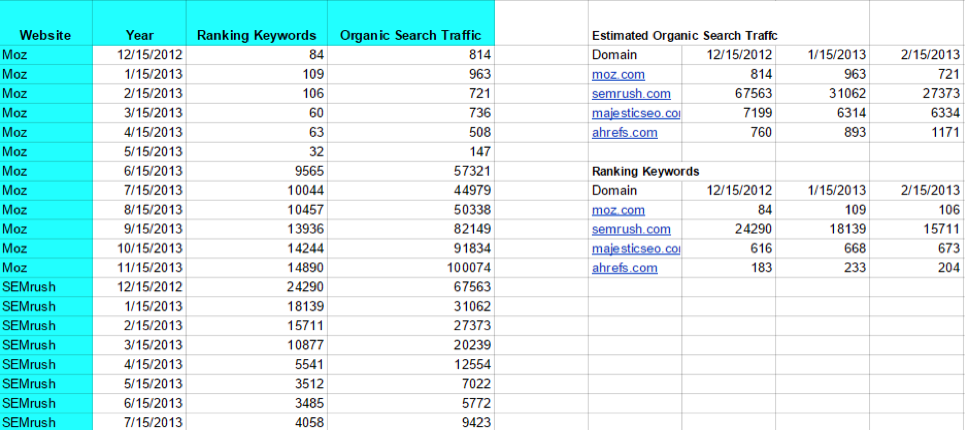
Because we’re using a Google motion chart, we’ll want to create a new sheet in Google Drive and copy and paste in the export data from Semrush. Before copying the data into a new spreadsheet, I like to clean out any fields I won’t be using in the motion chart like type, database and summary.
The first column we’ll add into our spreadsheet will contain the website name (entity) that we’ll want to track followed by a column that includes date values (FYI, this chart supports multiple date formats). The rightmost columns will contain our Semrush data that includes Google organic search traffic and ranking keywords over the selected date range (two years for this analysis). Because entities, dates and data points are all stacked vertically using the motion chart format, using the transpose feature in paste will allow you to quickly move Semrush data into the required format in your Google Sheet.
Once you’ve compiled data from both Semrush reports, your new Google Sheet should look similar to the below screenshot:

Now that we’ve compiled the data into the proper format, creating a motion chart is as easy as selecting the data, inserting a motion chart (Google should detect that the data is formatted for a motion chart and suggest it) and voila, you now have a dynamic chart that shows estimated Google organic search traffic and number of ranking keywords over a selected date range!
For those that prefer a visual step-by-step tutorial, I’ve created a short video to guide you through the process.
Once the chart has loaded, we’ll select Organic Traffic as our Y axis and Time as our X axis. To help define our entities in the chart, we’ll select all domains and additionally select unique colors from the color menu. For size, select Ranking Keywords which will cause each domain to increase or decrease in size as they gain or lose visibility for keywords in Google search. I also like to uncheck the Trails option as I feel it’s distracting, but feel free to experiment and go with what works best for you or your client.
Analyzing the Data
While this analysis isn’t entirely apples to apples, it should provide you with the insight needed to create your own motion charts using Charts data from Semrush.
Other ways to use Semrush Charts.
There are plenty of other ways to use data from Charts to analyze organic and paid visibility including:
Google algorithm updates — winners vs. losers Any major marketing campaigns, or link acquisition efforts — most backlink analysis tools allow you to analyze links acquired over time and look for any loose correlations between a spike in links acquired and organic search traffic Organic traffic and advertising paid traffic price — how much traffic a competitor is acquiring organically and how much they are paying for clicks Mergers and acquisitions Growth, or a decrease of organic visibility over timeSwitching Between Chart Formats
If you prefer a simple line or column chart, switching chart formats in Google Sheets is as simple as choosing between your chart preferences for visually displaying the data.
Publish and Share Your Chart
Another awesome feature worth mentioning in Google Sheets is the ability to publish your chart, which creates a URL for easy sharing between co-workers and clients.
Wrapping Up
I’ve just scratched the surface on ways to use Semrush’s Chart Tool and would love to hear how you’re using the data for analysis or to guide strategy for paid or organic in the comments below.
Innovative SEO services
SEO is a patience game; no secret there. We`ll work with you to develop a Search strategy focused on producing increased traffic rankings in as early as 3-months.
A proven Allinclusive. SEO services for measuring, executing, and optimizing for Search Engine success. We say what we do and do what we say.
Our company as Semrush Agency Partner has designed a search engine optimization service that is both ethical and result-driven. We use the latest tools, strategies, and trends to help you move up in the search engines for the right keywords to get noticed by the right audience.
Today, you can schedule a Discovery call with us about your company needs.
Source:


![How To Create a Strategic Dashboard in Excel Using Semrush Data [Excel Template Included]](https://new.allinclusive.agency/uploads/images/how-to-create-a-strategic-dashboard-in-excel-using-semrush-data-excel-template-included.svg)
