I am an odd duck in the SEO community. I have been an information architect for 16 years and focused on search engines for the last seven of those years. This puts me squarely in the SEO and UX camp, and highly suspicious of Google from both. My goal in life, my mission, my jihad is to bridge the gap between SEO and UX so we can make the decision of what’s relevant away from the algorithms and restore it to humans, us, you and me.
I am most grateful to Kathleen Garvin and Semrush for the opportunity to write about key UX concepts that influence rank in search results through that shape-shifting Panda algorithm. Earlier we discussed mental models. Last month we talked about the focus of attention and Google’s page layout algorithm. Today’s post looks at Zipf’s Law of Least Effort or, as it applies to your site visitors, don’t-make-me-work-too-hard-to-get-what-I-want-or-I’ll-bounce-back-and-pick-someone-else-and your-rank-will-drop-as-your-bounce-rate-rises.
It would seem obvious that one doesn't want to work harder than they have to to accomplish something. That did not prevent Harvard linguistic professor George Zipf from confirming this with his Principle of Least Effort in 1949, and it has been a mainstay of user experience ever since.
The Zipf’s Principle of Least Effort presents:
People want the most outcome for the least effort Most useful behaviors are performed frequently, and become easier and quicker over time due to thisApplied specifically to website user experience, the Principle of Least Effort reveals that users do not want to spend a lot of time and effort deconstructing your innovative navigation labels.
Easy or Accurate
Recent research complements Professor Zipf’s observations on least effort with insights into the criteria users employ to select information resources. Shall I Google it, or ask the competent villain down the hall? The moderating role of information need in information source selection from Lu and Yuan apply the Principle of Least Effort to selection of information resource for the following conclusions.
Information seekers use two measures for information resources: quality (relevance and specificity to the problem being addressed) and accessibility (ease at which an information seeker can reach an information source to get what they need).
Lu and Yuan refer to the sufficiency principle when labeling users as “cognitive misers" who are looking for a “good enough” rather than “the best” answer most of the time. Because searching the Web is fairly effortless and the search engines do such a good job at “quality” with relevance ranking, accessibility would be the key factor in selection.
What Does This Have to Do with SEO?
Users have a choice. If you are lucky enough to appear at or near the top of search results for a query and you do not provide satisfaction to the user very quickly upon landing on your page, they will quickly discard you and make another choice. Matt Cutts has mentioned Panda in conjunction with bounce rate frequently enough that we can probably assume some truth there.
In The Role of Visual Complexity and Prototypicality…, Google research shows that users strongly prefer text over image for information gathering because it is easier to read and understand words than to deconstruct what an image is trying to say. Let’s take a look at some Fit’s Fails for user experience and, as a result, SEO.
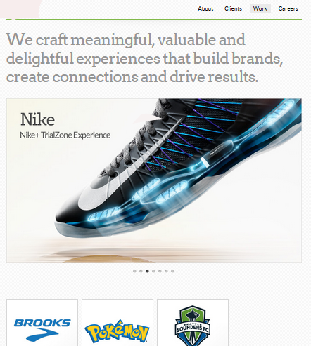
Least Effort Fail 1: I’m looking for a digital agency that can help me to increase revenue through my website. The one below is going to make me dig by clicking through to each section to see if what I want is there. There’s lots of big type and interesting colors when I get there but I have to scroll to the bottom of the page to see if they offer the services I am expecting or tell me why I should want what they offer.
I am sure that this is an award-winning site and will bet dollars to donuts that their bounce rate is high as users take one look and go back to pick another, easier result. Why not offer navigation menus? Why make your users work harder than they have to in order to get what they need? Professor Zipf would tell us that the user mental model conforms to presence of navigation and that clicking around is a lot more effort than selecting another search engine result.

Least Effort Fail 2: Another digital design agency that did not get the Zipf memo when they launched their site with obscure navigation labels is Collective A row of images with indecipherable text overlay our brow-furrowing text front and center, neither of which give me a sense of what I fill find at the other end. Sigh. Too much effort to find out, so I bounce back to the search results for selection number any-one-but-this-one.

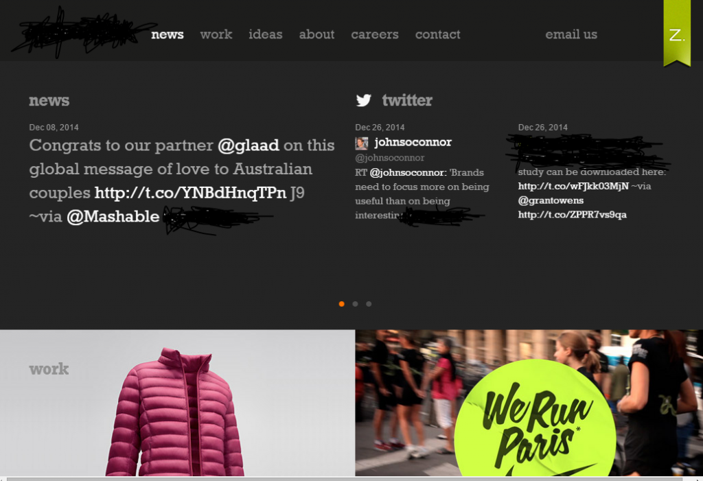
Least Effort Fail 3: This digital agency believes that site users come for news of their many accomplishments, and lucky users find this front and center, above the fold. Don’t get me wrong, design is important. However, I do not think that it is the most important contributor to the mix and neither is news about your agency. Navigation labels are somewhat clear. The "no menus" trend forces users to dig for what they want; likely most of them don’t.

Leave No User or Client Behind
Sadly, my Christmas wish that SEO go back to being easy was not granted. It is harder now, and involves sleeve rolling up, getting in touch with squishy user behavior and that all SEOs “cowboy up,” reach across the aisle to support their UX colleagues in putting users first and design second.
Users want quick and easy answer. Ensure that what the page is about is front and center of the user line of sight on landing. Users prefer text to pictures because text is easier to figure out. Fight to be involved in the design stage so that you can lobby hard, fisticuffs if necessary, to provide clarity and orientation when users land on a page. Link strategy is not just links coming in, but links going through. Look at your client sites from the lens of least effort. Users do not often have the luxury of time to navigate through the site. Are there links or paths to related or useful information that can help them? Keyword research is about users not placement. Look at the language that users employ to get to the site. Don’t make your users work too hard to figure out what labels and link text mean. Sometimes being too different is not so good. Look at competitor sites to make sure yours is not too far afield of what users expect.We’re all in this together, UX, SEO and the pointy-headed academics who set us in the right direction with their research. I don’t know about you but I feel like I’m in great company. Watch out Google Panda! We’re on to you.
P.S. Check out Whiteboard Friday: Information Architecture for SEO (Thanks, Rand! Nice to have you on the UX is the next SEO bandwagon. You’re in good company.)
Innovative SEO services
SEO is a patience game; no secret there. We`ll work with you to develop a Search strategy focused on producing increased traffic rankings in as early as 3-months.
A proven Allinclusive. SEO services for measuring, executing, and optimizing for Search Engine success. We say what we do and do what we say.
Our company as Semrush Agency Partner has designed a search engine optimization service that is both ethical and result-driven. We use the latest tools, strategies, and trends to help you move up in the search engines for the right keywords to get noticed by the right audience.
Today, you can schedule a Discovery call with us about your company needs.
Source:


![How To Create a Strategic Dashboard in Excel Using Semrush Data [Excel Template Included]](https://new.allinclusive.agency/uploads/images/how-to-create-a-strategic-dashboard-in-excel-using-semrush-data-excel-template-included.svg)
