

You’ll find out what mobile SEO is, why mobile optimization is important as well as some simple best practices you can follow to improve the mobile-friendliness of your web pages.
Ready to get your website ready for Google’s mobile-first index?
Let’s go.
What's Mobile Optimization SEO marketing?
Optimizing your site for mobile SEO requires different methods than desktop users.
You have to set your website up to display your content correctly in a mobile version if you want high SERP rankings. Without a mobile-friendly version, Google won’t find you as a reliable source. Let’s look at how to optimize your website using seven mobile SEO best practices.
Whenever a person uses a search engine to look up information, an algorithm runs to display the results that best relate to the query.
To get a website to pop up in these search results, companies tweak their websites using SEO — search engine optimization. Multiple techniques help your site rank better.
Using relevant keywords, making sure your content is on-topic, and the appropriate length, and adding links are just a few ways to optimize your site.
Why is Mobile SEO Important?
The short answer: because the number of mobile searchers is increasing:
58% of all Google searches are done from a mobile device. (source)
And this trend is growing, with 27.8 billion more search queries done on mobile vs desktop.
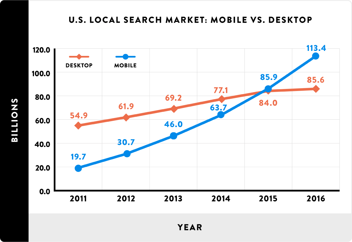
Source: https://backlinko.com/mobile-seo-guide
Many users overlook one of the most essential types of optimization: mobile SEO. There are many benefits of mobile SEO strategy with your website.
More Users
In 2019, 80% of all internet searches happened on a mobile device. And 40% of all sales transactions happened on a cell phone or tablet. Over half of all internet traffic globally was done through a mobile device instead of a computer.
If you have not incorporated mobile SEO into your website design, you could be losing profits and customers. Without mobile optimization, your site will not display correctly on a mobile device.
Almost half of all customers will move onto another site if they cannot view your site on their cell phone or tablet. The speed of your website can also cause you to lose business.
Google Ranking Mobile site
To keep up with the demand for mobile searches, Google ranks websites using a “Mobile First” algorithm (mobile-first indexing).
This index orders search results based on the mobile version of the site.
Even if a customer uses a desktop to Google a search query, the results will show up in the order of which site has the best mobile optimization.
Google’s old way of displaying results consisted of both mobile and desktop results. This process means your site could still appear high in the rankings, even if you don’t have a strong mobile version.
However, Google has updated this policy and now only uses mobile results. If you aren’t using mobile SEO or you don’t have a mobile version of your site, you may find yourself falling lower in the results or not ranking at all.
7 Mobile SEO Best Practices You NEED To Know
We’ve found seven mobile SEO best practices to help you improve your mobile rankings.
TLDR: Mobile SEO Best Practices 
Let’s look at some standard mobile SEO practices you can use to spruce up your site:
1. Website Configuration
A mobile version of your site should load fast, show smaller images proportional to the mobile device, and display your contents properly.
Many people make the mobile version identical to the desktop version. To create the mobile portion of your site, you have a few different methods to try.
Separate site
In the early days of mobile browsing, you would need two separate versions of your site: the desktop (main version) and the mobile (M version).
When a user visits your site, they are directed to one of two URL types, depending on their browsing — desktop or mobile.
This technique means more work for you, as you’ll have to create two versions of each page. And it can be challenging to incorporate flawless SEO into the M sites.
You’ll also have to spend some time placing in many difficult tags to get a proper mobile display. Many people have steered from using separate URLs. If this is your current method, keep reading to learn about some easier SEO-friendly techniques.
Dynamic serving
Dynamic serving means that you only have one URL for all of your content. You don’t have to worry about having two different URL formats.
Instead of directing the user to the appropriate URL version, your site will display a version of HTML/CSS that is compatible with the device.
But there’s no guarantee that the server will display the correct version. It’s common for dynamic serving sites to show the desktop version to mobile users.
And you will need different content versions for the various devices, including any new ones that may develop. While dynamic serving works better than separate URLs, there are still plenty of complications that make it less desirable than other methods.
Responsive web design
Responsive design customizes the content and layout by converting it to the user’s device without requiring multiple versions or separate URLs.
This method is most preferred by Google and will automatically rank higher than in other ways.
This technique also works seamlessly with SEO, another pro for Google’s ranking standards. Search engine spiders can crawl your site faster, improving your SERP score. And responsive design pages also load more quickly, making it more user friendly.
But, it can be time-consuming trying to switch from a different method to this technique, so many businesses stay with one of the other techniques they’ve already used.
Depending on the amount of content on your site, it may not resize appropriately for all devices. Often, the navigation bar doesn’t adjust to size correctly, resulting in failed hover-over links for touchscreens.
2. Mobile Friendly
Once you’ve figured out which way you want to have the separate versions of your website, you’ll move on to making sure your content will be mobile-friendly.

Source: https://www.bluecorona.com/blog/2017-seo-statistics/
Google makes it easy to check your site’s performance, but you will need to conduct the test on every page to get an accurate report.
To analyze your site’s mobile usability, you can use the Google Search Console. Locate the “Mobile Usability” button in the menu to view visitors’ results to your site. If there are problems, you’ll receive alerts with steps on how to fix the errors.
Or you could add your website’s URL directly into the Experte Mobile-Friendly test tool as well. The results will tell you if you passed, with a green “Page is mobile-friendly” tag. If you didn’t, it would explain the issues so you can correct them.
3. Crawling and Indexing
When Google ranks your page, they use search spiders that crawl your site to index your content. Sites that implement SEO properly will display higher in the search results for relevant search questions.
If you don’t allow your images, JavaScripts, or CSS files to be crawled, a search engine will not rank your site as high as your competition.
It may also rank poorly if the bots can’t determine between the mobile and desktop versions. You can use HTTP Header tags to help Google decide which version to show.
Search spiders like Googlebot need to access all areas and pages of your site to rank it appropriately. View the robots.txt file (site.com/robots.txt).
Or look at the robots tab through Google Search Console. Click Google Index—>Blocked Resources and make sure you aren’t blocking any areas. You can also use the Fetch and Render tool to make sure everything can be crawled.
An easy way to index your site is to create a mobile XML sitemap for each URL. Then submit each of these XML maps to Google Search Console, along with your mobile site.
4. Site Speed
How fast your site loads can play a significant factor in whether customers stay on your site long enough to buy something.
Or even leave you with a high bounce rate — when a customer visits your site, then immediately leaves.
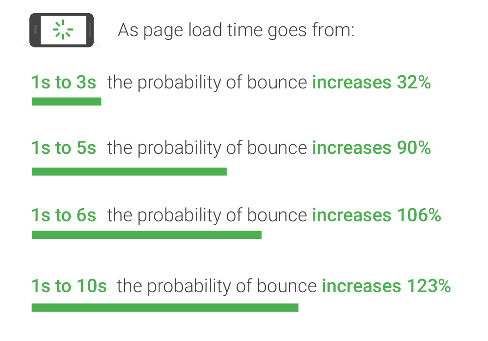
Many customers will give up on a site if it takes longer than one to three seconds to load. Cell phones may load slower than desktops, so you want to do your best to make your content load as quickly as possible.
You can quickly check how fast your mobile version loads by entering your website URL into the Google mobile speed test.
This tool will provide you with how fast your page loads and with what connection. It will also give you a rating plus recommendations for how to fix your issues.
You should also make sure you use image optimization for quicker uploads. A useful resource to speed up your site is the Google Developers PageSpeed Insights Mobile Analysis. It will help if you run regular checks using the PageSpeed Insights analyzer tool.
5. Mobile UX
UX means user experience, and it’s the most crucial part of your SEO strategy. You want to be sure your site provides fast speeds, easy functionality, and a solid mobile design.
Your site’s appearance can have as much of an effect on your users’ experiences as a slow loading site. In one study, Google found that 61% of users will not revisit a site that does not display correctly on their mobile device.
Using hard to read fonts, requiring frequent panning or zooming, and having navigation bars that don’t perform properly are all factors that can cause customers to avoid a website.
Google offers this useful resource that includes 25 tips on the ideal mobile design. Incorporating these recommendations into your mobile site design improves the chances of getting a higher ranking in Google search results.
Among the tips to make the best mobile SEO site are:
- Make your menus simple to use as a toggle or pull-down menu to reduce clutter.
- Forms or other links should not open in popup windows or lightboxes. Google does not consider this UX preferred.
- Users should not have to move the screen to get the page lined up correctly. Your design should fit into a smaller screen without losing its usability and attractiveness.
- Can users quickly access the search bar? Do you have filters that keep from having zero results?
- Did you include Click-to-Call buttons and an easy to find the home button to return to the main page?
6. UX Design
If users have to pinch in on the screen to make the words big enough to read or focus on one piece of the page surrounded by other stuff, they usually leave the site for your competitor.
With mobile pages, you want your content to be easy to read, without a lot of clutter or need for blowing it up larger. Some suggestions for how to format your mobile content include:
- Writing short paragraphs
- Strong color contrast between background and text
- Font size between 14 to 16 px without being in a fancy font
- Include bullet points for lists
Visitors who browse a site using a mobile device have less inclination to scroll too far down the page to get the answers they’re needing. You want to have your message in the center of the page, visible within the first 14 seconds of scrolling on your page.
Keep your header images small. Large images are one of the leading causes of a slow mobile website upload. Resize or compress our images, so they’re smaller or use HTML5 image tags to set the size dimensions.
7. Monitor Your Performance
You should never design your site and then leave it be to hit or miss with customers. The best way to be successful is to do frequent checks of your data and analytics.
See what areas have the best success and then compare that to the ones you see no positive feedback.
Check if you’re doing anything different between the pages and figure out how to fix your mobile SEO to make your pages stronger.
Google Analytics and Google Search Console are two great tools to use to keep up with your rankings and site performance.
Mobile SEO Checklist or How to optimize your website for mobile devices?
Now that you know the seven best practices for mobile SEO, use this mobile SEO checklist for a quick reference to make sure you have a mobile-friendly website:
- The site is mobile friendly
- Google Search Console is set up to count clicks, impressions, and site position
- The site is connected to Google Analytics to track mobile traffic
- Use Google Fetch and Render
- Check for crawl errors
- Do frequent mobile speed tests
- Responsive theme
- Limited or forbidden popups
- Mobile optimized design
- User-friendly UX design
Mobile SEO Best Practices
If your site is already well optimized for search engines, there are only a few additional things that you need to think about when optimizing for mobile devices and Google's move to mobile-first indexing.
Page speed
Because of hardware and connectivity issues, page speed is even more important for mobile users than desktop users. Beyond optimizing images, you'll want to minify code, leverage browser caching, and reduce redirects. More information on page speed can be found on our SEO Best Practices for Page Speed page.
Don't block CSS, JavaScript, or images
In the old days, some mobile devices couldn't support all of these elements, so webmasters of mobile sites blocked one or all three. But for the most part that's no longer true, and the Smartphone GoogleBot wants to be able to see and categorize the same content that users do. So don't hide it. These elements are also critical to helping Google understand if you have a responsive site or a different mobile solution.
Site design for mobile
Mobile devices are simplifying and revolutionizing the ways sites are designed. "Above the fold" no longer has meaning in a world where we scroll endlessly
Don't use Flash
The plugin may not be available on your user's phone, which means they'll miss out on all the fun. If you want to create special effects, use HTML5 instead.
Don't use pop-ups either
It can be difficult and frustrating to try and close these on a mobile device. This might lead to a high bounce rate.
Design for the fat finger
Touch screen navigation can lead to accidental clicks if your buttons are too big, too small, or in the path of a finger that's trying to get the page to scroll.
Optimize titles and meta descriptions
Remember that you're working with less screen space when a user searches using a mobile device. To show off your best work in SERPS, be as concise as possible (without sacrificing the quality of the information) when creating titles, URLs, and meta descriptions.
Use Schema.org structured data
Because of the limited screen space, a search result with rich snippets is even more likely to stand out than on a desktop. Read more about Schema.org structured data.
Optimize for local search
If your business has a local element, remember to optimize your mobile content for local search. This includes standardizing your name, address, and phone number and including your city and state name in your site's metadata. More information on local SEO can be found here.
Mobile site configuration
Probably the most important decision you'll make when setting up a site is deciding whether you want to use a responsive, dynamic serving, or separate site configuration. Each has its advantages and disadvantages. Google prefers responsive design but supports all three options as long as you have set them up properly.

Responsive web design
Responsively-designed sites use CSS3 media queries to serve the same content to mobile and desktop users using a fluid grid and a flexible design to automatically adapt to the size of a user's screen.

Responsive designs use media queries to target the layout based on screen width, orientation, and resolution. For example, you could use the following CSS to instruct browsers how to display content for a screen that's 420 or fewer pixels wide:
Code Sample
@media screen and (max-width: 420px) { .class { [styles for this class here] }}
And to link to a separate stylesheet instead, put the following HTML in between your tags:
Code Sample
Responsive designs allow you to have a variety of these media queries so that users on tiny mobile screens, larger-than-average mobile screens, and even tablets can all see a site that looks designed for their devices.
Use a Google's Mobile Testing Tool to verify that your website is optimized for mobile.
Dynamic serving
If you don't have the resources for a complete site redesign or want to display different content for mobile visitors than you do for desktop ones, one solution is to use one URL to display different sets of HTML and CSS depending on what type of device your visitor is using (also called detecting user agents). This can be useful, for example, if you're a restaurant who wants a mobile visitor (who might be wandering your neighborhood) to see a sampling of reviews and a map to your location instead of your full website.
Displaying different content based on the user agent is called dynamic serving and it's done using the Vary HTTP header, which looks like this:
Vary HTTP Header
GET /page-1 HTTP/1.1Host: www.example.com(...rest of HTTP request headers...)HTTP/1.1 200 OKContent-Type: text/htmlVary: User-AgentContent-Length: 5710(... rest of HTTP response headers...)
Example from the Google Developers Blog.
Simply put, this means that the content displayed will vary based on the user agent requesting the page.
Dynamic serving is not the perfect compromise that it might seem to be. For one, it relies on having an updated list of user agents, which means that every time a new mobile device comes to market that list needs to be updated. And it's not uncommon for desktops and mobile devices to be wrongly served with the HTML for the other device. Read more about common pitfalls.
Summary
If you want to get the best search rankings, you must optimize your website for mobile searchers.
We’ve given you seven mobile SEO best practices to help you improve your mobile version.
We’ve also provided a handy checklist. Using these techniques will help you rank higher in Google and see better visitor analytics
or you can schedule a Discovery call with us about
Mobile search engine marketing services


