Banner ads are easy to spot on the Internet. If you’ve ever read a blog or browsed a social media platform, you’ve likely spotted one.
PPC marketers use banner ads to grab viewer attention and encourage clicks to their websites. With the right strategy and budget, they can be a valuable boost to any display advertising campaign.
Let’s review how banner ads work and how to design your own.
What Is Display Advertising?
Display advertising is a type of online marketing that involves using visual ads to encourage customers to take a specific action. Visual ads combine text and images (static or animated) to inform viewers about a service or product.
How Are Display Ads Used?
Brands commonly use display ads to earn:
Brand Awareness: Much like the more traditional newspaper ads, flyers, or vouchers, and posters in public places, these kinds of ads aim to earn the maximum amount of exposure. Marketers can create banner ads and distribute them on as many platforms as possible to gain the maximum number of clicks.
Conversions: However, some advertising platforms will allow you to specify the audience you want your ads to appear to. Marketers may target their audience by specific demographics (age, location, etc) to earn more clicks but pay less for impressions.
What is a Banner Ad?
Banner ads are a type of display ad. These adverts are placed on websites, social media platforms, and apps to earn views and clicks. You can link your banner ad to any URL on your website, though most marketers prefer to point to a landing page.
Banner ads usually include a focal image, minimal text, and a clear CTA.
 Example of a banner ad on CNN.com
Common Banner Ad Sizes
Banner ad sizes differ according to the advertising platform you use. Choose a size that best suits your ad and has the best potential return on investment.
Google Ads
Google Ads offer banner ads in the following sizes (in pixels):
200 x 200 (Small Square) 250 x 250 (Square) 468 x 60 (Banner) 728 x 90 (Leaderboard) 300 x 250 (Inline Rectangle) 336 x 280 (Large Rectangle) 120 x 600 (Skyscraper) 160 x 600 (Wide Skyscraper) 300 x 600 (Half-Page Ad) 970 x 90 (Large Leaderboard)Facebook banner ads have the following image sizes:
Facebook Feed Image Ads – 1200 x 628 Facebook Feed Video Ads – 600 x 315 or 600 x 600 Facebook Carousel Ads – 1080 x 1080 Facebook Right Column Ads – 1200 x 628 Facebook Marketplace Ads – 1200 x 628 Facebook Instant Articles Ads – 1200 x 628 Facebook Stories Ads – 1080 x 1920 Facebook Collection Ads – 600 x 600Users can create banner ads in at least one of the following sizes for Instagram:
Instagram Single Image Ads – 400 x 500 Instagram Video Ads – 400×500 max Instagram Carousel Ads – 1080 x 1080 Instagram Stories Carousel Ads – 1080×1920 Instagram Slideshow Ads – 600 x 600 pixels, max. 1080 x 1080 Instagram Stories Image Ads – 1080 x 1920 Instagram Stories Video Ads – 1080 x 1920Banner Ad Examples

1. This ad repurposes the game’s packaging for the banner’s design. Repurposing your content can strengthen brand awareness over time, as certain design elements become more recognizable.
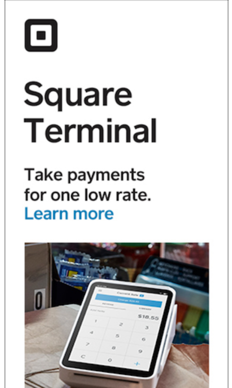
2. This half-page ad from Square balances image and text on a banner ad. This combination is effective in communicating what the product is, what it does, and how it can help you.
Sometimes an image of your product alone is not enough to convey its features and benefits. In these cases, add text to your banner ad. But remember to keep it simple and short: provide product information that’s easy to understand at a glance.

3. Banner ads can appear on busy web pages with tons of graphics or other visual elements. Color naturally draws a user’s eyes. In this banner ad, we get straight to the point with our offer (“7 competitor insights…”) once we have their attention.

4. This banner ad from Bulldog uses humor and color to draw viewers’ attention. The contrast of white and green adds a friendly spin on a humorous image.

5. This Audible banner ad highlights an offer or promotion with color and text. The promotional offer is in bold, earning the most
It can be difficult to get promotional messaging across effectively in a banner ad. But remember that less is more. You can always add a click for terms and conditions CTA if you need to cover any legal issues.

6. In this banner ad, Brita makes text the focal point. But it works because the copy is short, snappy, and delivers the message effectively.

7. Here’s another ad from Brita that alters the ad’s creative for placement. It conveys the same image, but the design adjusts to the size and format of the placement. Its design elements are still easily recognizable.
If you are placing multiple banner ads, consider how your creative looks with different placements. How you can keep the creative interesting yet consistent?

8. This ad from Samsung is a great example of a simple yet effective creative. The ad is simple and direct, which matches neatly with Samsung’s overall branding.
On a busy website, whitespace can be a highly effective design technique.
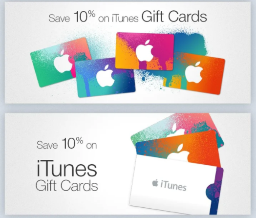
9. This Apple ad is eye-catching, colorful, and simple. Although less can be more, your ad can include an offer and an expressive image, as long as the messaging is clear.

10. AST’s creative for this banner ad draws attention to its text with bold formatting. It uses humor to answer a common question about its business.
Most businesses stick to formal language when designing ads, but informal language applied correctly can make your ad stand out. However, remember to stay on brand and consider if this would work with your brand tone of voice.

11. In this ad, FinalStraw uses a humorous customer quote to describe their product. Their brand’s bright color and wordplay let us know they’re advertising to a younger, more relaxed audience.

12. This Hitachi banner ad employs both color and placement to draw attention to their CTA. The CTA itself is short and actionable. Effective ads cause users to take action.
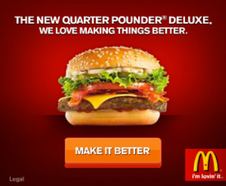
13. This ad from Mcdonald’s uses interactivity to drive action. Instead of offering their product, McDonald’s encourage views to create their own version of the Quarter Pounder burger.
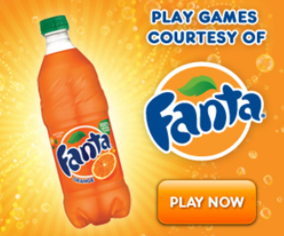
14. Fanta’s bright, colorful ad clicks through to an interactive game. We know this from the CTA (“Play now”) and the headline (“Play games.”)

15 This Disney banner ad entices viewers with a rare offer (“Exclusive Original series.”) Its CTA contrasts nicely with the earth tones of the creative and encourages direct action (“Start your free trial.”)
You don’t have to advertise a sale or exclusive offer with your banner ad. Simply highlighting your brand’s unique selling proposition (USP) can be enough to drive action.
Tips for Creating The Perfect Banner Ad
Developing a successful banner ad will ultimately depend on a host of factors: your budget, your resources, your brand, etc.
We recommend keeping a few best practices in mind:
Appeal to current trends and in-season colorways Keep it simple—less is often more Use high-contrast colors to grab attention Animate your ads to convey more information Try adding humor to your ads (if your brand personality allows)However, creative skills aren’t the only thing that guarantees an effective ad. Good banner ads start with proper advertising research that reveals your target audience and determines your ad’s best placements.
Try research tools that specialize in tracking your competitors’ ad metrics or keywords. You can use these insights to plan your strategy and take advantage of any opportunities your competitors may have missed.
Tools for Creating Banner Ads
The Advertising Research tool can show you any positions your competitors’ ads currently hold, keywords they’re targeting with their ads, and ad copy. Simply enter your competitor’s domain into the search input:

The tool returns an Overview report, which can be used to track any paid search trends, their projected traffic and costs, and their target keywords:
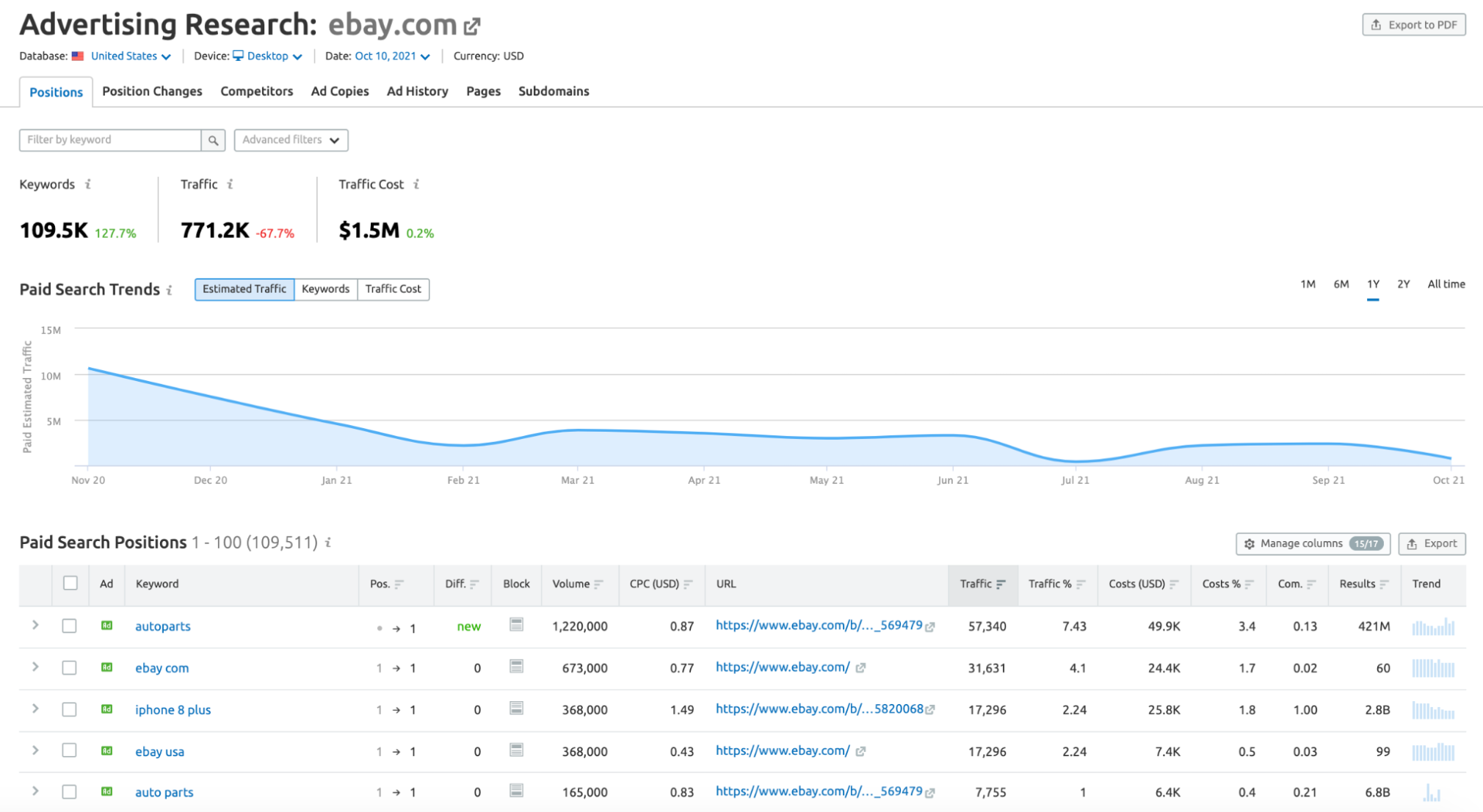
You can spot any position wins or losses your competitors earn over time with their SERP ads. To view any lost positions, click the Position Changes tab and toggle the Lost option in the toolbar:

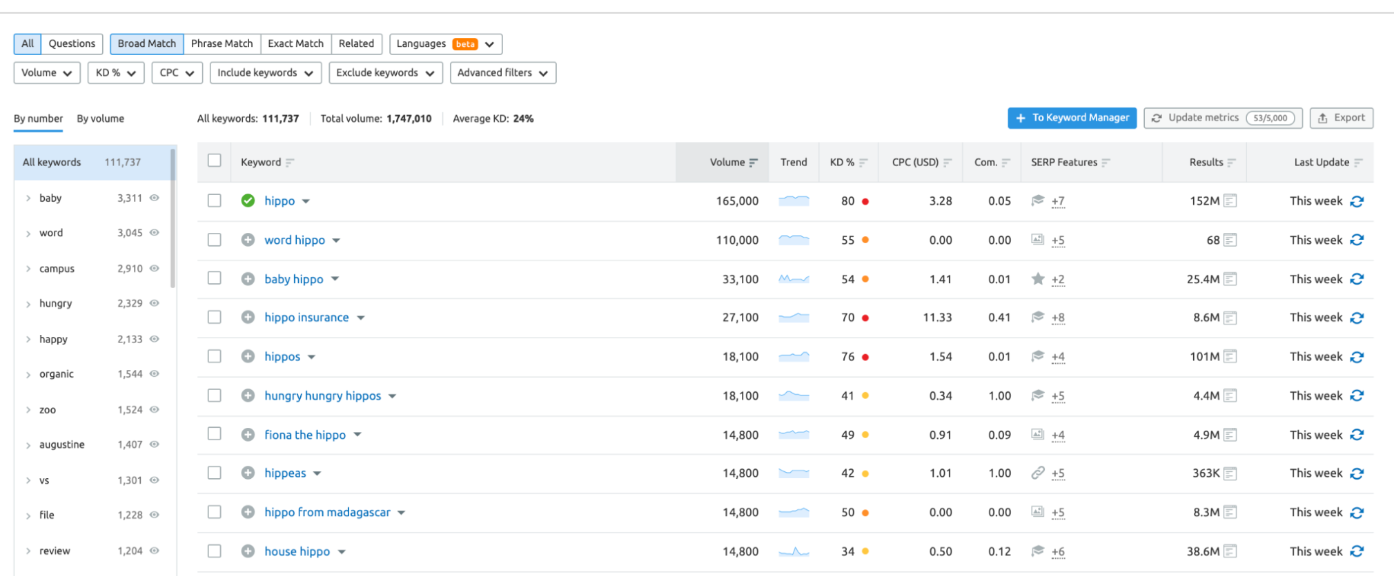
The Keyword Magic tool helps you discover the right keywords to include in your banner ad campaigns. You want people to see your banner ads, so target keywords you know people are searching for.
Start by entering your seed keyword into the tool input:

The tool returns a list of relevant keywords and their metrics. Keep an eye on each keyword’s search volume, average CPC cost, and competitive density. Though they’re based on SERP ad data, these columns can help you determine which keywords to bid on.
Select the + symbol to add keywords to your Keyword Manager.
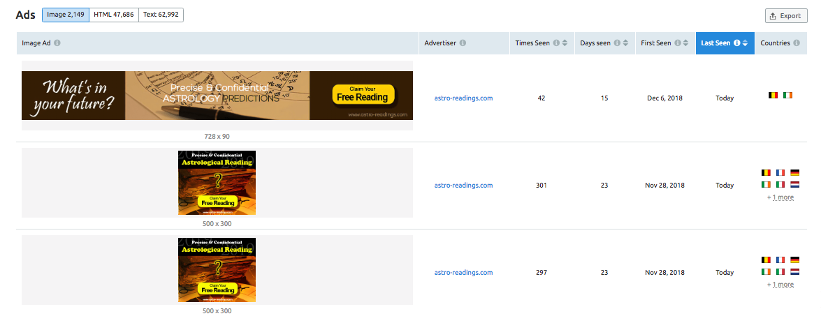
If you’re new to developing ad copy, generate ideas with the Display Advertisting tool. The tool analyzes your competitors’ text ads, banner ads, publishers, ad impressions, and more.
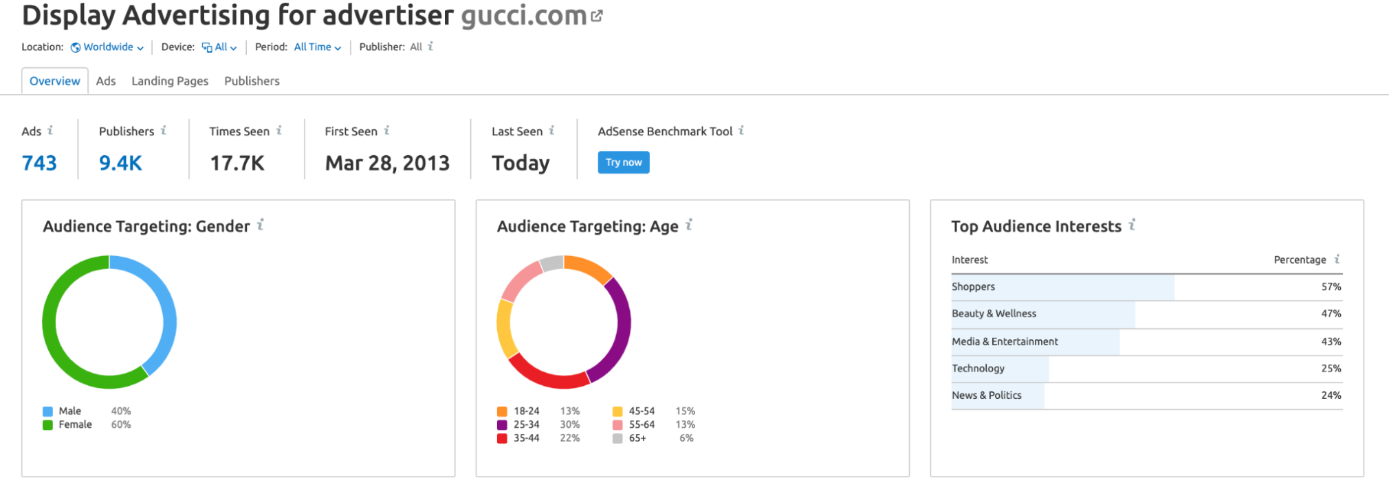
To get started, just enter a domain’s address or keyword. Click Explore now.

Select the Ads tab to your competitor’s current banner ads:
If you’re low on time or design resources, the Instant Banner Generator can help you create banner ads in a flash. You can design and save an unlimited amount of banners for different placement types and formats.
Key Takeaways
Banner ads are a type of display advertising that can drive brand awareness and clicks. Good banner ads fit their target audience. Use advertising research to determine the best look and placement for your banner ads. Use third-party research and design tools to develop effective display advertising campaigns.Innovative SEO services
SEO is a patience game; no secret there. We`ll work with you to develop a Search strategy focused on producing increased traffic rankings in as early as 3-months.
A proven Allinclusive. SEO services for measuring, executing, and optimizing for Search Engine success. We say what we do and do what we say.
Our company as Semrush Agency Partner has designed a search engine optimization service that is both ethical and result-driven. We use the latest tools, strategies, and trends to help you move up in the search engines for the right keywords to get noticed by the right audience.
Today, you can schedule a Discovery call with us about your company needs.
Source:



![Display Advertising Stats 2019: Semrush Study [Fashion Edition]](https://new.allinclusive.agency/uploads/images/display-advertising-stats-2019-semrush-study-fashion-edition.svg)
