

In 2016, mobile-friendly websites are considered an absolute must in the digital marketing world.
Mobile media consumption now accounts for triple what it did in 2009, and last year mobile search volume officially surpassed desktop queries.
These facts have sent many marketers racing to adopt responsive website designs. But not everyone realizes there are other, more effective options to optimize for a mobile audience.
This post will give you seven reasons why mobile optimization is more effective than responsive design.
1. There’s No Need to Cater to Everyone at Once
Responsive websites condense or expand navigation, re-optimize images, and ensure proper spacing to appear effectively on desktops, tablets, and mobile phones. So they need to consider the page’s goals and emphasis for all types of viewers at once.
Mashable is an example of a responsive website.
Their desktop version has a lot of real estate, so they can highlight news stories and encourage clicks in five different places on the screen:
 Image credit: Mashable
 But when you scrunch things down on a mobile phone, these features suddenly become very limited:
 Image credit: Mashable
 News stories are only highlighted in 2 different places now, and the Hot, Rising and New sections have been reduced to navigation tabs.
What comes below that is a scroll-fest of one individual news story after another.
There’s no way to argue that the mobile-size Mashable website is just as effective at achieving a certain goal in user behavior (in this instance, clicks).
That’s why with responsive websites, your page’s emphasis or goal has to translate across screens. And that’s not easy to do.
But when you take the effort to create a separate mobile website, there’s no need to cater to everyone at once.
Take a look at ESPN’s mobile-optimized website:

 Image credit: CrazyEgg
 Unlike Mashable’s responsive version, this one manages to offer everything the full website does, by designing with mobile in mind first.
Bad mobile design is a big problem. According to The Mobile Playbook, 57% of mobile users will not recommend a business if it has a poor mobile site design.
2. You Won’t Sacrifice Speed or Functionality
A responsive design requires mobile devices to download images and other data optimized for a desktop website, compress them in the phone’s memory, and resize them to fit the screen.
This actually takes a lot of CPU and memory. The result?
Slower loading times and other technical issues, such as incomplete loading.
Slightly slower loading time may seem like a small sacrifice to avoid the expense and hassle of creating a separate, mobile-optimized website.
But then again, maybe not:
Google uses page speed as an important SEO ranking factor. It can also seriously impact your bottom line – research has shown that 51% of US online shoppers would give up if the site loaded too slowly.
Even a one-second delay in speed can lead to a 7% drop in sales.
3. User Experience is Maximized
Taking text and other page elements designed for a computer screen and compressing them to fit onto mobile phones is far from the best way to optimize for user experience.
Responsive designs can often make text incredibly difficult to read, and other elements become less than optimal for mobile users to navigate with one or two fingers.
Take a look at this user-friendly mobile website:
 Image credit: TopDesignMag
 Its simple design and comprehensive navigation make it easy to find the flight (or hotel, or car) you need by using only your thumb.
Your mobile design needs to be focused on making it as easy as possible for users to navigate and find the information they need. Today, 44% of consumers say their mobile device is their most important aid in making purchasing decisions.
A responsive design may shrink elements down so they fit your screen, but that’s only the first step in creating a good mobile user experience.
4. There Are Major SEO Advantages
Google let everyone know last year that mobile-friendliness is now an important ranking factor. But what many fail to realize is that a responsive design and an (optimally) mobile-friendly one are not the same thing.
Google considers a long list of elements when deciding how mobile-friendly a website really is, such as:
How well the fonts scale for readability on small screens
The spacing and usability of touch elements
Whether or not the website uses Flash (which doesn’t work well in mobile browsers)
Page load time
These are just a few of the factors Google considers when ranking websites, and as I’ve argued so far, responsive designs are often less than perfect in these areas.
Websites that are specifically mobile-optimized, however, can focus on perfecting all these points and more for mobile friendliness – and reap the SEO benefits.
SEO has changed a lot over the years. And because search engines are just as preoccupied with UX as all marketers should be, they ensure that mobile-optimized websites also get a boost in local search results.
5. It Makes it Easier to Engage with Users
Mobile-optimized websites can make use of unique features that make it easier to engage with users and provide them with the information they’re looking for. Responsive sites can’t use these features.
For example, mobile-optimized websites can have a “click-to-call” button:
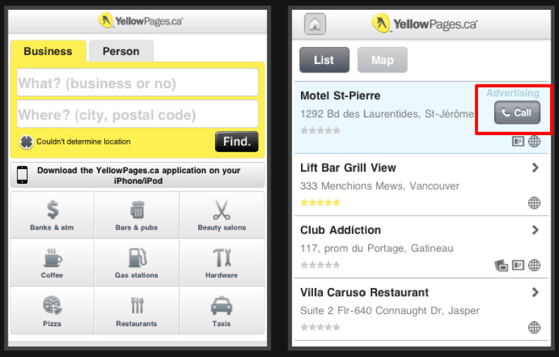
This makes it as easy as possible for users to benefit from what the website has to offer.
Mobile-optimized websites also allow marketers to take advantage of location data to better suit users’ needs.
Geek Squad’s mobile site, for example, has a helpful “Locate Store” button:
 Image credit: Geek Squad
 When I click on it, it shows me locations near me, with Google Maps integration and helpful links for directions:
 Image credit: Geek Squad
 This kind of functionality is incredibly valuable for encouraging in-store sales. According to the latest Mobile Path to Purchase report, when using mobile search on the go, 1 in 4 users are trying to find a specific business location, and 42% have intentions to make a purchase within the hour.
Making user-specific directions just a click away increases the chances that you can cinch a quick sale.
Sure, responsive designs can integrate Google Maps as well, but they won’t carry the same individual personalization as a mobile-optimized website.
The searcher’s location isn’t considered, and no directions are offered. In many ways, the map is more decorative than helpful – and people will probably end up using their phone’s geolocation features to direct themselves to their destination anyway.
6. Sales are Streamlined
It’s interesting to note the stark differences in cart abandonment rates on average and on mobile devices:
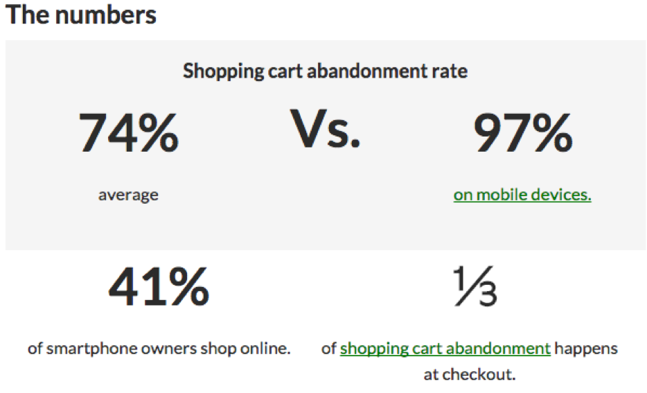 Image credit: OMFramework
 It would seem that shoppers using a small screen have a much lower tolerance for jumping through the checkout hoops than other device users.
Luckily, if you have a mobile-optimized website, this is something you have complete control over.
Mobile websites can make all the necessary design changes to simplify the checkout process for small screens and thus decrease cart abandonment.
Topshop’s mobile website is a great example of streamlined checkout:
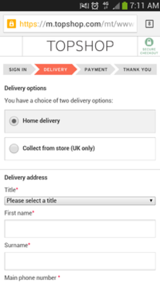 Image credit: Econsultancy
 Topshop’s mobile checkout is simple, easy to navigate, and has a useful progress bar so users can see how far along they are. It also has additional features like guest checkout (making it even easier), a postcode lookup tool, and numerical keypads when you need them.
7. It Offers Simple Integration with Offline Media
Smartphone use in-store has increased four-fold since 2013. And a lot of that has to do with QR codes:

Image credit: Internet Retailer
QR codes on mobile devices offer a unique link between online and offline media, which mobile-optimized websites can easily take advantage of.
Your brand’s physical advertisements (billboards, posters, brochures) can easily include QR codes that direct people to a customized mobile landing page – a whole new way to advertise.
Conclusion
You’ll hear time and again that using a responsive design is the simplest, cheapest way to make the move towards mobile-friendliness.
But since when has effective digital marketing ever been about what’s easiest for the brand?
No – the real success stories come from efforts that put the customer first. Developing a unique, mobile-optimized website is simply the only way to maximize user experience which, ultimately, can drive major results for your bottom line.
Innovative SEO services
SEO is a patience game; no secret there. We`ll work with you to develop a Search strategy focused on producing increased traffic rankings in as early as 3-months.
A proven Allinclusive. SEO services for measuring, executing, and optimizing for Search Engine success. We say what we do and do what we say.
Our company as Semrush Agency Partner has designed a search engine optimization service that is both ethical and result-driven. We use the latest tools, strategies, and trends to help you move up in the search engines for the right keywords to get noticed by the right audience.
Today, you can schedule a Discovery call with us about your company needs.
Source:

![How To Create a Strategic Dashboard in Excel Using Semrush Data [Excel Template Included]](https://new.allinclusive.agency/uploads/images/how-to-create-a-strategic-dashboard-in-excel-using-semrush-data-excel-template-included.svg)
