

When it comes to PPC, convincing visitors to stay on your page is a true challenge.
For non-branded PPC campaigns specifically, converting visitors is twice the challenge, despite a much greater reach.
However, in 10 months, the Semrush Paid Traffic team managed to increase profits from non-branded PPC campaigns by 94%. And we found out what actions led the team to this result.
Today we're going to talk about landing pages.
A landing page that is dull and difficult to read can nullify all your keyword research efforts. That’s why experimenting with landing pages ispart of our daily routine.
On average, out of every 4 A/B tests we conduct, 3 confirm the “B” hypothesis (the new one). We consider this a pretty good result.
And here’s how we make sure that spending time on split tests is worthwhile.
We let a heartless tool decide when to stop the A/B test
When we started conducting experiments a year ago, we were simply uploading two versions of a landing page into AdWords and, after a certain period, looked at the results.
It became evident pretty soon that defining your sample size and testing period is highly important. It was hard to determine if, for example, 1,000 clicks were enough to terminate the A/B test or if more traffic was needed.
This is where Convert came in handy for us.
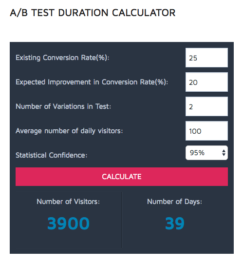
Convert - A/B test duration calculator
It’s pretty easy to use:
Measure your current conversion rate (for example, your conversion-to-registration rate is now at 25%).
Do you want sign-ups to increase to 30%? Put 20% as your expected improvement.
Enter the number of variations you want to test (we used only 2 variations at a time, otherwise the experiment would have taken too long).
Next, enter the current (or expected) number of daily visitors to your landing page.
95% of statistical confidence by default is completely OK for us. But you may want to change it.
You might find that you need to drive more traffic to your landing page in order to terminate your test in a reasonable time.
We justify every hypothesis
Our schedule is tight. It usually takes us 6 to 8 weeks to conduct a test, and there's often pressure to launch a new experiment before the previous one is terminated.
With this in mind, we can’t afford stabs in the dark.
Like Justin Rondeau said in his interview, “I find that people do too much ad hoc testing. You need a process in place with a hypothesis, a schedule, and a stopping point.”
Every change in a landing page we suggest should be based on a hypothesis containing:
The reason you are conducting a test
A proposed solution
An assumption of how the solution would change user behavior
The results you expect to get
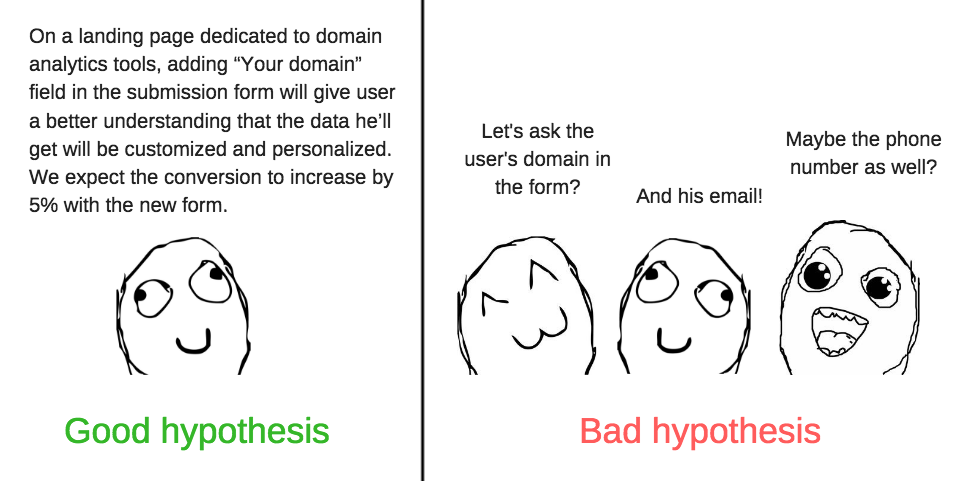
Hypothesis: Right VS Wrong
After you’ve come up with a ready hypothesis, you may find out that it doesn’t fit common rules and best practices. And that’s completely OK.
At least it worked for us, because…
We questioned the rules, even those set in stone
Use videos. Highlight testimonials. Red is aggressive. Long forms don’t convert. You must create a dedicated landing page for each campaign (or, better, for each ad group).
You’ve seen dozens of lists such as “20 Rules of a Successful Landing Page”, and most of these rules keep traveling across these articles.
The truth is, breaking them can sometimes increase conversions. Here are 4 examples of how they didn’t work for us:
1. Longer form = conversion decrease?
During October 2015, the 30th anniversary of the movie Back to the Future, we launched a landing page dedicated to website traffic analysis.
Our conversion rate was OK, but we saw potential in the landing page and wanted it to convert better.
So, we decided to play with the submission form, adding one more field in order to make it more personalized.
With the two-field sign-up form, the user was actually unaware of what he would see after clicking the “Submit” button. A ready report? The main page? Another pop-up urging them to check their inbox, confirm the email, go to their dashboard, enter their domain and get a report?
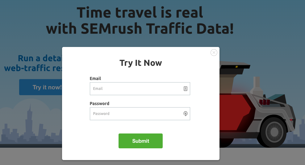
Semrush Website Traffic experiment — before
By adding one more field and changing the call to action, we explained to the user what would happen after:
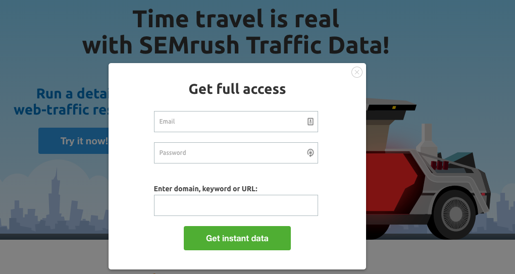
Semrush Website Traffic experiment — after
As a result, our conversions increased by 25%.
Takeaway: By adding more fields you can get your bread buttered on both sides. If done in a smart way, it shows the prospect that you’re going to give them a customized solution (an audit, for example) and not just a typical commercial proposal — and you get more information for your database as well.
2. Is red not the right color for a CTA button?
Every PPC specialist should tick the “split test red button vs. green button” box in his own experiment list and find out if UX experts are correct in saying, “red is the color of danger.”
We tested this ourselves with our Spanish landing page:

Red vs Green button split test
Contrarily to UX guidelines, using a red button gave us a 7% increase in conversions.
Takeaway: Red can be a winning color. But it must be treated with care. In most cases, it’s unsuitable for websites in the medical industry because of a negative association — “red = blood” — but for other industries, it can work pretty well.
3. People don’t look below the fold?
According to a 2015 study by the Nielsen Group, the 100 pixels just above the fold are viewed 102% more than the 100 pixels just below the fold:

People seldom scroll below the first screen. However, in our case, this didn’t mean that longer pages don't convert.
In our experiment with the Site Audit tool, we assumed that a complicated multifunctional tool needs to be explained in more detail.
When it comes to choosing an automated solution for a technical SEO audit, people want to make sure the proposed tool will provide them with the most complete and detailed information. They are potentially ready to read more.
We supposed that providing a more detailed information with appealing visuals would increase our conversion rate and decrease cost per registration.
This is what the page looked like before:
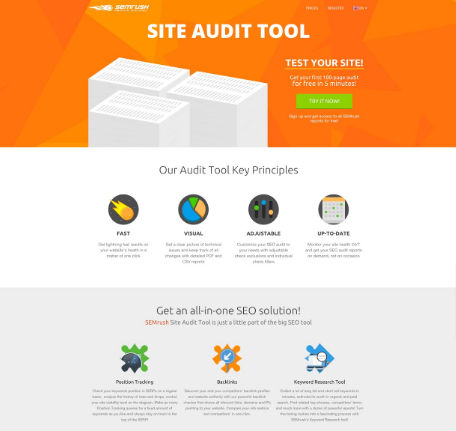
Semrush Site Audit experiment — before
Here’s how it was modified:
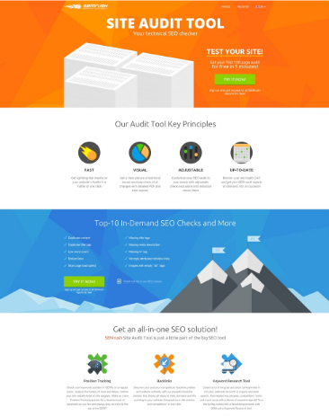
Semrush Site Audit experiment — After
And it worked. Our cost per registration decreased by 20%.
Takeaway: It’s not true that people don’t like long landing pages. They don’t like long and senseless landing pages. If the product is complicated and prospects are ready to delve into details, tell them as much as possible. They’ll be grateful.
Would you buy a helicopter from a single-screen landing page with only a nice photo and a huge CTA button?
4. “Regular” website pages mustn’t be used for a PPC campaign?
You’ve probably read hundreds of times that every landing page for a PPC campaign must be created from scratch. Driving traffic to a catalog page or to a main page is extremely mauvais ton.
When we finally designed a new Main Features page, we liked it a lot and were convinced we should 100% of our traffic to the new version:
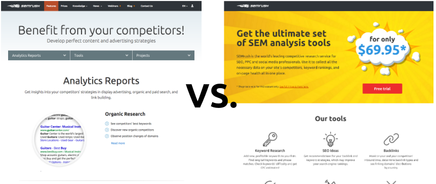
Semrush Features page split test
You can easily guess which page was built from scratch for the campaign, don't you?
But we decided to run the A/B test and the results were quite unexpected. Registrations dropped, and our cost per conversion increased by 29% for version B.
Takeaway: We’ve seen PPC specialists move 100% of campaign’s traffic to a new dedicated landing page and abandon a previously used “regular” website’s page. We strongly suggest running an A/B test before doing so,even when the “special” page seems obviously better. You could overlook some important details (in our case highlighting prices wasn't a good idea).
Moreover, dedicated landing pages come across as pushy: big buttons, overly obvious calls to action, succinct forms above the fold. Sometimes a person just wants to read specs or compare products without being constantly urged to buy right away.
To sum up:
A/B tests are not about guesswork. Don’t start without knowing what you want to test, how this change should modify user behavior, why users should react to it positively and what results you expect to get.
Base your hypotheses on data. Here’s our toolkit for experiments, from the top the funnel to the bottom:
AdWords to analyze clicks and spends
Inspectlet to monitor user’s actions on a landing page
BigQuery+Tableau for tracking what happens after the user clicks the “Try It” button (registrations, pages viewed in Semrush reports, payments, refunds, etc.).
Remember the importance of statistical confidence. Use tools like Convert, Optimizely, VWO or others to determine when the data you’ve gathered is enough to evaluate the results.
Question “universal truths.” A BOB (Big Orange Button) doesn’t always work better. Long pages can convert. Multi-field forms can provide more leads. The main question you should ask is, “Does this guarantee a better service or product to my prospects?” If it does, why should you care about common practices?
Brilliant results like “We’ve moved the button 10 pixels to the left and got a 200% increase in conversions” are thrilling but, unfortunately, rare. Silver bullets are hard to find. Keep in mind that A/B testing is a routine that helps you optimize your ROI through baby steps.
Stay tuned for the next post to find out how using dynamic retargeting helped us boost conversions and increase quality score.
Read these previous posts to discover:
How we established our analytics system using tools for big data analysis and visualization What tools and techniques we used to gather and distill keywords in order to focus on most profitable search terms for our campaignsMeanwhile, what is your experience with landing page split testing? Where do you go for insights on formulating successful hypotheses?
Innovative SEO services
SEO is a patience game; no secret there. We`ll work with you to develop a Search strategy focused on producing increased traffic rankings in as early as 3-months.
A proven Allinclusive. SEO services for measuring, executing, and optimizing for Search Engine success. We say what we do and do what we say.
Our company as Semrush Agency Partner has designed a search engine optimization service that is both ethical and result-driven. We use the latest tools, strategies, and trends to help you move up in the search engines for the right keywords to get noticed by the right audience.
Today, you can schedule a Discovery call with us about your company needs.
Source:

![How To Create a Strategic Dashboard in Excel Using Semrush Data [Excel Template Included]](https://new.allinclusive.agency/uploads/images/how-to-create-a-strategic-dashboard-in-excel-using-semrush-data-excel-template-included.svg)
