We’ve all been there.
You’re gearing up to launch your next campaign. You spend weeks (or perhaps months) making sure your product or service is ready to sell.
You’re ready to take payments. You have traffic sources lined up, to drive potential customers to your site. Your sales team is ready for calls. Your support staff is standing by for questions.
Now, your final step: You create a new landing page – a sales page that will generate interest in your product and drive your first sales.
You go to publish your new sales page, you start driving traffic to it, and . . .
Nothing.
Sales are barely trickling in (if at all).
You’re left wondering: Why? What went wrong? More importantly, how can I fix it quickly?
So What Happened?
When campaigns fail like this, the first place you should look is not at your product, but at your landing page itself.
I should know. At LeadPages, I spend my days writing and testing new landing pages for our own campaigns. I’ve probably seen more landing pages in the past two years at LeadPages than I did in my 10-year copywriting career before that.
(If you’re not familiar with LeadPages, we create landing page templates that allow our 40,000 customers to publish their own opt-in, sales, and webinar pages in minutes.)
I’ve also had the opportunity to critique the landing pages of our customers. After reviewing so many landing pages, I can tell you: failed campaigns often boil down to a few mistakes on your landing page.
In today’s post, I’m giving you 7 of these mistakes so you can evaluate your own landing pages. I’m showing you exactly how to fix them (so you can keep testing until you get it right).
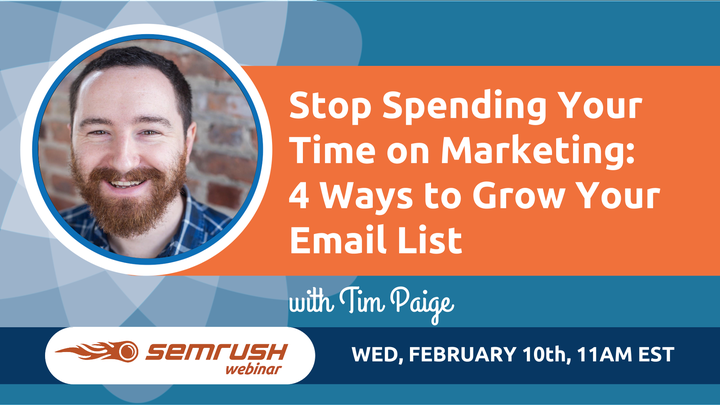
I’m also giving you a quick preview of our SEMrush webinar this Wednesday, February 10th.
1. Your Headline Just Isn’t Working
Your headline is the very first copy your potential customers see when they hit your landing page. If your headline isn’t working, it’s almost impossible for your landing page to convert.
The good news: your headline is also the fastest element to fix when your campaign starts to head south. It’s the very first thing I change if a landing page isn’t performing as I expected.
The first step to crafting a new headline is figuring out why your existing headline isn’t converting. Then you can modify your headline as necessary.
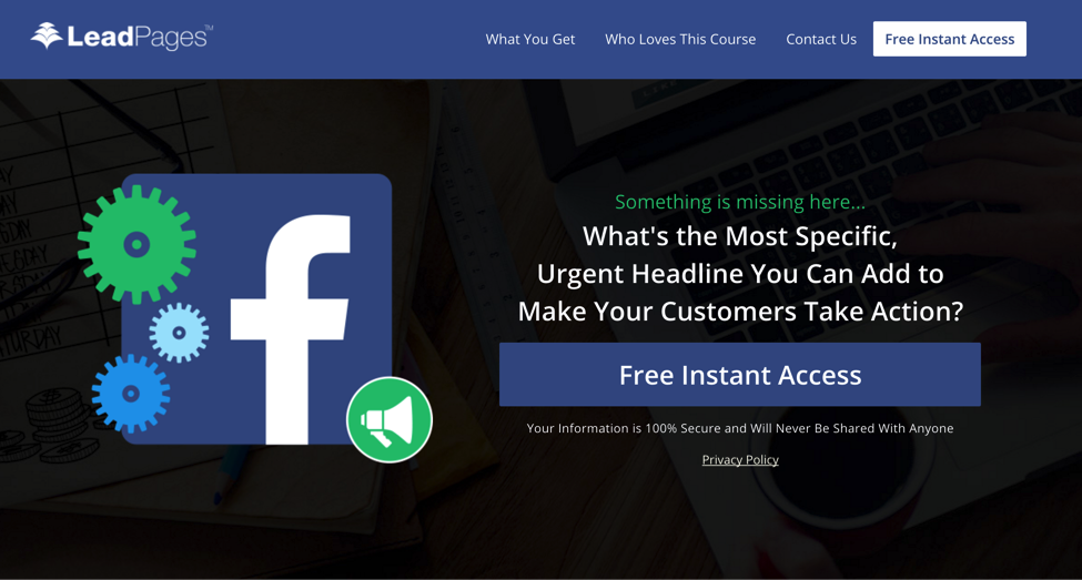
Let’s say this is your page. What would you add to get your customers to take action?
Quick fix: Use this checklist to evaluate your headline.
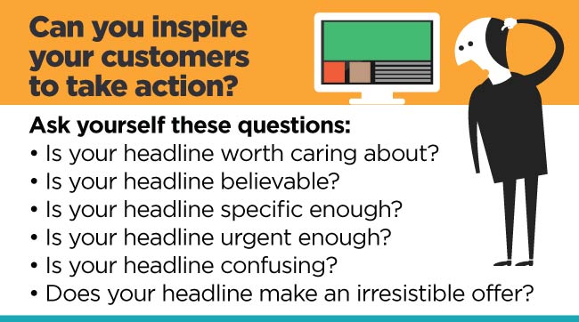
Is your headline worth caring about? Be honest. If your potential customer saw your headline on a Facebook ad or in their Twitter feed, would they care? Why would they care? Keep asking yourself: “Why should they care?” until you discover a more compelling reason for someone to want your offer. Add that “reason why” to your headline. Is your headline believable? Are you making a claim in your headline that’s perhaps too large for your average reader to believe? If so, consider adding some proof elements to deliver more credibility. You can add testimonials, case studies, or news sources to help deliver that proof. Is your headline specific enough? Does your headline already offer a specific benefit? If not, can you make it more specific? A simple way to add specificity is to add a number to your headline. (For example, you can add the number of action steps, time or money saved by your solution, etc.) Is your headline urgent enough? Are you asking for your customers to respond within a specific timeframe? If not, I recommend adding a deadline to your headline to encourage your customers to take action. Is your headline confusing? Read your headline out loud. Does it make sense? Can someone who has never heard of you (or your business) glance at your headline and instantly understand what you’re offering? If not, revise and test again. Does your headline make an irresistible offer? Granted, this is the hardest to change. Your headline should offer your ideal customer a real, tangible benefit that they can’t get anywhere else. If you can’t promise that kind of value, you may need to go back to the drawing board and revise your offer.Once you have a revised headline, run an A/B test against your existing headline. Did your new headline win the test? If not, keep running tests until you find what messaging does resonate with your audience.
2. You Didn't Tell Me What to Do
After your headline, the most important copy on any landing page is your call to action.
It’s up to you to tell your customers exactly what to do on your landing page. Usually, that means telling your customers very clearly to click your call-to-action button and either 1) join your email list or 2) purchase your product or service.
If you don’t tell your customers exactly what to do, you can’t reasonably expect your customers to figure it out on their own. It’s more likely they’ll simply exit your landing page (and that will hurt your conversions).
Quick fix: Go through each of your landing pages. Are your call-to-action buttons easy to find (ideally, above the fold on your landing page)? Does your copy clearly outline exactly what someone has to do to join your list or purchase your product?
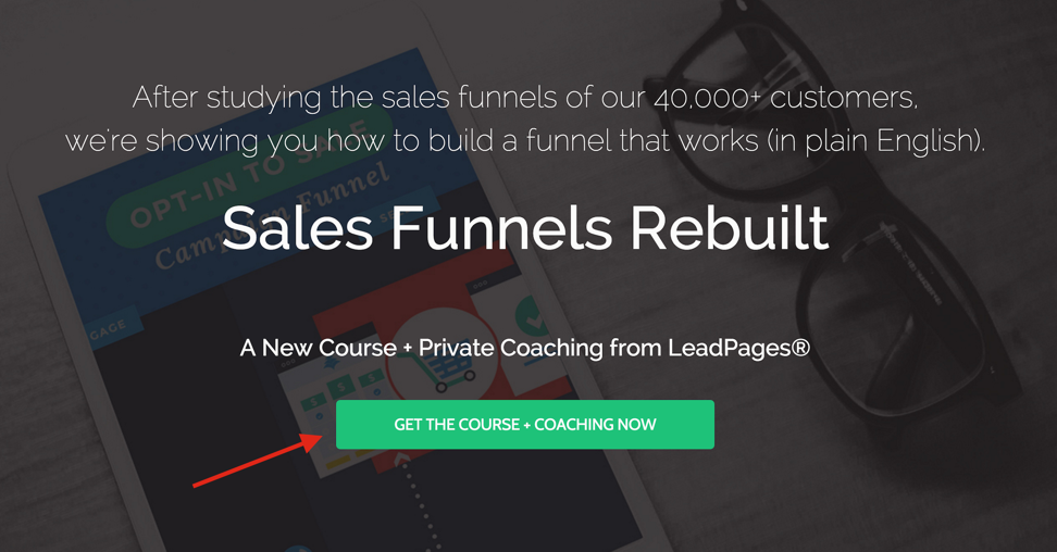
Try split testing your button copy (and the placement of your buttons) to get even higher conversions.
If you already have a very clear call to action on your page, I recommend you try split testing your button copy to see which call to action resonates best with your audience.
At LeadPages®, we have observed that split testing button copy more than any other element has the potential to dramatically increase your conversions. For example, The Coyle Report recorded a 198% conversion-rate boost last year after a small change in their button copy.

Split Test Results: “YES! SEND ME” won out by 198% in this split test by The Coyle Report.
Here are a few possible split tests to try on your own call-to-action copy:
First person vs. second person: “I want the course” vs. “Get the course.” Focus on the result vs. the intended action: “Watch the video” vs. “Click here.” vs. No Caps: “YES! SEND ME THIS EBOOK” vs. “Yes! Send Me This Ebook.” Free vs. Download: “Free Report Access” vs. “Download the Report.” Urgency Angle: “Get This Now” vs. “Get This Before Friday at Midnight.”Then start testing and see what you find out.
3. You Asked for Too Much Information
I see this all the time with lead generation pages.
More often than not, when you're trying to get a lead, all you – really – need at first is a way to contact that person.
And yet many pages force prospects to fill in their full name, phone number, age, address, business size, location... all before those prospects even know whether they want to have a relationship with that company. Even if your page is offering something valuable, it's a lot to ask.
Not surprisingly, this hurts conversions.
Quick fix: Only ask for your potential customer’s email on your initial lead generation page (or first name and email at most, if you plan to personalize your emails).
Pro tip: If your business truly needs additional information in order to follow-up with your leads, consider asking for this information after your initial lead generation page.
For example, once a new subscriber joins your list, you can send them to a thank you page. You could use that thank you page to offer something of even greater value, like a consultation, in exchange for a phone number.
Here’s an example:
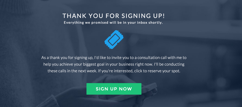
You could use a thank you page like this to collect phone numbers after a subscriber has joined your list.
4. You Gave Too Much Information (You Lost Me!)
As a copywriter, I know writing too much copy is a tough habit to break. But it’s also one of the most annoying mistakes you can make on your landing pages.
Your landing pages should contain only the copy you absolutely need to entice your would-be customers to either join your list or purchase your product.
For a lead generation page, the “bare minimum” could just be your headline and a call-to-action button. For a sales page, this might be as simple as a video and a button to purchase your product.
The only way to find out is to start testing long copy vs. short copy for your own audience, and find out what your audience sees as “too much information.”
Let me give you an example.
Over the last six months, I started testing shorter copy for LeadPages webinars like the one below. Rather than adding bullets or other descriptions about the webinar itself, I summed up the entire webinar in two sentences.
Even with the shorter copy, the results stayed strong. This tells me that in this instance, this shorter copy was the “bare minimum” I needed to get people to sign up.
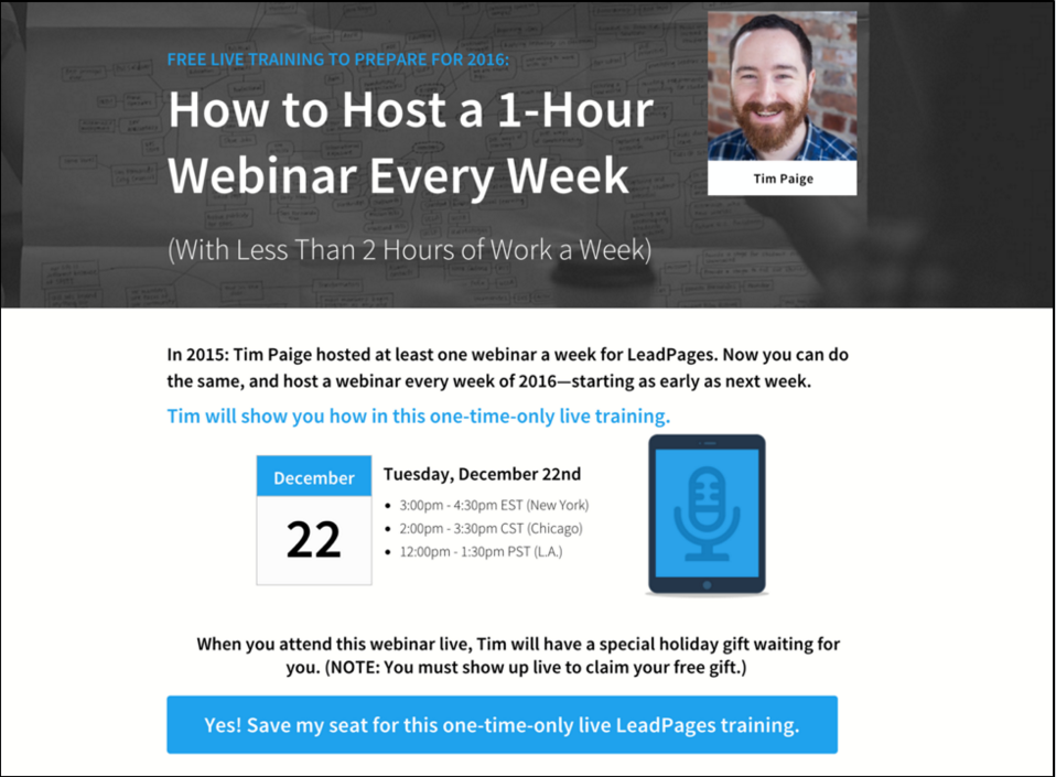
It’s up to you to test to figure out what’s the “bare minimum copy” for your customers.
Quick fix: If you suspect that you’re giving too much information, run a split test against a landing page with 50% fewer elements and see what happens.
5. Sounds Like You Don’t Really Get Me
The last thing you want is for your ideal customers to check out your landing page and think: “Nope, this isn’t for me. Sounds like they don’t really get me.” The problem is, you’ll never hear this message. They’ll just exit your landing page, and you’ll see the lack of their engagement show up in your numbers.
You want the exact opposite to happen. You want your ideal customer to take one look at your page and think: “Yeah, they get it. They get where I’m at, and they know what I’m looking for.”
The fix for this? Understand exactly who your ideal customer is. Then, keep testing until you find the offer that your ideal customer can’t resist.

Here are a few ways to understand who your ideal customer is.
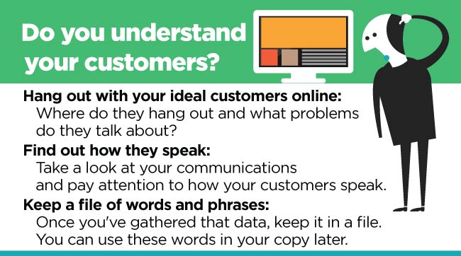
Hang out with your ideal customers online: Join Facebook communities where your ideal customers spend time. Look at the forums where they hang out. Start paying attention to the kinds of problems they talk about. (Are there any you could address in your copy?) Find out how your ideal customers speak: Look at their support emails, blog post comments, forum postings, Facebook messages, Twitter feeds—and start getting used to how your ideal customer speaks. What kind of language do they use? Start a file of words and phrases you’ve found: Make a list of words, phrases and other ideas from your ideal customers’ blog comments, forum posts, support emails, Facebook posts etc. Then start using these words and phrases in your copy.Remember: The goal is to get your customer to look at your landing page and instantly say: “Yes, that’s me! They’re talking to me.” The best way to do that is to figure out who they are, and then speak to them in language that inspires them to take action.
6. Your Page Didn’t Work on My Phone
Considering mobile traffic accounts for more than a third of pages served around the world, every landing page in the world should be 100% mobile-responsive. But the fact is, not every marketer has caught up yet.
If your landing pages don’t function well on mobile devices, then you are likely missing out on significant numbers of leads and sales.
Quick fix: When you publish a new landing page, you should immediately check that 1) all the integrations work, and 2) your new page looks and behaves just as nicely on your phone (and tablet) as it does on your computer. Otherwise, you will lose conversions.
If you happen to be a LeadPages member, you can test your landing page’s mobile responsiveness before you even publish, as you can see below.
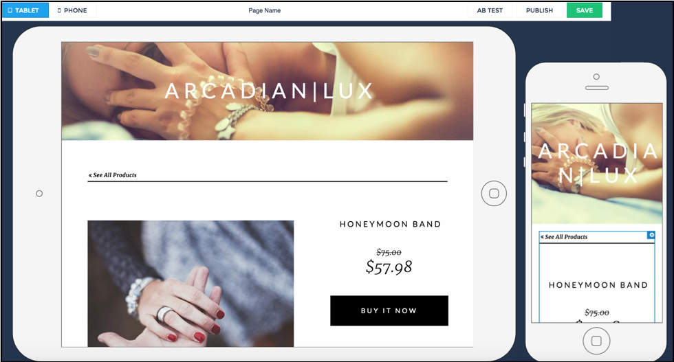
LeadPages shows you what your landing pages look like on mobile devices before you publish them.
7. Uh... What’s Up With Your Design?
When it comes to your landing page design, any number of things can go wrong. Any one of them can hurt your conversions.
Here are a few of the biggest design flaws to watch out for:
Way too much going on: Too many design elements can be overwhelming and distract from your overall message. That will stop customers from taking action. Images don’t match your copy: If you’re creating a landing page about a new wine guide, then your background image should match that messaging. Anything else would confuse visitors.Images don’t match copy: A cat is hiding behind the call-to-action box, while the copy talks about...wine?
The design doesn’t lead you anywhere: A landing page that’s optimized for conversions draws your eye to the most important elements on the page, like your call-to-action button. If your pages has elements that point away from your call to action (like the cat’s face in the example above), consider modifying. Hidden call-to-action buttons: Your customers should not have to hunt to see your call-to-action buttons. Ideally, you should place your first call-to-action button above the fold (so it’s easy to spot) and another at the bottom of your page. Lack of brand consistency: Your landing page design should match whatever paid media ads and social media posts are driving traffic to this page. Otherwise, visitors may question whether they’ve landed in the right place and even worse, your ads may be flagged. Careless color choices: Choose a color scheme that works with your brand and draws attention to the most important parts of your landing page. For example, all your call-to-action buttons should ideally be the same unique color to attract attention from the rest of the page.Quick fixes: Run down this list and assess your page with a critical eye. Even better, ask a friend or colleague to look at your design with fresh eyes.
If you’re looking to start from scratch with a high-converting landing page template, we have many sample pages that you can test in the LeadPages Marketing Library. The library also includes over 300 images that you can download for your pages.
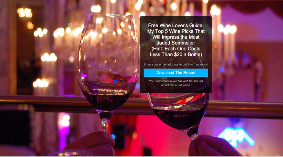
Quick fix: The exact same wine page as above, with a background that matches the copy.
A Final Quick Fix: Live Training Webinar with SEMrush and LeadPages
Mistakes cost you conversions. They can make it difficult to grow your audience, build your email list, and ultimately sell your products and services.
We want to help you overcome these kinds of mistakes. That’s why SEMrush is teaming up with LeadPages®to host a live training for you on Wednesday, February 10th at 11 a.m. Eastern.
During this live training, LeadPages’ Tim Paige will show you four steps you can take to start growing your audience without committing extra time to your marketing efforts.
Tim will also take you behind the scenes and show you how you can build landing pages like the ones you see in this blog post, in 5 minutes or less.
I hope you’ll consider joining. Let me know if you plan to attend by dropping a “yes” into the comments.
But first, make sure you go here to reserve your seat. Register for the free webinar here.
As Senior Campaign Owner, Kat Von Rohr spends her days managing promotions, campaigns, launches, and copywriting awesomeness at LeadPages. Connect with her on Twitter at @katvonrohr, or go here to get in on this live training.
Innovative SEO services
SEO is a patience game; no secret there. We`ll work with you to develop a Search strategy focused on producing increased traffic rankings in as early as 3-months.
A proven Allinclusive. SEO services for measuring, executing, and optimizing for Search Engine success. We say what we do and do what we say.
Our company as Semrush Agency Partner has designed a search engine optimization service that is both ethical and result-driven. We use the latest tools, strategies, and trends to help you move up in the search engines for the right keywords to get noticed by the right audience.
Today, you can schedule a Discovery call with us about your company needs.
Source:


![How To Create a Strategic Dashboard in Excel Using Semrush Data [Excel Template Included]](https://new.allinclusive.agency/uploads/images/how-to-create-a-strategic-dashboard-in-excel-using-semrush-data-excel-template-included.svg)
