When it comes to advertising on Facebook, it’s important to remember one thing - a Facebook ad is nothing without its image!
Sure... headlines, copy and call to actions are all important. But when so much real estate is dedicated to the image itself, the image becomes a key component of your ad’s performance. Are you guilty of using boring stock photos without giving it too much thought? Stock photos are obvious and perform badly under pressure. No one pays attention to such generic photography! (Don't worry, we’ve all been there.)
To get you started on the road to better Facebook ad design, we take a closer look at the images. Here are six best practices for driving more clicks.
1) “Bake” a written message into your image
A picture is worth a thousand words. True. But you can also put actual words in that picture too. However, use text with caution as Facebook limits text to 20% of an image. Don't write Harry Potter-length novel within your image. You have to be strategic about what you say.
Focus on your value proposition. What is it about your advertised item that strongly appeals to viewers? And, how can you say it in a way that’s clear and fits within FB’s text requirements?
Here’s how one brand, Freshly, has done it.
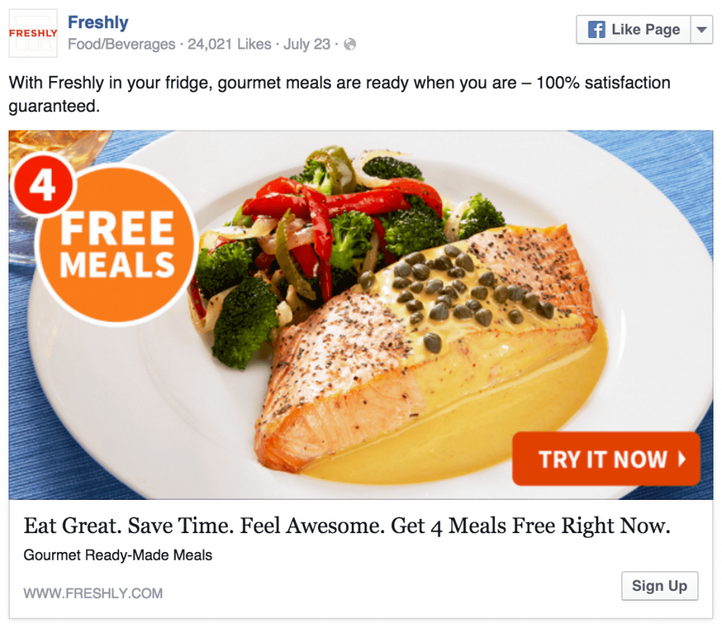
Look only at their ad’s image. Any idea what the value proposition could be? It’s “4 Free Meals”. That proposition jumps out of the ad to reinforce the written statements in the background.
You can also think about this strategy as a way of screening and then “prepping” your ad audiences. The ad attracts a certain segment of people who are interested in the value proposition. Free meals have a broad appeal, yet there will still be those who aren’t interested. Seeing the “4 Free Meals” part ahead of time tells these uninterested folks not to go any further. They don’t have to read the ad to have a basic idea of its gist. For those who are interested, though, the ad “preps” them on what to expect when they actually read it.
Keep in mind that your image’s value proposition needs to fit with the text. For example, you can’t say “4 Free Meals” in the image and then never mention meals in their ad’s main text. The image’s text must be relevant, working in symmetry with the main written message.
2) Use colors that stand out
Ever heard of “the clutter”? It’s a term coined by marketer Chet Holmes to describe the barrage of messages confronting consumers. Holmes’ point is that with an ever-increasing number of messages, it’s harder than ever to get a consumer’s attention.
Unfortunately, Facebook is no different. “The clutter” exists there too. Just look at newsfeeds. This area of Facebook alone is becoming progressively more crowded. Your challenge then, as an advertiser, is to break through the Newsfeed “clutter”.
An easy way to do that, as explained by AdEspresso, is to give your ad some color. A bit of color can go a long way in grabbing a reader’s attention and getting them to focus on your ad.
Just make sure you use the right colors. Here’s where it pays you (perhaps literally) to think strategically. Let’s do the wrong color first. Because there’s definitely one color you want to avoid.
Any guesses? It’s blue. Nothing will help to camouflage your ad like blue. Facebook’s color scheme is based around blue. That means the usage of blue in your ads will make you blend in - rather than stand out.
There may be times, though, when you have to use blue. When that happens, use a bright shade of blue. You want to give “your” blue the best chance of outshining Facebook’s own blue.
If your Facebook ads aren’t confined to a blue straitjacket; try red. Elegant Themes makes the case for red in a great ad, shown below.
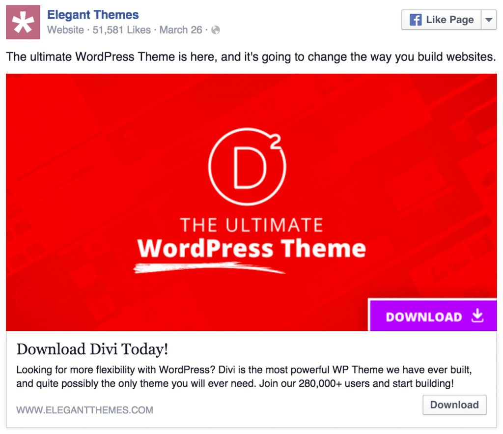
Talk about breaking through the Newsfeed “clutter”. This ad doesn’t just break through. It burns the “clutter” to ashes in a roaring bonfire that you, the newsfeed viewer, are unlikely to miss.
And here’s the good news. This technique is not just for pro designers. With a free tool like Snappa, you can overlay color on top of any background image.
3) Use contrasting colors
If you’re going to throw some color in your ad, don’t be afraid of contrast. Colors that sharply contrast with one another can work to your advantage.
That’s not just theory either. You can find evidence showing that contrasting colors do make your ads more effective. One of the most striking cases comes from Performable. In a split test, Peformable’s team experimented with the color of their website’s CTA (“call to action”) button. The button was originally green on a green and grey color scheme. For the test, the button color was changed to red - so it contrasted sharply with the rest of the site.
Think it worked? Definitely. Changing only this one element increased conversions by 21%. Naturally, there may have been other factors lurking behind the scenes of this test. But the results still make a strong case for using contrasting colors. And that case only gets stronger when you think about it logically.
Just look at a color wheel.

Image source: Wikipedia
In this wheel, colors on opposite sides contrast sharply with one another. The orange colors in the top right, for instance, are in definite contrast to the blues in the lower left. You can also verify the contrast from Performable’s split test too. Just look at how the reds and greens in the wheel contrast.
Let’s take that color wheel now and see its lesson in contrast in an actual Facebook ad. Here’s one from Udemy.

Udemy makes powerful use of contrasting colors in this ad. Notice how the dark blue of the text (both bold and normal) contrasts with the bright yellow background. The white of the key lends a hand too, contrasting with both the black text and the yellow background.
4) Add a “Call to Action” Button
If you want more people to click on your image, try making your image more “click-friendly”.
That’s accomplished by putting an image of a button within your ad. Having a “button” that can seemingly be clicked taps into the natural tendency of people online. This tendency results from steady conditioning. Over and over again, people see that clicking a button on a website lets them do everything from opening an email to saving a NetFlix queue.
As an advertiser on Facebook ads, you can use this conditioning to your advantage. LeadPages certainly has. They frequently run Facebook ads with “Call to Action” (CTA) buttons within the ad images. Here’s a good one:
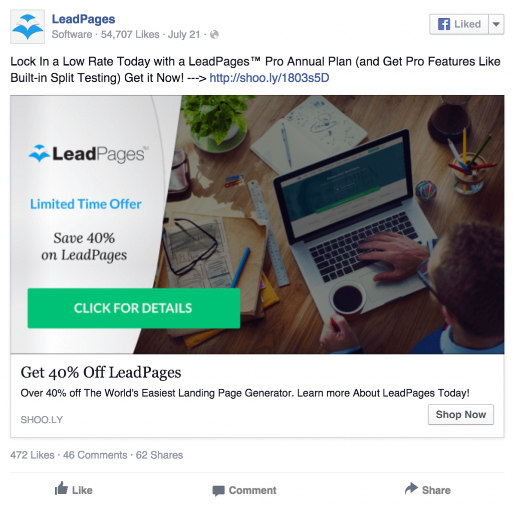
In the LeadPages ad above, the “Click for Details” button is practically urging you to click it. That’s an important point because you want to tell the people who see your ad what action to take. Don’t assume that they will just see the ad and instinctively know to click on it.
Having a button helps with that instinctive reaction, as we’ve mentioned. But you can still directly say what you want people to do when they see the button in your ad. That way, when your button looks “click-friendly”, people will know that they should indeed click on it.
5) Vary Your Font Sizes for Better Emphasis
Elegant Themes’ ad shows the effect that varying font sizes has in an image. The words “WordPress Theme” are much larger in the image, demonstrating their importance. “The Ultimate” part still matters, of course. But Elegant Themes probably wants viewers to focus on the fact that their offering is a WordPress theme. Varying the size of this text (“WordPress Theme”) places it directly in the spotlight.
You can also see this principle demonstrated in a Facebook ad from online personality Ramit Sethi.

Sethi’s ad employs varying font sizes with its “30 Successful Online Business Ideas”. Those 30 ideas are the ad’s value proposition and Sethi wants you to know. He not only raises the font size of that phrase, but puts it in bold too. In comparison, the title of his offering (“Zero to Launch”) and his name (“by Ramit Sethi”) are so small they seem like trivial details. And that’s probably what Sethi wants. Just focus on those 30 ideas.
6) Use headshots
The “Zero to Launch” ad above is also notable because it makes use of a headshot. Headshots enable Sethi to instantly be recognized by his herd of nearly 100,000 Facebook fans. Those fans, who he undoubtedly uses as a FB ad audience, will see the headshot and recognize him. It’s like their cue card to pay attention.
Hopefully you too have paid attention and are better equipped now to do Facebook ads. By incorporating some of these best practices into your Facebook ad images, I’m confident that you’ll see improvements in clickthrough rates. After all, they seem to be working for some well established businesses.
Innovative SEO services
SEO is a patience game; no secret there. We`ll work with you to develop a Search strategy focused on producing increased traffic rankings in as early as 3-months.
A proven Allinclusive. SEO services for measuring, executing, and optimizing for Search Engine success. We say what we do and do what we say.
Our company as Semrush Agency Partner has designed a search engine optimization service that is both ethical and result-driven. We use the latest tools, strategies, and trends to help you move up in the search engines for the right keywords to get noticed by the right audience.
Today, you can schedule a Discovery call with us about your company needs.
Source:
