

As a UX and CRO analyst, after having spent my previous years in customers' acquisition, I have become a proponent of analytics and user experience. In this article I will answer the following questions:
Can better UX influence ranking for a page? How can you measure it? And if so, what should we do?I hopefully can persuade you that UX is necessary for SEO.
If you are an SEO agency, there is something for you in this post — which arts you need to master for extending SEO services to UX and data analytics. Similarly, if you run a small website, I hope this article remains useful by explaining how to make the most of your visitors and search engines.
What is UX?
UX is the art and science of improving customers' satisfaction and loyalty through the utility, ease of use, and value provided in the interaction with a website.
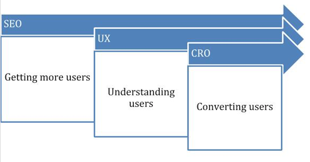
UX, Conversion Rate, and Page Optimization
Before we get into discussing whether UX is a ranking factor or not, I would like to clarify the definition:
UX: User experience analysis will help you understand how visitors use your site.
CRO: It is the process of optimizing your site to increase the likelihood that visitors will complete that specific action.
SEO page optimization: It is the practice of optimizing individual web pages in order to rank higher and earn more relevant traffic in search engines.
It is worth noting that the three elements are connected to each other.
The Circumstances Behind UX As a Ranking Factor
Google doesn't say whether there is a strong correlation between UX metrics and rankings, so I decided to try and find out for myself. To start, I would like to report the opinion of a couple of SEO experts. Here is what I found:
Gianluca Fiorelli, Strategic International senior SEO Consultant, Moz Associate, and "State of Digital" blogger. He is also the founder of The Inbounder Conference. He replied to me:
Honestly, I don't think Google will take into consideration solid UX and CRO elements as ranking factors. Google will surely reward sites that better answer users' intentions and queries, this doesn't mean UX has to be always exceptional, but obviously it doesn't hurt.
Gianluca Fiorelli supports his statement with an example. If you search for "insurance quotes" on google.co.uk, you will land on a form page.
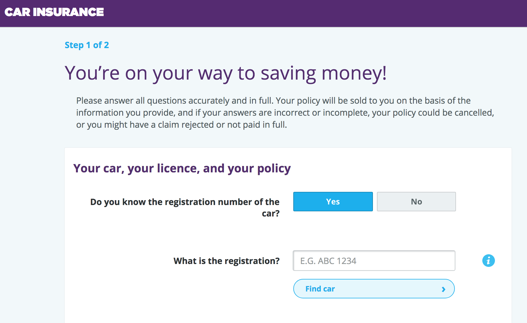
Google is smart, and it understands what the user intention is:
1- "Insurance quote" means "car insurance quote";
2- People want to simply fill in the form and get a quote.
This means that even if the form is not amazing from a UX perspective, for Google, it has an overall high value in search results.
Here is what Sean Work, VP of Inbound Marketing for Crazyegg.com, a heatmap tool, has to say:
Oh definitely. We already know that Google prefers mobile-friendly sites over non-mobile friendly ones. That’s really a user experience ranking factor right there.
If you think like a search engine, search engines have customers too. Their customers want the best results for their query. So, not only do they want the most relevant information, they want to be able to get to it.
So, it looks like there are some different theories on whether good UX is a ranking factor. Almost every ranking factor has a prominent theory on how it is supposed to be done (content, on-page, backlinks, etc..). Not for UX because we cannot really call it a factor, it is more close to a discipline. So there isn't an agreed best practice.
When I, as a UX and CRO analyst, work on improving UX, I don't even think about SEO rankings. My success is putting the users first and increasing conversions based on data-driven changes and tests.
However, what I hadn't realized was that when I experienced SEO success, it was because I accidentally stumbled upon it. I had managed to increase Google organic traffic to the home page because of UX improvements based on data-driven decisions to implement a section on the homepage.
The Advantages of Doing UX Analysis
Before we discuss my case study, let me show you some of the advantages of doing UX analysis, whether it is done to increase rankings or not:
You reduce a pogo-sticking rate. Users land on the result page and they interact with your website as opposed to just going back to SERPs because you offer them what they are looking for.For every search result, there is a different pogo-sticking rate. But great pages and sites tend to have the trait that they have got really low pogo-sticking rates.
— Rand Fishkin
Also, by late 2015, Eric Enge, CEO of Stone Consulting, said something quite strong in his Moz Whiteboard Friday:User experience is now a big deal. You really need to think about how users are interacting with your page and how that shows your overall page quality. Think about the percent satisfaction. If I send a hundred users to your page from my search engine, how many of those users are going to be happy with the content or the products […]?
Let's not forget that user experience also contributes to the following:
If users are coming to your website to complete a task that has commercial value to you; you may be seeing an increase in completed tasks.
Because you build the pages of your website around your users with better UX, they will feel more welcomed, and your analytics will show an increase in returning visitors.
The Rationale Behind Improving UX on the Homepage
Before I speak about the details of my case study, I just want to explain the rationale behind improving our homepage.
When I started working on the homepage a few months ago, using heatmaps, video recording, and GTM events, I identified four major problems:
A pretty big area of the home page with "fake links": 31% of people were clicking where there wasn't anything to click, on text that looked like a link. In UX metrics this translates into high bounce rate (46%), high avg. time on page (because users weren't finding quickly what they were looking for), and high exit rates. Actual links were hidden in some kind of badly built accordion, and this created a navigation nightmare. On this accordion, we were listing 14 services titles (not clickable) and 15 sub-services within each of those titles. To add more complexity to the issue, you had to move your mouse over each service title to find the sub-services and finally be able to click on them. For example, to be able to see the sub-list under "Business", you had to navigate to the title and then to the open area which would display another list of 15 sub-services under Business. Each link section didn't have any sort of header, so the section wasn't even built according to HTML best practices.Here is the screenshot of our heatmap clicks. On the left, not-clickable link but users were clicking on them.
On the right, the sub-sections of each Service, which only shows clickable links when your mouse goes there.
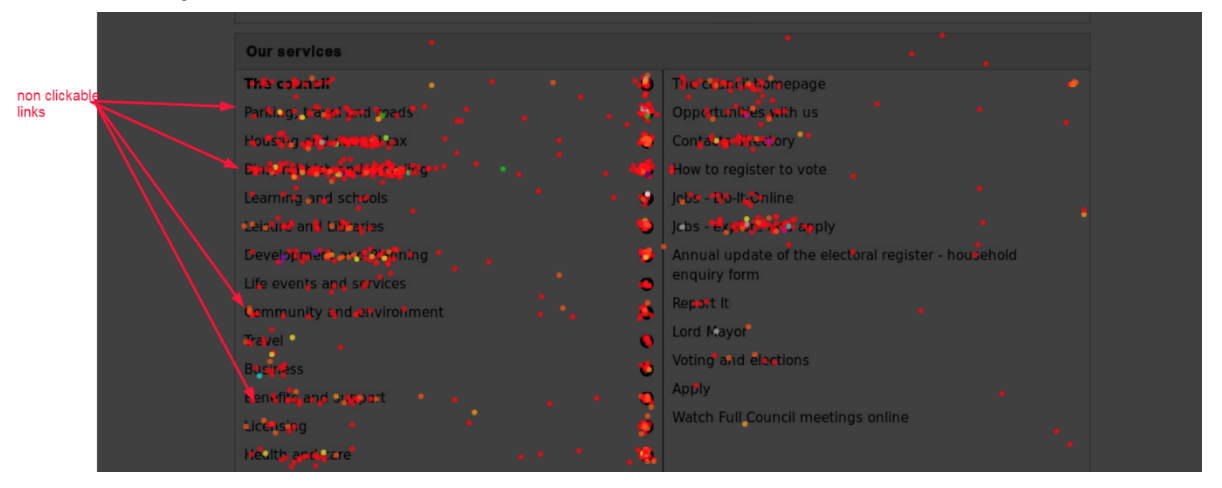
This "Our Services" section of the homepage underperformed our expectations. I knew this div was a badly designed piece of code, but, as you can see, I found that it was causing even more issues than I thought.
To counter this issue, I started an A/B test. The idea behind the test is that I would create a second version of the home page with obvious clickable links. In theory, my hypothesis was that the new B version of the home page with more clicks would reduce bounce rate and exit rate, and improve avg. time on page.
After a couple of weeks of testing, I collected enough data to persuade anyone that the B version of the page had great benefits in terms of UX.
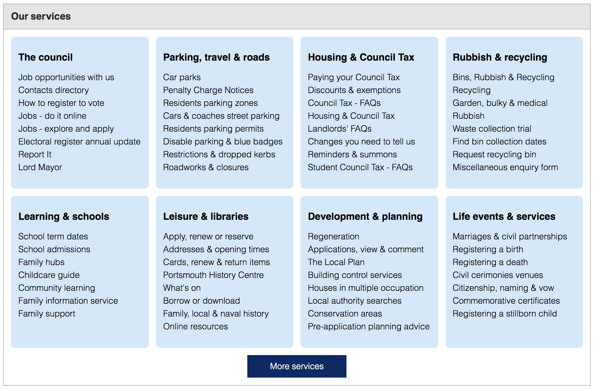
This is the new version of the "Our services" section on the homepage:
The Changes Breakdown
Note: I haven't changed anything else on the home page but the "Our Services" section.
Services Headers
Before the changes, we use to list 14 different type of services, and each of them had a different name. These names didn't have any headings. Using the SEMrush Audit Tool, I identified and added H3 headers to each service section and added better semantic markup.
Why are these important? As Jason Barnard said in this SEMrush post:
Google and Bing’s bots (spiders) are, if not blind, seriously sight impaired. For them, the visual clues are phenomenally difficult to see and understand. They need your help. If you can successfully communicate to Google and Bing which part of the page is the header, which the footer and which is for navigation they will thank you.
Section Navigation Structure
I reduced the number of the 14 services within the section to just 8 services and added a button "More Services" to a new brand page; that I called /all-services. This means I actually have fewer links than before on the home.
Why did I do this? I resisted the urge of showing 14x15 links on the Services section. The homepage is already busy with tasks, news, events, and contacts. What it needed was to show a clear categorization of the services and sub-services within them. This helped reduce avg. time on page because people were finding what they were looking for much quicker.
Opening Hidden Links
I opened up the hidden links of each of the 8 services listed. Before the changes, users were forced to move their mouse over the service title to see the sub-services links. This is not very obvious for most people.
Why did I do this? I wanted to reduce bounce rate and increase on page CTR to service links by making it easier for users to click on them.
The Promising Results
Let's check Google Analytics page views and bounce rates:
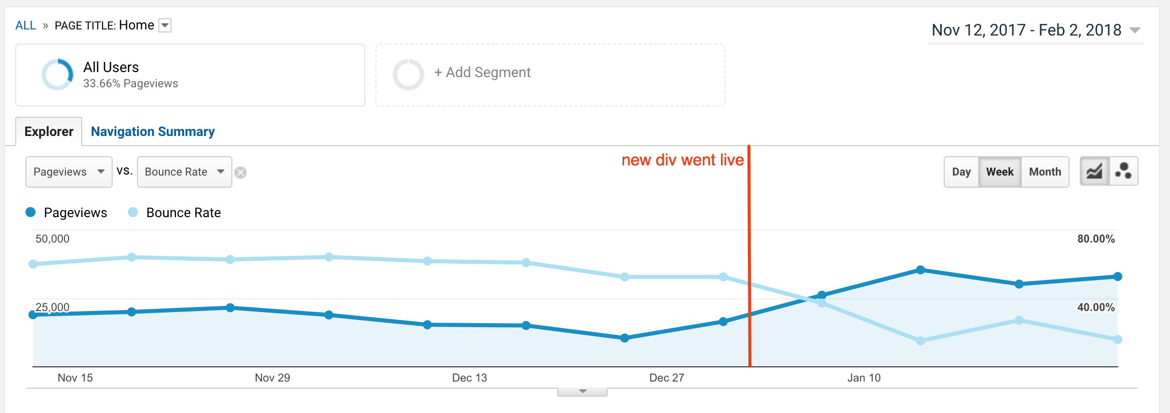
This graph shows that after the change on the home page was published, bounce rate started going down from an average of 36% to 12% (-24%) and it is steady and at very low levels as we write.
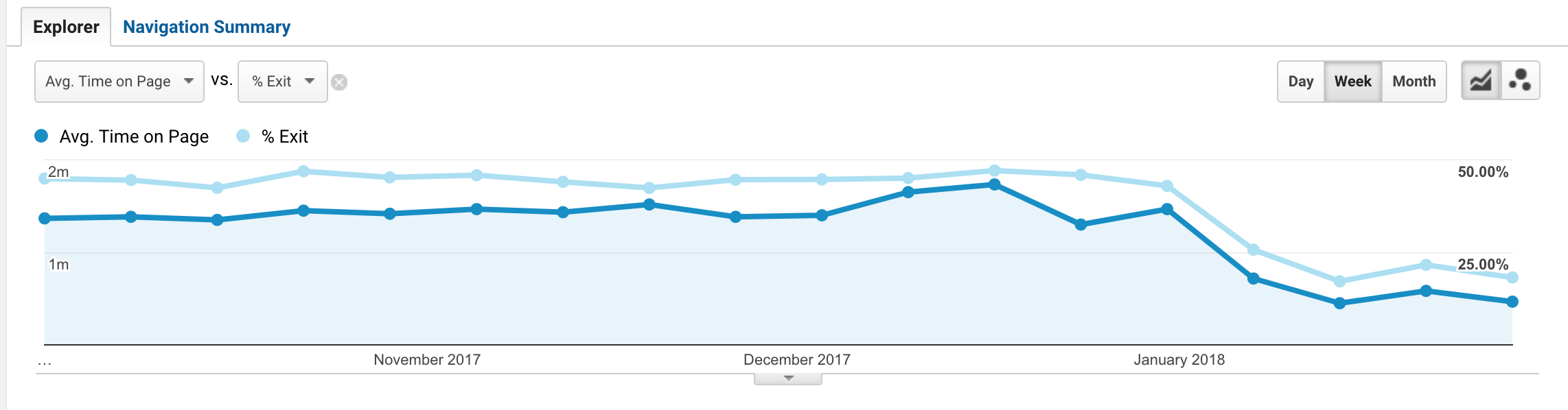
The next graph also shows avg. time on page and exits went going down too. What does this mean?
People spend less time on the home page because they click somewhere within the page; they find links to click on.
Fewer people leave the website on the home page because they engage more with the website.
This is great!
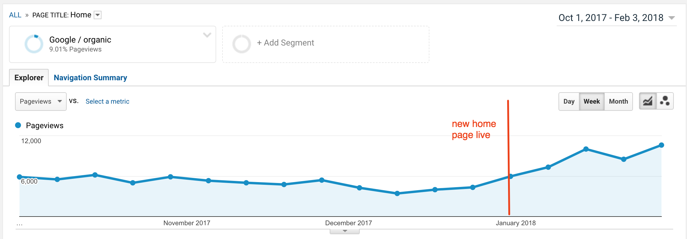
When I checked my Analytics, I noticed an increase in page views. So I had an idea and thought:
What if Google is rewarding the home page with more organic traffic? After all, better UX is what they always preach!
So my question was: did this UX improvement on the home page bring more Google organic traffic to the same page? Yes!
Assumptions
My new theory is that a combination of great numbers for key UX metrics such as lower bounce rate (from 36% to 10%), lower exit rate (from 40% to 22%), more returning visitors and shorter avg. time on page, probably positively affected the dwell time of the entire homepage. Google's algorithm seems to indeed calculate dwell time of a page by combining different UX metrics.
Also, the improved semantic markup made the life of search engines much easier. As a result, Google is sending us more traffic.
How Do I Identify Needed UX Changes?
Figuring out which elements to change on a page and how to change them for the better, can be a daunting task even for the most experienced UX analyst. But it doesn’t have to be a stressful experience if managed following this strategy.
Step 1: Traffic Data
Google Analytics: always start with Google Analytics and identify the most visited pages on the website for the last 12 months, so you have a good time span and reliable numbers.
Then filter this report with a segment for organic traffic only. Once you have done this, you are in a position to check all UX metrics for organic traffic only for every single page:
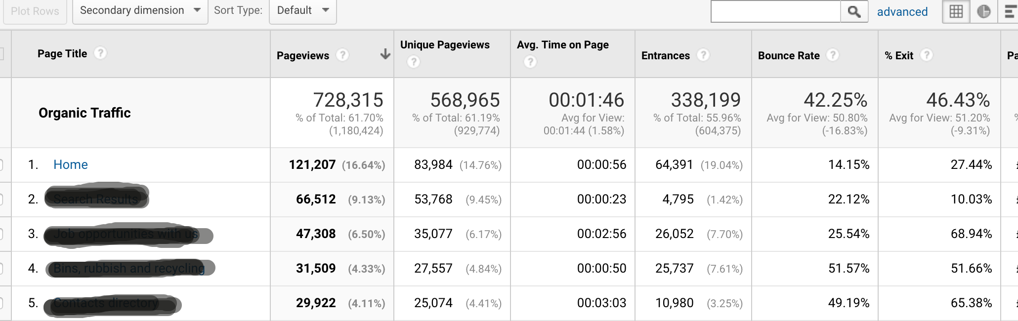
You can see from this report that the page number 4 has the lowest avg. time on page and highest bounce rate, so it is worth investigating more.
But since the home page is the page with the highest organic traffic, you start from this one.
Start using heatmaps either with CrazyEgg or Hotjar. I often use Hotjar for heatmaps like this simply because it comes free (yes, it’s free!) for life with limited functionalities and it only cost $29/ month to use the professional version.
A simple way to identify a bad user experience is with heat maps and choosing the click reports you can see where people are clicking the most. As we have seen above in my example, this report was telling us something was really wrong on the home page: people were clicking where there wasn't any place to click!
Stage 2: Feedback Data
Once you have identified the issues with heat maps, you can ask your users what issues they have with your site with using feedback tools. Questions can vary depending on what your goals are. In our case, we have asked customer satisfaction (CSAT) related questions:
Have you found what you were looking for?
If not, can you explain why?
You want to come up with a very simple report like this:
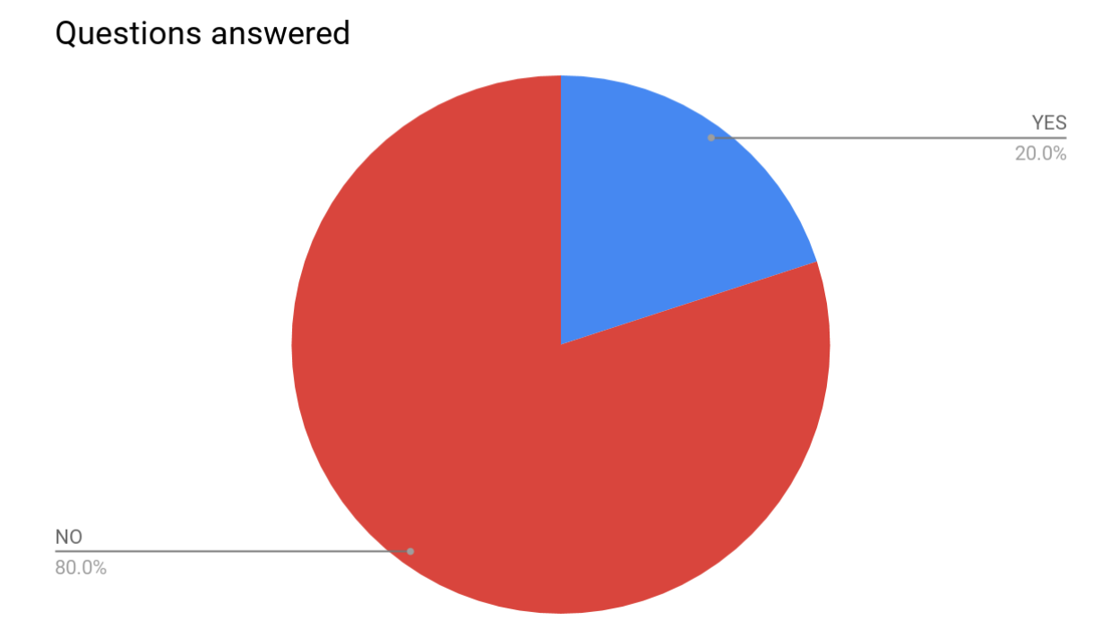
If you have a scenario like the questions above, you definitely have to focus all your attention on improving the page.
Other questions you may ask is how to rate the usefulness of a page/ its content/ a task. These are typical Net Promoter Scores (NPS) which result in multiple answers with scores.
One of the questions I often get asked is when to use NPS and when CSAT. I believe both CSAT and NPS have merits but are also very different. While CSAT measures users’ satisfaction with a page or a website, NPS is more related to loyalty because it answers questions like: “How likely would you recommend this X website to your friends and colleagues?”
I often use Hotjar for feedbacks and polls. You should probably check it out if you run a number of polls or want to recruit anonymous users to review your website.
Step 3: Run A/B Tests
At this stage, you start to feel you have a clear list of problems in front of you that require a fix, but changes are only theoretical. The theory should be proven with data. How do we get actionable data? How do we measure it? And how do we go about making changes that put the users first?
People didn’t find what they were looking for, and you know it because you have polls and feedback;
They wouldn’t recommend your website;
High bounce rates;
High exit rates;
Low returning rate;
Probably low dwell time too
Bad search engine rankings.
What you also have, which is far more powerful for your analysis, are the reasons behind those bad metrics:
- You know why there is a high bounce rate; people tell you this with polls;
- You know what's causing it because you can see it with heat maps;
- You have real users telling you they have issues with your homepage.
Once you are at this stage, you have data to back up your theories, and it is time to set A/B tests.
In my A/B test, I measured the success of the B version with the same metrics used for the original version: bounce rate, exit rate, avg. time on page, number of clicks to links.
Ideally, I would like to measure dwell time too, but to my knowledge, there isn't any tool that does this.
Step 4: The B Version and Hypothesis
The B version of your page should be built around your users' feedback, so always come up with a solution that is good for them. It is important to test A vs. B instead of publishing the B to 100% of your traffic, simply because you need data to back up your hypothesis and make comparisons.
Google Optimize
With A/B tests, the simplest thing you can do is setting up Google Optimize to send 50% of your traffic to the old version and 50% to the new version. I often use Google Optimize because it is free and lets you run up to 3 A/B tests simultaneously.
The Hypothesis
The hypothesis is that by making X change, your analytics will show better numbers on specific key metrics. I always like to say in the hypothesis what the expected change is and how it is measured.
After 2-3 weeks of collecting data, you probably have a clear winner. If not, keep going for another week until Google Optimize says you have enough data to determine the winner and you can finally publish your new page.
Conclusion
Don't just assume UX doesn't improve rankings and say it is not a ranking factor. Use analytics and feedback tools to improve user experience and build your pages around people, not around opinions. They will feel the difference, and you will see also an increase in returning visitors (reducing your re-marketing efforts in the process).
If you put users first, all the benefits of UX analysis and implementation come through also with rankings. There is no guarantee that you will see an increase in traffic to the page you have worked on, but you for sure will improve your odds.
Innovative SEO services
SEO is a patience game; no secret there. We`ll work with you to develop a Search strategy focused on producing increased traffic rankings in as early as 3-months.
A proven Allinclusive. SEO services for measuring, executing, and optimizing for Search Engine success. We say what we do and do what we say.
Our company as Semrush Agency Partner has designed a search engine optimization service that is both ethical and result-driven. We use the latest tools, strategies, and trends to help you move up in the search engines for the right keywords to get noticed by the right audience.
Today, you can schedule a Discovery call with us about your company needs.
Source:


