As an SEO professional, you know that a big part of your job is tracking rankings in the SERPs, as well as that of those of competitors'. I am going to be sharing a way to obtain SERP data and import it to a DataFrame (table / CSV / excel sheet) for analysis, on a large scale, and in an automated way.
I will be using the programming language Python, so there will be some coding involved. If you don't know any programming, you can ignore the code snippets below, as you don't need to understand them to follow along.
So how exactly are we going to procure the data, and what are we going to do with it? Here are the steps we're going to cover to use Python to analyze Google Search results:
Importing the Data Programming Environment Handling the Data The Dataset Content Quantity Analyzing Titles Peeking at Snippets Final ThoughtsImporting the Data
Google's Custom Search Engine is a service that allows you to create your own customized search engine, where you can specify the sites you want crawled and set your own relevancy rules (if you don't set any specific rules, then your custom search engine will essentially search the whole web by default).
You can further streamline your efforts by specifying parameters for your search queries, including the location of the user, the language of the site, image search, and much more.
You can also programmatically pull the data through its API, which is what we are going to do here.
Here are the steps to set up an account to import data (skip if you don't want to run the code yourself):
Create a custom search engine. At first, you might be asked to enter a site to search. Enter any domain, then go to the control panel and remove it. Make sure you enable "Search the entire web" and image search. You will also need to get your search engine ID, which you can find on the control panel page. Enable the custom search API. The service will allow you to retrieve and display search results from your custom search engine programmatically. You will need to create a project for this first. Create credentials for this project so you can get your key. Enable billing for your project if you want to run more than 100 queries per day. The first 100 queries are free; then for each additional 1,000 queries, you pay USD $5.Programming Environment
For this analysis, I will be using the Jupyter Notebook as my editor. If you are not familiar with it, it is basically a browser-based tool that combines regular text, programming code, as well as the output of the code that is run. The output could be text, tables, as well as images (which could be data visualizations as you will see below).You can try it out here to see how it works if you are interested.
It looks a lot like a word processor, and it is great for running analyses, creating campaigns, and general programming work. I use it for almost all my work.
By allowing you to store the steps that you made by keeping a copy of the code, the notebook enables you to go back and see how you came to your conclusions, and whether or not there are errors or areas that need improvement. It further allows others to work on the analysis from the point where you left off.
The notebook contains text boxes that are referred to as "cells", and this is where you can enter regular text or code. Here is how it renders, including a brief description of the cells.
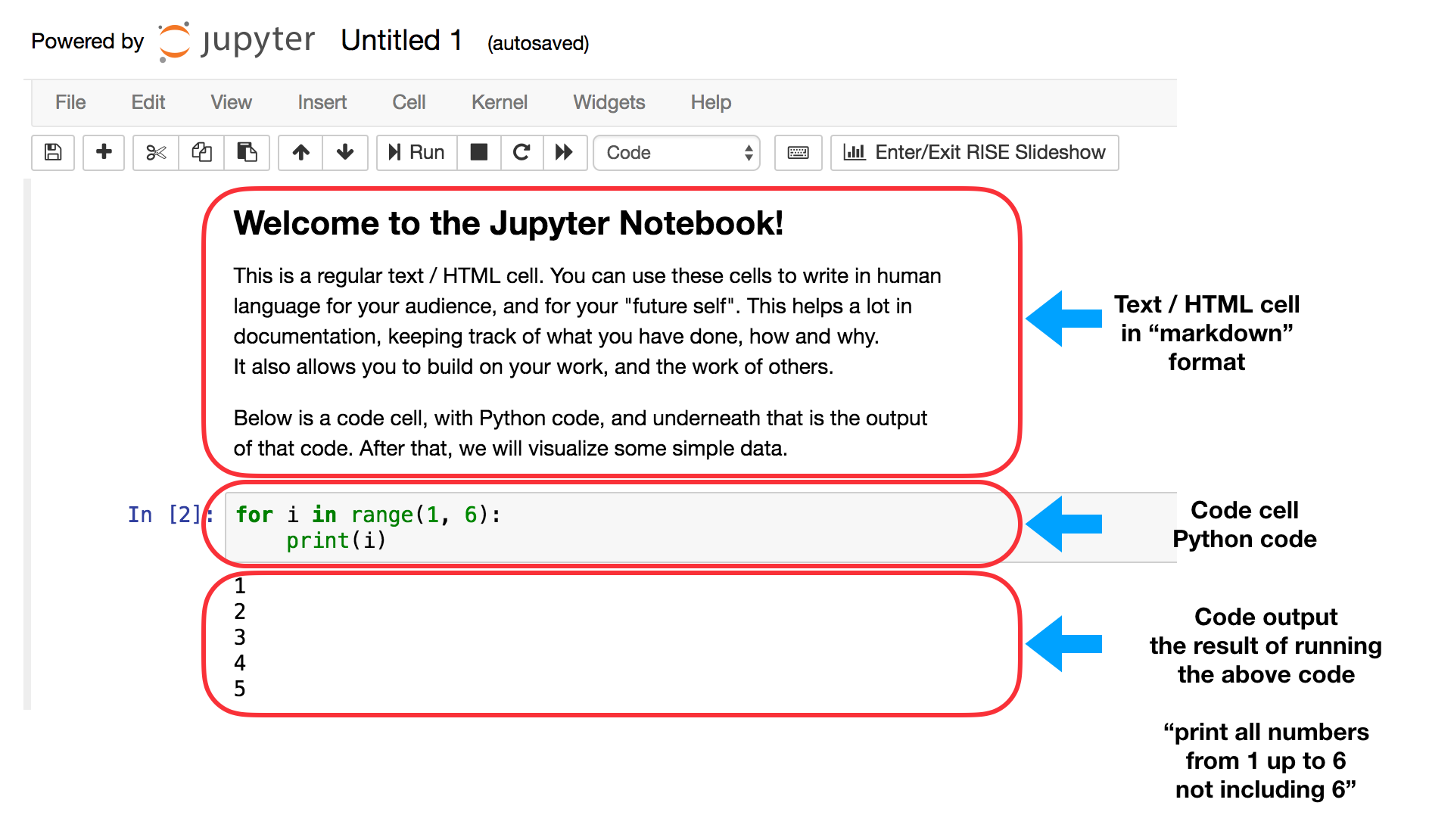
Jupyter Notebook code and markdown cells
Here is a simple data visualization, and an explanation of what the code does below it:
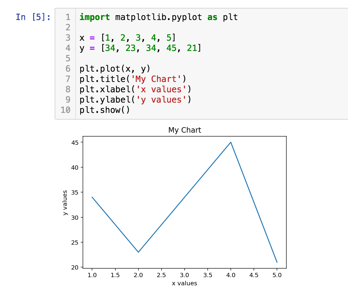
Jupyter Notebook data visualization
Line 1: Importing a package simply makes it available, like starting an application on your computer. Here we are importing a package called "matplotlib" with the sub module "pyplot" which is used for data visualization. As its name is quite long and tedious to type every time we want to run a command, we import it as "plt" as a shortcut, which you can see in lines 6 - 10.
Any time we want to run a command from matplotlib, we simply say "plt.<command_name>" to do that, for example, "plt.plot".
Lines 3 and 4: Here we define two variables, "x" and "y", where each is a list of numbers that we want to plot. The "=" sign here is an 'assignment' operator, and not used as in the mathematical sense. You are defining a list of numbers [1, 2, 3, 4, 5] in this case, and calling it "x". Think of it as a shortcut, so you know what this list is so you don't have to type all the numbers every time.
Line 6: We simply plot "x" and "y".
Lines 7, 8, and 9: Here we add a few options, and there are a number of available options as you will see later in the tutorial. The results of those settings can be seen in the chart as the title, "xlabel", and "ylabel".
Line 10: shows the plot.
In "[5]": This identifies the cell as an input cell. This was the fifth instruction that I ran, and that's why it shows the number 5.
Running those lines of code produces the chart above.
Below I have added links to all data sets used, as well as the notebook for this tutorial if you are interested, in one repository.All the steps that I took to import the data, manipulate it, and visualize it are included here, so you will see the entirety of the code that produced these results. As mentioned, if you are not familiar with Python, you can ignore the code and follow along.
Handling the Data
We will be using three Python packages for our work:
advertools: To connect to the Google CSE API and receive SERPs in a table format. (This is a package that I wrote and maintain. It has a bunch of productivity and analysis tools for online marketing.) pandas: For data manipulation, reshaping, merging, sorting, etc. matplotlib: For data visualization.To give you a quick idea, here is a sample from the customized SERP results that we will be working with:
import pandas as pdserp_flights = pd.read_csv('serp_flights.csv')serp_flights.head()
SERP results in an Excel sheet sample
Not all columns are visible, but I would like to share a few notes on the different columns available:
"queryTime" is the time that the query was run (when I made the request); this is different from "searchTime", which is the amount of time it took Google to run the query (usually less than one second). Most of the main columns will always be there, but if you pass different parameters, you will have more or fewer columns. For example, you would have columns describing the images, in case you specify the type of search to be "image".
The Dataset
We are going to take a look at the airline's tickets industry, and here are the details:
Destinations: I obtained the top 100 flight destinations from Wikipedia and used them as the basis for the queries. Keywords: Each destination was prepended with two variations, so we will be looking at "flights to destination" and "tickets to destination". Countries: Each variation of those was requested for one of two English-speaking countries, The United States and The United Kingdom. SERPs: Naturally, each result contains ten links, together with their metadata.As a result we have 100 destinations x 2 variations x 2 countries x 10 results = 4,000 rows of data.
We begin by importing the packages that we will use, and defining our Google CSE ID and key:
%config InlineBackend.figure_format = 'retina'import matplotlib.pyplot as pltimport advertools as advimport pandas as pdpd.set_option('display.max_columns', None)cx = 'YOUR_GOOGLE_CUSTOM_SEARCH_ENGINE_ID'key = 'YOUR_GOOGLE_DEVELOPER_KEY'Now we can import the Wikipedia table that shows the top destinations, along with some additional data:
top_dest = pd.read_html('https://en.wikipedia.org/wiki/List_of_cities_by_international_visitors', header=0)[0]top_dest.head().style.format({'Arrivals 2016Euromonitor': '{:,}'})
Top tourist destinations
Next, we can create the keywords by concatenating the two variations mentioned above:
cities = top_dest['City'].tolist()queries = ['flights to ' + c.lower() for c in cities] + ['tickets to ' + c.lower() for c in cities]queries[:3] + queries[-3:] + ['etc...']['flights to hong kong','flights to bangkok','flights to london','tickets to washington d.c.','tickets to chiba','tickets to nice','etc...']With the main parameters defined, we can now send the requests to Google as follows:
serp_flights = adv.serp_goog(cx=cx, key=key, q=queries, gl=['us', 'uk'])# imports dataserp_flights = pd.read_csv('serp_flights.csv',parse_dates=['queryTime'])# saves it in a csv fileserp_us = serp_flights[serp_flights['gl'] == 'us'].copy() # create a subset for USserp_uk = serp_flights[serp_flights['gl'] == 'uk'].copy() # create a subset for UKLet's now take a quick look at the top domains:
print('Domain Summary - Overall')(serp_flights.pivot_table('rank', 'displayLink', aggfunc=['count', 'mean']).sort_values([('count', 'rank'), ('mean', 'rank')], ascending=[False, True]).assign(coverage=lambda df: df[('count', 'rank')] / len(serp_flights)*10).head(10).style.format({("coverage", ''): "{:.1%}", ('mean', 'rank'): '{:.2f}'}))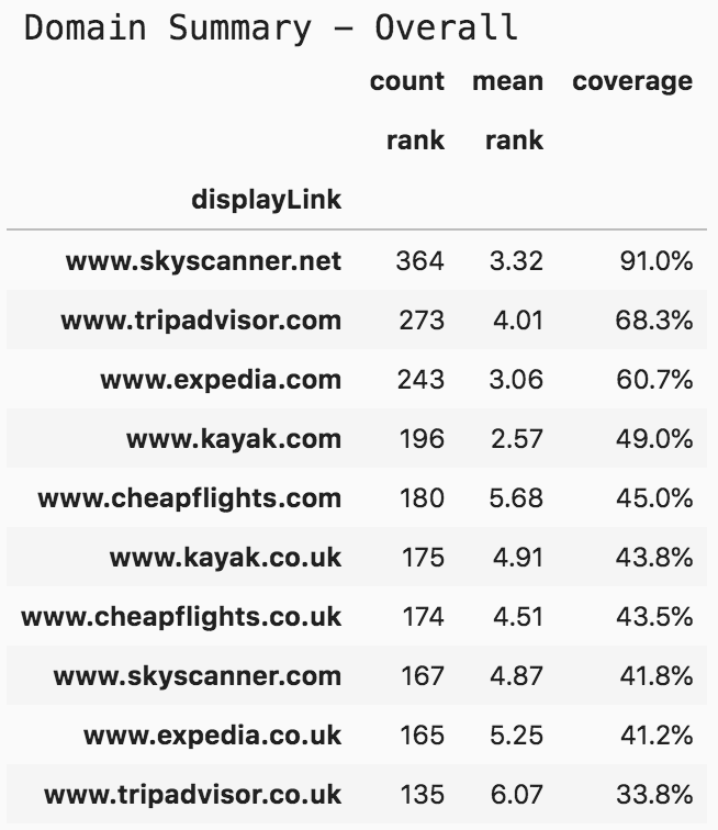
Top 10 domains - flights and tickets
As you see, since we are mainly interested in the ranking of domains we have it summarized by three main metrics:
1. Count: the number of times that the domain appeared in the searches that we made.
2. Mean: the mean (average) rank of each of the domains.
3. Coverage: the count divided by the number of queries.
The above pivot table is for all the results and gives us a quick overview. However, I think it is more meaningful to split the data into two different pivot tables, one for each of the countries:
print('Domain Summary - US')(serp_flights[serp_flights['gl']=='us'].pivot_table('rank', 'displayLink', aggfunc=['count', 'mean']).sort_values([('count', 'rank'), ('mean', 'rank')], ascending=[False, True]).assign(coverage=lambda df: df[('count', 'rank')] / len(serp_flights)*10 * 2).head(10).style.format({("coverage", ''): "{:.1%}", ('mean', 'rank'): '{:.2f}'}))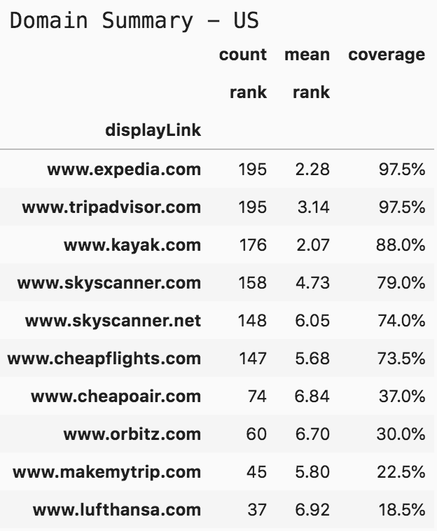
Top 10 domains - flights and tickets United States
For coverage, I divided by 400 in the first table, but for the countries, I am dividing by 200, because we are interested in queries for that country. An interesting point here is that kayak.com has lower coverage than tripadvisor.com, but it has a higher mean rank. In top positions, the difference between position two and three is quite high in terms of value. Depending on your case, you might value one metric or the other.
print('Domain Summary - UK')(serp_flights[serp_flights['gl']=='uk'].pivot_table('rank', 'displayLink', aggfunc=['count', 'mean']).sort_values([('count', 'rank'), ('mean', 'rank')], ascending=[False, True]).assign(coverage=lambda df: df[('count', 'rank')] / len(serp_flights)*10*2).head(10).style.format({("coverage", ''): "{:.1%}", ('mean', 'rank'): '{:.2f}'}))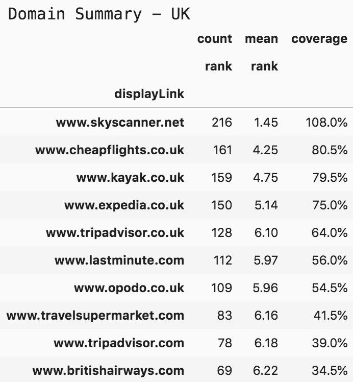
Top 10 domains flights and tickets - United Kingdom
Having a coverage of 108% means that skyskanner.net has appeared on all searches, and in some cases, they appeared more than once in the same SERP. Note that their mean rank is 1.45, much higher than the second domain. No joking with SkySkanner!
Now that we have an idea about the number of times the websites appeared in search and the average ranks they have, it might also be good to visualize the data, so we can see how it is distributed.
To determine this, we first get the top 10 domains for each country, and define two new DataFrames (tables) containing only the filtered data, and then visualize:
top10_domains = serp_flights.displayLink.value_counts()[:10].indextop10_df = serp_flights[serp_flights['displayLink'].isin(top10_domains)]top10_domains_us = serp_us.displayLink.value_counts()[:10].indextop10_df_us = serp_flights[serp_flights['displayLink'].isin(top10_domains_us)]
top10_domains_uk = serp_uk.displayLink.value_counts()[:10].indextop10_df_uk = serp_flights[serp_flights['displayLink'].isin(top10_domains_uk)]
fig, ax = plt.subplots(facecolor='#ebebeb')fig.set_size_inches(15, 9)ax.set_frame_on(False)ax.scatter(top10_df['displayLink'].str.replace('www.', ''), top10_df['rank'], s=850, alpha=0.02, edgecolor='k', lw=2)ax.grid(alpha=0.25)ax.invert_yaxis()ax.yaxis.set_ticks(range(1, 11))ax.tick_params(labelsize=15, rotation=9, labeltop=True,labelbottom=False)ax.set_ylabel('Search engine results page rank', fontsize=16)ax.set_title('Top 10 Tickets and Flights Domains', pad=75, fontsize=24)ax.text(4.5, -0.5, 'Organic Search Rankings for 200 Keywords in US & UK', ha='center', fontsize=15)fig.savefig(ax.get_title() + '.png', facecolor='#eeeeee', dpi=150, bbox_inches='tight')plt.show()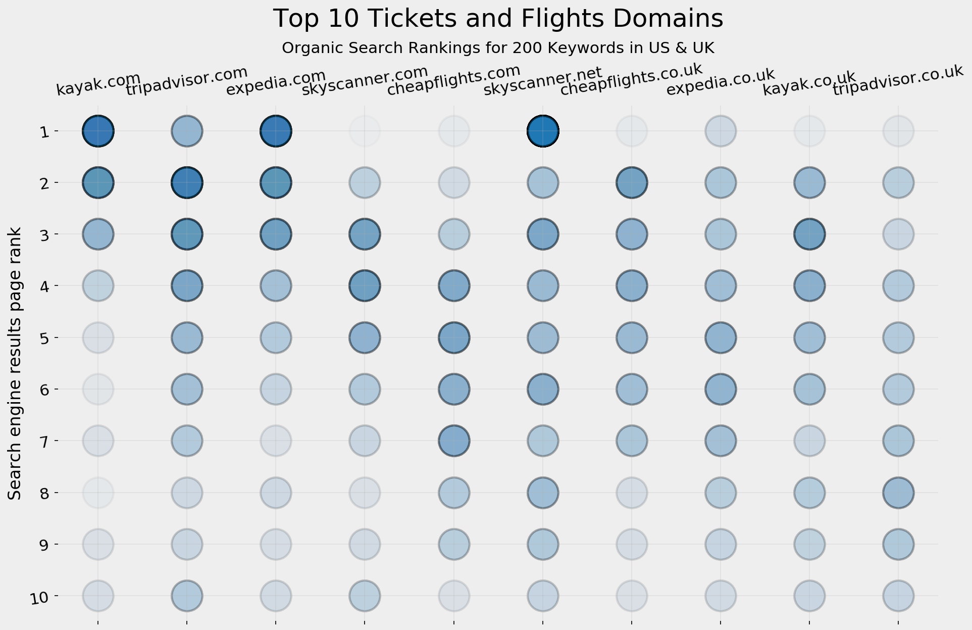
Top 10 tickets and flights SERP visualization
For each appearance on a SERP, we plot a very light circle in the position where that domain appeared (from one to ten). The more frequently a domain appears, the darker the circle. For example, kayak.com, expedia.com, and skyskanner.net have solid blue circles on position one, as well as lighter ones in different positions.
A minor issue in this analysis so far is that it treats all keywords equally. The number of tourists in the top one hundred list varies between 2 and 26 million, so they are clearly not equal. Also, for your specific case, you might have your own set of the "top 100" based on the website you are working on. But since we are exploring the industry and trying to understand the positions of the different players, I don't think it is a bad assumption. Just keep this in mind when doing a similar analysis for a specific case.
As above, this was for the overall data, and below is the same visualization split by country:
top10_dfs = [top10_df_us, top10_df_uk]colors = ['darkred', 'olive']suffixes = [' - US', ' - UK']fig, ax = plt.subplots(2, 1, facecolor='#ebebeb')fig.set_size_inches(15, 18)for i in range(2):ax[i].set_frame_on(False)ax[i].scatter(top10_dfs[i]['displayLink'].str.replace('www.', ''), top10_dfs[i]['rank'], s=850, alpha=0.02, edgecolor='k', lw=2, color='darkred')ax[i].grid(alpha=0.25)ax[i].invert_yaxis()ax[i].yaxis.set_ticks(range(1, 11))ax[i].tick_params(labelsize=15, rotation=12, labeltop=True,labelbottom=False)ax[i].set_ylabel('Search engine results page rank', fontsize=16)ax[i].set_title('Top 10 Tickets and Flights Domains' + suffixes[i], pad=75, fontsize=24)ax[i].text(4.5, -0.5, 'Organic Search Rankings for 200 Keywords', ha='center', fontsize=15)plt.tight_layout()fig.savefig(ax[i].get_title() + '.png', facecolor='#eeeeee', dpi=150, bbox_inches='tight')plt.show()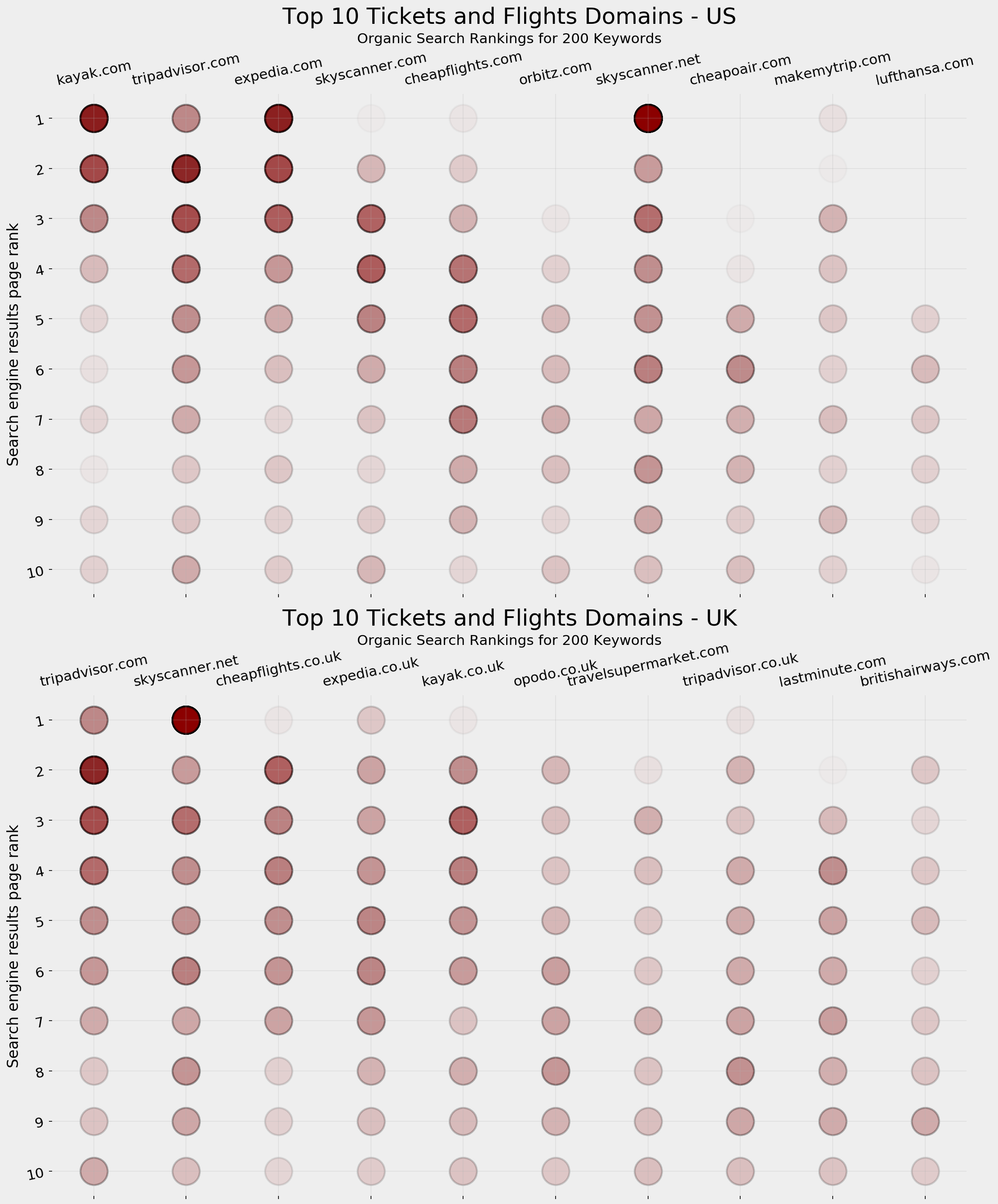
Top 10 tickets and flights SERP visualization: US vs UK
Content Quantity
There are a range of content metrics which you should take note of but the one you might be interested in this case is how many pages each domain has for the different cities. Assuming the content is real, and with a minimum level of quality, it follows that the more content you have, the more likely you are to appear on SERPs — especially for keyword variations and the different combinations users can think of.
One of the parameters of the request allowed by Google is specifying the site you want to search in, and you have the option to include or exclude that site. So if we search for "tickets to hong kong" and specify "siteSearch=www.tripadvisor.com" with "siteSearchFilter=i" (for "include") we will get the search results restricted to that site only. An important column that comes together with every response is "totalResults", which shows how many pages Google has for that query. Since that query is restricted to a certain domain and is for a specific keyword, we can figure out how many pages that domain has that are eligible to appear for that keyword.
I ran the queries for the top five destinations, and for the two countries:
pagesperdomain_us = adv.serp_goog(cx=cx, key=key, q=queries[:5], siteSearch=top10_domains_us.tolist(), siteSearchFilter='i', num=1)pagesperdomain_uk = adv.serp_goog(cx=cx, key=key, q=queries[:5], siteSearch=top10_domains_uk.tolist() , siteSearchFilter='i', num=1)Here are the first ten results from the US for "flights to hong kong", and below that is a visualization for each of the keywords and the destination countries:
(pagesperdomain_us[['searchTerms', 'displayLink', 'totalResults']].head(10).style.format({'totalResults': '{:,}'}))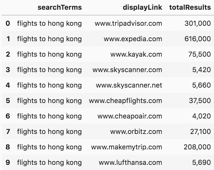
SERP number of results
from matplotlib.cm import tab10from matplotlib.ticker import EngFormatterfig, ax = plt.subplots(5, 2, facecolor='#eeeeee')fig.set_size_inches(17, 20)countries = [' - US', ' - UK']pages_df = [pagesperdomain_us, pagesperdomain_uk]for i in range(5):for j in range(2):ax[i, j].set_frame_on(False)ax[i, j].barh((pages_df[j][pages_df[j]['searchTerms']== queries[i]].sort_values('totalResults')['displayLink'].str.replace('www.', '')),(pages_df[j][pages_df[j]['searchTerms']== queries[i]].sort_values('totalResults')['totalResults']),color=tab10.colors[i+5*j])ax[i, j].grid(axis='x')ax[i, j].set_title('Pages per domain. Keyword: "' +queries[i] + '"' + countries[j],fontsize=15)ax[i, j].tick_params(labelsize=12)ax[i, j].xaxis.set_major_formatter(EngFormatter())plt.tight_layout()fig.savefig('Pages per domain' + '.png', facecolor='#eeeeee', dpi=150, bbox_inches='tight')plt.show()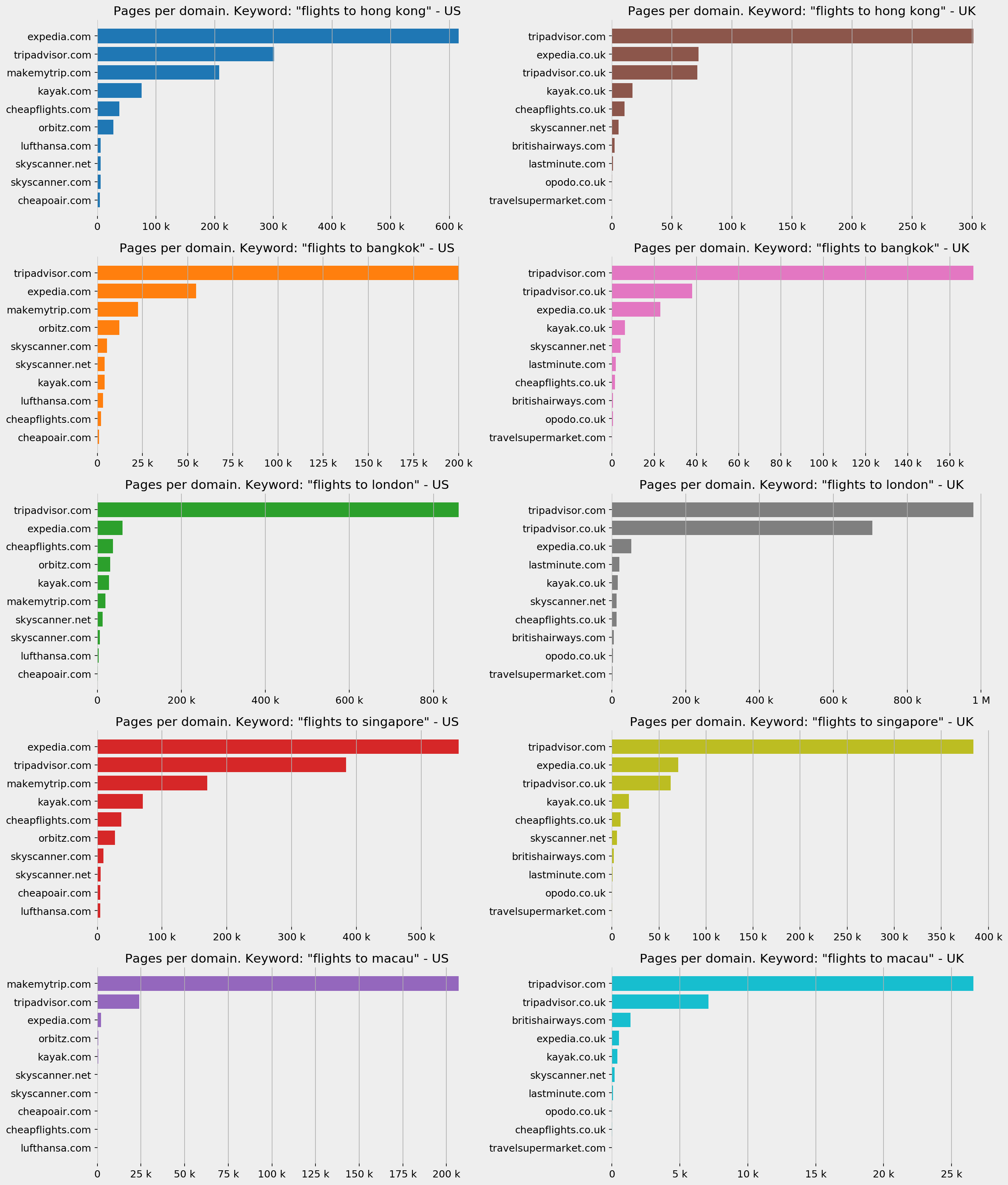
Number of pages per domain
As you can see, the difference can be dramatic in some cases, and it does not always correlate with top positions. Feel free to analyze further, or try other keywords if you are interested.
Analyzing Titles
There are many ways to analyze titles (and snippets), but in this case, one particular thing caught my attention, and I think it is very important in this industry. Many sites have the price of the tickets in the title of the page, which is not only visible in SERPs but is one of the most important factors that either encourage or discourage people to click.
For example:
serp_flights[serp_flights['searchTerms'] == 'flights to paris'][['searchTerms', 'title']].head(10)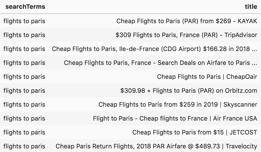
Flights to Paris SERP titles
Let's now extract the prices and currencies, so we can do further analysis.
serp_flights['price'] = (serp_flights['title'].str.extract('[$£](\d+,?\d+\.?\d+)')[0].str.replace(',', '').astype(float))serp_flights['currency'] = serp_flights['title'].str.extract('([$£])')serp_flights[['searchTerms', 'title', 'price', 'currency', 'displayLink']].head(15)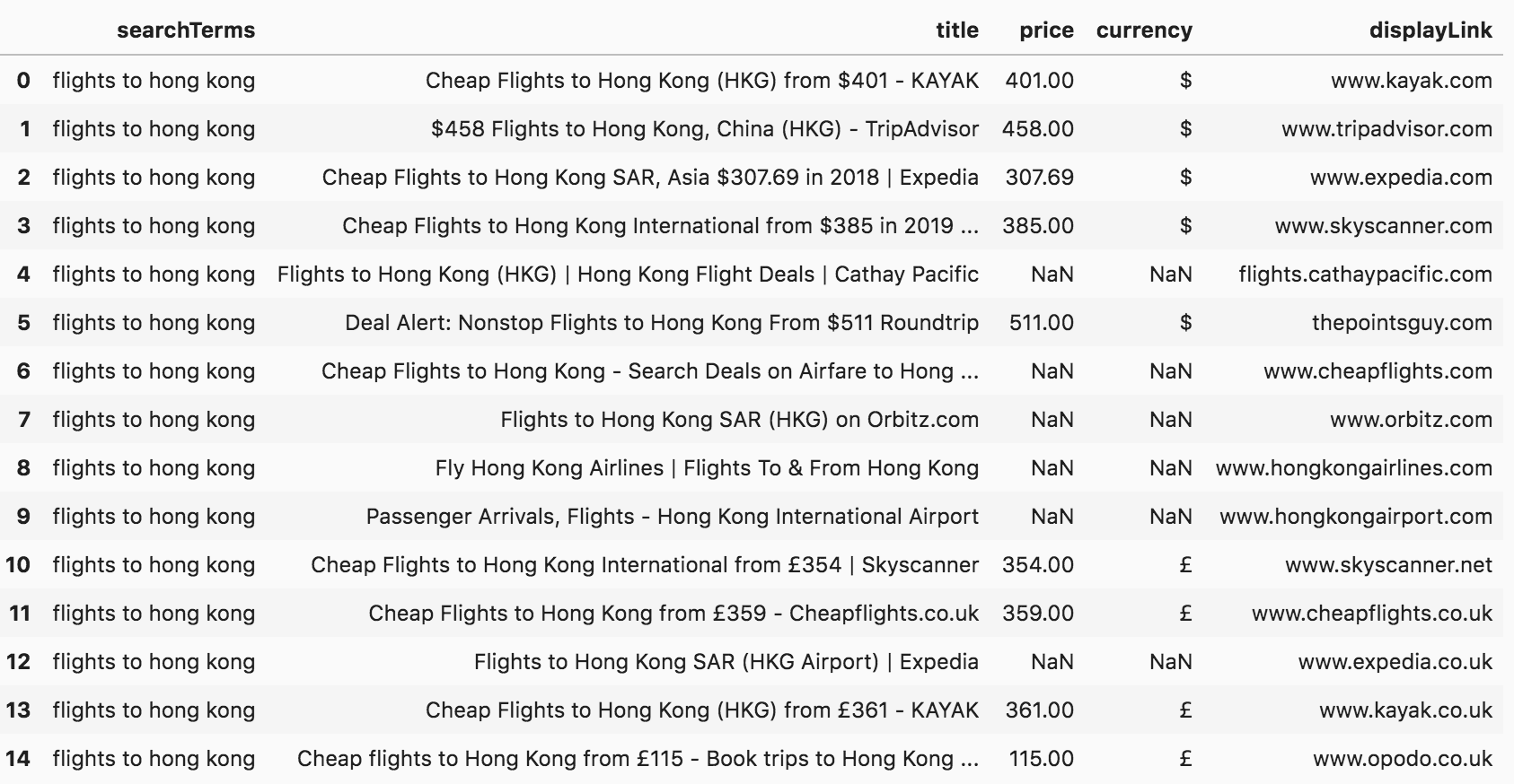
SERP titles with prices
Now we have two new columns, "price" and "currency". In some cases, there is no price in the title ("NaN" for not a number), but for others, there are dollar and pound signs. Some sites also display the prices in other currencies, but because they are very small in number, it doesn't make sense to compare those, especially when there are big differences in their values. So, we will only be dealing with dollars and pounds.
For the top five queries, we can plot the different prices (where available), and get a quick overview of how the prices compare.
Here is a quick price comparison engine for you:
fig, ax = plt.subplots(5, 2, facecolor='#eeeeee')fig.set_size_inches(17, 20)countries = [' - US ($)', ' - UK (£)']country_codes = ['us', 'uk']currency = ['$', '£']top10dfs = [top10_domains_us, top10_domains_uk]for i in range(5):for j in range(2):ax[i, j].grid()ax[i, j].set_frame_on(False)df = serp_flights[(serp_flights['gl'] == country_codes[j]) & (serp_flights['searchTerms'] == queries[i]) &(serp_flights['currency'] == currency[j])]for country in top10dfs[j]:ax[i, j].scatter(df.sort_values('totalResults')['displayLink'].str.replace('www.', ''),df.sort_values('totalResults')['price'],color=tab10.colors[i+5*j], s=300)ax[i, j].set_title('Price per domain. Keyword: "' +queries[i] + '"' + countries[j],fontsize=15)ax[i, j].tick_params(labelsize=12, rotation=9, axis='x')plt.tight_layout()fig.savefig('Prices per domain' + '.png', facecolor='#eeeeee', dpi=150, bbox_inches='tight')plt.show()
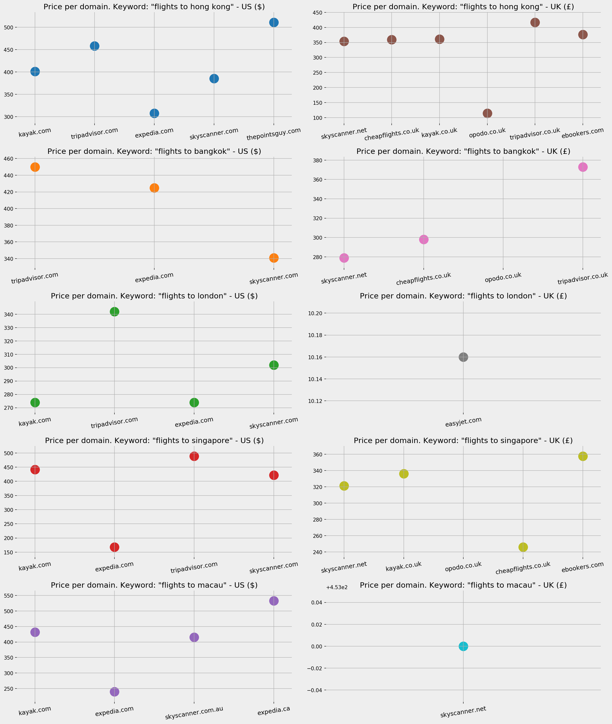
Ticket prices per domain
To get a general overview of pricing for the top domains, we can also plot all instances where a price appears in the title of a SERP, so we can see how prices compare overall by domain:
fig, ax = plt.subplots(1, 2, facecolor='#eeeeee')fig.set_size_inches(17, 8)countries = [' - US ($)', ' - UK (£)']country_codes = ['us', 'uk']currency = ['$', '£']top10dfs = [top10_domains_us, top10_domains_uk]for j in range(2):ax[j].grid()ax[j].set_frame_on(False)df = serp_flights[(serp_flights['gl'] == country_codes[j]) & (serp_flights['currency'] == currency[j]) &(serp_flights['displayLink'].isin(top10dfs[j]))]ax[j].scatter(df.sort_values('totalResults')['displayLink'].str.replace('www.', ''),df.sort_values('totalResults')['price'] ,color=tab10.colors[j], s=300, alpha=0.1)ax[j].set_title('Prices per domain'+ countries[j],fontsize=21)ax[j].tick_params(labelsize=18, rotation=18, axis='x')ax[j].tick_params(labelsize=18, axis='y')plt.tight_layout()fig.savefig('Prices per country' + '.png', facecolor='#eeeeee', dpi=150, bbox_inches='tight')plt.show()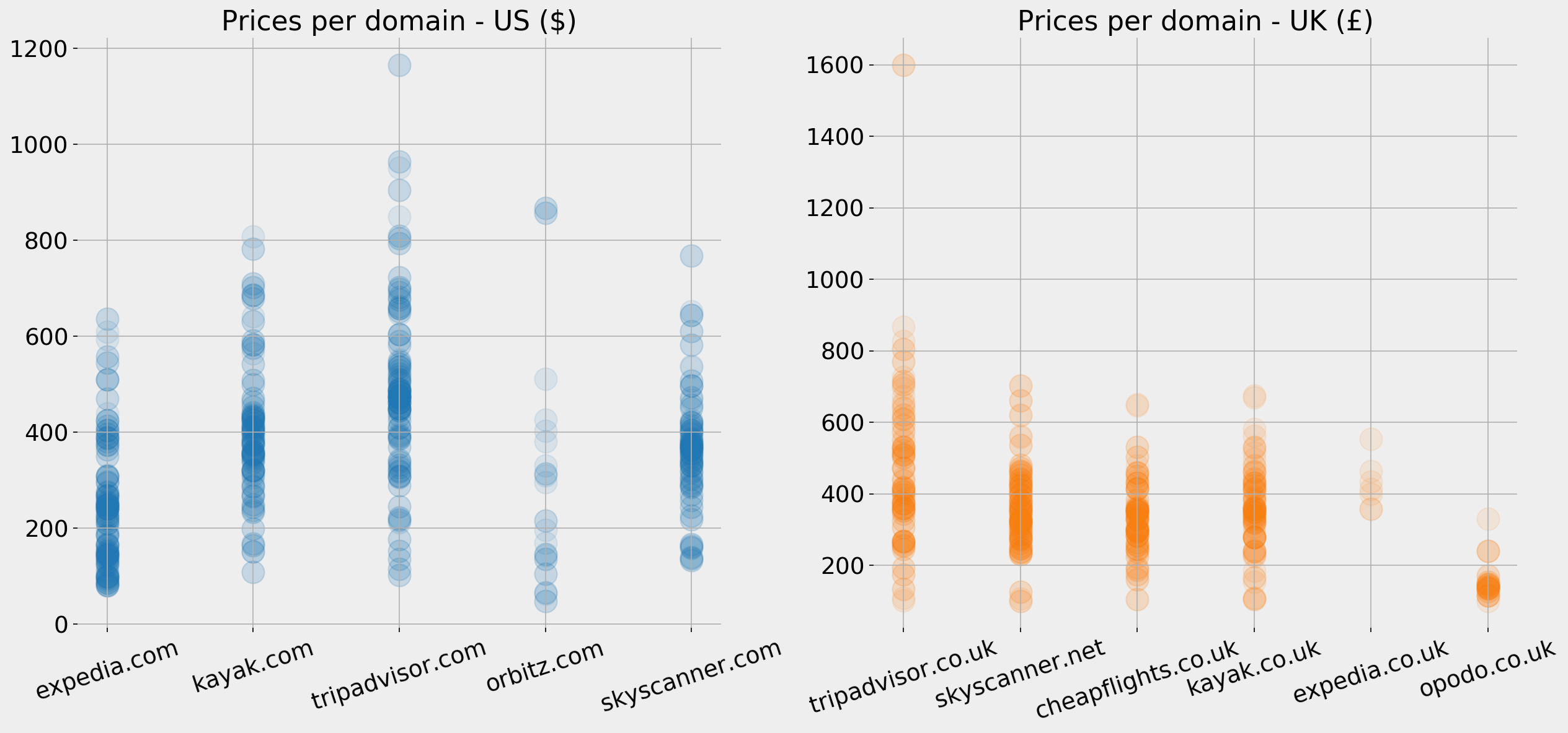
Ticket prices per domain per country
In the US, expedia.com clearly has lower prices on average, and a good portion of them are below $200. Tripadvisor.com seems to be the highest on average, but they also have a higher range of fluctuation compared to others. Opodo.co.uk is clearly the cheapest for the UK, with almost all its prices below £200.
Keep in mind that the two charts have different Y axes and show prices with different currencies. At the time of writing the GBP is around $1.30; this does not necessarily mean that expedia.com actually has lower prices, as it could be based on "starting from" or premised on certain conditions, etc. But these are their advertised prices on SERPs.
Peeking at Snippets
As with titles, we can do a similar analysis of snippets. One site caught my attention with the text of their snippets, and that is kayak.com.
Below is a sample of their snippets. Note that they mention airlines' names, prices, and destination cities, even though the queries do not indicate where the user is flying from. Note also that they are different for each query. For the destination of Hong Kong, they specify flights from San Francisco and New York, while for the destination of Dubai they specify New York, Chicago, and Orlando.
It seems that they have the text of the snippets dynamically generated based on the most frequent places people buy tickets from, and the airlines they use for those destinations; this could be an interesting insight into the market, or at least on Kayak's view of the market and how they position themselves. You might want to export the Kayak snippets and generate a mapping between source and destination cities, as well as the airlines that they are most frequently associated with.
serp_flights[serp_flights['displayLink'] == 'www.kayak.com'][['snippet']][:10]`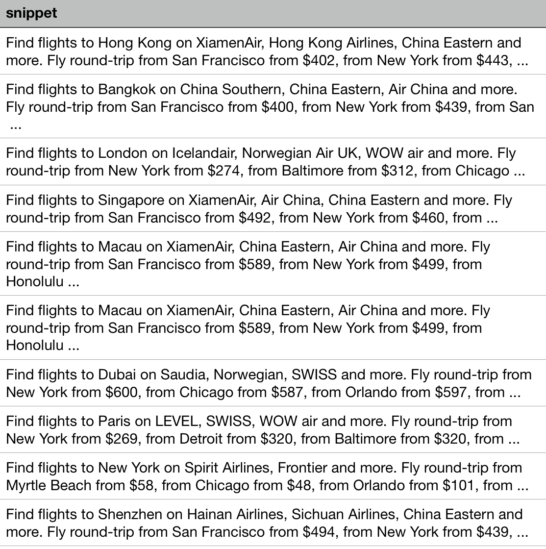
Snippet text in SERPs
Final Thoughts
This article was a quick overview of how to use Pyhton to analyze Google Search. It can be used to automate a large number of reports and a few ideas on what can be analyzed.
There are other things you might consider as well:
Run the same report periodically: Usually, we are not interested solely in a snapshot of where we stand. We are interested in knowing how our pages perform across time. So you might run the same report once a month, for example, and produce charts showing how positions are changing in time. Assign weights to different destinations: As mentioned above, we are assuming that all destinations are equal in value, but that is usually not the case. Try adding your own weights to each destination, maybe by taking into consideration the number of annual visitors mentioned in the table, or by utilizing your own conversion / sales / profitability data. Try other keywords and combinations: Travel is one of the most complicated industries when it comes to generating and researching keywords. There are so many ways to express desire in traveling to a place (for instance, New York, New York City, NY, NYC, JFK, all mean the same thing when it comes to travel). Note that we did not specify a "from" city, which makes a huge difference. Try "travel", "holidays" and/or pricing-related keywords. Try doing the same for YouTube SERPs: advertools has a similar function for extracting similar data for videos. YouTube data is much richer because it includes data about video views, ratings, number of comments, metadata about the channel, and much more. Build on this notebook: Instead of re-inventing the wheel, you can get a copy of the code and data, or you can explore the interactive version online (you will need to have your own Google CSE keys) and run a different analysis, or produce different visualizations. I'd love to see other ideas or approaches.Good luck!
Innovative SEO services
SEO is a patience game; no secret there. We`ll work with you to develop a Search strategy focused on producing increased traffic rankings in as early as 3-months.
A proven Allinclusive. SEO services for measuring, executing, and optimizing for Search Engine success. We say what we do and do what we say.
Our company as Semrush Agency Partner has designed a search engine optimization service that is both ethical and result-driven. We use the latest tools, strategies, and trends to help you move up in the search engines for the right keywords to get noticed by the right audience.
Today, you can schedule a Discovery call with us about your company needs.
Source:


