

Having a good mobile version of your website today is absolutely necessary.
Since Google announced that it had started experiments on shifting page indexing to mobile-first, there has been a lot of talk and tons of speculation. After a year and a half of experimentation, finally and officially, mobile-first indexing is rolled out.
Your customers are likely to access your site from different devices and to meet the goals of your website it is your responsibility to provide them with the best experience possible. This is what mobile optimization is all about: adapting your site, the design, and your content for various screen sizes and platforms.
More than half of all searches today are conducted via mobile, and those numbers are growing.
A simple analysis of traffic will help you understand your audience's device preferences. Google Analytics allows you to access some of this data and it will help you see if what you are doing is working with mobile users, or if you should adjust your methods. But keep in mind, a "mobile-first" mentality should never take over "customer-first" approach.
Key SEO aspects of developing a mobile website:
Choose Mobile-Friendly Configuration Responsive Design Dynamic Design Separate URL for Mobile Version Desktop-Only Version Research Mobile Keywords Optimize Content for Mobile Devices Provide a Good User Experience ConclusionChoose Mobile-Friendly Configuration
The first step of mobile optimization is deciding which website configuration to use. If your site already has a mobile version with the same markup and content as on desktop version, you are all set up. You can go ahead and skip to the next section, where you will find tips on reviewing mobile friendliness, evaluating content & design, how to research keywords & competitors, and what tools can help you.
If you don't have a mobile version yet, we recommend that you start with determining the goals for your mobile website. What do your visitors want to do? What do you want them to be able to do? Figure out what you want and need to happen to reach your goals. Then determine how much time and resources you can put into it. The goal is to make everything mobile and user-friendly. So let's look at how you can do that.
Responsive Design
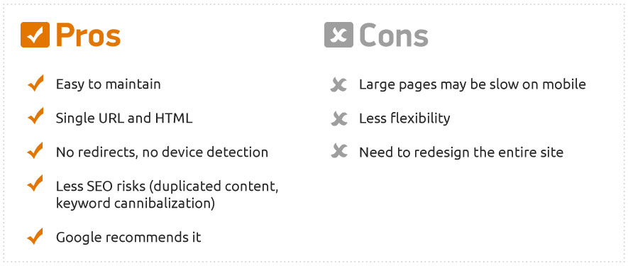
Responsive websites provide users with a consistent experience on all devices by adapting the layout to a browser window size. It appropriates all assets for the screen, but everything on the page stays similar; it has the same HTML code and the same URL.
Websites using responsive design are easy to maintain and update because they require little to no additional configuration for search engines. Google blatantly stated that this approach is favorable. It is a good option for any website, but you should not view it as the only way.
Implementing responsive design will require you to rebuild the site in a way that will look good both on mobile and desktop. If you have a big site, this might take a lot of time and money. To save on resources, you can apply the responsive design incrementally, starting with pages that have the highest percentages of mobile traffic. For in-depth information on developing steps, you can check out this article about creating your first multi-device site.
Dynamic Design
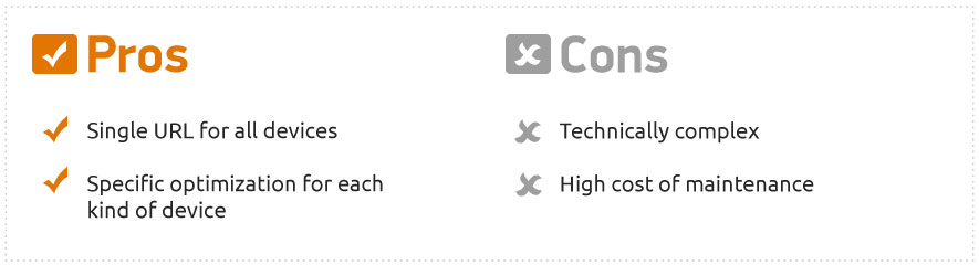
Depending on your business type, you might want to provide specific experiences designed for the mobile version of your site. This can include showing different content or optimizing for different search queries. You can do these things with dynamic design.
Dynamic design allows you to have several different versions of a single page on a single URL, where the distinctive HTML depends on the user agent device. This gives you the opportunity to differentiate versions of your website, offering a more custom experience while targeting different audiences. Dynamic serving does not require a full site redesign but does increase the workload of maintenance and updating.
You will need to use a Vary HTTP Header to correctly detect user agent devices and to tell the crawler that you have an alternative mobile page. Here are Google’s guidelines for implementing a dynamic serving website.
Separate URL for Mobile Version
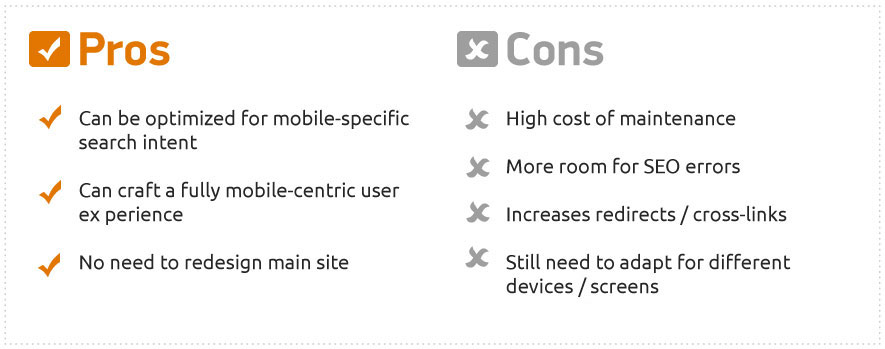
This works exactly how you think it would; you create a new mobile-friendly page that exists on a different URL. Usually, it sits on a subdomain, like “m.website.com.” If you go this route, it is a good idea to keep this URL structure paralleled with the desktop version of the site.
As with the dynamic serving, having two separate sites has the drawback of more complicated maintenance. It does give you the opportunity to create a more defined mobile experience, but it leaves more room for technical issues. User agent detection is not always perfect, so it is a good idea to provide users with the ability to switch versions.
Google will not automatically distinguish the mobile page as a version of the desktop page, so you will need to add rel=”alternate” and rel=”canonical” tags accordingly to indicate correspondent pages and avoid duplicating content. This also lets you keep the backlink weight of a related desktop page. Make sure you have all the redirects in place, but keep them to a minimum, so that you won’t drag page speed down. To avoid common mistakes, examine Google’s recommendations for creating a mobile website on a separate URL.
Desktop-Only Version
Believe it or not, having only a desktop version is still an option in a mobile-first world. Obviously, this is not advisable because you will not get a mobile friendliness boost and will potentially lose a chunk of clientele. That being said, it is better to have a fully-functioning desktop-only website than a poorly implemented mobile version. Your desktop site will still be searchable from mobile, after all. You can check if your content is accessible with the Mobile Usability report in Google Search Console.
Make Sure Your Efforts Pay Off
Whichever option you choose, it is a good idea to see if your website is crawlable and if everything is working as it should. You can set up a SEMrush Site Audit with mobile crawler as a user agent to see if there are technical issues that you need to resolve, like broken links and images, duplicated content and meta descriptions, redirect chains, and much more.
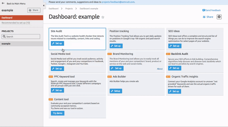 Set up of SEMrush Site Audit
A good way to find out if Google considers your page fitting is this Mobile-friendly test. It shows a list of mobile usability problems you might have and a picture of how the page looks on a mobile device.
Research Mobile Keywords
You can’t overestimate the importance of keyword research for SEO. There are tons of articles on its benefits and on how to conduct it, so I won't discuss it much here. But whatever your current strategy of finding the right keywords is, you need to remember that you are competing on two fronts—mobile and desktop. At least for now. Eventually, you might need to make a complete shift to mobile. How you show up for mobile keywords vs. desktop keywords can be different - and this can be different for each location you are optimized for as well. So if you haven't been focused on mobile SEO, you should start looking into it right away, especially since your competitors are probably already doing it.
SEMrush now provides an option to research mobile keywords separately and compare them to desktop keywords. You can also easily learn about your competitors’ in a mobile segment, too. Monitor which keywords they are pursuing and figure out which keywords you should be using for your site using Domain Analytics - where you can now select data by devices as well.
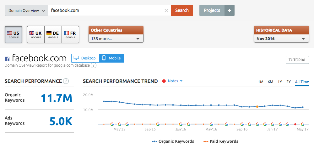 SEMrush Domain Analytics
On top of this, you can also set up multitargeted Position Tracking to discover the correlation of search queries between mobile and desktop. Review positions of your domain on multiple devices, track changes to get a grasp of overall trends and pave the way for efficient resource management.
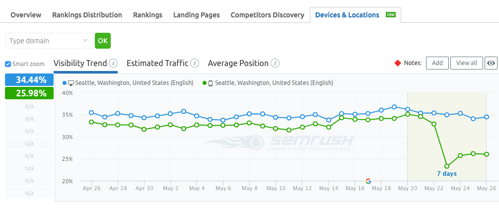 SEMrush Position Tracking
Optimize Content for Mobile Devices
Having a mobile-first approach in mind can benefit the desktop version of your site. Imagining a website on a smaller screen is a good way to shave off all of the unimportant parts and to rebuild the information architecture in a way that provides easy access to the answers and information people are looking for. It also helps you prioritize and create content that is better and stronger than ever.
Good content is good content, and guidelines for creating it are universal across all platforms. It should be structured, informative, easily scannable, and have great, click-worthy headlines. Long-form content is universally considered to be more valuable from an SEO perspective, but there currently isn’t a consensus on mobile.
Shorter content on mobile makes sense because small screens can show less information. On the other hand, having less is not necessarily good, especially if there is an inequality between desktop and mobile versions. When mobile first indexing rolls out, that could become a huge problem.
So, what you should do is aim for being more concise. That includes shorter titles, URLs, and meta descriptions. Break content into digestible portions by making shorter paragraphs that have a consistent rhythm. Prioritize helpful and engaging material, and put it above the fold so it will load first.
This Tool Can Help
To find the recommended word count for your article, you can utilize SEMrush SEO Content Template with a phone selected as a device for Google search targeting. There, by simply putting in targeted keywords, you will get recommendations based on the list of your top 10 Google rivals for that search query. This tool also shows how your competition already uses the target keywords in context and provides suggestions for diversifying the semantic core.
Creating Content for A Less Focused Audience
It is important to learn and understand the behavior of your audience and manage content accordingly. Look at what they are doing and needing to determine what kind of content you need to create. Remember that people using mobile versions of websites are mobile themselves. They are more easily distracted and usually spend less time looking at the screen, so put more effort into grabbing and holding their attention. Give them the info they need fast.
Get to the point quicker, let your users easily navigate through the content sections and skip ones that are not important to them. Expandable content is one way to do this, and it is a good way to have all information available without overburdening the page. According to Gary Illyes, this type of content will not be devalued on mobile.
Improving Content
It is good to have guidelines for creating new content, but most people already have content on their site. How to make it better is often the question. To find ways of improving your existing content, you can set up SEMrush On Page SEO Checker with a "phone" as a target device. This tool gives you ideas for optimization based on your top 10 rivals from Google’s search result page. It will also present you with a list of recommendations for fixing up your page's content, semantics, user experience, and technical issues. The data provided will help you determine if you used the right keywords to help with search rankings, if you need to add more, or on the contrary crammed in too much, and if there are any cases of cannibalization. For more information about this tool, you can read this article about On Page SEO Checker and SEO Content Template.
 Set up of SEMrush On page SEO Checker
Key Elements You Can't Forget
Do not forget about adding structured data to your site. Rich snippets are even better on mobile because they take up more screen space (of course, Google could change this in the future). But for now, definitely look out for opportunities to get featured. Keep your microdata relevant, but don’t overkill it. You can check your page with Google’s structured data testing tool.
Load time optimization is crucial for mobile SEO. Remember, everyone is in a hurry. You should avoid using Flash and over using JavaScript. Intrusive popups, PDFs, and infographics are also not advisable. Page speed is a higher priority on mobile devices since connection and hardware capability varies. Try to reduce code and redirects, and add browser caching. Optimize images and videos and determine if they are essential for understanding your content; if they are not, you may want to remove them. Google’s PageSpeed Insights can show ways of optimization for both desktop and mobile.
Another thing you might want to keep in mind is optimizing for local search and voice search. Lots of mobile users are looking up local businesses on the go, and you want them to find you easily. So standardize your name, phone, and address and keep it consistent, and updated, in regards to on-page and metadata. Don’t forget to add working hours, so mobile visitors know when you are open, and it is always nice to have a click-to-call option on the phone number.
Voice search is growing in popularity, so it is a good idea to aim for longtail keywords that resemble conversational questions. Make a FAQ page or find another way to incorporate keywords that appear like natural language queries.
Provide a Good User Experience
If you have followed all the tips listed above, solved technical issues, and optimized content, then you should have a mobile-friendly website. But it is still not quite enough; you need to provide a good user experience. Look at your site through the eyes of a mobile user and think of the journey that a visitor makes.
Make sure you have a big enough font and that the text is readable without zooming. Buttons and links need to be spaced in a way that is not frustrating for the user. Fingers obscure the view and do not offer the precision of a mouse. It is best to define clickable items and to give users feedback on their actions. For example, you can indicate buttons were pushed and highlight links to show that has already been clicked on; this helps in a case of a slow connection, so people won't furiously keep tapping.
Keep in mind, that typing on mobile is slower and on-screen keyboards cut the visible area in half. So, simplify ways of communication, create checklists, and pre-filled forms if you can. Try to keep layout streamlined so that there is no need to go through lots of pages to get to a destination.
There is no single conclusion on whether having HTTPS is a big ranking factor or not, but adding it does make your website more trustworthy. You can read this expert roundup on the matter for more information. HTTPS adds a layer of security by encrypting a connection between server and web browser. It is an absolute necessity if you are running an e-commerce business or if you need to gather private information from your users. Plus, HTTPS is not only about collecting names, credit cards, and dates; some browsers forbid certain features for non-secure websites. For example, Chrome will not allow using geolocation and push notifications without it.
You can easily check your website for mobile usability issues in Google Search Console. There you will see all the problematic pages and a line graph that shows how their quantity changed over time.
Conclusion
Mobile optimization of a website seems like a lot of hard work, and it is, but the benefits it provides are potentially game-changing. If you are thinking about getting into mobile optimization, or already have been blessed with such an experience, please share your thoughts on the subject in the comment section.
Here is a list of the all mobile SEO tools mentioned above:
SEMrush Site Audit for a full-fledged report on technical SEO issues
Mobile-friendly test and mobile usability test to see if Google considers your website well-suited for mobile devices
PageSpeed Insights for load time optimization
Self-evident Structured data testing tool
SEMrush Domain Analytics to pursue your competitors and keywords
SEMrush Position tracking to simultaneously track site rankings for desktop and mobile devices
On Page SEO Checker and SEO Content Template to help with content creation
Innovative SEO services
SEO is a patience game; no secret there. We`ll work with you to develop a Search strategy focused on producing increased traffic rankings in as early as 3-months.
A proven Allinclusive. SEO services for measuring, executing, and optimizing for Search Engine success. We say what we do and do what we say.
Our company as Semrush Agency Partner has designed a search engine optimization service that is both ethical and result-driven. We use the latest tools, strategies, and trends to help you move up in the search engines for the right keywords to get noticed by the right audience.
Today, you can schedule a Discovery call with us about your company needs.
Source:


